Software
Houzz Logo Print
debbyshepard

Dining Room Dilemma

2 years ago
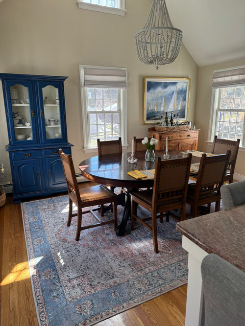
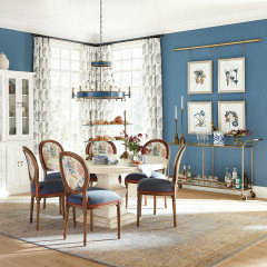
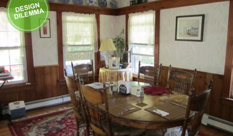
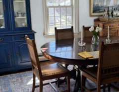
Feeling like my dining room is not pulled together since adding the painted blue cabinet which I love .
Is table and chairs the issue?
Need some help!

Comments (24)

  • 2 years ago

    How about a table runner or cloth? What a pretty room! Love the cabinet.

  • 2 years ago

    I think the light fixture is not doing the room any favors. It's pretty, but the style doesn't seem to work well with your more rustic furniture. Darker finish would also balance some of the wood and the blue.

  • 2 years ago


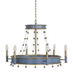
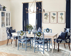
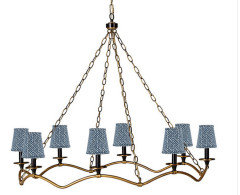
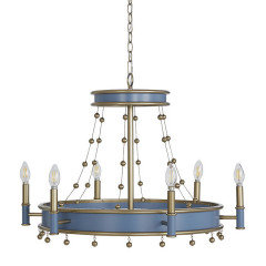
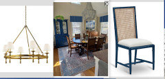
    Not the right shade of blue, but just showing what a darker (or blue) fixture might look like. There are probably some that come in the right shade of blue. Maybe this? Again, probably not the right blue,


  • 2 years ago


    Not the right shade of blue, but just showing what a darker (or blue) fixture might look like. There are probably some that come in the right shade of blue. Maybe this? Again, probably not the right blue,


  • 2 years ago

    The picture over the chest is pretty but it makes the room feel too cluttered, especially with that attention grabbing chandelier. I would either change the light fixture to something simpler, maybe a transitional style, or replace the picture with something less colorful.

  • 2 years ago

    The blue is sucking the subtle vibes out of this room. And, the items displayed inside are not very interesting to look at. Are you up for painting the exterior and interior a pale grey or taupe and placing other objects inside? Do you really need a china cabinet to store things or did you just get this because you wanted something else in this room?


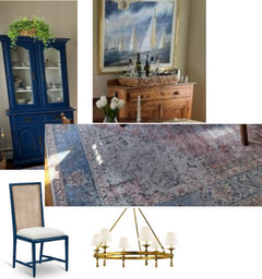
    I adore the artwork with the brass frame. It looks great with the buffet. The chandlier didn't bother me until anyone mentioned it. I think it is fine but if you replace it, I'd go for brass to pick up on the artwork frame.


    There is a nice wood, woven texture, and brass potential as a theme in here.

  • 2 years ago

    I like the dining room set to compliment the strong blue of your new cabinet. It offers a complimentary muted color in the same lightness/darkness as the blue. I don't think that's "the problem".
    I also like how you balanced the blue cabinet with the wood buffet, and I like the picture over it that repeats the blue and fills in the shape of the cabinet on the other side of the door.
    What first grabbed my attention was the wall color. Maybe the blue cabinet accentuated the yellowness in the wall color but since it's a pale color it got weird. What would you think about using the light grey in your area rug as a wall color instead? Or would that require painting the whole house...
    And how would you feel about a new light fixture that was lower so it was connected to the table more? Or remove that fixture and install wall sconces?
    I love the color of your countertop and how you picked it up with your area rug. And I love your new blue cabinet and how it coordinates with the blue in the rug and painting.
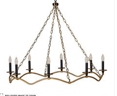
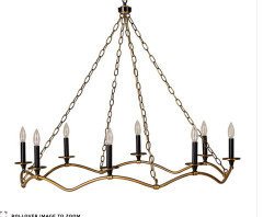
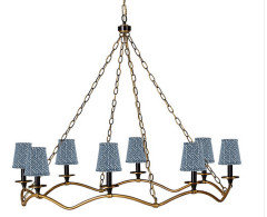
    I agree with choosing a different style light fixture with a darker tone, maybe antique brass like others said. Just make it a lower height, around 36" above your table. And choose a shape that is much wider than it is high, like the one @Olychick selected with the candle-looking lights and wavy bottom.

  • PRO
    2 years ago
    last modified: 2 years ago
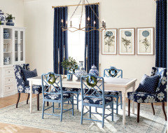
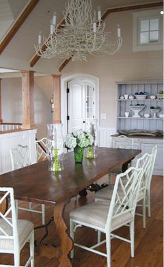
    Chairs and chandelier, add window color: ) and I might be in Nantucket, right off the cobblestone streets.

    Paint the chairs. The wire basket chandelier is a misfit, but we don't know exactly what you were going for, do we?

    Not loving the heavy upholstered and gray counter stools, we can't fully see?


  • PRO
    2 years ago
    last modified: 2 years ago

    IMO nothing works together in the space except maybe the rug and the table .a differnt style from the blue cabinet, the chandelier all wrong and hung too high .We have no idea about your style and I guess start by telling us why you love the blue cabinet?

  • PRO
    2 years ago

    Because she loves it, Patricia. No different than you love mid cen modern anything: )

  • 2 years ago

    I like your room.


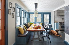
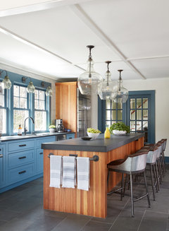
    For me the blue is pretty but I think it is trying to be the star. If it were my house, I would repaint it a grayer blue. Something softer but still dark. Labrador Blue by BM


    Labrador would go better with what I see as a yellow toned wall color that you have. Your floors and other chest also have a golden tones to them (which I love) and to balance this out a blue with a hint of gray but still dark could really work for your space.


    Farmhouse Kitchen · More Info


    Another photo of that great color


    Farmhouse Kitchen · More Info


    I think the light fixture is fine maybe hung a little lower


  • 2 years ago

    I think your dining room just needs more blue added to it as the others so nicely showed.
    Reupholster the chairs in a strong blue fabric to match fabric on windows. Also a different chandelier hung lower.
    I love the rug and blue cabinet. Please come back and show us what you have done.

  • 2 years ago

    I love the blue in the painting echoing the cabinet. To start simple, how about a beautiful blue bowl in the center of your table?

  • 2 years ago

    Meant to ask where did you get your rug? I love it,as our dining is blue too

  • 2 years ago

    The rug is a washable from The Rug collection.

  • 2 years ago

    Thank you all for the advice.
    I live in New England and have the coastal theme in my house.
    Blue cabinet is used to display my Dedham Pottery collection.

    Thinking I may change wallpaper paint color in addition to chandelier.
    Too much beige !

  • PRO
    2 years ago

    So...... I was close in locale: ) and feeling.

  • 2 years ago

    @Olychick
    Could you share where chandeliers are from?
    Thank you

  • 2 years ago
    last modified: 2 years ago
    I immediately felt the cabinet‘s color was a bit too deep/harsh with the rug and island’s seating.


    Only then decide on other changes, if still needed. Given the open concept with a heavy dining set, lighter chairs could create a more casual airy feel.


  • 2 years ago

    Following

  • 2 years ago

    Any chance the sailboat painting could go on another wall? It’s lovely, but what caught my eye in your photo was a wall full of rectangles at inconsistent heights. Something different over the low cabinet would break that up.

  • 2 years ago

    Looking closer at the table and chairs...really love them, love the blend of materials in the chairs and the cut of the wood. Love the claw foot table.

    I tried to upload your photo in Sherwin Williams to try a few different very light grey paint colors. You should try it and find what you like. This is just an example, not a recommendation...too personal a decision.

  • 2 years ago
    last modified: 2 years ago
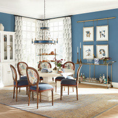
    Sorry I just saw your request about the chandeliers. I didn't keep track, was just looking for ideas, but I'll do a reverse image search and post in a few minutes! Here is the first one from:

    eta: the links aren't highlighted on my computer, but both the Ballard Light listings below are links to the light, in case it isn't obvious.

    Ballard light


    oh the 2nd is from there, too!


    2nd Ballard Light