

White vs dark interior window
2 years ago
Sort by:Oldest
Comments (15)
Related Stories
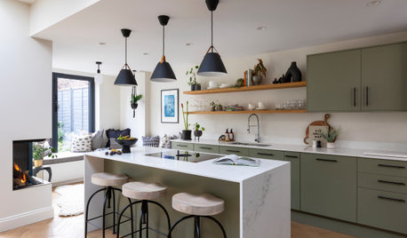
KITCHEN DESIGNKitchen of the Week: Green, White and Wood With a Window Seat
A cozy and practical cooking-dining space provides a strong indoor-outdoor connection
Full Story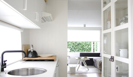
HOUZZ TOURSMy Houzz: White Interiors Brighten a Dutch Cottage
Snowy finishes and minimal accessories give a compact 2-bedroom home for a family of 5 a more open feel
Full Story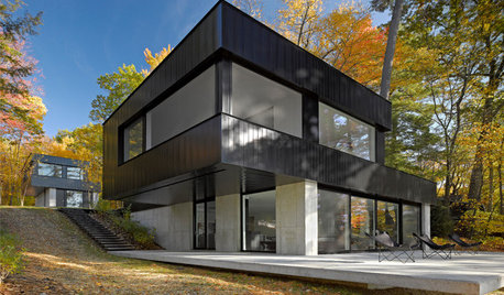
ARCHITECTUREDark Exterior, Light Interior: 6 Homes That Celebrate Contrast
They claim the best of both worlds and have a distinct wow factor. See if any of these high-contrast homes light a spark of curiosity
Full Story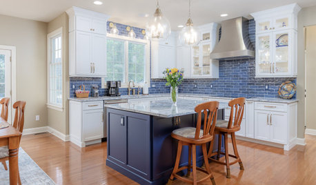
KITCHEN OF THE WEEKDark Cramped Kitchen Opens Up With a Blue-and-White Palette
A New Jersey couple gets a brighter, better-organized kitchen with an indigo island and full-height cabinetry
Full Story
COLOR PALETTESCrisp, Clean White Interiors to Start the New Year Right
Beginning with a blank-slate backdrop gives you infinite design freedom with accent colors, furniture styles and finishes
Full Story
TRANSITIONAL HOMESHouzz Tour: Dark and Moody Contrast With Serene and White
A design team working remotely brings dramatic contrast, style and comfort to a family’s Southern California home
Full Story
ROOM OF THE DAYRoom of the Day: White and Teak Brighten a Dark Kitchen
A modern-rustic design brings in more light and style, while a new open floor plan increases entertaining options
Full Story
ROOM OF THE DAYRoom of the Day: New Windows and White Paint Brighten Things Up
A crisp neutral backdrop, built-in storage, shiplap walls and new furniture update a once-bland living room
Full Story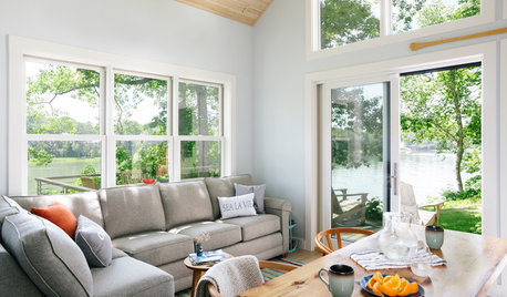
VACATION HOMESHouzz Tour: Coastal Maine Home Celebrates White, Wood and Windows
Efficiency, resiliency and waterfront views drive the design of this New England vacation house
Full Story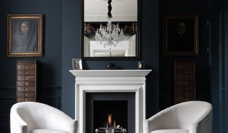
COLORDiscover White’s Surprising Power to Energize Every Room
Using white in different ways gives you limitless options for light, color and creativity
Full Story



millworkman
elcieg
Related Professionals
Waterloo Interior Designers & Decorators · Eugene Interior Designers & Decorators · Everett Interior Designers & Decorators · Bronx Interior Designers & Decorators · Augusta Architects & Building Designers · Kankakee Architects & Building Designers · Winston-Salem Kitchen & Bathroom Designers · Jamestown General Contractors · Ogden General Contractors · Watertown Home Remodeling · Southaven Interior Designers & Decorators · Beaumont Interior Designers & Decorators · Frisco Interior Designers & Decorators · Sanford Architects & Building Designers · Williamsburg Home BuildersPatricia Colwell Consulting
Elizabeth COriginal Author
User
chispa
JAN MOYER
palimpsest
Sophia Van Zyl
Elizabeth COriginal Author
T T
JAN MOYER
wdccruise
kandrewspa
WestCoast Hopeful