Software
Houzz Logo Print
rog_w

Ideas for quartz countertop colour to match oak cabinets?

2 years ago
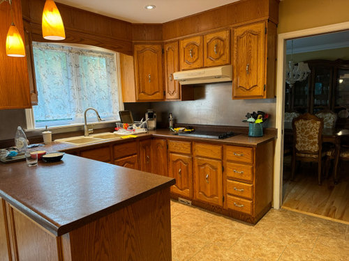
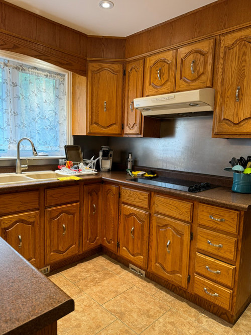
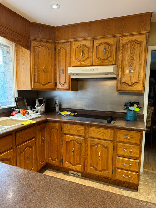
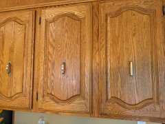
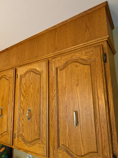
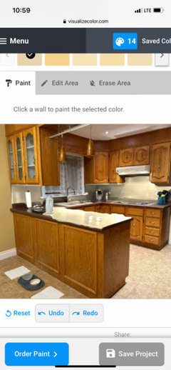
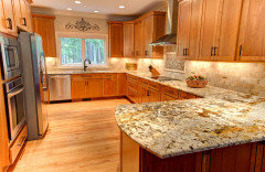
We are looking to do a very simple update to our kitchen without tearing out our cabinets. We are notconsidering any other options (ie new cabinets, painting cabinets, replacing doors etc)We want to lighten it up with only replacing the countertop and backsplash. We would also update the overhead fan to a compact stainless steel microwave version, undercabinet lighting, and the sink to undermounted stainless steel.


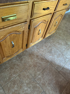
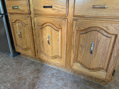
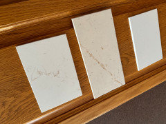
Based on the first look at many quartz countertops, our favourite has been Caesarstone Nougat. However, clearly with the cabinet grain, and the flooring, it would be way too busy.


The best option for us that might go I believe would be Vicostone Milky White. Simple look, much brighter and would brighten things as we want.


My questions are:

- are there any suggestions for a countertop quartz colour that would work with the grain of those oak cabinets?


- do you think Vicostone Milky White would be a good choice?


- do you think it is possible to find a quartz countertop to work with our existing environment, or are we better served leaving everything until we decide to replace cabinets in the future?


- based on Milky White, or another suggestion, what backsplash suggestions might you have? Our thought was again a simple hexagon blue or green tile just to bring some colour into the area and play against what likely would be a very plain countertop, and not be brown like everything else but still go.


Thank you for any comments.


Comments (141)

  • 2 years ago
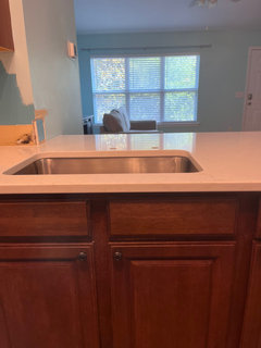
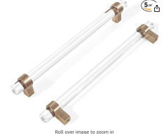
    Champagne bronze is growing on me as it does blend and I agree the more blend the better with the pull location. Food for thought until we figure out rest.

  • 2 years ago
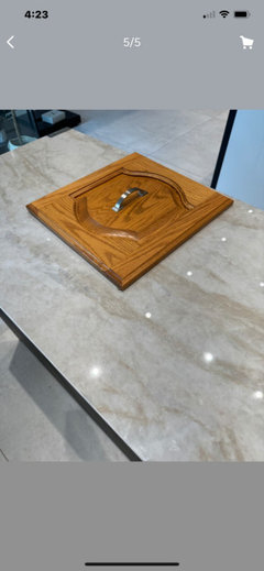
    The golden cup also arrived.


  • 2 years ago
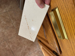
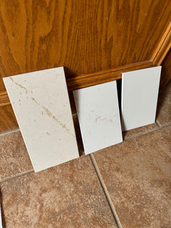
    Silestone Marfil also arrived.


  • 2 years ago

    Embrace what you have yes the cabinet design is dated, but that isn't always bad. Just be sure your countertops have a hint of a warm color in them to blend with your oak tone. I'd consider theses crystal(glass) and champagne brass pulls. Theyhave a modern look with a nod to classic colors.


  • 2 years ago

    @Rog W so you've settled on champagne bronze. What are your thoughts on a backsplash? How about leaning towards a 4" backsplash of your counter material and just a painted wall above it?

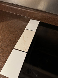
    Are you concerned about the black stove top will look on a nearly white counter?

  • 2 years ago

    I think the champagne bronze blends well yes. I think 4" backsplash and painted wall would be fine. Not really, it would be replaced but not sure how to get around it.

  • 2 years ago

    I like the Silestone Marfil and Halcyon. Both look good with the cabinets and floor. I would do the 4-inch splash with the Silestone and paint the remaining your wall color.


    I would wait on the new countertop install before I selected the cabinet pulls and new lights. With the lighter counter-top and stainless-steel sink the space will feel different.


    I think the space will look nice. Please post picture when you are done.

  • 2 years ago

    @Rog W what do you mean you're "not sure how to get around it"? Do you mean that you don't know how to remove the stainless steel and replace the drywall behind it? Are you doing this yourself?

  • 2 years ago

    @Rog W I have a question for you. How does it feel opening a cabinet with center pulls instead of pulls on the side opposite the hinges. Center pulls offer an interesting look but I don't know if they would feel awkward to me.

  • 2 years ago

    @Rog W which bronze pull most closely matches the hinges on your cabinetry? Are you also replacing the hinges with your metal color of choice?

  • 2 years ago

    Prob prefer the Marfil because it has even more cream to it. Not sure if its too much cream though. Unfort it is substantially higher priced than Halcyon so that might take it out of the running for our proposed inexpensive update.

  • 2 years ago

    Sorry, I meant not sure how to get around having a black cooktop as they are all that colour. No, contractor will be tearing out that stianless wall piece.

  • 2 years ago

    We have been doing it for over 10 years so it is second nature. Dont think about it at all, physically or aesthetically to be honest. Neither bothers us. Certainly a different ”feel” pulling open from the middle, but not awkward enough that we ever thought oh these have to go NOW.

  • 2 years ago

    I’d say neither is great match. Oil rubbed prob closest, although definitely darker. Champagne bronze in same colour hue for sure and prob goes fine. No thoughts on replacing which I know is not the right answer but until we get to the end where we would consider pulls and then hinges, havent considered greatly.

  • 2 years ago

    Thanks @Rog W for your answers and clarification. I especially appreciate you helping me out with the center-pull idea.


    If the champagne bronze is what you like, and the hinges are in the same hue but darker, that's probably better than the hinges being lighter.


    Thanks for explaining you were talking about a cooktop. Looks like there are different color cooktops. Maybe there will be more coming when yours gives up the ghost. There sure aren't many now! https://www.builderonline.com/products/fagor-adds-light-colored-cooktop-to-induction-line_o


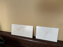
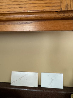
    Can you show a picture of your candidate countertops next to the cooktop and some stainless steel?

  • 2 years ago

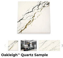
    @Rog W since you are still flexible on a countertop, what do you think of finding one that has a whitish background with both gold and black veining? I'm thinking of tying in the warmth of the wood and floor but also the cool stainless steel and black cooktop.

  • 2 years ago

    Possibly. I think though even with veining that anytime I see more white it looks less appealing. But still open for sure.

  • 2 years ago

    Moved the champagne pull to the vertical and tough to tell here but it does blend in well with the cabinets and therefore is a bit more "hidden" in that centre position.


  • 2 years ago


  • 2 years ago

    @Rog W I agree the bronze looks better than the silver/steel color.

    So when you say, "anytime I see more white it looks less appealing" are you saying you like a creamy warm white better than a cool paper white? To me, they are all just different versions of white. 😊

  • 2 years ago

    For a countertop, Vicostone Milky White sounds like a solid choice to keep things bright and not too busy with your oak cabinets. Another option you might like is Silestone's White Storm, which also has a clean, simple look. For the backsplash, a simple subway tile in a soft blue or green would add a nice pop of color without overwhelming the space. A hexagon tile in those colors could work well too. Stick with light and simple designs to keep the kitchen feeling fresh.

  • 2 years ago

    For a countertop, Vicostone Milky White sounds like a solid choice to keep things bright and not too busy with your oak cabinets. Another option you might like is Silestone's White Storm, which also has a clean, simple look. For the backsplash, a simple subway tile in a soft blue or green would add a nice pop of color without overwhelming the space. A hexagon tile in those colors could work well too. Stick with light and simple designs to keep the kitchen feeling fresh.

  • 2 years ago

    @Rog W I had a thought about your black stovetop looking out of place. What do you think about someday replacing the vent with a black one to make it look purposeful? Like they go together?

  • 2 years ago

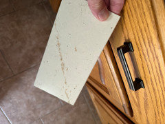
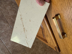
    We did look at Milky White sample with cabinets. I just dont think it has enough going on, too plain is my concern. Trying to find balance between that and say Vicostone Misterio Gold, as don’t want to in my opinion to cross line and have counter too busy against those cabinets. I think that is why I keep coming back to Silestone Halcyon.


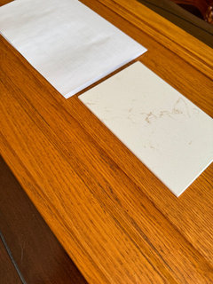
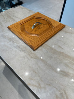
    Yes more warm white than paper white.This is Halcyon beside paper white.


  • 2 years ago

    I don’t think I would want to introduce any more black at all, especially not against the cabinets, but I understand your suggestion.

  • 2 years ago

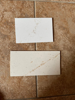
    Halcyon and Marfil on flooring marfil is double the price


  • 2 years ago

    Marfil, Halcyon, Miami Vena


  • 2 years ago


  • PRO
    2 years ago
    last modified: 2 years ago

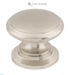
    Pay for the Marfil, get satin nickel hardware in a fat knob with a back plate and a same finish pull for drawers

    The black cook top isn't going to matter at all. You have a stainless under mount sink, a stainless faucet and stainless fridge. If you want a venting micro wave "hood" get a slim. You can even get a slide out hood.

    Take the back splash thing off, find a soft white subway tile ...........install simply.

    Don't make any more elements than this be jammed into the space. You are at over think, in expectation of a miracle that won't be that. But you'll be happy. All the other tops are too white, and far too harsh for floor, will only make the flooring worse. That's the max of lipstick for the u know what.


  • 2 years ago

    ^ agree with Jan -


    you say “i just dont think it has enough going on, too plain is my concern.“ remember you are looking at a TINY sample + your flooring is pretty bossy + all the wood grain with your cabs is busy - there is already a lot happening in the space, I don’t think you will regret keeping it simpler (which takes a lot of discipline)

  • 2 years ago

    I realize floors and cabs are bossy as some one mentioned early on. That is why I prefer Halcyon as it has a bit of something without getting too busy. Miami Vena has too much grey and is too plain I think I think Marfil is possibly too busy the more I look at, maybe too cream, plus it is over twice the price of Halcyon so tough to accept that. I also would prefer to go with same wall colour on already, that runs from family room into kitchen, and just put that on kitchen wall and 4” backsplash. When I look at Marfil against that wall colour I am not sure it goes.

  • 2 years ago

    Jan, you have made your thoughts known and appreciate if you just move on.

  • 2 years ago

    @Rog W sounds like you are getting close to being settled on Halcyon. Jan isn't worried about the black cooktop, so I won't either. And if you have the 4" backsplash of the counter material, I think you are done with the decision making. How do you feel about the choices?

  • 2 years ago

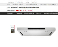
    @Rog W I realized in your original post that you also wanted to address the vent over the stove. I was interested in the slim profile range hood Jan recommend. She showed a picture but gave no link, so I used Google Lense, and I think I found it. When I Googled generally I found some really expensive ones but this one is more reasonable. It's the best of both worlds with stainless steel and a black glass inset (even though I'm not to be concerned with the black glass stovetop so sharply contrasting with the counter). 🤭


    https://www.kitchenaid.com/major-appliances/hoods-and-vents/under-cabinet/p.30-low-profile-under-cabinet-ventilation-hood.kvub400gss.html

  • 2 years ago

    Hi Rog, i’m literally in the same boat as you where I don’t wanna change out my cabinets and if I do, it wouldn’t be anytime soon. We have light off-white, tan floors, oak cabinets that are a bit orange-ish and went with CaesarStone Moorland Fog: https://www.caesarstoneus.com/countertops/6046-moorland-fog/.

    It looks very taupe in the pictures, but in our kitchen it is definitely gray with hints of taupe. I wanted some thing a little bit more interesting than just white, but I’m struggling with backsplash right now (picture below).

  • 2 years ago

    Re plan to paint same as family room which is a bit dark if want to lighten the kitchen. Consider exploring painting walls a lighter version of FR color. If can find the 3 or 4 colors on the same chip as your current color you could use a lighter version that will blend with rest of the house and look good with cabinets. Bonus it limits decision choices. There should be obvious start and stop places on your walls. Do wait till decided and installed countertops and new bulbs or lighting.

  • 2 years ago

    I think Rog W has left the building...

  • 2 years ago

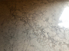
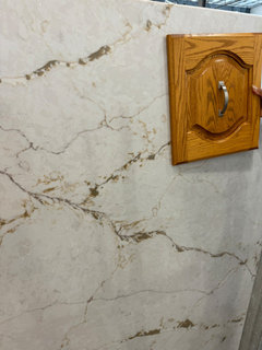
    Not sure any of these go well.


  • 2 years ago


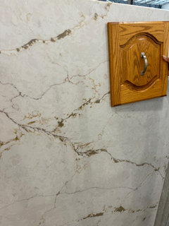
    I would do a very simple counter in a white/cream. Or this bold veined one ONLY on the counters. I would not use it on the backsplash at all. Just paint the backsplash area in a cream color in eggshell finish - or alternatively paint the backsplash the same gold color as your other walls, in an eggshell finish. And I am serious... NO tile backsplash either - not with this bold counter. Just paint the backsplash wall area. That’s it.


    It‘s the only one that you are showing that really works with the existing floor. And the veining is large enough and bold enough to work with the floor, as well as to push the floor into the background. Plus, it could be an interesting look with the cabinet style. What is this veined one called?


  • 2 years ago

    I would go with the Silestone Halcyon. It looks like it’s warm enough and the pattern is not overbearing that it won’t compete with your cabinets or flooring and has enough grey fleck to pick up your stove. I did spa similar project and selected Carrara Breve which looks very close to the Halcyon. It’s light and muted enough to look white from afar but warm and has some interest.

  • 2 years ago

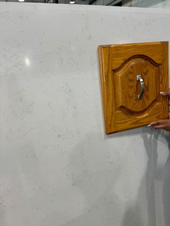
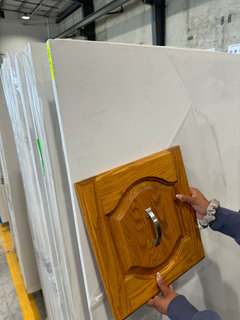
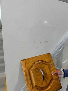
    @Rog W smart of you to take a bit of door with you to the store. Only the veiny one looks golden enough through the magic of photos and individual screen optics. ☺️ You said this project was to get you by until you invested in a complete renovation. Perhaps it is a chance to see if you really like a bold pattern. And since you are planning to have just a 4" backsplash, you don't have to worry about that pattern being on the wall and conflicting with patterns in adjoining rooms. Could be fun!

  • PRO
    2 years ago

    Chose countertop with less contrast with oak cabinet color. They are very dated and so I recommend more warm tones on countertop with NO 4” stone backsplash. That’s very dated too. Just make sure your fabricator does a very good “templating so you get stone nice and tight to wall surfaces. I think this choice you posted works well. Looks like current countertops are laminate? The new laminates are worth looking at too and generally less costly. I would minimize cost for countertops, because once you replace cabinets, you will likely want new countertops too. Personally, I would save to do cabinets and countertops at the same time. Too many partial jobs can lead to damaged refresh items. Just usually hard to pull off. Think more about this. You will save money in the long run. Do you plan on selling in next 2-5 years? If so, you won’t recover costs for half done kitchen.

  • PRO
    2 years ago

    Flo??

    You are way late.....and while wise? Will not happen. You didn't read the entire thread.: ) thoroughly.

  • PRO
    2 years ago

    @Jan, yes, we have had a hurricane and no power so I am “catching up”. Sorry if I repeated or whatever. But guidelines are helpful to all looking at this dilemma.

  • 2 years ago

    if the cabinetry is in good shape - no need to paint it. Some interior decorators want you to paint, but should you like the look of wood or oak (as i do) - just don't. Yes, I; would remove the valence, but even that is not critical.


    I'd find a color that can bring out the cabinetry for the countertops - you don't want to match the oak. But obviously it will have to be something you enjoy.


    When building my kitchen, i ordered lots of samples - do NOT rely on images on websites or photos - check pieces of material out by your own eyes. This saved me from ordering a countertop that looked like sweet potatoes combined with mashed green peas that an infant might have regurgitated - looked fine on the website!

  • 2 years ago

    Have you looked through some examples of oak cabinets with light countertops?


    Search


    I don't think some of them look to busy. I kind of like this one;


    But, I have no idea what kind of look and feel you're going for in your home, what kind of look you want for your new cabinets. But, if you want really simple Milky White seems fine.

  • PRO
    2 years ago

    In regards to your counters:


    1. **White or Off-White Quartz**: This provides a clean, classic look that brightens the space and complements the natural warmth of oak wood.

    2. **Gray Quartz**: Soft gray tones can add a modern touch and create a subtle contrast with the oak cabinets.

    3. **Beige or Cream Quartz**: These colors can enhance the warmth of the oak wood and create a cohesive, inviting atmosphere.

    4. **Marble-look Quartz**: Quartz with a white background and gray or subtle beige veining can give an elegant, sophisticated look while pairing beautifully with oak cabinets.

    5. **Soft Green or Sage Quartz**: This can add a pop of color while maintaining a natural, earthy feel that complements the oak


    Who ever you have doing your demo, they must be a professional with regards to removing the counters. Many times you can severely damage the cabinets upon removing them. Blessings and take care. If you want to email us directly we would love to give you some ideas FREE at cost.

  • 2 years ago
    last modified: 2 years ago

    Based on the uncertainty here in commentary, and your list of 5 options, do you think Silestone Halcyon in suede would work with our cabinets..or are they too dated and it will end up being lipstick on proverbial pig?

  • 2 years ago

    @Rog W OMG, you WILL be hearing from someone on that. ☺️

Sponsored
Miller Woodworks
Average rating: 5 out of 5 stars23 Reviews
Franklin County's Trusted Custom Cabinetry Solutions