

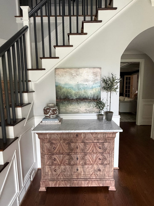
Help me finish this entryway please!
9 days ago
Featured Answer
Sort by:Oldest
Comments (14)
 9 days ago
 PRO9 days ago
Related Professionals
Lawrenceburg Interior Designers & Decorators · Ottawa Interior Designers & Decorators · Baton Rouge Architects & Building Designers · DeRidder Architects & Building Designers · Alexandria Architects & Building Designers · Santa Fe Architects & Building Designers · Cowansville Architects & Building Designers · Salisbury Kitchen & Bathroom Designers · McAllen Kitchen & Bathroom Designers · Gary Kitchen & Bathroom Designers · Beatrice Kitchen & Bathroom Designers · Utica Kitchen & Bathroom Designers · Lima Kitchen & Bathroom Designers · Ontario Kitchen & Bathroom Designers · Kahului Kitchen & Bathroom Designers 9 days ago
 9 days ago
- 9 days ago
- 9 days ago
 9 days agolast modified: 9 days ago
- 9 days ago
 7 days ago
- 6 days agolast modified: 6 days ago
 PRO6 days ago
 PRO6 days ago
 PRO6 days ago

Related Stories
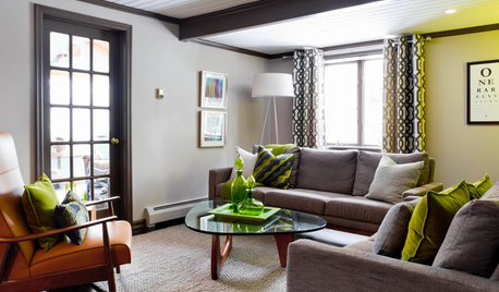
LIVING ROOMSCurtains, Please: See Our Contest Winner's Finished Dream Living Room
Check out the gorgeously designed and furnished new space now that the paint is dry and all the pieces are in place
Full Story
COLORHow to Paint Your Front Door, From Start to Finish
Learn what you need to know about this weekend project, such as the best paint to use and the right time to do it
Full Story
HOME OFFICESQuiet, Please! How to Cut Noise Pollution at Home
Leaf blowers, trucks or noisy neighbors driving you berserk? These sound-reduction strategies can help you hush things up
Full Story
KITCHEN DESIGNKitchen of the Week: White Cabinets With a Big Island, Please!
Designers help a growing Chicago-area family put together a simple, clean and high-functioning space
Full Story
ENTRYWAYSHelp! What Color Should I Paint My Front Door?
We come to the rescue of three Houzzers, offering color palette options for the front door, trim and siding
Full Story
KITCHEN DESIGNKitchen of the Week: An Entryway Kitchen Opens Up
More square footage and seamless transitions help a historical pied-à-terre's kitchen blend in beautifully
Full Story
ENTERTAININGGot Hand-Me-Down Dinnerware? Make a Memorable Meal
They might be mismatched and not your style, but those inherited plates and forks can help bring meaning to your table
Full Story
FUN HOUZZHouzz Quiz: How to Find Your ‘Me Time’ Place
Looking for the best place in your house to soothe away your stress? We’re here to help
Full Story



Lyn Nielson