Software
Houzz Logo Print
kl23

The anti-accent-wall how-to quest

last year
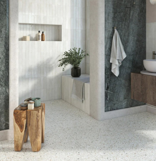
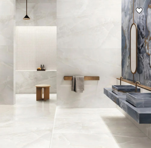
Think of a small room like a 5x8 bathroom with the entry door on one end of a long wall. Enter the room and the vanity is in front of you, the toilet to the left, followed by a shower. You can tile the room in a large-format tile in two colors: 1) a very busy onyx-look in blue, brown and white; 2) same pattern but all creamy white. What is the effect of having all four walls in the busy tile? Stressfull? What is the effect of having all four in the creamy white? The individual items stick out and the room feels cramped, cluttered and somehow boring. What is the effect of having the wall with the vanity and toilet creamy white and the other walls the busy blue? The toilet doesn't seem as noticable any more. The color is attracting more attention. But it feels a little stressful. So make the short wall by the vanity creamy white. Now you have two walls in white and two walls grabbing attention. Does the room have the right balance? Are all the walls doing their jobs without causing problems? What happens when the long wall with the doorway is creamy too? Then the only wall in the bathroom with the busy blue tile is the back wall of the shower. It now is the standard accent wall. It could do its job of attracting attention if the entrance to the room were on the opposite wall, but I don't think it is effective enough all by itself when the door is on the long wall. I think the best chance the busy blue tile has of de-accenting the toilet/vanity wall is to have it on two walls: the wall with the entry door and the adjoining back wall of the shower. What do you think is the best way to deploy a creamy anti-accent wall? One? Two? or Three?

https://architessa.com/products/vert · More Info
https://www.alofttiles.com/products/onyx-chic-white-24x48-lappato-porcelain-tile · More Info

one creamy wall behind the vanity and toilet through to the shower
two creamy walls and two busy blue walls
three creamy walls with only a busy blue walls on the back wall of the shower

Comments (14)

  • last year
    last modified: last year

    I can't vote, sorry. Hard to figure out your floor plan in my head to visualize.

    Like this?


  • last year

    Yes, exactly! Your standard 5' x 8' bathroom. Well done. I am interested in all opinions and the thinking behind them.

  • last year

    To clarify even more, let's have frameless showers.

  • last year
    last modified: last year

    What color is the vanity? And the countertop? That might make a difference. Oh yes, and the floors are a consideration. Both bath floor and shower floor. More info, please. Its' all about color blocking the entire space.

    If you're just asking about the walls, I just voted for back of shower only : )

  • last year

    OK @tracefloyd thanks for your choice. Now help me understand why. What is your thinking?

  • last year
    last modified: last year

    A darker color on the far wall adds depth to the room. Dark recedes against the white shower visually.

    Think about this: all white except for the blue shower wall and a blue vanity.

    The blue vanity would be the focal point from the door, the eye will go to the blue vanity and from that vantage, the white walls would recede and give the depth.

    I haven't figured out which part of the vanity should be blue, the countertop blue or white, or the body blue, white or wood? When I say white I mean white, off-white or cream.

  • last year

    Thanks @tracefloyd If I am understanding correctly, you are trying to achieve the additional goal of making the room feel larger than it is. I agree with you that using just the one wall in busy blue would be most likely to do that. If you wanted the space to feel more cozy instead, would you opt for two walls?


    Since it is of interest to you, the vanity is a floating alderwood vanity also attached to a pony wall or half wall. The counter is a blue-grey soapstone. So the vanity will provide contrast with the creamy wall behind it but will not be a matching blue. The two tiles are the ones in the picture of the blue bathroom in the original post. Here is another picture. See the brown? That color is repeated in a sliced pebble floor in a cherry-chocolate color. It was hard to find and blends nicely with a dark chocolate glue-down cork floor that was equally hard to find for the adjacent "bedroom" that we will use as a workout room.

    But I really am just searching for the reason behind the three options above to make sure I understand how to apply them in different rooms. I am renovating my entire home and starting upstairs with three bedrooms and bathrooms. So you have really helped me by explaining why you chose the option you did. I think it will be perfectly deployed in our family room.

    https://www.tileclub.com/products/emporio-blue-onyx-24x48 · More Info

  • last year
    last modified: last year

    Sounds nice.

    We have a pony wall, actually two, one on each side of the shower door...frameless shower tub conversion. We asked the contractor to build them taller than usual.

    We used white marble for the shower and had them tile the entire pony walls... outside of the pony walls, too, the same white marble.... instead of sheetrock. What a fantastic look. So rich.

    Ours is a white bathroom with gray floors and shower floors. Floating birch vanity, white marble top. The threshold to the shower is white marble, very nice contrast against the gray floors.

    We wanted a white bath,..but these ideas might help for your color blocking.

    Oh yes, a built in tiled shower bench sided against the pony wall...both are 15" deep...so act as one unit.

  • last year

    Good to know! We were planning to tile the pony wall too. My designer is pushing for curbless showers. Apparently they are becoming expected in our area.

  • last year

    I saw this shower in a showroom. I was considering the tile but thought it looked too angry for me. But this looks structurally like what you described.

  • last year
    last modified: last year

    Exactly like that! Our pony walls are taller and statelier. As I recall at least 48".

  • last year

    I like the look of one accent wall. Therefore I would only do one wall with busy tile. I also generally prefer the accent wall to be what faces the entrance to the room. I really love the second photo you posted!

  • last year

    @ilikefriday yes, isn't this a challenge! That's why I love the question. You said you like the accent wall to face you as you walk in the door. Therefore, if we were making an accent wall, it should be the wall with the vanity and toilet.
    However, we are starting with all four walls in the busy blue but changing the vanity/toilet wall to creamy white tile in the picture you like to de-emphasise the toilet. It is the anti-accent wall. That is the effect of having one anti-accent wall.
    The effect of having three anti-accent walls is to have created an accent wall but on the "wrong" wall because it's not the wall facing you when you walk in. Will that be jarring because it isn't what is normal? Will it then be perceived as " poor dear, she tried to create an accent wall because that's what we all try to do, but she got the wrong wall."? Or would it be perceived as making the room feel longer? And then does it therefore feel narrower? Or is 5' x 8' too small a space to create that illusion without infinity mirrors or a perspective mural?
    What would be the effect of having just two creamy anti-accent walls; the main one behind the vanity, plus a second one to the right of the vanity behind the open door?

    Would our choice of Options (1,2,3) depend on the color of the swing door? If the open door was creamy it would blend into a creamy wall. If the open door were wood like the vanity, or dark near-black blue like the hallway outside the bathroom, the door would contrast strongly with a creamy wall and less so with a busy blue wall. And what if the hallway and door were green? What a mess, right?

  • last year

    @ilikefriday the fifth wall... plain blue-grey with glitter? Don't want wallpaper on the ceiling of a small bathroom in a humid climate, right? And we will not tolerate a plain cream up there, will we. 🙂

Sponsored
Wannemacher Interiors
Average rating: 5 out of 5 stars26 Reviews
Customized Award-Winning Interior Design Solutions in Franklin Cnty OH