Software
Houzz Logo Print
mc4887

North Facing Room Blue Paint Colors

last year

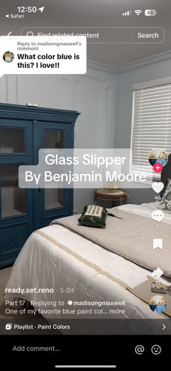
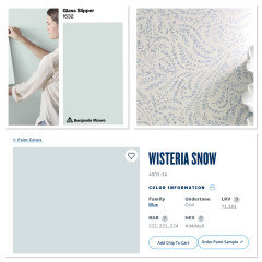
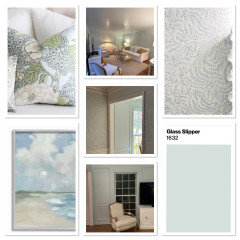
Just painted my living room Glass Slipper by BM & sample read and was hoping for an icy blue and got a mint green. any paint color advice for a north facing living room?

Comments (60)

  • PRO
    last year

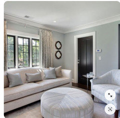
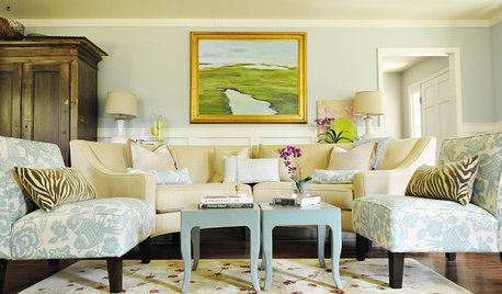
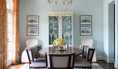
    Sorry, I'm a bit confused. Are you looking to paint over the Glass Slipper color with a different blue? If so, you might want to check out BM's Marilyn's Dress, which leans a bit gray: Here's a family room we did with that color on the walls:


    8th Avenue · More Info


  • last year

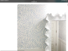
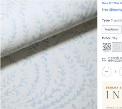
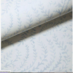
    Thanks for the recs! yes wanting to paint over the glass slipper. we have the Serena & Lily Parino Wallpaper in Sky right next to our living room. should i try & color match the blue and bring it down a shade to make it lighter?

  • last year
    last modified: last year

    My living room has a large bay window facing north, and one fairly large window on the west.

    The walls are BM HC-171 Wickham Gray -

    " Embrace the soothing elegance of Benjamin Moore's HC-171, better known as Wickham Gray. This ethereal hue effortlessly blends grey and blue undertones, creating a serene and tranquil ambiance in any space. Wickham Gray is a versatile color that complements both contemporary and traditional interiors beautifully. It is a perfect choice for a subtle hint of color that adds depth and sophistication."

    I have to be careful when picking upholstery fabrics, etc., because the lighting will often pull "green", even when it doesn't in other rooms.

  • PRO
    last year
    last modified: last year

    Yes have the wallpaper matched and mix at 50%


  • last year

    Are there trees or shrubs with green leaves or needles outside your north-facing windows? That can influence the color inside.

  • PRO
    last year

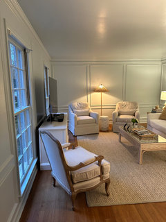
    Post an image of the actual room.

    The next color will do the same thing unless you determine what is causing the color to change.

  • last year


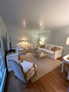
    This is what it looks like in morning light

  • last year

    All the pics i saw of glass slipper were like this which is why I was so confused by the mint /seafoam color pulling


  • last year

    Maybe you should pick a blue with less green?


  • last year

    Behr Day Spa

    a beautiful fresh blue (white with blue undertone) that shows more blue in low light.

  • last year

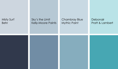
    here are some of the BM and SW blue green and blue colors - as the Hue (h) gets bigger the more blue and less green the colors become.

    Chroma (c) shows how colorful the color is (lower the number the more neutral/gray)

    and Light shows how light or dark the paint is (Higher is lighter, lower is darker)


  • last year

    You cannot trust images on the internet. Every phone color corrects photos automatically, then they are uploaded to a computer or online site that translates the color space to the one it uses and then every device that you view the photo on updates the color information and displays the colors differently.


  • last year

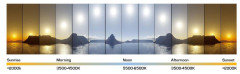
    Morning and evening light is more yellow than noon light and that will impact how green the color appears. I would still go with a bluer blue if I wanted a true blue and not a blue/green.


  • last year

    Super helpful - what bluer blues would you go with/would work best for a North Facing room?

  • PRO
    last year

    Evidently, in your room with your light, Glass Slipper is too close to the green end of the color wheel. Therefore, you need a blue that is more toward the purple end of the color wheel.

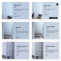
    Try Celestia Blue (BM 1429), Spring Flowers (BM 1430), Lake Placid (BM827), Airway (BM 828), Misty Blue (BM 820), or Blue Ice (BM 821).


  • last year

    So helpful! Thank you!

  • PRO
  • PRO
    last year

    Make sure you get several large samples before you pay for gallons of paint and labor to paint the room. View them at different times of day and evening, in natural and artificial light.

    Good luck and let us know how it turns out!

  • PRO
    last year

    Serena & lily designers can help I am sure they have many paint color suggestions to match the wallpaper…the designers at our store are wonderful and very helful.

  • PRO
    last year

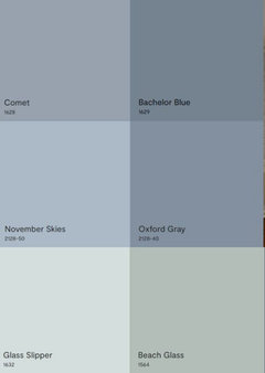
    BM colors mentioned in thread..thought these descriptions of each color would help.


  • last year

    Thank you! This is all so helpful!

  • PRO
    last year

    Descriptions are nice but they aren’t always accurate.

  • PRO
    last year

    I find it so helpful…my clients want as much info as possible…and those sneeky undertones are our nemesis!

  • last year
    last modified: last year

    I see warm green in Glass Slipper in the paint swatches...it looks almost aqua, not blue. But yes, most paints lean green indoors with outdoor foliage, low-e glass etc. Look at your ceiling...blue/green in the photo.

    I fear even a "true blue" will read green so stick to the violet end of blue as suggested. On my screen Spring Flowers looks to have coolest undertones. At 60 LRV it will have depth and not wash out.

  • last year

    Is this your paper?


  • PRO
    last year

    And therein lies the rub. “On my screen Spring Flowers looks to have the coolest undertone”. It’s all subjective. All color is a function of light, and that is why sampling in your room with your light and your eyes is the only way to avoid disappointment.

  • last year

    @tracefloyd it is!

  • last year
    last modified: last year

    Speaking of undertone, I don't see any aqua in the wallpaper but the ivory background mixed with the pale blue gives a greenish overall cast. Maybe it's fine in real life?

    Artificial light at night has yellow in it which will bring out the green in a blue and the ivory in a white so consider a cooler white temp for your light bulbs. They should all be the same.

    This wall looks aqua compared to the blue font next to it. You don't want any contrast between your paint and your paper. It's gotta be seamless.


  • last year

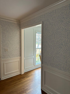
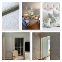
    Yes we used this wallpaper in our foyer next the living room. When I tested Glass Slipper before we painted it - it looked like a pale powder blue (also per undertone descriptions I had researched) and looked like it would pair well next to the wallpaper but not be too matchy match but definitely came back more green

  • last year
    last modified: last year

    Use the small paper swatches from the paint store and take a sample of your paper and look at them in natural daylight on a clear day to find the ones that are closest in color.

    Once you have a few that are close order full size samples from Sampleze. Do the same exercize - looking at it under natural daylight.

    Then test inside your home.

    Spring Flowers is pretty purple - just used it for a 3 year old's bedroom. I believe it will be too purple and will be too colorful, but the best way to tell is to see the colors with your paper.

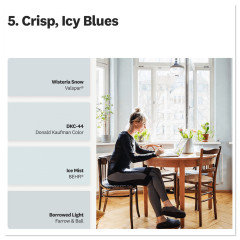
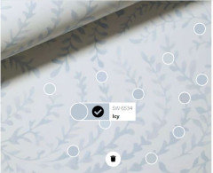
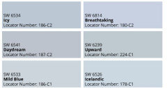
    I tried the SW app, which sometimes seems to work well and sometimes is off, but this is what it showed as the closest colors.


  • PRO
    last year

    If the wallpaper is in a different room, it's not important to match it. What is important is that the color on the living room walls works with the furnishings in that room. It's important that the color is what you want to see. What else is in your living room? Rug? Upholstery? Curtains? That's what you want to have the paint color on the wall work with, not what is in another/adjacent room.

  • last year


  • last year

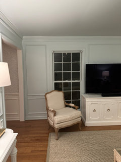
    The room is furnished with very neutral colors minus the pillows are more of a true blue. The lighting game is weird in this room. but you can see what it looks like in the day next to the foyer wallpaper and how the color changes at night

  • PRO
    last year
    last modified: last year

    Mckenzie..I think it is just fine..I would try mixing those two shades of blue together..maybe just one pillow..or wall art….I love mixing different shades of color together….


  • last year
    last modified: last year

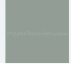
    You need a blue with a slight gray undertone for north facing light. B.M. Beach Glass is one of many. The paper and the paint color are simpatico. Add art on the wallpaper to bring the darker tone into the dining room.


    Consider going even darker. North light is constant through out the day. Often you will have some lights on...


    B.M. Sea Glass.

  • last year
    last modified: last year

    I like the blue/gray in your pillows and it will look nice on the walls. Does it go with the wallpaper? I hope so. Bring a pillow to the paint store and they can match the fabric color.

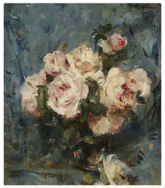
    The colors in the roses painting are very nice. Your furnishings have a pinkish beige undertone and the gold pillows look off to me. I would stick with your blues or a blush beige or the green suggested.


  • PRO
    last year

    What a gorgeous room! You’re overthinking it. I love the architecture, the furniture, the rug, the wood floors and the wall color. The windows would look great with silk curtain panels. Add a few colorful pillows, some artwork and you’re ready to entertain.

  • last year

    Look for blue grays in these color families - true blue grays - not violet or green blues.


  • last year

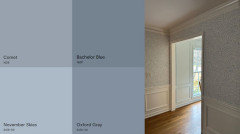
    You can see how much greener glass slippers is in comparison


    Remember, small samples may look too gray, but when you paint a whole wall with color it intensifies the color.

  • last year

    I do love when each room in a home coordinates with the room next to it. I think picking a blue gray that matches the blue in the wallpaper is the right answer. You just have to find that perfect blue gray.

  • last year

    @Diana Bier Interiors, LLC thank you! so kind! so would you keep the paint as is if you were me or if this was one of your clients?

  • PRO
    last year

    It looks very pretty on my screen, but as you know, that's not a true rendering of the color.

    If you were my client, I'd be there in person to make the determination. It all comes down to what YOU like and how you perceive the color. If you feel that it's too green, then try one of the colors I suggested in my post previously.

    I would definitely add more pattern, like a floral or a toile, but that's my taste.

  • PRO
    last year

    I do think the rooms look beautiful together…it works! add some art or pillows that pulls the two colors together…easy breezy…


  • PRO
    last year

    That floral would make beautiful curtain panels!

  • PRO
    last year

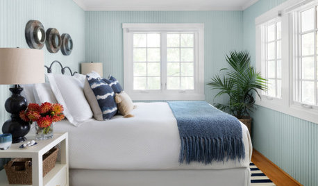
    What a beautiful bedroom, HIWE! Lucky guests!

  • PRO
    last year

    Diana Thank you! was designed for my mother when she stays over…she is 92!

  • last year

    I see a floor lamp on, in one of your pictures above. The lighting from that floor lamp is on the yellow side. Try changing your light bulbs, to daylight 3500 or 4000 led bulbs. It may make a difference in the Glass slipper, and it could look a little more blueish.

  • last year
    last modified: last year

    @Home Interiors with Ease - I want to come stay in your guest bedroom! It looks so beautiful and relaxing!

  • PRO
    last year

    dani-m08…Thank you!

Sponsored
Wannemacher Interiors
Average rating: 5 out of 5 stars26 Reviews
Customized Award-Winning Interior Design Solutions in Franklin Cnty OH