Software
Houzz Logo Print
sana_faruqi

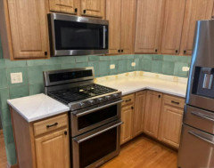
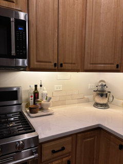
backsplash suggestions

last year
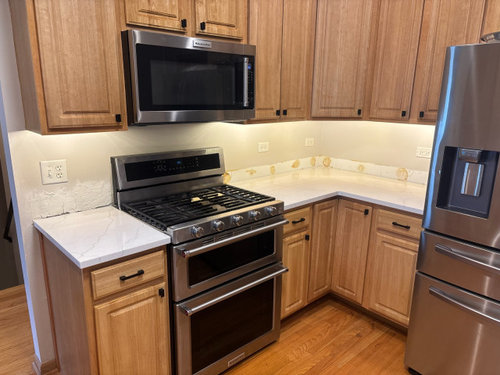
Subway tile vertical or horizontal?
Texture tiles or flat? Shiny might be too much..
Grout color?
Subway tile size?

Rest of house is mix between traditional and transitional, I feel subway is safe but a bit boring..

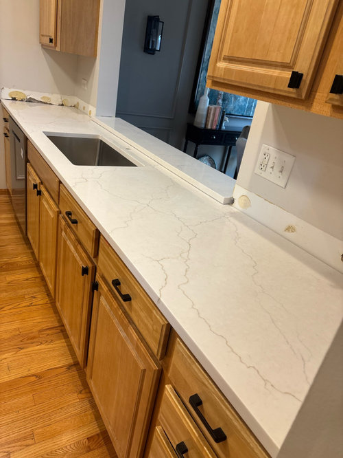
I would love to experiment with a bold porcelain pattern tile but with a small kitchen like this + pattern on countertop, I’m nervous it will look too busy..

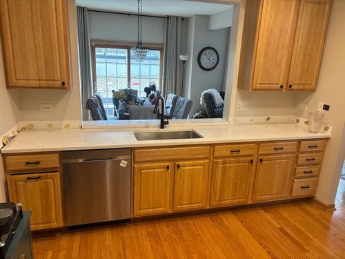
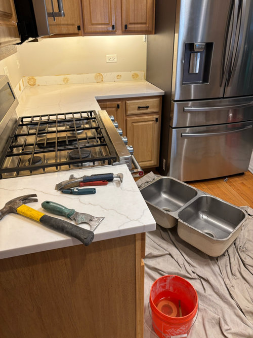
Counter next to stove has a silver kitchenaid mixer, toaster oven, assortment of oils, wood knife block and fruit bowl far left of the sink

Tiles need to go with current cabinets and black pulls for now and then maybe in future if we refinish cabinets to ivory and brass or silver pulls. Hardwood floors will stay.
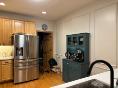
Opposite wall has a sage green coffee hutch and wainscoting.

Comments (20)

  • last year

    Get more of your counter top material and install it in one large slab on each wall.

  • last year

    That was the initial plan.. till they quoted us the price.. so now looking at backsplash options

  • last year
    last modified: last year

    Pretty kitchen! If subway feels too boring, you could consider a different shape. Square and picket ideas below, but there are many others. With your counters, I'd stay away from any tile that is veined, like a marble tile.

    Picket


    Square:


  • last year

    Kind of you to put this mock up :) The picket pattern looks nice! I am going to Home Depot to see what options they have and share here

  • last year

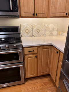
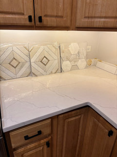
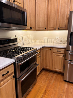
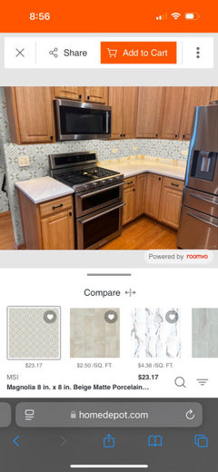
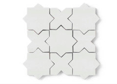
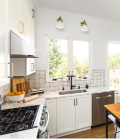
    Landed on these, divided between going subway vertically or the 2 pattern ones? Brought some green tiles home as well but didn’t feel it, looks too overwhelming. Will go to other stores tomorrow as well

  • last year

    I actually have a similar countertop. This is the tile I used.

  • last year

    You mentioned having a small kitchen. You also have wood grain pattern in the cabinets and floor. For that reason I would keep the backsplash simple and not add more pattern. For me subway would be calm, not boring at all in your kitchen.

  • last year

    I also like the ones next to the fridge.

  • last year

    All of these comments are so helpful! TYSM! I like how Gloria stacked up the tile. So now I have to decide between subway like this or the ones next to fridge

  • last year

    I'm not a pattern person at all and yet I really like the ones that are next to your fridge too. I'd photocopy them many times and mock up an entire wall with the photocopied images just to see if it is too busy feeling or just right.


    Your kitchen is truly beautiful. Can you show us a sample of your green paint and the hutch? I'd like to imagine the tiles with those elements too.

  • last year

    Home Depot invested in AI I guess lol

  • last year

    Other side of the kitchen

  • last year

    I wouldn't use either of the two mosaic tiles that have real marble in them with a faux marble quartz countertop - it will make your countertop look more "fake." I like the white stacked subway tile - or the patterned ones by the fridge.

  • last year

    Gloria’s photo looks nice to me.

  • last year
    last modified: last year

    What is the installed price difference between using the counter material vs tile as the backsplash?

    You may be living with your kitchen for many years. If there is a way to stretch your budget to use the counter material it would be stunning.

  • last year

    Stop the presses. The added pic of your hutch wall changes everything.


    The green hutch, while sweet on its own, looks like doll house furniture next to your lovely large cabinets. Do you truly not have enough counter space for your coffee appliances and storage in your new cabinets? Why do you have this furniture in here?


    Additionally, the detailed wall trim is important info. It lends a very traditional look to this room. I would not put grid stacked subway tiles in a room with this trim. Did you add this trim to the room and if so, what was your vision for it? If you didn’t add it, how come you didn’t remove it during this renovation? It does not related to your new cabinets at all.

  • last year

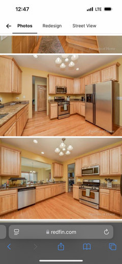
    TY for your comments Kendrah! Sharing original listing pictures, we added the black cabinet pulls fixtures lights when we were going to go a more modern direction with decor and white wash all the wood siding/doors/windows.. but eventually I convinced my husband we like traditional decor and to keep all the oak as is and now some things don’t go together with rest of house. The hutch was another temporary decision, empty wall, needed a coffee station off the counters (very little prep area), cabinets look big but higher up cabinets are not very accessible for daily use items and we don’t have a pantry. Open to ideas on how to utilize that wall :) thought about selling hutch and building a built in to match the height of the opposite cabinets but it will still have to be in middle of that wall without extending too far on both ends as one side is our garbage pull out cabinet and other side is laundry/garage door.
    The trim was a choice, the kitchen looks into dining and it mirrors the trim on that wall. And yes the black sconces don’t match the dining chandelier, still in market for what I like there

  • last year
    last modified: last year

    Oh wow, you've done a great job transforming your kitchen from the listing pics. Not sure why I assumed you were at the end of a major renovation.

    Now that you added very traditional molding, you need to embrace a super eclectic look for your coffee area and backsplash to make it work with your cabinets and hardware. This is hard to do, but once you get it right, you are going to end up with a really beautiful space that has character and isn't cookie cutter.

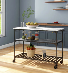
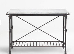
    Not only is the hutch the wrong scale, but it covers the molding. It has to go. I envy the amount of counter space you have but if it truly is not enough for you, then I would add a narrow, moveable island against that wall. Get one that is open beneath so it isn't so dense looking in the space, made of black iron to echo your hardware, but be careful because a marble top is likely going to make your counters look fake.

    Don't know if this is quite right but something like this.


    This is too traditional but you get the idea.


    For your tile, it would be nice to see a slight pattern with a bit of black in it. Nothing too bold. These delicate lines echo your molding. You could do a dark grey or light black grout.


    A pic of it with black-ish grout.


  • last year

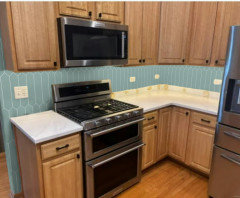
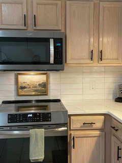
    Landed on this tile and orientation, it has a zellige look but not very opalescent and the texture is just enough to be interesting and I’m happy with the color variations. Tried whiter tiles and they looked too stark.