Software
Houzz Logo Print
webuser_958317674

Painting Scheme on Tudor Revival Problems

last year
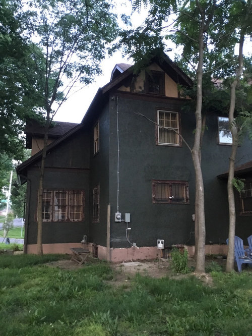
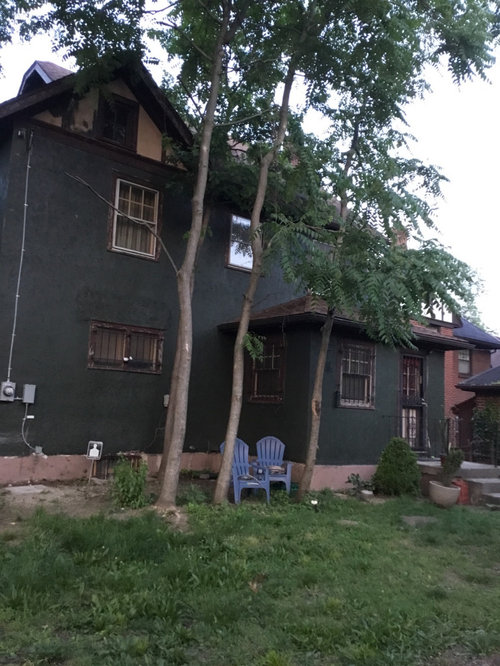
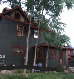
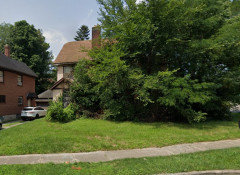
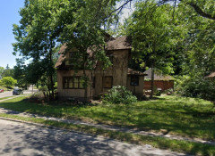
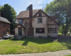
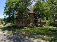
A former salmon and brown English Cottage/ Tudor Revival has now been painted green.
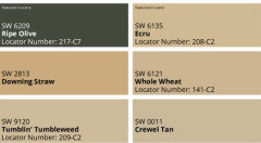
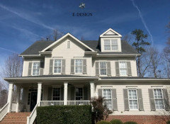
I’ve seen all the paint schemes for SW Ripe Olive, and am keeping the previously painted gold hued windows to match upcoming hardware.
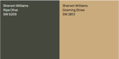
But I was going to use the light color for on the Timbers, and I realize now that’s horrible, it was going to be Alabaster, Shoji, Dover White or Greek Villa. ( Downing straw looks close to the gold yellow)
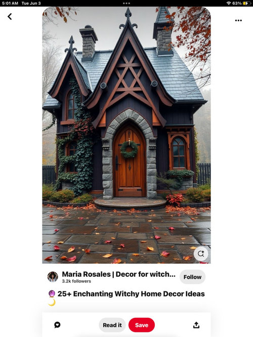
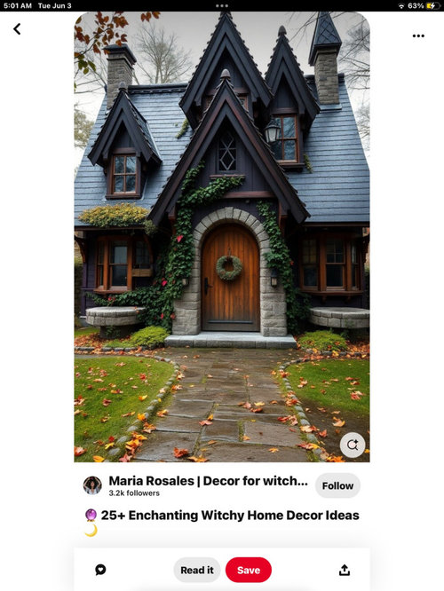
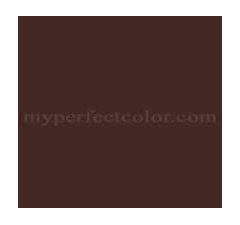
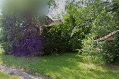
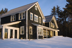
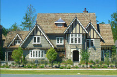
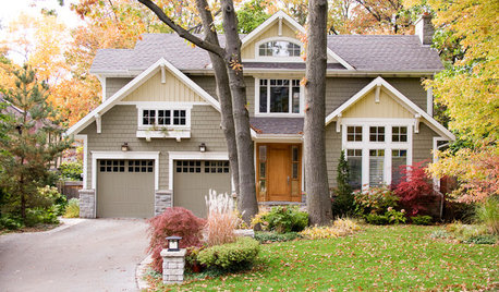
But should I have the Timbers painted in a brown like the third picture? Or darker like the fourth?
Also what color specifically do you think please? I use sherwin Williams, and have been trying to paint this house for over a year.
Foundation:
TIMBERS:
Window trim: …I was thinking that downing straw and maybe pearle noir or darkroom?
The top should be painted the same as the bottom?
It has a med warm brown roof, with a red brick fireplace on the other side.

Please help me, It’s with a long line of other tudors all cream, beige, grey and white and had to do something different but I think I wrecked it.

Comments (28)

  • PRO
    last year

    Can't WADE through the text. Go in front of the house and take a picture?

    No clue the point of the cartoonish, "Witchcraft" thing....

    Why on earth would you highlight the foundation?

  • last year

    I love this combo.


  • last year

    If you have some "before" photos, please post them to show what the trim and timber detailing look like.

  • last year

    If you want an artist-chosen palette, use William Morris prints for inspiration. This one with dark green, light green, tan and coral is deservedly popular. Using a professionally chosen palette can get you great results without having to come up with a color scheme from scratch.


    https://www.williams-sonoma.com/products/william-morris-golden-lilly-napkins/?sku=1411204


  • PRO
    last year
    last modified: last year

    Sorry but that looks a mess . I too would like to see the before .

  • last year

    I would like to see a picture of the before also. The green now, doesnt look great to me.

  • last year

    If I wanted a gold tone I would not pick anything as saturated as Downing Straw. It will be too bright gold. I would probably move toward the Crewel Tan - nothing more colorful than Ecru, but you will need to test samples to know for sure.


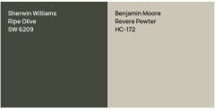
    If your not stuck on SW colors I might try Benjamin Moore Revere Pewter with Ripe Olive.


  • last year

    How is this green?

  • PRO
    last year

    I realize this is supposed to be a witchy lean in.. but between the super dark green looking almost black, the bars on the windows, and the whole being unrelieved by any contrast it looks more like a haunt moving in. It is all just too much.

    In the witchy inspo pics there is a lot of contrast on the dark. Lighter colored wood and accents, lighter stone accents, green foliage- even the colors chosen to color in the roofs and most window reflections are on the light side of grey. You don't have any of those details on the majority of your house to relieve all that sheer dark wall. Are you going to be adding more details in? Or planning on just the window trim providing the contrast?

  • last year

    I think it needs something brighter on the windows. There is so little half timbering detail on this facade of the house that its hard to tell what it needs...

    Why are you showing the utilitarian side of the house? What does the street facade look like? The reason I ask is I think this all could be a bit misleading because this side doesn't have much detail. I used to commute on the train through the early commuter suburbs and passed by rows of houses that had their butt end facing the tracks like this, that were actually really nice looking from the front. Why aren't we seeing that?

  • last year
    last modified: last year

    I don't see any timbers but the similar to the brown in the third picture and for the trim.

    Was the utility line installed after painting...it should be painted over the same color.

    The peaks seem to be a nice color. The foundation would like nice in that dark Charcoal gray and would show off the green.

    I don't have software but here is my sketch. Exact paint colors TBD.


    Get rid of those awful Tree of Heaven before they take over everything. I call them Tree of Hell. If the leaves stink bad, it is a Tree of Heaven. Apply stump killer and cut off any sprouts and spray them too.

  • last year
    last modified: last year

    I would sample SW Acacia Haze for the trim(s)

    I'd add a thin line between the white windows and the trim SW Polished Mahagony.


  • last year

    The front has no character, it’s so boring, I was looking into different timber patterns to create with hardboard. I don’t want to highlight the foundation, but I thought it might be too dark, I like the appeal of the other two images, and thought I would have to go through the same scheme because the body is so dark.

  • last year
    last modified: last year

    If the front has no character and it's so boring, why don't you show it for some ideas? If you like the other two images, then paint over the green with Charcoal gray.

  • last year

    I thought you were looking for accent paint options, not cladding ideas.

    Here are ideas to help create a tudor style accent to your plain exterior.


    https://tudorboard.com/gallery/

  • last year

    Apple pie,I just g

  • last year

    It was vacant 25. Years, and lots of oth rs are there in creamy white and brown

  • last year

    I bet the neighbors are extremely happy that you've purchased the house!

  • last year

    I am guessing you don't want to re-paint. You picked a very dark green, almost black.

    You want to add cladding and repair/paint trim and for now are looking for a color to use.


    You can gleam some inspiration from art, but the inspiration pictures are not real homes and have all types of detail that your home doesn't have.


    The green was too dark for my taste, even if you wanted a dark home. I would have gone up at least one shade, but what is done is done.


    Finding a color that will highlight the cladding and bring interest needs to be something light enough to stand out against the walls, but not so light that it screams.


    You are correct that the colors you selected were too white and probably screamed ice white next to the dark green.


    Here is a nice home that I believe may have been painted Ripe Olive or something close to Ripe Olive. The white they used balances the dark vs screams at the dark.


    https://www.houzz.com/photos/saxon-hill-vernacular-traditional-exterior-burlington-phvw-vp~39133


    Saxon Hill Vernacular · More Info


    This is another home shown painted with Revere Pewter


    I wouldn't want to go any brighter than Revere Pewter and possible a shade lower.


    But I do really like the two colors together


    Compare that to the color you were thinking.


  • last year

    Wow, thanks for additional "before" photos. Those overgrown trees were really something- One of the biggest changes I have seen on Houzz recently.


    Do you actually want to paint over the new dark green walls? Or are you happy with those and just need the additional trim colors?

  • last year

    It may have been badly neglected and the color may be on other houses in the neighborhood, but, that color that is there on your original picture, when there are still those terrible vines on the house, shows a very attractive house. The color it is on the front is very nice. I would redo the awful dark green back to the light, and repaint the front, the same as it is.

  • last year

    I'd do the timbers in a lighter green. Retreat, Acacia Haze or Oyster Bay. Your current pictures look gloomy, but the day isn't sunny and you have too many trees too close to the house. The pink foundation isn't helping, nor are the dark bars on your windows, which overwhelms any window trim. You might consider painting them a cream. You have no landscaping.


    All of this is to say that when you are done painting and you have a few shrubs and a sunny day, the house will look great.


    Are the bars on the windows needed for day-to-day security or were they installed to prevent vandalism when the house sat empty? If the latter, I'd remove them.

  • last year

    I like tracefloyd's idea of continuing the timbering on the rest of the house, but not "X"shapes. Continue the horizontal line from the right and then continue the vertical lines from the top down to it.

    Seriously, that dark greenish black does the house no favours IMO. tracefloyd's sage green is nicer though there are lots of better colours.

  • last year

    Whichever color you choose, paint the concrete foundation to match the walls.

  • last year
    last modified: last year


    This is a nice color scheme using green. Similar to the one Roarah posted.

    I don't like that dark green on that house. Makes the lady look dowdy.

  • last year

    Thank you each of you for helping and now i’m going to repaint but I don’t want a cream beige tan white and gray and I think yeah more timbers but maybe it’s more of an English cottage house? Besides those colors Have you seen anything that looks good on my tutor, revival or English cottage with that light brown roof?

  • last year

    Colleenoz just straight up and down, I’m able put curves decorative mill trim work, It’s a corner house that Needs a statement to stand out from all the other neighbors similar houses

Sponsored
Mary Shipley Interiors
Average rating: 4.8 out of 5 stars34 Reviews
Columbus OH Premier Interior Designer 10x Best of Houzz