Software
Houzz Logo Print
ldiscep

Paint Help for Low, Sloped Ceilings

10 months ago
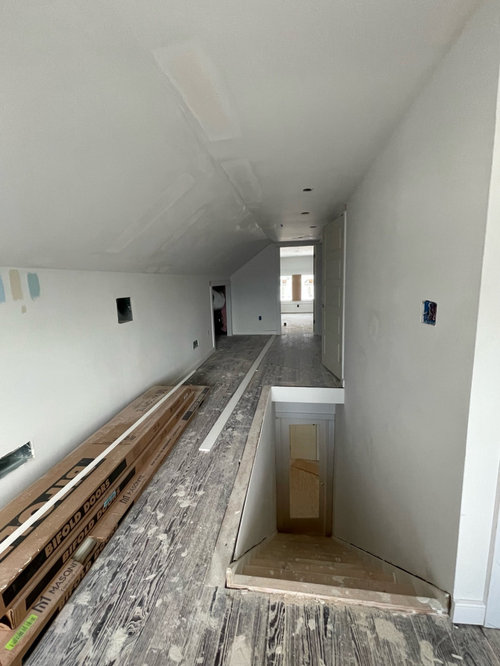
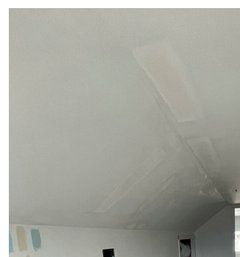
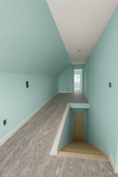
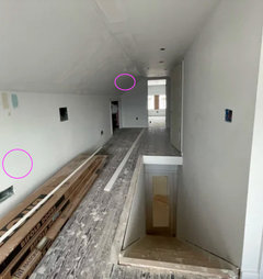
I have decided on SE Tidewater for my attic conversion and SW Pure White trim. Thinking I will leave just the flat, horizontal ceiling white and paint the rest of the walls, including slanted walls and stair area, in Tidewater. The ceiling is only 7 feet high so I don’t want to close this already small space in any more than necessary. Thoughts or suggestions are appreciated!

Comments (28)

  • PRO
    10 months ago

    You treat this slope as WALL color


  • 10 months ago

    To expand the room I would treat the slant as ceiling.

  • 10 months ago

    I think your plan is perfect and it will look very cohesive. Good luck!

  • 10 months ago

    I would also paint the ceiling and the walls all the same color.

  • 10 months ago

    If a lighter color, I would paint the ceiling as well and the space would feel larger. But SW Tidewater isn’t a very light color
    and this is an area with a low ceiling and seems to have little natural light. The color is likely to intensify. I might pick something even lighter in that hue, or cut the intensity by adding more white. If DIY painting ?, paint the walls, then the slant, then decide about the ceiling!

  • 10 months ago

    I agree with chloe00s that Tidewater is going to be too intense for this space. Have you looked at a large sample of it? Sea Salt is a popular blue-green from SW that is grayed down as compared to Tidewater. A lot of this is personal preference of course, so I think you need to start sampling before buying gallons of paint.

  • PRO
    10 months ago

    The 2 looks... I would paint the sloped ceiling the same colour as the walls, make the space seem higher.


  • 10 months ago

    Thank you lisedv. It is soo obvious #2 is the only way to go once you see it.

  • 10 months ago

    You may not agree, but the space needs to be all white or you will get the tunnel look. All white will keep it bright, airy and have a spacious feel.

  • 10 months ago

    White is only beautiful when there is adequate light. In spaces with limited light you are better off using something with more chroma so that it doesn't fall flat. It doesn't need to be bright, but shouldn't be too desaturated where it doesn't have anything to combat the gray shadows.


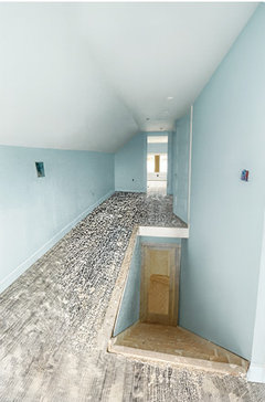
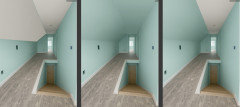
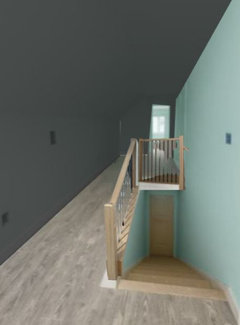
    I am not sure that the AI pictures below are fair, one is bright and has great contrast between the ceiling and the walls while the other has much less contrast.


    I just adjusted the first photo using excel to show the three choices


    I generally determine if a slanted wall should be painted the wall color or the ceiling color based on the height where the angle starts. If it starts above the top of the doorways I will treat it as ceiling, but when it is lower I treat it as a wall.


    In this case I would paint everything the wall color to avoid the landing strip or bowling alley effect.


  • 10 months ago

    Aint the entire space the same color - walls, slat, ceiling. It actually opens up a space and makes it feel larger because you can’t see any lines delineating the size and space.


    I’d kick the color down a notch too but I guess that is just personal preference wanting something to feel airy.

  • PRO
    10 months ago

    Thoughts or suggestions are appreciated!


    In a small attic space, color can intensify through interreflection. That’s the bounce-back effect where light keeps reflecting the wall color onto itself, and the result can be a lot more colorfulness and intensity than anticipated. And that space definitely needs to be one color walls/ceiling.


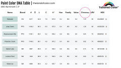
    Here are a few option that are less intense than Tidewater - the Chroma number is lower. Sherwin doesn't have less intense options in the same hue family range as Tidewater.


    As for the rule of thumb that it's best to always get 'your color' mixed in its home brand that's generally very true.


    However, if the brand of paint you want to buy has a color(s) that align in terms of data values (like LCh) to the color your want, that's a really good indication that your paint brand can mix a match. In other words, Sherwin should be able to hit any of these.


  • PRO
    10 months ago

    Since we have no idea of what you're planing for the railing nor the space as such it's difficult to suggest any specific colour.

  • 10 months ago

    Use one color for all the walls (including the ceiling). I agree the color you think you’d like in there will feel very intense. Go softer, paler.

  • 10 months ago

    You can also do a color combination. Do the lighter shade that you love and a darker color in that same range to compliment it.


  • 10 months ago

    Adding some texture to the wall might be the answer.

  • 10 months ago

    I would paint only the vertical wall(s) and leave the ceiling and sloped walls white.

  • 10 months ago

    I like the faceted look of the space. Light falling differently on the different angles and orientations will make the same color look different on each facet, but I might actually emphasize the difference with different shades of the color, maybe darkest on the tallest wall and graduating lighter to the shortest wall. Agree with @Kendrah about reducing the intensity of the color, but that's me as well.

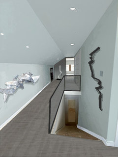
    (Made the space into a sculpture gallery, just for fun.)

  • PRO
    10 months ago

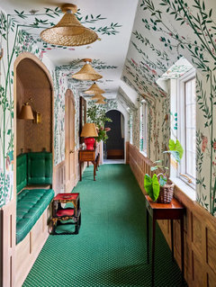
    Made me think of this recent Redd Kaihoi space.

  • PRO
    10 months ago

    As anyone can see, painting all the same light color looks best. The option with the dark color on the left and blue on the right is very claustrophobic.

  • 10 months ago

    All of your responses have been so helpful! I am on my way to the paint store to pick out a lighter shade. I intend to paint the walls and ceilings all the same shade. Thank yoiu so much!

  • 10 months ago

    Just a follow up, I found a lighter color that I think will work better in this space. SW 6749 Embellished Blue. LRV is 79, so I’m hoping it will lighten things up!

  • PRO
    10 months ago

    Lighting is how you lighten up a space not paint and honestly I have never got bogged down with all the LVR stc a color either works or it doesnt no other way to choose . I would do all the same color to make the space feel a bit bigger

  • 10 months ago

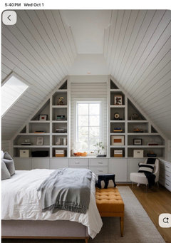
    I'm on the search for a photo I saw awhile back, no luck so far. However, the ceiling itself was covered in bead board, painted a gloss finish. There was nice ceiling light, and when on, the light reflected up onto the bead board was really cool. The slant was considered wall and the walls were light, railing black iron. If I find it, I will post.

  • 10 months ago

    Given Jennifer's side by side I can see the upside of painting the hall all the same, assuming the color is less vs more saturated.

  • 10 months ago

    Instead of testing colors directly on the wall, paint them on poster board, or purchase the already painted SW swatches. Test at least a 14"x14" square.


    You need to see how this color looks in the varying areas of light, as it will change dramatically.


    See how different your white walls are in different areas? Your minty green walls will look that different too - different times of day, different parts of the room. With different artificial lighting.


    These are each pictures of your walls:


    Are you looking for a minty blue? We all have personal associations with color. To me embellished blue feels a bit dentist office green, but again, personal bias. Do you want a greenish-ness to your blue?

  • 10 months ago

    I have actually decided on BM Crystal blue (2051-70). I think it will work better in this space and flows better with the rest of the house.