Software
Houzz Logo Print
vacaytime

I am rethinking my color palette, Help!

8 months ago
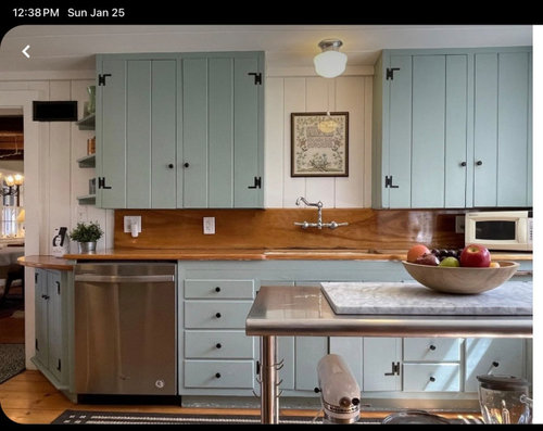
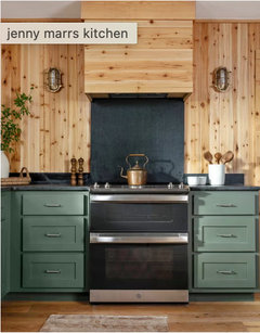
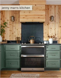
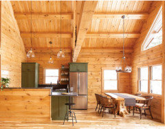
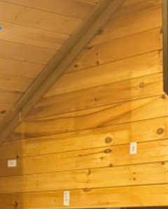
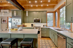
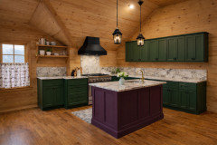
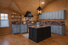
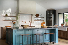
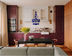
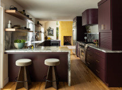
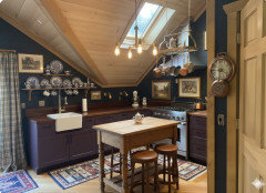
I am in the midst of my cabin guesthouse renovation. I have dreamt of and wanted plum cabinets in my kitchen for almost 10 years. Some of the experienced folks on this site have made me step back and think. Then my daughter took a look and agreed that maybe I need to rethink as well. She actually has an art degree, so I do trust her when it comes to color theory and such. My big issue is that the cabin has knotty pine walls that are staying. I’ve been made aware that maybe the plum isn’t a good option with the orangey/yellow pine(that I cannot paint, too much to explain). So she and I went thru some palettes and she got me looking into some cooler options leaning towards blue and doing plum as an accent color. I actually like that idea. I found a few options and was hoping to get some insight on whether this may work or I’m just spiraling out of control.


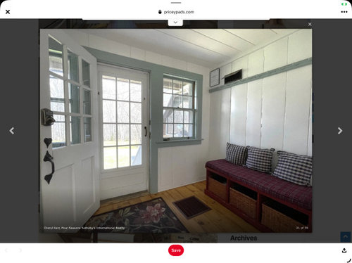
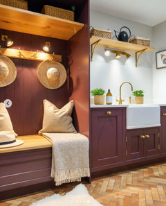
I like that they have the burgundy on the bench in this space.


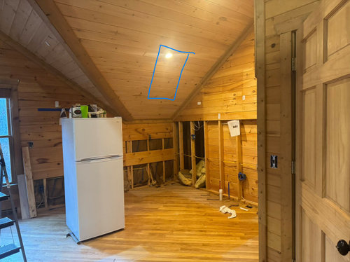
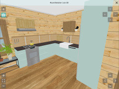
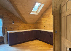
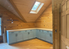
Here is the current state of my kitchen. The floors will be getting refinished, so that color can be changed. The square drawn in blue is the location of the skylight. Also, I don’t know if you can tell from the pics, but the ceiling is a different stain color, looks kind of limewashed.


Comments (39)

  • 8 months ago
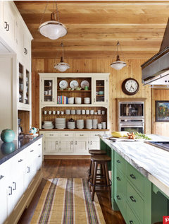
    Slate blue with punches of purple would look beautiful. But careful of your inspiration pics again, because you'll notice they have white walls and yours will not.


    You might also enjoy a more deep teal green-blue cabinet or green cabinet with purple accents.


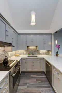
    I love how the black-ish grey counters help mediate and bridge the colors together. Perhaps you can do a black countertop with an area of the counters in viola calcutta instead of the whole counter in viola? Look at this example of the two counters across from each other. It works well.


    The thing to be careful of is not having it look like this - small blocks of color floating in a sea of knotty pine.


    Also, I'm not a pro. Just a home owner who loves an eclectic look!

    vacaytime thanked Kendrah
  • 8 months ago
    last modified: 8 months ago
    Thanks all! This is all part of a bigger project that includes the main cabin getting renovated this summer. That kitchen is absolutely going to be green, so I want something different for this carriage house. The inspiration pics have knotty pine floors and their countertop is a yellowish stone of some sort so I figured that color was still present. I will find a blue that leans toward green most likely.

    I’m going to skip the Viola marble. As much as I love it, it introduced a bunch of dilemmas. My son is building a house next year and his wife loves it as well so it may end up still in my life somehow lol.

    Another thing to think about is that I will have almost no uppers, so the cabinet color won’t really bump up against the knotty pine.


  • 8 months ago
    last modified: 8 months ago
    I like plum better than blue with the pine, the more saturated color does not get lost or overpowered and the right plum does look good with the yellow in your pine.

    It is difficult to find pics of plum with pine walls but if you look up plum with pine floors there are plenty of examples that look good.

  • 8 months ago
    I'd do green over blue personally. Green and wood always go together, and there are countless colors of green -- yellow-based, blue-based, light, dark, and everything in between; just stay away from anything minty.


    I don't like your light blue inspo pics, I think you can do better. Too wimpy against all the wood. If you want blue, go mid-tone or darker.


    vacaytime thanked porkchop_z5b_MI
  • 8 months ago
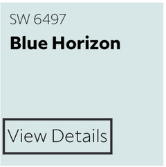
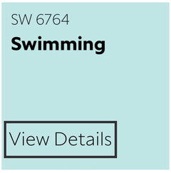
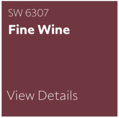
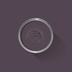
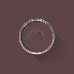
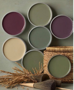
    I’m so glad you’re doing a deeper dive on color. Knotty pine does tend to yellow, but you will notice the yellow less if your paint colors have a touch of yellow in them, so teal as opposed to a grey blue. Knotty pine and turquoise was actually a thing in the 60s - I’m not recommending that for you, but here are some cottage-y colors that might go well in your space. Blue Horizon and Swimming both have a touch of green in them, and Fine Wine or Burgundy could serve as a plum accent.


    Once you’ve chosen the green for the kitchen, you’ll be in a better place to build a paint palette for the whole space.

    vacaytime thanked eam44
  • 8 months ago
    This is the best article I've ever read on choosing a color scheme for your whole house: https://www.fromhousetohome.com/whole-house-color-scheme/

    Your knotty pine is orange. You can choose to pair it with 1) neutrals; 2) purple and green for a triadic color scheme; 3) blues for a complimentary color scheme; 4) blue-violets and spruce for a split-complimentary color scheme; 5) orange-reds and reds for an analogous color scheme; or 6) lemons and limes for s a different analogous color scheme. All those sound like bright colors but they don't have to be. Lime can also be toned down to be olive green an lemon can be straw, as an example. I say choose your favorite colors like in the article. I have a bedroom set in the color of your wood and it looks fabulous with a wine-colored blanket and blue greens of all sorts. Just one example...

    vacaytime thanked kl23
  • 8 months ago
    If you can, take sample cabinet doors from the cabinet manufacturer to look at next to the pine in your house. In my experience, blue next to orange makes the orange pop, so I would lean green on the cabinet color. Lighting can make a big difference in how you perceive color, so looking at it in the actual environment will help you be able to make a decision. I hope you have good lighting, because black floors and counters can make a room look dark.


    Whidbey Westside High Bank · More Info


  • PRO
    8 months ago
    last modified: 8 months ago
    I think plum can be used its how you use it. you can mix it in with a dark smokey green cabinet color and it would make a dark moody vibe. Bringing in a light stone with plum veinig for the counter tops and keeping accetns black.


    or you can move to the lighter blue you've shared keep the accents black but change the counters to a dark burgundy/plum choice


  • 8 months ago

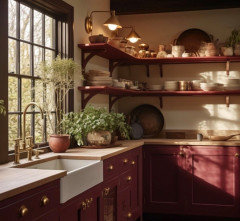
    I appreciate your daughter’s artistic input, but if a plum colored kitchen will make your heart sing, go for it. The right shade would look amazing in a pine cottage.

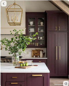
    How does this not make you smile? The wrong purple would be awful, but there are too many deep, interesting ones to discard the idea.

  • PRO
    8 months ago
    last modified: 8 months ago

    I have to say the plum was never my choice but this is your space so if you want plum do plum IMO better than blue with knotty pine 2 shades fro F&B thta would be awesome


    vacaytime thanked Patricia Colwell Consulting
  • 8 months ago
    last modified: 8 months ago

    What is that second Farrow and Ball color called? That is the color I’ve been imagining. i

    Is it Brinjal? I have that color in my sample cart.

  • 8 months ago
    last modified: 8 months ago

    personally the envelope of wood encasing this suite is enough. I'd feel much happier and comfortable long term to put in white..if not then a very LIGHT robins egg blue was a good idea. Odd things like purple cabinets in a small suite can backfire .


    go back to the blue..find the right one..then get a couple plum or reddish brown or deep accesories/ mats etc. thats enough.


    Lake House Minnesota · More Info


    NKBA Award Winning Kitchen - DESIGNED BY CJ LOWENTHAL · More Info


    Danville Hilltop Hideaway · More Info


    vacaytime thanked herbflavor
  • vacaytime thanked elunia
  • 8 months ago

    Again, again, again the thing to remember is that all of the beautiful inspo photos of purple cabinets below are not in a yellow-orange leaning knotty pine kitchen. You have to keep everything in context.


    And, you are not going to have uppers, so you will see TONS and tons of yellow-orange. It doesn't matter that the cabinets will be against a backsplash - without uppers you will see wood and purple in big doses. Your splash will not mediate that. It would be very interesting to see @design interior south's rendering without upper cabinets. It will change the look entirely.


    Get bringal and other plum large samplize swatches and play, play, play. There is no substitute. And maybe you'll find it beautiful. We just haven't seen pics of together to know.

    vacaytime thanked Kendrah
  • 8 months ago

    Not at all a fan of adding eggplant or plum to your kitchen. I agree with your daughter.


    If your heart is set on it, then use it in small doses in accessories.

    vacaytime thanked Amanda Smith
  • 8 months ago

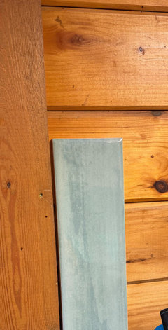
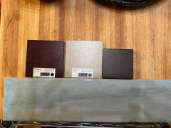
    I will probably be iced in tomorrow so doubt I’ll make it to the paint store. I ordered a bunch of samples from Farrow & Ball, SW and BM, so at least Im getting something done. I found this tile in my sample box and it is a light teal so got it out to just see how it looks up against the walls.


    This shows it with a few of the countertop options.


  • 8 months ago

    Don't throw out the plum cabinets idea. I have spent decades paying close attention to color and working with it professionally in various arenas. While green and blue-green are more failsafe, I love orange and plum/burgundy together - one of my favorite shirts of all time was striped in these two colors. If you don't mind a lot of WARM all over the home (which is why green and blue are safer for many people), the right tones go beautifully. I'd recommend getting real paint samples and double-coating a full sized poster board or foamcore board with your top contenders to see in the space. The bigger the sample, the easier to tell what's going to work on your cabinets.

    vacaytime thanked Julie S
  • 8 months ago
    last modified: 8 months ago


    F&B Brinjal looks great with warm wood:


    Robin's egg blue, not bad but a completely different feel.


  • 8 months ago
    last modified: 8 months ago

    Omg, thanks for that! You even added the skylight! Is that photoshop? If so, I need to give in and learn to use it.

    And sigh, because I love them both lol. But I am planning on one of the other bathrooms being blue so this does help with that as well.

  • 8 months ago

    Have you used paper stone before? I recall when I looked into it years ago it was a problematic product. Maybe they have improved. It would be nice to have more recycled options.

  • 8 months ago

    I actually used Richlite at my kennel at least 20 years ago. It was still in like new condition when we sold the kennel a few years ago.

  • PRO
    8 months ago

    Yes it is Brinjal

  • 8 months ago
    last modified: 8 months ago

    @vacaytime I used Google Gemini to change the image, sometimes it does a great job and sometimes it does not. Here is what it gave me when I asked to make the room rustic but traditional in the style of Ralph Lauren:


    The next time I just asked it to decorate the room in the style of Ralph Lauren and it spit out this nonsense:


    I prefer to use it to only change specific elements, usually one at a time, so that it stays more true to the space. Once AI is used to decorate or make major adjustments it tends to get farther from reality and, imo, less useful for getting a realistic idea of what can be achieved.

  • 8 months ago

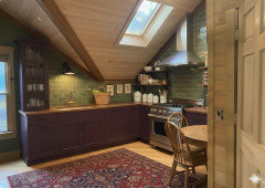
    Plum surrounded by the wood walls and floors is not aweful. But I’d want more than not aweful. Plum surrounded by green tile and dark rug is sensational. The green makes the plum sing!

  • 8 months ago

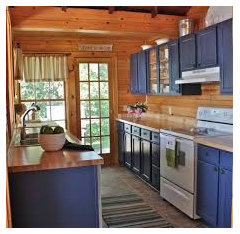
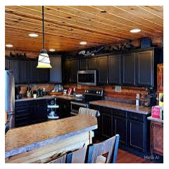
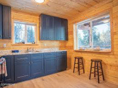
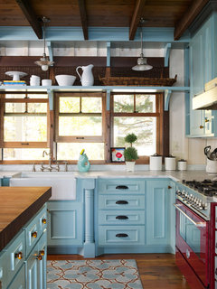
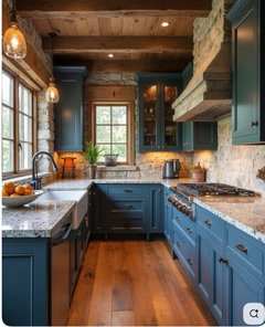
    I like the plum, but here are various blue kitchens. So many different blues out there, of course. All of these are rustic-looking houses.

  • 8 months ago

    One thing your manipulated images have in common, as Kendra pointed out, is that they make your pine look much less yellowed than it really is. I know you’re not painting those walls and ceilings, but have you considered refinishing them with a finish that minimizes the yellow? I imagine this would be an expensive process, but you might like the space a lot more if you do.

  • 8 months ago
    last modified: 8 months ago

    I think if you paint large sample boards (3 ft x 3 ft), stand them up where the cabinets will be, and view them both in the day and at night with the lighting you plan to have (if the lights are not installed, then put some bulbs on extension cords and hang them from the ceiling), the answer will come naturally. I could see either the blue-green or the plum, but the plum risks looking very dark (think black hole). Is there a lighter tone in the plummy hue family that you’d consider?

  • 8 months ago

    Hi all, just wanted to say thanks again. The weird storm that came through took my internet out and being in the mountains meant it was a few days to get up again. Anyway, I ordered paint swatches and am hoping they get here in the next few days.

  • 8 months ago

    Looking forward to seeing the samples.

  • 8 months ago

    Just lurking here…🙂

  • 8 months ago

    You could do a blue trim that's very light that would be nice with the burgundy and the black and white

  • 8 months ago

    I'm team plum - but don't settle on the final color until you know your countertop and backsplash. Any idea of what those will be? I may have missed it in the thread if it was stated.

  • 8 months ago
    last modified: 8 months ago

    Love the earthy warmth of plum or maroon with deep green accessories and they will work well with the pine‘s tone.


    Good to know you are removing most of the uppers, as that will make the space feel larger and lighter. Adding floating shelves would add to the ambiance and be appreciated by guests for the convenience.


  • 8 months ago

    Love the idea of plum!

  • 8 months ago

    Following

  • 8 months ago

    The plum kitchen cabinets with the green backsplash ❤️ it’s beautiful!

  • 8 months ago

    Don't go all plum cabinets unless u have a HUGE kitchen trust me!! You will regret it and have a very hard time re-painting them once done. Plum is beautiful in the way you "vision" it but pick uppers or lowers only in that dark of any tone! You will be so happy with it if you do!