

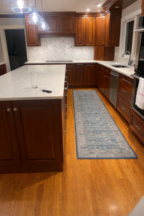
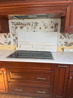
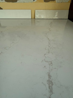
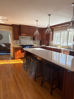
Warm white backsplash ideas
9 months ago
Featured Answer
Sort by:Oldest
Comments (14)
 9 months ago
- 9 months agolast modified: 9 months ago
Related Professionals
Vincennes Kitchen & Bathroom Designers · Bronx Kitchen & Bathroom Designers · Effingham Custom Countertops · Des Moines Custom Countertops · Coldwater Custom Countertops · Niles Custom Countertops · Logan Custom Countertops · Birmingham Interior Designers & Decorators · Tyler Interior Designers & Decorators · Farmington Interior Designers & Decorators · Fort Collins Interior Designers & Decorators · Joplin Architects & Building Designers · Huntington Architects & Building Designers · San Angelo Architects & Building Designers · Spokane Architects & Building Designers- 9 months ago
 9 months ago
- 9 months ago
- 9 months ago
 PRO9 months ago
 9 months agolast modified: 9 months ago
 9 months ago
- 9 months ago
- 9 months ago
- 9 months ago
- 9 months ago

Related Stories
MOST POPULARMust-Try Color Combo: White With Warm Off-White
Avoid going too traditional and too clean by introducing an off-white palette that brings a touch of warmth and elegance
Full Story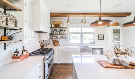
KITCHEN DESIGNWhite Farmhouse Kitchen Warmed by Wood and Metal
Homeowners with a clear idea of what they want get a beautiful new space that feels like it’s been in place a while
Full Story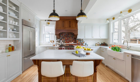
KITCHEN MAKEOVERSKitchen of the Week: White, Wood and a Dazzling Backsplash Design
An expanded footprint allows for an island and abundant storage, while warm walnut and personality elevate the look
Full Story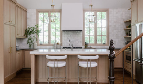
KITCHEN MAKEOVERSKitchen of the Week: Warm and Bright in Wood and White
A designer expands a couple’s kitchen and creates inviting style with wood cabinets and a creamy zellige-look backsplash
Full Story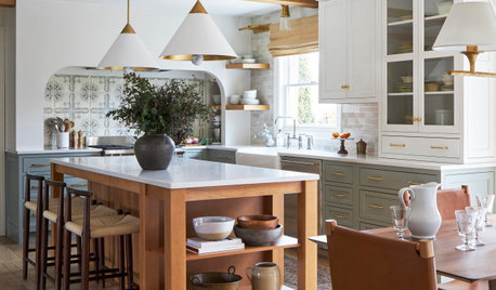
KITCHEN MAKEOVERSBefore and After: 4 Warm Green, White and Wood Kitchens
See how beautifully this color trio plays out in kitchens of different styles
Full Story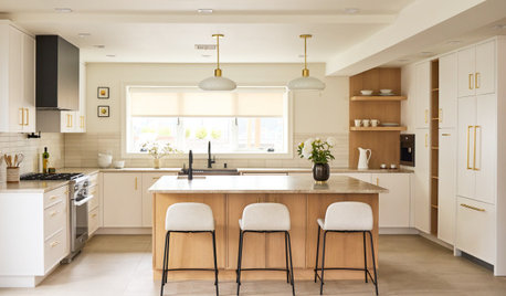
KITCHEN MAKEOVERSKitchen of the Week: Warm White-and-Wood Style for Empty Nesters
A design-build pro creates a light and airy space with a clean, contemporary look, updated layout and improved storage
Full Story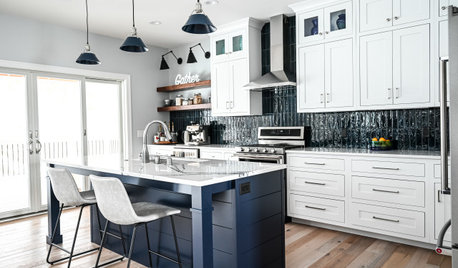
KITCHEN DESIGNKitchen of the Week: White and Blue With Smart Storage Ideas
A designer helps an empty-nest couple create a new kitchen with modern farmhouse style and creative cabinet solutions
Full Story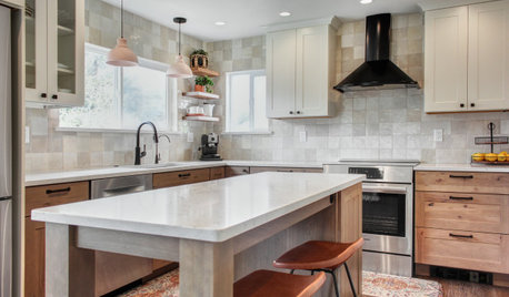
KITCHEN MAKEOVERSKitchen of the Week: Bright and Warm in Creamy White and Wood
A designer rejiggers her kitchen to create an efficient layout with an inviting style and small-space storage solutions
Full Story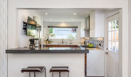
KITCHEN MAKEOVERSKitchen of the Week: Warm White and Walnut Add Midcentury Style
A couple find a designer on Houzz to update their kitchen with improved storage, new appliances and two-tone cabinets
Full Story
MATERIALSKitchen Ideas: How to Choose the Perfect Backsplash
Backsplashes not only protect your walls, they also add color, pattern and texture. Find out which material is right for you
Full Story
chispa