

Paint Poll: F&B Light Blue vs. Pigeon
5 months ago
last modified: 5 months ago
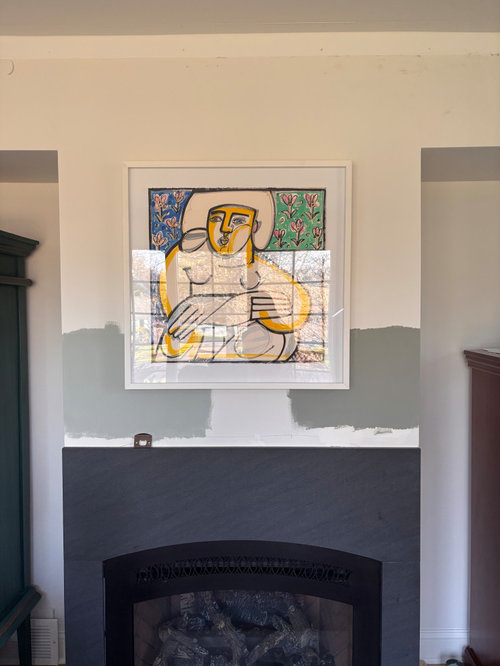
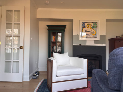
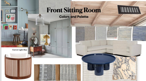
Farrow & Ball Light Blue No. 22
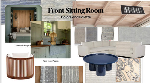
Farrow & Ball Pigeon No. 25
Sort by:Oldest
Comments (11)

Related Stories
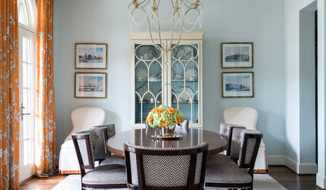
COLORDesigner Picks: 12 Soothing Light Blue Paint Colors
These sky-blue paint colors evoke a sense of calm and cheerfulness. Designers tell us why they love them
Full Story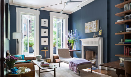
DECORATING GUIDESDesigner Picks: 9 Beautiful Saturated Blue Paints
Bold cobalt, inky indigo and moody midnight are just a few of the hues that can set a dramatic tone
Full Story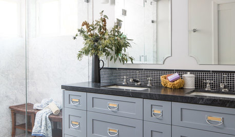
GRAYDesigners Share Their Favorite Light Gray Paints
These versatile neutrals can help create a range of moods in any room
Full Story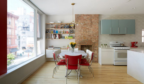
TOWNHOUSESHouzz Tour: Color and Light Transform a Brooklyn Townhouse
Bright red and robin’s egg blue accents set off white walls and wood floors in this bright New York family home
Full Story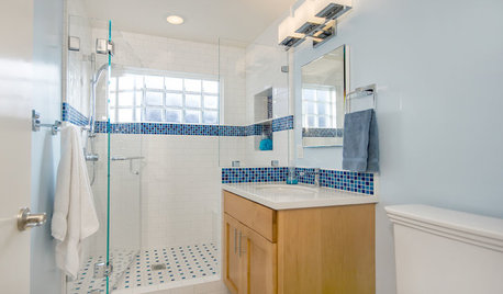
BATHROOM DESIGNLight-Happy Changes Upgrade a Small Bathroom
Glass block windows, Starphire glass shower panes and bright white and blue tile make for a bright new bathroom design
Full Story
COLOR4 Cool Paint Colors Touted for 2014 — and How to Use Them
Muted but complex, these hues from Farrow & Ball can stand on their own or play supporting roles
Full Story
WHITEWhat to Know Before You Paint Your Walls White
A coat of white paint can do wonders in one room and wreak havoc in another. Here are tips for using the popular hue
Full Story
COLORS OF THE YEARThey’re All Here: Paint Colors of the Year for 2017
There’s a bit of a consensus, plus a couple of interesting outliers, among paint companies' top color picks
Full Story
DECORATING GUIDESDesigner Secrets: 10 Pros Share Their Favorite White Paints
Decorating experts look to these hues when they want a go-to white they can count on
Full Story
COLORCooking With Color: When to Use Blue in the Kitchen
Keep your cool. We show you when to nosh around navy or try a taste of turquoise so you can stay relaxed while finishing your kitchen
Full Story
cat_ky
Jennifer Hogan
Related Professionals
Dover Interior Designers & Decorators · Kansas City Interior Designers & Decorators · Temecula Interior Designers & Decorators · Joplin Bathroom Remodelers · Middletown Bathroom Remodelers · Glenwood Springs Kitchen & Bathroom Designers · Kingman Interior Designers & Decorators · Austin Kitchen & Bathroom Designers · Janesville Furniture & Accessories · Fresno Furniture & Accessories · Longview Furniture & Accessories · Leominster Design-Build Firms · Decatur General Contractors · McAlester Flooring Contractors · Oshkosh Flooring Contractorschinacatpeekin
SF DESIGN
K Laurence
oncape
porkchop_z5b_MI
Kendrah
arcy_gw
Maureen
RedRyder