Software
Houzz Logo Print
mtnrdredux_gw

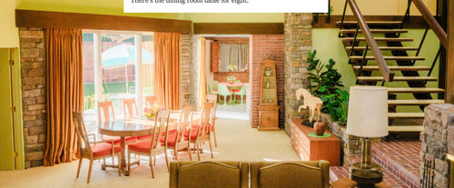
The Brady Bunch house

last month

... is now a de facto museum. Interesting story in the NYT today.


Did they really mix stone and brick this way? Wow, that looks bad. I like the Ming horse, seems pretty sophisticated in context.


Comments (24)

  • last month
    last modified: last month

    People STILL mix brick and stone like that, I don’t love the look but it is 1000% better when the colors are harmonious….e.g. if the brick were a partially whitewashed brown with brown tones of stone. That orange brick is (or should be) a standalone feature— if used at all 🙄

  • last month

    In the ’70s natural materials were ”in”, and blended where possible. The brick floor, though, really bothered me and does still, on steps and at the bottom of the stairs. Concussion or compressed disc waiting to happen!

    Every room has different flooring. I support that! Different rooms, different uses, call for different floors. Same with paint color. That plaid sofa in their family room, though….

  • last month

    Interesting that the house was supposed to reflect that Mike Brady ( the dad) was an architect.

  • last month

    🩷

  • last month
    last modified: last month

    Did anyone see how they remodeled the actual house to look like the inside? The inside of the house not used and was entirely different.


    https://youtu.be/i1M9mlmabmw?si=uzw7mIyXpL5G7Bgh

  • last month

    That was interesting, @eld6161. Thanks!

  • last month


    Sigh…my one true love.


    I used to think the Brady house was soooo cool.

  • last month

    @eld6161, yes ... that was discussed inthe NYT article i mentioned in the OP; that is where the photo came from... not the set. Interesting that the inside was similar enough that it was possible to mimic the set.

  • last month

    I loved it when Greg turned Mike’s office into a groovy lava lounge.

  • last month

    "Marcia, Marcia, Marcia," and who could forget George Glass.


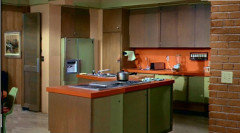
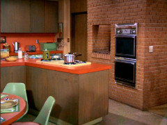
    The set was a mix of materials. I never did like the kitchen, but did like the staircase.


  • last month
    last modified: last month

    Mtn, not sure what mean. The actual house didn't even have a second floor. Extensive renovation had to be gone to make it look like the house on the set,

  • last month

    Remember the episode where Marcia got bopped on the nose with a football right before a big date?


    The stonework in this house is exactly like my parents mid century house.


  • last month

    This home was very much like the ones in my neighborhood, where we lived in CA in the early 70s, the only odd part was they didn't have a pool. The pic of Peter brought up a question, from ages ago. Who cast Greg? He was not attractive when pitted against the other 'siblings'. Seems like story lines would have been more believable if he were more attractive.

  • last month

    I mean. Greg was no Peter, but I don’t recall thinking he was unattractive…


    Kendra, me too! Wasn’t it painted all black or something?


    The things we remember…and I can’t remember what I did last week!

  • last month

    WDYM, they were just little boys when cast.


  • last month

    It looked better on the set, the real house above was smaller and things are kind of squeezed in. That said, I did not think it was a very nice house even when I was little.

  • last month

    I never liked the 70s color palette and still don't. Thank goodness neither did my parents.

  • last month

    Peter was my crush as well 😊

    I never was crazy about the color scheme in that house/set, but it was definitely a common one at the time. I do like the staircase tho.

  • last month
    last modified: last month

    My inlaws built a large home in the late 70’s and the kitchen looked very much the BB house but had an island, which was a very new idea then. The cabinets were walnut, the counters orange formica and the paint color was green— exactly the colors of the photo above. There was a series of casement windows looking out onto a field (cattle farm) and a poufy valance above spanned the line of windows. The fabric was black chintz printed in a faux Jacobean floral of orange and blue flowers with green leaves and curlicues.


    (They finally remodeled the house in 1992 or 1993, and everything became white and gray with green trellis wallpaper and fabric everywhere.)

  • last month

    My mother designed their new kitchen in 1970, with an island (no seating, it was for working on). And her kitchen, too, was like that and further innovations: dark brown woodlook formica cabinets (easy to clean! no chipping!). Lowered base cabinets and longer uppers to accommodate her petite size (5). Flip-up Ronson blender system in the island, zones, cabinets that opened on both sides of the peninsula. Brick-look floors (the carpeting that supposed to be great for kitchens was quickly replaced within the year). Casement windows overlooking the terrace and field beyond. No window treatments, though mini-blinds were eventually added to the windows over the sink, since they faced west. Mom had planned everything in late fall, when the sun was not due west, and we moved in the following late fall. In the spring, she realized she hadn’t accountrd for the seasonal shift.

    Colors were brown and avocado, and gold, of course. Eventually the green and gold were replaced by creams and blues. The kind of off-white formica countertop still looked new 50 years later. Thank goodness it was never orange!

  • last month

    Yes, the mix of stone and brick is real and was mainly done for practical reasons stone provided strength while brick was cheaper and lighter so it can look rough or mismatched today, especially after aging or repairs. In contrast, the Ming horse from the Ming Dynasty is much more refined, because these pieces were crafted with high skill and symbolic purpose, often for tombs, which is why they appear far more sophisticated than everyday construction.

  • last month
    last modified: last month

    My parents kitchen in 1969 was all white,including floor, "country" cabinets in a lacquer finish, an island with a Chambers cooktop, and white wallpaper with black outlines of flowers that were about 9" in size. The rest of the house had white woodwork except for one room.

    Where I grew up everyone had stick built, varnished cabinets and varnished woodwork (not even stained) and at the time nobody up there had seen anything like their kitchen (even though in the big scheme of things it has not revolutionary) and people actually called up my parents to ask and see it.

    The house did make nods to the 60s but it was very tradtional.

    Our local country club, opened in 1967 was designed by somebody who had gone to Taliesin and was very much like above, but stone and concrete block and bluestone on some of the floors, floating staircase and such. Most people hated it.