Software
Houzz Logo Print
cltaube

Help Find Paint Palette that matches

3 months ago
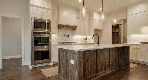
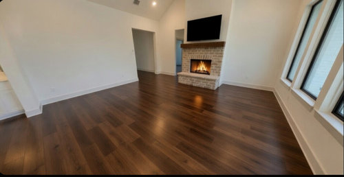
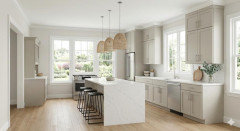
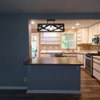
I am having a hard time deciding on paint colors for the interior of our new build. Undecided if we want to use the same colors (wall and then trim) throughout, or if we want to change room-to-room. Photos of what our kitchen and living room will look like. Kitchen cabinets will be changed to match trimp/door color. Wanting to avoid gray/cool colors, and colors that pull too much yellow. Want a warm and inviting home, however. Ext is white board and batten with light stone skirt and black roof.

Needing Sherwin Williams suggestions. Help please!


Comments (18)

  • PRO
    3 months ago


  • 3 months ago

    The wall color in the pictures looks like a good choice. I would try to copy it in the kitchen and family room as shown. If you find the idea of the same color everywhere boring, it is not uncommon to use different colors in bedrooms and bathrooms, so you could be more adventurous there. Everyone does not like the same thing - that's why there are so many different paint colors. If you have decision fatigue (not uncommon when doing a new build), have the builder paint everything the same color and change it up later. It will be easier to choose colors once you're living there and aren't rushed. Paint also needs to go with your furnishings. If you're bringing in furniture you already have you need to take it into account.


    The dedicated SW stores (not hardware stores) will sometimes have color consultants who can help you decide so that's something to pursue if you want different colors right away.

  • 3 months ago
    last modified: 3 months ago

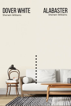
    For me, SW Alabaster is the soft white of choice for ceiling, walls and trims.

    that said, SW Dover White is a beauty. Warmer feeling with good light and no graying.


    Both colors can be paired with anything... aquas, blues, greens, even deep rich tones. I have alabaster butted up to SW Naval on one side and SW Virtual Taupe on the other, and it sings.

  • 3 months ago

    The color of the walls looks lovely in your space and cozy as well. I wonder when you add art, a rug, furniture and so on if you might find the color you have is a perfect backdrop. I am having the hardest time with my west facing bedroom. Everything looks too green undertoned, peach, or violet, orance, yellow and all I want is a nice neutral color. For a west facing room it doesn't act like a west facing given the colors that should not read cool seems to do so and that in the afternoon warm sun.

  • PRO
    3 months ago

    I have never found beige to be neutral so not that. I think I agree the color in the pic seems pretty easy to live with and all one color for now to make your life as simple as possible

  • 3 months ago

    This article was useful to me in choosing a cohesive color scheme for the whole house: https://www.fromhousetohome.com/whole-house-color-scheme/

    I only want a cohesive color scheme that includes my favorite colors after reading this article. There are embedded links to other useful articles from the same author. Choosing color schemes for one room at a time is a huge waste of resources.

  • 3 months ago

    We used SW Ivory Lace. It’s warm but not yellow, bright but not stark. Going on 10 years and we still like it for the main rooms.

  • 3 months ago

    Do you still have any original features worth highlighting. Old brick, beams, steel doors, concrete, or vintage hardware? Those details usually make the palette decision much easier.

  • PRO
    3 months ago
    last modified: 3 months ago

    Would it bother you if the interior white is different one from your exterior white? Think about standing on your front step and looking into to a different white. Sounds kind of weird when I type it, but it would drive me nuts if the two were incompatible.


    Normally, my suggestion would be a B.M. white, because B.M. is what I use in my home and my clients' homes. So, I went to Kylie M Interiors, a trusted source, and she recommends a color for ceiling/trim/cabinets in the correct sheens for each.

    SHERWIN WILLIAMS WHITE SNOW 9541

    https://www.kylieminteriors.ca/sherwin-williams-white-snow-9541-color-review/


  • 3 months ago

    Thanks so much for all the responses! All the input is genuinely appreciated.


    After visiting a Sherwin Williams store, we ended up choosing Drift of Mist for the walls, Gossamer Veil for the cabinets, and Pure White for the trim. Pure White will also be used on our exterior.

    No idea how it'll look in real life, but I've never stepped foot in this floorplan either, so we're kind of flying blind all the way around. lol. Trying hard to embrace the "It's only paint and can be redone if absolutely needed" philosophy, knowing that the tone will totally shift after furnishing and decorating.


  • PRO
    3 months ago
    last modified: 3 months ago

    Rethink those choices. Gossamer Veil has a green undertone and Drift of Mist has a gray/violet undertone. Choose one or the other for the walls and do the Pure White for the cabs, ceiling and trim.


    Please read this post:


    https://themartinnest.com/gossamer-veil-vs-drift-of-mist/


  • 3 months ago

    Oncape, I appreciate your response (even though I am so over thinking of paint colors.. LOL)

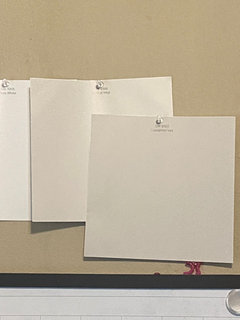
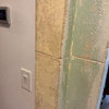
    I've included an AI rendering of the two colors together, as well as the swatches we used (in a room with similar directional lighting) to make our decision.

    We did contemplate white cabinets, but we will have white countertops and white backsplash and just ultimately do not want white on white on white.

    I'd love additional thoughts if anyone has them.


  • 3 months ago

    One more picture of how they look side-by-side.


    The link suggested above was a great read. I think they do pull similar tones though in real life (in this space at least), which is confusing.


    Honestly one of the most stressful decisions we've ever had to make..


  • PRO
    3 months ago
    last modified: 3 months ago

    I'd love additional thoughts if anyone has them

    Here's a factual perspective on both. Which is very different from subjective opinions on what colors look like to someone personally, in whatever context and light source they're judging colors.

    And, of course, we all know that AI color is still color online and that's not a fact either.

    Gossamer and Drift sit in the same hue family pocket.

    What that means is if any color shifting happens, odds are very high that they shift and morph together in response to the in situ light and context - because they have similar DNA.

    Light and context is what determines how a color actually shows up. Opinions about undertones aren't facts, they're just opinions to consider -- or not.


  • 3 months ago

    Well the fact is that they are too close to each other and it will look off. It’s not enough of a difference.

  • 3 months ago
    last modified: 3 months ago

    Def not a pro and for sure walls can easily be repainted but cabs not so much - so that is the color I’d be super sure about

    what direction does your kitchen face?

    fwiw we just did white painted cabs and white quartz counters - we used BM in this new build /BM simply white cabs and trim, bm navajo white for walls (big east windows and needed some warmth for the flat afternoon light) in our other house we have SW dover white trim & cabs and SW honied white walls - I with @Lyn Nielson, I love dover white but every house/lighting is different (honied white looked terrible in my sister’s home)

  • PRO
    3 months ago

    The difference between Gossamer and Drift of Mist will likely read as a subtle shift, not a clear contrast.

    Contrast ratio in LRV is 11%, difference in Munsell chroma is .18

    Far from meeting ADA visual economic standards, however…

    In general, someone with typical vision can usually distinguish two adjacent colors with an 11% LRV contrast ratio, especially if they are side-by-side, the lighting is decent, and the surface area is large enough. E.g. walls and cabinets.

    That works when the goal is subtle tone on tone vs harder lines of contrast.