Software
Houzz Logo Print
tonidavenport

would like a designer look for our back splash

24 days ago
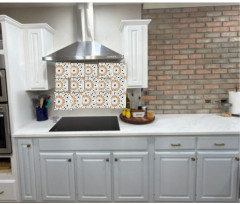
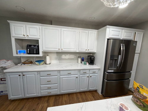
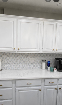
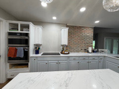
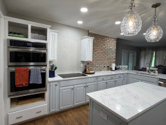
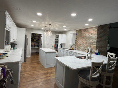
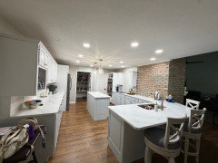
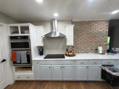
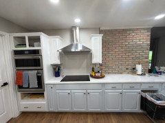
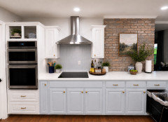
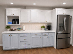
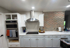
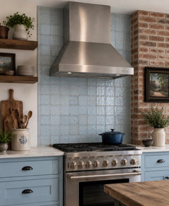
Wondering what would be the most designer look for our back splash. The uppers are white, lowers are pale baby blue with stainless vent and brick wall.

Comments (46)

  • PRO
    24 days ago
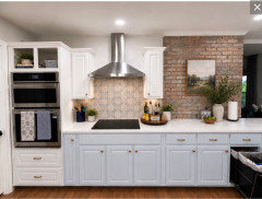
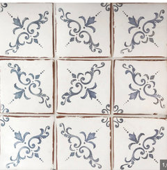
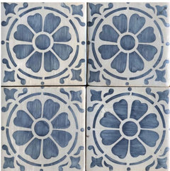
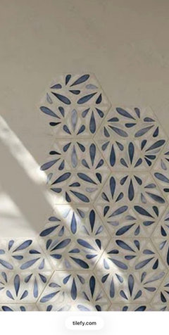
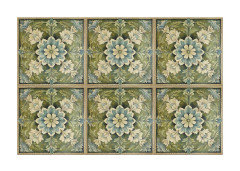
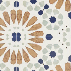
    I love the brick wall! I think that a colorful handmade tile would further the rustic vibe and add a nice contrast to the white cabinets and counter top. I'm partial to blue but there are many other colors:


  • 24 days ago
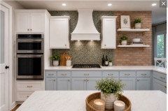
    A simple white tile with white grout will enhance the baby blue lowers.

    You can get a more modern square or install subway tiles in an interesting pattern but keep it subtle with white grout.

  • 24 days ago
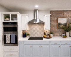
    I agree that a white tile with some blue would be very pretty. With the stainless steel vent hood I’d use a tile that isn’t too traditional looking.
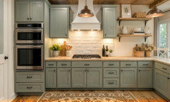
  • 24 days ago

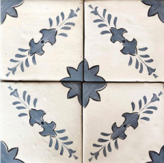
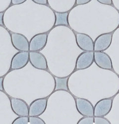
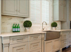
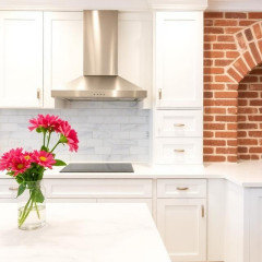
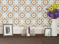
    Here’s another pattern.

  • 24 days ago
    last modified: 24 days ago

    I like Diana Bier’s excellent suggestions!

  • 24 days ago

    Get some samples! All of these ideas are doable, but you need to see them in your kitchen. The patterned ones could really take the room to another level - or you’ll hate them. Samples, not photos!
    (If it’s any consolation it took me a year to find a backsplash in my last house…😂)

  • PRO
    24 days ago

    Yes, Jan, I thought the kitchen with the brick was real. You just can't believe anything online anymore.

  • 23 days ago

    Your kitchen is A LOT of white....normally I would say the best 'designer' look out there right now is running the counters up the back splash, but you need some color......I can't tell if the veining would be enough to add interest to your kitchen. Love true hand painted tiles done minimally. An entire back splash is over load. A grid of grout lines is just so busy and boring...I would minimize that look as much as possible.

  • PRO
    23 days ago

    IMO you will tire quickly of the blue in a pattern for tile . I think if possible do the counter material and use blue for accents . Baby blue for cabinets is an odd choice so maybe tell us what drove that. You can just do a very small backsplash . I thnk the brick wall is your kitchen since you mention that in your post. If the brick wall is real then no added backsplash in another material just the same as the counter or the tile behind the cook top. You better explain what is real and what is a wish.

  • PRO
    23 days ago

    I'm with Patricia Colwell on this. Patterned backsplashes tend to wear on home owners rather quickly and become outdated quickly as well. For me a backsplash should be understated and be a background for other elements in a kitchen.

  • PRO
    23 days ago

    Although the thought of having blue in your white tile is nice, as Patricia Colwell and Norwood Architects have noted, it will get dated. Going with something simple will better highlight the light blue lower cabinets.

  • 22 days ago

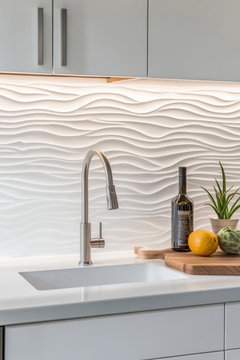
    Like just white 2x6 wavey? Or something white?

  • 22 days ago

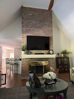
    The brick is real. It’s the back of the great room fireplace, but it only went half way on the kitchen side. This is the other side. On the baby blue, I just thinks it’s beautiful.

  • 22 days ago

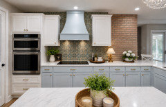
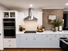
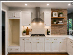
    Oh I’m sorry I did do AI on it to show what type of hood vent it will have. It’s still a work in progress These are real

  • PRO
    22 days ago

    I think the brick is the star so any backsplash should be very simple with matching grout too.

  • 21 days ago

    I like the tiles that @Diana Bier Interiors, LLC showed - if it were me, I’d want something a touch rustic to play well with the brick - once I chose a contender I’d be tempted to make color copies and tape them up to make sure I was happy with the overall feel

  • PRO
    21 days ago

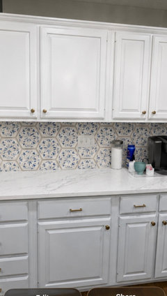
    I still think a patterned tile would look beautiful with the all-white/pastel blue cabinets, brick wall and counter top. Unless of course you dislike color and pattern, which many on this site do. Personally, I think if you really like something you will like it for a good long time, and if it's outdated according to the current trends, you won't care.

    I had a brick backsplash in the range alcove in my kitchen, with a blue and white octagon and dot backsplash elsewhere, and I never got tired of it.

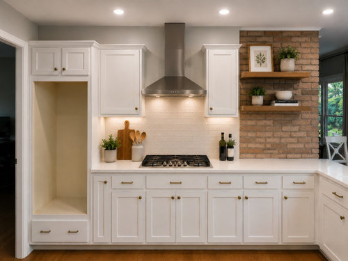
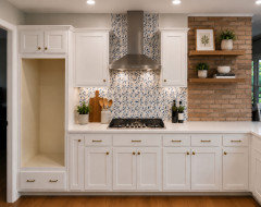
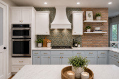
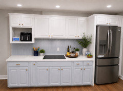
    Here's what your kitchen could look like. I also changed the range hood to one built into cabinetry, which I personally prefer rather than a stainless steel chimney hood wedged between cabinets. I also had AI bring the cabinets to the ceiling.


  • 21 days ago

    I think the blue and white patterned tile is really pretty and pulls the white and blue together. And it’s a great style with the brick.

  • PRO
    21 days ago
    last modified: 21 days ago

    Thanks, Emily I agree.

    Another thing to consider is that there really isn't all that much area for the backsplash, so I don't think it's going to overwhelm, compete with or diminish the effect of the brick.

  • PRO
    21 days ago

    In your real photos it appears on my screen that the brick has a bit of green cast to it. Do they still make the brick? Can it just be carried across the entire wall?


    I find the transition from the warm brick to white tile a bit harsh. I would bring in warmth by doing something with both blue and green in it and make it old world.


    I would also not do a stainless steel hood. I would do it with a cabinet finish whether that be blue


    or the white


  • PRO
    21 days ago
    last modified: 21 days ago

    Another great suggestion, Design Interior South.

    The problem with the AI image is that the cabinets flanking the hood are show much wider than in reality. I think the whole wall would look better with an uninterrupted run of upper cabinetry.

  • PRO
    21 days ago

    Diana Ai sometmes doesnt cooperate but if i were doing a hood on this wall i would not have cabinets flanking the hood. I would have pulled them. Obviously thats not what we are working with so the AI rendering is what it is and based off the original posters AI rendering. My point is I would not do a stainless steel hood. I would have it match cabinetry and I would do a tile with less contrast to the brick color.

  • PRO
    21 days ago
    last modified: 21 days ago

    I agree Design Interior South, I don't care for cabinets flanking a standalone hood. If you must have them, integrating them into a vent inserted into a cabinet is far preferable.

    I have a s/s chimney hood, but no cabinets on either side--there are windows instead. I have enough storage that I don't need any more wall cabinets. If I had to do it over, I might have considered cabinetry with a hood insert. But as you know, there are so many options when designing a room--there's no one perfect setup.

  • 21 days ago

    The hood is installed now

  • 21 days ago

    Maybe just a black or stainless steal back and keep the top the paint color ???

  • PRO
    21 days ago

    Personally I think that would be boring. With all the suggestions you received, that's what you want to do? I guess if that is your choice, then go for it.

  • 21 days ago

    I know, I don’t want boring. I trying to figure why it looks so dark!

  • 21 days ago
    last modified: 21 days ago

    You have received some nice ideas. You see that many things can potentially work. Including your stainless idea.

    I am not sure what your countertops are. I am guessing maybe a quartz. With the countertop and brick, I think that my personal choice for the backsplash would be an actual Carrara marble subway tile.


    You don’t need a lot of it; you could just leave white painted wall in that area above the hood.

  • 21 days ago

    “I trying to figure out why it looks so dark!“


    The hood is casting a shadow. No problem, though- it should have a light that you can turn on.


  • 21 days ago

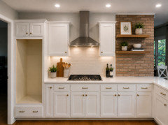
    Here’s your AI image. The hood light is on- plus, there are under cabinet lights.


    Electricity. In motion.

  • 20 days ago

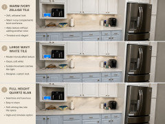
    This shows a solid color tile in an off white to coordinate with brick, but you might also consider a blue backsplash to match the color of your base cabinets.

  • 20 days ago

    Here a patterned tile too

  • 20 days ago

    I’m also thinking the hood might be to high

  • PRO
    20 days ago

    Please no on the flanking/hood cabinets? I'd lose those asap

    Then tile ONLY to hood bottom.


    Proportion matters/ details matter......look down here. Yes I do understand it was simply an inspo, but interpretation to consider what one has? Very important, : )


  • 20 days ago

    Thoughts:

    - I love the brick accent and would keep it as "the star".

    - No to two-tone cabinets. It'll be "too much" with the brick accent. It'll be too busy /keep the eye bouncing around. White is good. Blue is good. Both together will be a mistake.

    - Similarly, I'd keep the backsplash simple. I love the blue-prints people have suggested, but I'd consider a cream-on-white /gray-on-white instead: A subdued bit of pattern.

  • PRO
    20 days ago
    last modified: 20 days ago

    I think patterned tiles are contradiction to that nice brick walk. Pattern next to pattern produce more chaos without giving brick a space to stand out.

  • PRO
    20 days ago

    You couldn't be more wrong, Jana. The OP asked for a "designer look" for the backsplash. MANY very prominent designers know how to mix patterns to beautiful effect.

  • 20 days ago
    last modified: 20 days ago

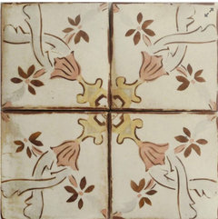
    One more option for you. Adding a tile that brings in some of the brick color.


  • PRO
    20 days ago


  • PRO
    20 days ago

    Check your cooktop manufacturer's installation instructions for backsplash clearance against the existing before making a decision please.


    Too many designers fail to check and/or to pull the base cabinet forward enough to get the required clearance.

  • PRO
    20 days ago

    Whatever mixing pattern is an art, this is not a case, Diana. Mixing pattern requires rhytm, playfullness with domimant accent across space, subtones from which one should be that of a brick in other to make a "connection". White blue tile with smooth maybe even liitle glossy texture is not a match to rough brick right next to it. That is what my designer look is in this case.

  • PRO
    19 days ago

    Well, we'll have to agree to disagree, Jana. The juxtaposition of the hand painted tiles against the rustic brick is a lovely look, IMO, as shown here by Emily and Design Interior South. I don't see "chaos" in either of these:


    There's no right or wrong, it's a matter of taste and what style/vibe/feel you want for a room.

    As designers we need to distinguish between what is good/bad design, and what is merely a valid choice based on taste.

  • PRO
    19 days ago
    last modified: 19 days ago

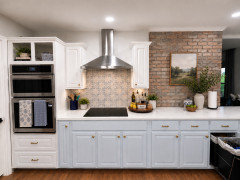
    Great mock up. I took out the trash pull : )


    Every detail matters. right down to those handy towels hanging at the oven stack.

    For Joe Corlett up above?

    The Brick is wall beyond the cabinetry wall, You walk past the brick : ) it doesn't abut the tile of desire.

    The op can seek a thousand opinions, ........but NEEDS to take a trip to a dedicated tile shop in her locale. the picture of her kitchen is on her phone, she browses, take home sample boards, stand them up.

    Crowd source is good for "a concept" but doesn't ever eliminate the task of sampling IN your own space.

  • PRO
    19 days ago

    For a unified look I would make one look as in this mock up. I painted or smeared current brick and found matching backsplash look to create united visual. Really opens up the look.

  • 19 days ago
    last modified: 19 days ago

    I think the brick is important to complement/incorporate and also suggest removing the flanked cupboards…not practical enough to keep vs having a less interrupted expanse. Also suggest going right to the ceiling if possible (for the same reason).