Software
Houzz Logo Print
webuser_446384553

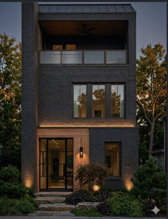
modern organic - new build exterior

17 days ago

Please help on exterior design advice.

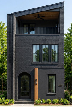
The architectural committee requires 80% brick. I like modern organic and asymmetry. I need suggestions for texture(panel siding?)/ patterns/ color.

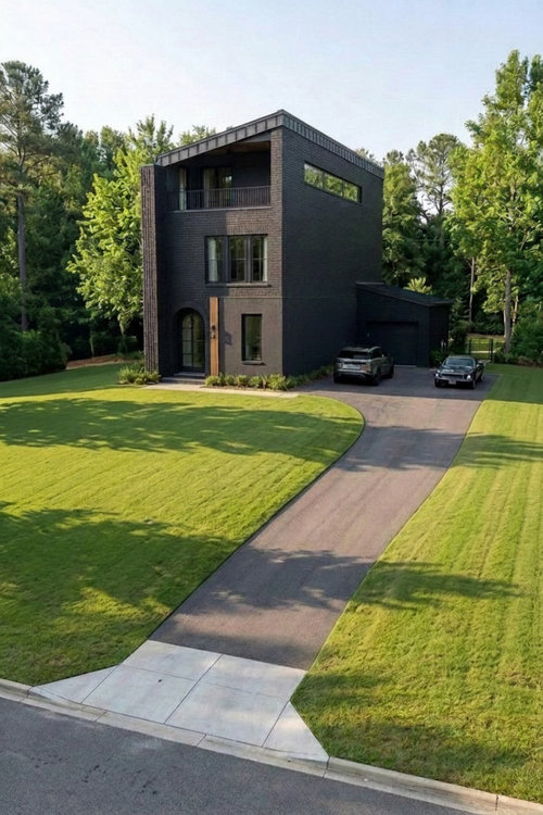
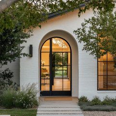
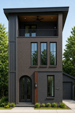
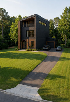
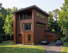
I generated this Al image for what I have in mind so far. I need something to show my general contractor (we are past the layout stage. Now I'm needing to complete elevation plans).
The left vertical segment is supposed to be vertical grooved brick - corduroy (all the way from ground to roof)

I wanted one ‘signature’ accent like some wood that I could also incorporate into a mailbox. My render seems kinda plain, any suggestions?

Ps. I don’t have the budget to significantly change the windows. I’m sticking with majority black colors.

Comments (44)

  • 17 days ago

    I'd find a better designer than AI. That's a black box. Nothing about it looks organic. The arches door does not belong and the only side of the building we can see has no windows.

  • PRO
    17 days ago
    last modified: 17 days ago

    In light of increased flooding due to random rainstorms that no municipalities can seem to get control of, I WOULD NEVER START MY FIRST FLOOR ON GRADE!!!!

    I'd consider a garage on the first floor, or get the living area to start at least 6 steps up from grade unless you live on a hill. People hardly recover from a flood and insurance doesn't cover the losses anymore.


    Window selections from one floor to the next should relate or match. Your front fenestration is just a mess. Why add an arched door that fights with all the existing angles of the building? The second floor windows should relate to the first floor windows.

    Fenestration: the arrangement, proportioning, and design of windows and doors in a building


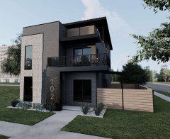
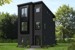
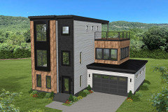
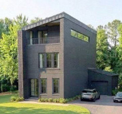
    These aren't great examples of 3 story buildings, but you'll get the idea. BTW three stories is a lot of stairs.


  • 17 days ago

    Looks like a certain library that just opened.

  • PRO
    17 days ago

    What is "organic" ?

  • 17 days ago

    Hope you’re putting in an elevator. I moved, a few years ago, from a house similar, by necessity ( narrow beach lots ) my current single story home feels & lives so much larger even though it’s the exact same square footage.

  • 17 days ago

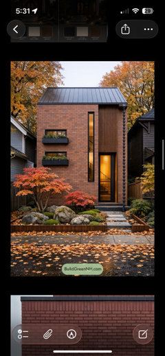
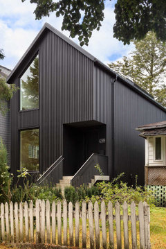
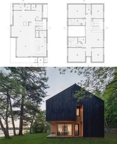
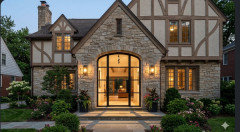
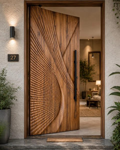
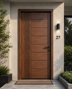
    @BeverlyFLADenziner the house is being built on a hill. The arch doesn’t conflict, it’s just the style - the examples you showed imo are more “hyper modern/ modern luxe”. The arch helps incorporate organic;Along with the stucco segment on the bottom right and wooden plank. I’ve included some examples of my inspiration.

    “Organic” is a combo of asymmetrical/round/wavy elements and rough materials like stucco/ wood/ cement and mix it with “modern” which imo is minimalist/black/metal/sharper edges. I guess a dated word for this style is “scandi”?

  • 17 days ago

    @sigrid ☺️ yes, my black box that I designed. Modern and simple. Just wanted alittle help tweaking it so it fit the style I’m going for. I’m not trying to change style type. Yes, I get it’s not some “antebellum” home or Venetian. It is a tall and skinny.

  • 17 days ago

    Get rid of the arch.

    How you add the feeling you are trying to add is landscaping. It's not through doo-dads, and architectural 'features'. It's trees and shrubs and other organic matter.

  • 17 days ago

    I agree. Get rid of the arched door. It doesnt work.

  • 17 days ago

    Why black? It's so dark and heavy. That red brick example you showed is a much better look, easier on the eyes, not so dark and foreboding.

  • 17 days ago

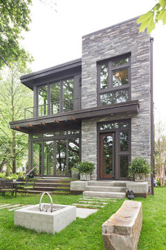
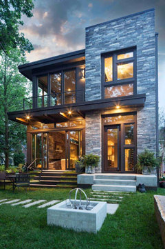
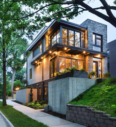
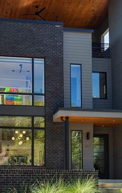
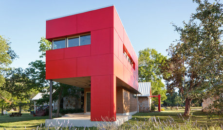
    You can do tall, skinny and modern in a way that's far more attractive than that. Something like this has plenty of black, is tall and skinny, but has more balance and grace than that black box.


    Lake Calhoun Organic Modern · More Info


  • PRO
    17 days ago
    last modified: 17 days ago

    I really like the image posted by Sigrid. That is a handsome house.

    https://onekindesign.com/contemporary-residence-lake-calhoun/

  • 17 days ago

    Here are a list of issues:

    1) the arch over the door would be an interesting detail, if it echoed anything else in the building, but it doesn't.

    2) The windows on the second floor don't emphasize the vertical, as a group, they are a horizontal shape

    3) The second floor windows are not aligned with any elements on the first floor.

    4) The wood element to the right of the door detracts from the arch shape. The arch is in a tunnel between the two verticle elements on either side.

    5) The column on the left appears wider than the edge on the right, giving an unbalanced impression.

    6) Because the roof is not emphasized and doesn't extent past the walls, it just looks plopped there.


    These disparate elements are what give the impression of a black shoebox, not a modern exterior. I'd strongly recommend you get a designer to tweak your design, as it looks like a mess.


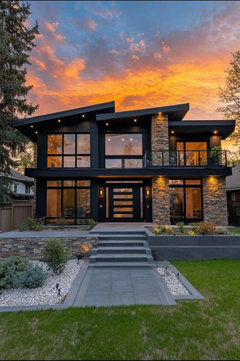
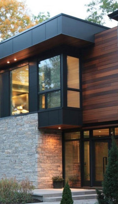
    Note how the angled roofs here extend beyond the walls, making them an interesting element, not merely a top for the building.

    Bellevue Private Residence · More Info


  • 17 days ago

    I think that it would be helpful if you posted your inspiration photos that were turned into your exterior. If you post inspiration photos, we can all see the "look/feel" that you are trying to achieve.

  • 17 days ago

    Oh, and lastly, the column on the left fails to emphasize the verticality of your shape because it's on the shorter side. So the higher wall on the right isn't emphasized and seems like an afterthought.

  • PRO
    17 days ago

    IMHO all people in HOAs need to learn how to fight stupid ideas put forth by people with no taste. A huge monolith like this in black brick is so wrong .80% brick why you need to ask .

  • 17 days ago

    ? … i think most on here are just wasting their time making suggestions. The OP seems satisfied, for better or worse, with the design as is.

  • PRO
    17 days ago

    You are probably right the more I look at the plan the worse it gets I guess if the OP likes it, it really their home .

  • 16 days ago

    @sigrid it’s hard to get AI to generate a 100% accurate image of my description of the home. The roof you are suggesting is what will be placed on the house ( with overhang …. I’m not sure if a ‘flush’ sloped roof even exists, but you should know that) The windows on the front are all 3x7(on the image they do appear more like a 3x5) .The garage is also suppose to be bigger ( taking up about 1/3 of the right wall) . The vertical feature on the left is the side people drive in on. This house will sit at the end of a road on a hill and the ‘front’ of the house doesn’t face the road. I opted for a dark brown brick, since I agree the all black was a bit bland. Could any one make a suggestion for how to keep the arched French door. I’m dead set on it but I’m willing to hear out how to balance it out

  • PRO
    16 days ago

    "Could any one make a suggestion for how to keep the arched French door."

    At the risk of sounding repetitious, engage a competent local residential architect to design a home with you that meets your needs and fits your site.

  • PRO
    16 days ago
    last modified: 16 days ago

    First, find better inspirations that a Monty Python French castle tower crossed with a prison machine gun tower. Now go and boil your bottoms, sons of a silly person!

  • PRO
    16 days ago

    Are you claiming it smells of elderberry?

  • 16 days ago

    One thing I noticed with AI is to save the images you like, delete the thread, upload the image you liked and start a new thread. It tends to reference old images since it is a different AI/program that alters the image so your prompts need to not give it old references. I find this works most times. I personally feel you need to add some contrast and I would do that on the first floor to break up the black/brown box.


  • 16 days ago

    I would consider a lighter grey brick. You can provide more visual interest and contrast than losing the detail in the black brick. It will highlight the incongruity of the arched door, however, so that is a risk.

  • 16 days ago
    last modified: 15 days ago

    I usually try to be positive about people's houses, but you are going to spend an awful lot of money building this thing and your design is pretty awful. Most people don't do a good job the first time they try something, like design a house. AI makes it easier to get something that superficially looks okay or even spiffy, if it's a bad design, which yours is. You'd really benefit from paying a designer/architect.

    For example, you still have windows that are not aligned with any of the elements on the first floor and your column on the left still outweighs the edge on the right and the arched door still looks odd between the two vertical elements of the column and the strange wood thing.

    Further, I'd imagine you've spent no time thinking about the interior and how the windows are going to impact the rooms. I would not be surprised if you haven't thought about the light on your site. And I don't think you've spent any effort on the side elevations. I could be wrong, but the interplay of your site, building exterior and interior are pretty important.

  • 16 days ago

    It blows my mind that people think they can design a house, spend a large amt of $$ to have it built and not have regrets or have it turn out as great as it could with some professional input

    This is not like saying I think I will design and sew a dress even though I really don't know how. Building a house that you will drive up to everyday is something to get right. Fixes are not cheap or maybe even possible.

    Is it an ego thing? Do people think they are so good at everything, that designing a home should be no problem?

    My thoughts echo @Sigrids but I was coming here to write this. SHe just got here first!

  • 16 days ago
    last modified: 14 days ago

    At this point, can you change the brick, and add windows/their size to get more natural light, and the arched entrance is taking away vs adding to the facade. These would be a must for me.

    With only 20% allowed for other than brick, have you looked on line for inspiration? You mentioned wanting Modern organic; be careful about it being austere.


  • 16 days ago

    I've not used AI to generate images very much. It's difficult because when you ask for one change, it does something crazy to the image that you've provided.


    Anyway - here are a couple examples to help with your organic modern exterior:


    It didn't do exactly what I asked in the image below - however, it did change the roof line like I wanted and sort of repeated the overhang on the first level like I asked.


    I wanted to see it with a glass door that works with the windows and isn't arched. Also, I wanted to see how an expanded wood element would look that is set back a bit from the brick/window portion on the right side of the first floor. I also wanted to see what it would look like if there was a glass railing instead of just the metal one.


    However, it messed up the roof line for some odd reason. It also changed the windows back to a previous version of your house. Additionally, it changed the element on the left side of the house back to brick + removed the overhang that I added over the lower window (I wanted it to go across over the front door to provide a bit of protection over the front door). Instead, it removed the overhang and added a recessed light element (which would look interesting at night - but doesn't help with adding any texture to the house for during the day).


    I tried to have it fix everything that I wanted - and it kept generating visuals that changed other things on the home that i didn't ask it to do. The last image it generated was this:


    😳


    I was so frustrated that I had to stop!


  • 16 days ago

    It seems the approach of this project might have led you to a front elevation you are not happy with. Mostly, you state the "layout stage is complete" (floor plans?) and now you need to complete "elevation plans." It is also unclear how a window budget at a design-on-paper stage does not allow different sizes, shapes, or locations of windows for any future design or tweaks on a design.

    The term "organic" is being misapplied to stated elements of the design. It would best apply here as an adverb, being that the elevation should be organically derived from the floor plans and sections. Meaning, the facade is an expression of the 2D floor plans and 3D massing, and all should be designed simultaneously and "tweaked" together.

    It sounds like this may be a builder-led drafter project where you get heavy input yourself, and may be based on a standard plan that you are trying to apply makeup to in the style you like. I don't know, then, if this setup will meet what you are picturing and struggling to describe here. Also remember there are multiple facades on a house.

    As an aside, a good part of one of my early semesters in architecture school was front elevation design exactly as your project, a "vertical" 3 story facade. It started as study of classical architecture, proportion, balance, focus, shadows, materials, shapes (e.g. how a semi-circle relates or opposes other elements), and led to our own designs. It was difficult to create something from nothing, because it was limited to only the facade design, with no outside inspiration, no building programming as a guide, or anything else to work with.

    I offer that memory as you have much more to work with to derive an elevation, and that also there is a point when something might be out of someone's purview.

  • PRO
    15 days ago

    So much effort put into one elevation leaves the others to happenstance. This is not architecture, this is Mr. Potato Head plopped on a site.

  • 15 days ago
    last modified: 15 days ago

    @RNmomof2 zone 5 You said " This is not like saying I think I will design and sew a dress even though I really don't know how."

    I participate in sewing forums, and you'd be surprised at how many people with no experience want to design and sew their own wedding dresses. $$$ spent on fabrics, with predictable disappointment at the look and fit.

    These things look deceptively easy when someone experienced does it well.

  • 15 days ago

    I would want way more windows, for me the best modern houses are almost “floaty” and take full advantage of the site and have abundant natural light throughout (many of the images provided by others on this thread are great examples)

  • 15 days ago
    last modified: 15 days ago

    ""Organic” is a combo of asymmetrical/round/wavy elements and rough materials like stucco/ wood/ cement and mix it with “modern” which imo is minimalist/black/metal/sharper edges."

    I see what you are trying to do, but the proportion of Organic is too small to be impactful, and looks like a patchy afterthought.

    For example, the only round/wavy element is the arched door. Because it is all alone, and so tiny in proportion to all the straight lines, it looks jarringly out of place, a Tudor wannabe. For a pleasing overall balance, you would need to repeat the arch in something meaninfully large, in proportion to the whole structure. I can't see a way to do that effectively.

    As far as the rough materials, the stucco is the same colour as the brick so it is not effective in breaking up the large expanse of brick. Same with the wood element. It's too small to be impactful in the overall look.

  • 15 days ago
    last modified: 15 days ago

    Does 80% of the house need to be brick, or 80% of the front facade? If 80% of the house, then you have plenty of latitude to add more wood to the front facade.

    A wood door in a warm wood stain would look good with that brick, and with your house style.


  • 5 days ago
    last modified: 5 days ago

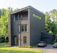
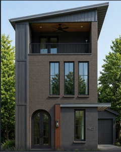
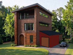
    With red brick it makes sense to me. I added a side window and extended the roofline.


    I ran out of my AI usage today for another visual- but you could extend the garage as a two car tandem garage along that wall.

    Rough sketch:


  • PRO
    5 days ago

    It is a sad day on Houzz when someone runs out of their intelligence.

  • 5 days ago

    Leave it to Mark lol.

  • PRO
    5 days ago

    "Organic architecture is a design philosophy that creates harmony between human buildings and the natural world. Coined by Frank Lloyd Wright, it treats a structure like a living organism where the layout, materials, and site work together as a single unified system."

    Your design does not look like anything approaching organic.

  • 5 days ago

    The thing that would really make me nervous about self-designing a home like this— besides the fact that you will clearly be spending a significant sum: you are putting a LOT of trust into both AI renderings AND your contractor’s (or their drafter’s?) ability to interpret and execute them.

    Good modern home design relies heavily on the ability of a skilled architect to both (a) manage the big picture alongside all of the details/ minutiae that undergird it, while (b) monitoring and holding the contractor accountable to not taking shortcuts in the build process. You’re going to leave a lot of things to chance and risk the build looking like a very dumbed-down version of the general concepts you asked for by not having an architect on board.

  • 5 days ago

    Again, why a three story townhouse on a broad suburban lot? Why not a two story if there's room to build out?

  • yesterday
    last modified: yesterday

    I guess the OP did not get the response they were looking for and has disappeared.

    No more replies in the last two weeks. I thought my tandem garage was a good idea. Oh well.

  • 23 hours ago

    The problem with your improvements is that the starting design was awful. It had no coherence. Posters here have improved it, but you can still see the core design, which was done with AI and someone who knows little about what makes for good design.

    I usually try to be positive about other people's taste and other people's houses, but there was little positive to say about this thing and no point, since it hadn't been built.


    It's something you see often with AI --- something that looks spiffy, but is bad design. I've often thought for many of the befores with AI afters that if the AI had just done a glow up of the before --- make the lawn all green, added some lights in the windows, improved a cloudy sky --- there would be the same sense of Wow! that the after got.

  • 23 hours ago

    Like I said the OP has left the building.

Sponsored
Mary Shipley Interiors
Average rating: 4.8 out of 5 stars34 Reviews
Columbus OH Premier Interior Designer 10x Best of Houzz