Software
Houzz Logo Print
webuser_641254183

Help with Backsplash with wood cabinetry

last month
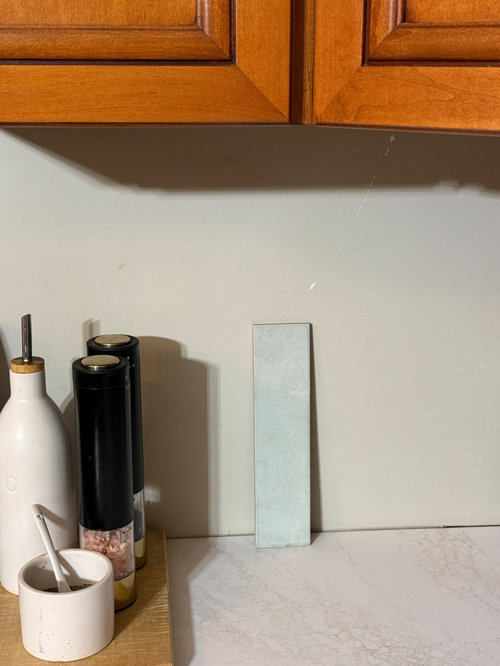
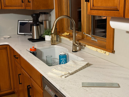
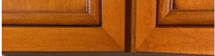
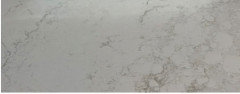
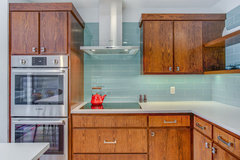
We just updated our dark kitchen countertops with Cambria Everleigh quartz in a satin finish. Now we need to pick a backsplash. We have a lot of wood in our house (it's a 4 square farmhouse) and maple cabinets with a cherry stain.


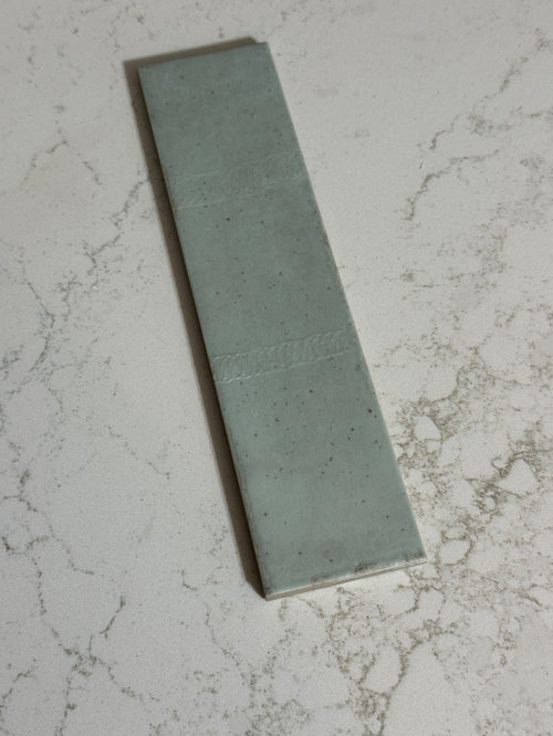
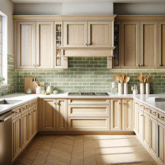
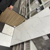
I initially thought I wanted a soft white backsplash, but then we found this Tribeca seagrass tile in a pale green. Thoughts on how this would look, or any recommendations? I would like a glossy tile to bounce some light in the space, so nothing too dark.


I've never had a tile backsplash before so I'm terrified I'll get it wrong. The store was sold out of this tile other than this one - I wish I had more to show!


Comments (22)

  • last month

    I think the green may make your cabinets look more orange.

    HU-641254183 thanked Tina
  • last month

    Consider using the counter material as the backsplash. No or greatly reduced installation labor costs should be figured into the total.

  • last month

    Thanks @dan1888. The countertops have already been installed, we can't afford to purchase another slab.

  • PRO
    last month

    I like the green

  • PRO
    last month
    last modified: last month

    I like green, but not a fan of that very light green. If you want green, get something with more presence, something darker or more bright. If you don't want something more dramatic, do a white tile backsplash. The combination of the orange-y cabinets, pale green and white/gray counter tops is not a pleasing one, in my opinion.

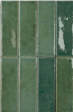
    This glossy green tile would work better, the color stands up to and balances off the cabinet color better, and isn't too dark.


  • last month

    Do you have any local independent tile stores in your area? They have grouted sample boards you can borrow, to better see how a tile might look in your kitchen.

    HU-641254183 thanked chispa
  • last month

    I like the green that Diana Bier suggested. The light green is too ”Dr” office for me, probably because I’ve had a few visits recently, ☹️

  • last month

    I don't like the green you show, either. Too light, too minty, too baby-themed. I have green tile so obviously am a fan of it, but an above poster brings up a good point that the green may make the cabinets look more orange.


    I would also consider a mid-tone grey, similar to the grey you see in the countertop.

  • last month

    I went and got a box of it to try because I was sure it would look great. Instead...it kind of looked like I had strips of toothpaste on the wall. 🤣 However, I did find a super light green/grey that looks fantastic in my opinion. It's very neutral and allmost reads as a white in some light and bounces light just like I needed.


    Thanks for help me to think this one through, I appreciate it!

  • last month

    Before you skip slab as an option, compare the full prices with install labor. If you are doing the tile install this won't apply.

  • last month

    I am over the busy-ness of tile and grout lines. Running your counter top up the wall would be my first choice. If choosing a color I would paint. Color choices change with time and tile will likely out live your love of _________ by decades.

  • PRO
    last month

    Post photos when you are finished--we'd love to see it!

  • last month

    Consider painting a few sections the color of the light and darker green to get an idea of how they work with the counter counter and

  • last month

    I was trying to edit comment. In general by painting sample in few areas you can get an idea of how the tones work and make a decision before paying for tile install. Just make sure you get as close to the tire color in paint and buy paint with sheen close to tile to see how light might reflect. Good luck

  • last month

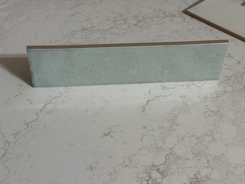
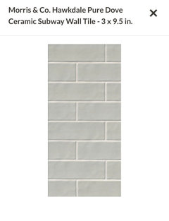
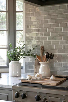
    This is an alternative I’ve found. It’s a green-grey and much softer.


  • last month

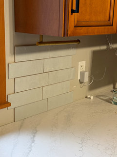
    This is a sample of the tile with the light on (overcast morning) and light on. paper towel holder will come down and bulbs can be adjusted.


  • last month

    I liked your original color but this new one looks great!

  • last month

    I don't like your newest choice, either. I really think you need to go darker -- not dark, just darker than these uber-light samples you're gravitating towards, which aren't doing your counter any favors.


  • PRO
    last month

    Agree with pork chop-the light one doesn’t look good with the counter top material. It’s washed out. You need some contrast

  • last month

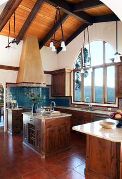
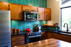
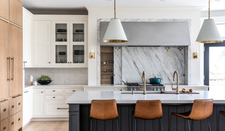
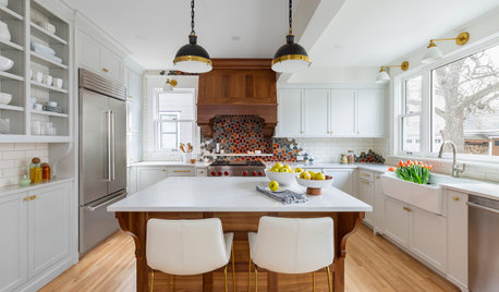
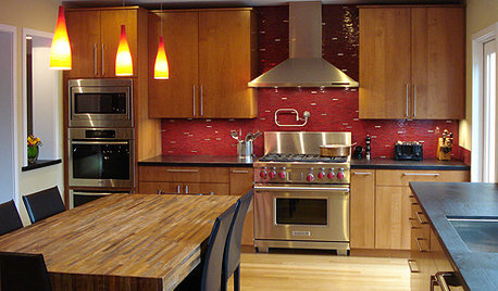
    definitely move to a color for the splash. Here's a few versions...I like the square tile with traditional cabinets as in the first....even the pale teal as in the 3rd image would be better than the pale whites/grays etc. Your cabinet color needs counterpoint color , alongside .


    COLORFUL MEDITERRANEAN · More Info


    Mid-Century Modern Kitchen Backsplash · More Info


    Las Colinas | Northgate | Kitchen (Revive) · More Info


    HU-641254183 thanked herbflavor
  • last month

    I agree with the others that some color in the space would be fabulous.

    You get light into the space with undercabinet lighting. You can get flat LED lights that plug into an outlet - simple DIY improvement.