Software
Houzz Logo Print
zzplus3

I'm back - reno finally underway and need advice on kitchen backsplash

18 days ago
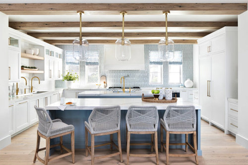
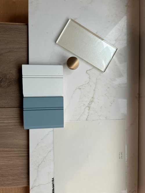
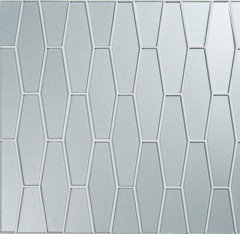
Hi friends - it's been quite the journey but the new kitchen is taking shape! I have fallen deeply in love with a shimmery backsplash tile, but just a wee bit concerned it may read too yellow against my blue/white coastal theme.


I will have brushed gold accents (faucet/handles). I'm almost afraid to ask, but hoping beyond hope that this tile is blessed by ya'll. But ... please give it to me straight. It's not cheap (in my world) and I can't afford an expensive mistake.


Right now I'm focused on the color alone - it's the only white option available. I will post more about which shape (although I lean towards the elongated hexagon) and placement (up to ceilings like insp pic) later.


Thanks in advance, can't wait to hear your thoughts! (crossing fingers....)


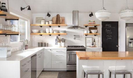
Inspiration pic


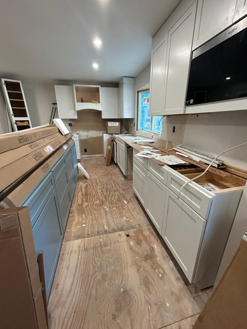
Where I am today


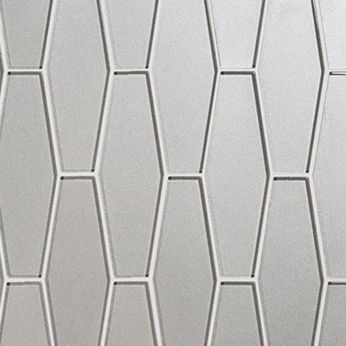
Online pic - drawn to this shape


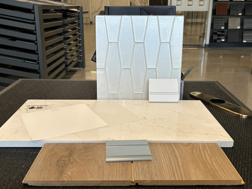
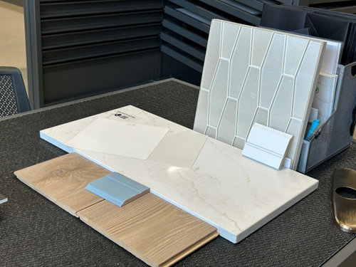
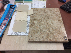
At the tile store


At my house - everything locked in here (walls City Loft) except the tile


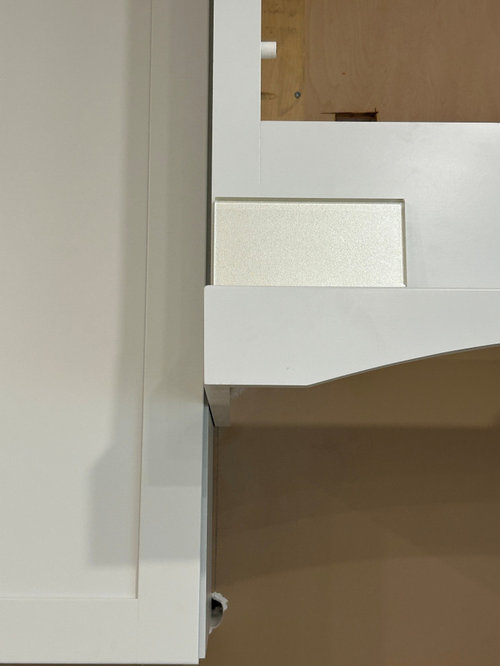
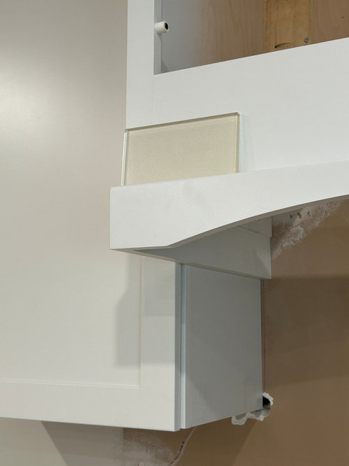
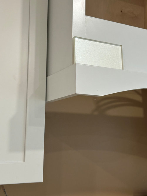
Propped up on the hood cabinet - three different angles - the light plays so differently!


Comments (7)

  • 18 days ago

    Congrats on your reno getting started! Looks like it will be really pretty!

    I can see why you’re drawn to that tile; it’s very pretty and unique. However I agree with chispa to wait until you’re further along, at least until counters are installed, to finalize a selection. Ditto that glass tiles can look different when installed.

    What is the brand of the tile? Do they make an iridescent tile in other colors? Asking because a pale blue would go nicely with your coastal vibe, without the worry of potentially clashing whites with your cabinets.

    zzplus3 thanked chicagoans
  • 17 days ago
    last modified: 17 days ago

    Thank you both so much for your input! Here is the link: Astoria Collection by Sonoma Tilemakers. I think the pics are best in the catalog here: ceramicmatrix-media.nyc3.cdn.digitaloceanspaces.com/wp-content/uploads/2020/07/STM_Astoria.pdf

    The tile dealer wouldn't let me take the sample board home, I most definitely lobbied for that, lol. They do have a pale blue (Gibson) and a gray (Sidecar) that leaned blue in certain light.

    I worried about the blue backsplash looking too "matchy matchy" and too much contrast with the white cabinets - a banding effect if that makes sense? Something was off with the hue of the Gibson as I recall but I will fetch a sample of it nonetheless. The Sidecar is reading more silver (and dark) at my house and I didn't like it with the brushed gold.

    Here is Gibson Gloss


  • 17 days ago
    last modified: 17 days ago

    Find another tile shop that will lend you sample boards. I have never had an issue borrowing sample boards in many mid/high end tile shops in CA or FL.

    If you have to, offer to leave a deposit and always return the sample boards within 48 hours.

    zzplus3 thanked chispa
  • 17 days ago

    The yellow cast is the thing to settle before you buy a full wall of that tile.


    Shimmery whites pick up whatever light hits them. On the hood they will look cooler; in afternoon sun they can go champagne. That is normal. It only becomes a problem if the glaze is actually warm and your “coastal” plan is a crisp blue-white.


    Do this before you commit:

    Tape a few tiles on the backsplash plane, not on the cabinet face. Look at them morning, noon, and with the undercabinet lights on. If they go yellow only in one hour of sun, you can live with it. If they stay creamy next to City Loft and the blue, skip it or choose a cooler white in the same shape.


    Brushed gold will warm the room anyway. A slightly warm white tile can sit fine with gold. It fights you when the tile reads mustard beside a true blue.


    Elongated hex is a good choice for a coastal kitchen if the grout is close to the tile, not a contrast gray. Contrast grout on a sparkly white hex is what makes it feel busy. Floor-to-ceiling only if the tile stays quiet. Full-height shimmer plus gold plus blue is a lot.


    Buy one extra box and have a small mock-up set on the wall with the real grout color. That is cheaper than a wall you resent.


    If you are in Winnipeg and want the mock-up set and grouted in place before the full install, we can do that.

    The Handyman Winnipeg
    Winnipeg, MB
    431-816-2379
    https://www.thehandymanwinnipeg.ca/

    zzplus3 thanked The Handyman Winnipeg
  • 17 days ago

    There was another user on Houzz who was considering using the same tile (Astoria Bergamot) - she said that it read gold in her home. Based upon the photos that you've posted, I see gold in the tile also.


    You are not viewing the backsplash tile in the right spot. You need to view it on the wall where it will be installed. Right now, you have photographed it flat on top of your countertop + propped up on your hood. You should attach it temporarily to your actual backsplash area.

    Your upper cabinets will block some of the light + once it's grouted, more of the light will be blocked = it will look different.


    There have been MANY posts on Houzz where people have been unhappy once their glass tile has been installed due the change in color (white tiles that have turned gray/green/blue/etc.+ other colored glass tiles that do not look the same once installed). The posts I've read on Houzz would cause me to shy away from installing glass tile (unless it was a through body color glass tile) - if I was considering using one.


    That's why it would be very helpful to be able to borrow the grouted sample from the store. You are able to prop it up right against your backsplash in order to see how it looks. FYI - I've always been able to borrow the grouted sample also - typically I ask to borrow it overnight at the end of the day - however, I have had grouted samples for longer than overnight also).


    What color are your cabinets? Are your cabinets whiter vs. the color of your countertops?


    I worried about the blue backsplash looking too "matchy matchy" and too much contrast with the white cabinets - a banding effect if that makes sense?


    Question - do you think that the blue backsplash in your inspiration photo is too "matchy matchy" or creates a banding effect? If you love your inspiration photo, I feel like you will be disappointed if you don't find a similar blue tile for the backsplash. Having the blue of the island repeated in the backsplash tile pulls everything together (IMHO).


    I also would listen to the advice provided in the above comments re: waiting to select your backsplash until everything else has been installed. Your countertop is an extremely important element when selecting a backsplash - selecting a backsplash tile, without having it installed, is very risky.


    zzplus3 thanked dani_m08
  • 17 days ago
    last modified: 17 days ago

    The risk that glass tile will change colors once installed is quite high.

    I helped my Mom find this tile mosaic for a kitchen backsplash in a previous house several years ago. Of course there was no grouted sample board, so we took a chance. It didn't look bad overall, but the glass tiles turned more green than the beige you see in the uninstalled sample tiles and didn't quite give the look we thought we would get. The stone tile stayed the same color, which probably made the now green tinted glass tiles stand out even more.


    zzplus3 thanked chispa