Software
Houzz Logo Print
meladurango

Help choose which art piece!

24 days ago
last modified: 24 days ago
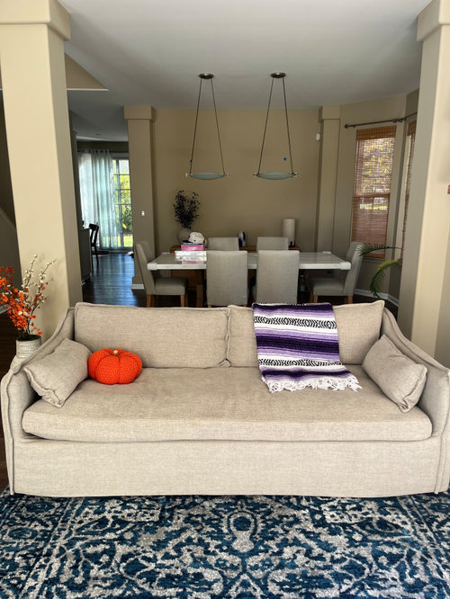
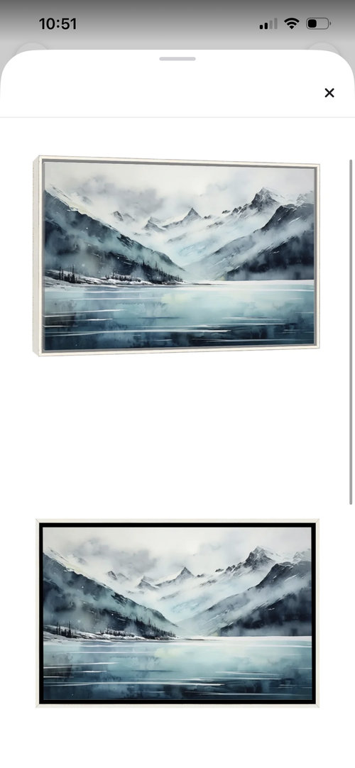
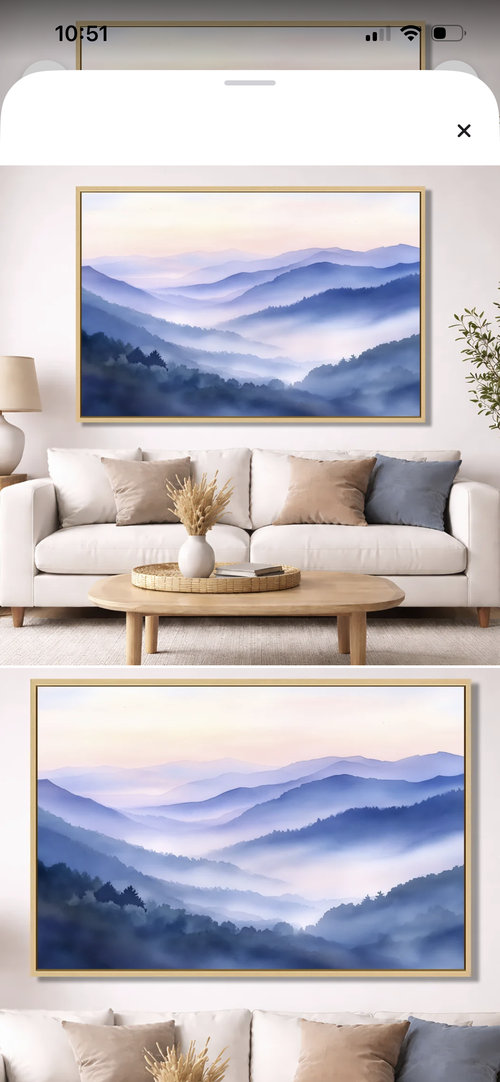
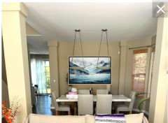
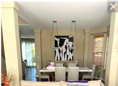
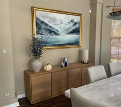
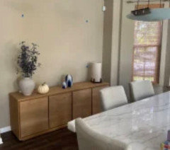
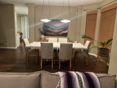
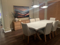
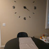
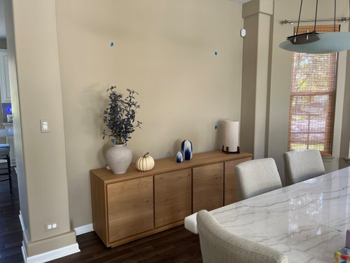
Please help us decide which of two art pieces looks better in our space! It’s our living room/dining room- the blue tape above the console shows where it will go.


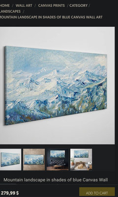
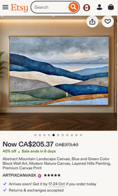
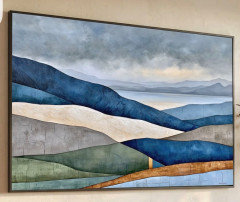
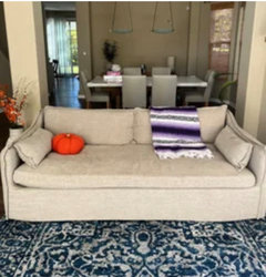
You can see we have a blue rug in our living room, so narrowed it down to two pieces with blue in them with the intent to connect the rooms. We do have blue accents as well but not seen in the photos.


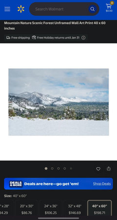
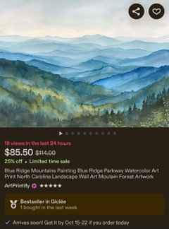
Art pieces pictured below as well. Advice welcome! Thank you!!!


Comments (27)

  • 24 days ago

    Art does not need to match the rug at all. Art should be bought because you love it and it speaks to you emotionally ... and not because it matches some replaceable item in your decor scheme.

    Art is personal and subjective, so no one else should be choosing it for you.

  • 24 days ago

    @chispa - the blue tie-in was at the suggestion of a few designers who visited our home- and more importantly, my husband and I fully agree! So now knowing this- are you able to answer my original question?

  • 24 days ago

    of the two, I would choose the Aqua tone blue.

    Softer and it compliments the light fixtures over the dining table

    meladurango thanked Lyn Nielson
  • 24 days ago

    If it was me, I would pick something with prominent blues but not *only* blues, to give you more wiggle room as times goes on.

    I also see you have a more violet colored throw, so perhaps you might like a bit of other colors thrown in?


    meladurango thanked bjstem
  • PRO
    24 days ago
    last modified: 24 days ago
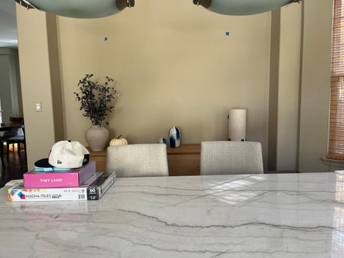
    Here is your room with the art. IMO the dining lights might be a bit too low. If your ceiling is about 9ft then the lights should be about 3ft above the top of the table.


    meladurango thanked BeverlyFLADeziner
  • PRO
    24 days ago

    I do not like any of the 2 for this living /Dining room. They are beautiful paintings but a little too much blue. You have a beautiful warm yellow(?) Beige Hue to your walls and something mostly blue but mixed, framed in either wood or gold would look very nice and tie the walls with the blue everywhere else.

    If you absolutely only want to choose from these 2, I would suggest the top photo as the colors are more muted. You don't want to get a painting saturated in bright colors while everything else is muted in the house.

    meladurango thanked SF INTERIORS
  • PRO
    24 days ago

    To add, here is how it would possibly look with a gold frame ( either thin or thick can go well) and bring the painting down so it is roughly 6 to 8 inches above the console but no more. If you show what blue accents you have, the painting you chose might fit better. Are you open to other blue paintings or have you decided on these 2?

    meladurango thanked SF INTERIORS
  • 24 days ago
    last modified: 24 days ago
    @SF INTERIORS - not glued to those two. But our budget is $350. It’s quite hard to come by in a 40x60 piece. And we love mountains! They are special to us so wanted to have that personal touch. I appreciate your message!!

  • 24 days ago

    Aqua and I might spring to have it matted in white to play off your table with a wood frame that plays off the buffet. Alternatively, I would go with more color to bring in some brown. I like multicolors so bias there.
    and play well

    meladurango thanked Renee
  • PRO
    24 days ago

    These are all significantly under 350 and blue mainly and mountains. You can also get smaller size prints and put them in gold frame like I showed you, get archive-quality matting so it looks professional. They are a little more muted down and not as striking blue, but these are good examples that would fit well with your space. I would suggest a painting that has some yellow and beige to tie in with the walls. Not your style?

  • PRO
    24 days ago

    I particularly am biased on the first painting I sent you of Colorado, as I used to hike and visit often. You can absolutely make it more intimate and a conversation starter by getting a mountain you and hubby visited and play around with it till its blue and get it printed out or get a similar canvas of a location you love. You have many choices by searching for blue mountain ranges. Just make sure it has some other colors such as yellow or green or white as well.

  • 24 days ago

    @SF INTERIORS you are so sweet to share all those options and elaborate on your expertise! We are taking in all your advice. So helpful thank you!!

  • PRO
    24 days ago

    My pleasure!

    Feel free to update any new finds you like or find while searching. Happy to see what you choose.

    meladurango thanked SF INTERIORS
  • PRO
    24 days ago

    If the artworks you have selected are special to you (as you said they are) they you should use them and you should use whichever appeals to you the most.

  • 23 days ago

    @AUSJOJO - lovely artwork indeed. But they are too small for my space for one. And a bit out of budget for another lol

  • 23 days ago

    I agree that a portrait or square will fit better. And even if the art pieces Bev picked out I still like great big canvass for options.

    meladurango thanked justcallmepool
  • 23 days ago
    last modified: 23 days ago

    Both feel a bit generic, but if you love scenery/mountains and want blue, both meet the criteria. You may though want to consider what suits a modern dining room and what resonates the most personally. Maybe have a look on Etsy.


    To create a connection with the living room’s rug, pull the spaces together with cushions. The designers may have said to use blue, but how is key.


  • 23 days ago

    Above are good options to consider. This one a bit outside your budget it is a 36 x 24 and comes in a few sizes.


    It is textured. Here's the link


    Textured mountain picture

    or

    https://artextured.com/products/whispered-peaks-textured-minimalist-mountain-abstract-wall-art?_pos=12&_sid=fd1a9ccbd&_ss=r&variant=51393011581241


    meladurango thanked SD
  • 23 days ago
    last modified: 23 days ago

    My thoughts were in line with what Beverly FLA suggested, but she articulates it better, that’s why she’s a ”Pro” & I’m not . i thought something more interesting & square. But you & your husband have to love whatever you choose. Good luck.

    meladurango thanked K Laurence
  • 22 days ago
    last modified: 22 days ago

    @SD the buffet console is 80” W. The wall itself is 100” W, with 80” of space above the console. I’m no designer but I fear anything much shorter than 40 x 60” will make it look very bare and chintzy!

  • 22 days ago

    @BeverlyFLADeziner - We are aiming to go against the common ”beige” aesthetic in our art choice. But I do appreciate the shape suggestions.


    The space is very large though so even a square or vertical piece I would assume needs to be large. The buffet console is 80” W. The wall itself is 100” W, with 80” of space above the console. I’m no designer but I fear anything much smaller than 40 x 60” will make it look very bare and chintzy!


  • 22 days ago
    last modified: 21 days ago

    Cut different sizes of Kraft paper and tape to wall and height is important as well. Ignore the content, only providing to help with visualizing a balanced vignette.


    meladurango thanked Maureen
  • PRO
    22 days ago

    If you do not want beige, avoid all the suggestions for beige and go with what you wanted which was something colorful/ blue and mountain_/ocean related. Something sentimental. A

    As Norwood Architects said, just choose whatever you want that is a reminder of your trips/memories. If you are set on the two you found in your OP, the first one is nice and framed can look good. Adding blue accents might be all you really need to tie in the space.

    There's 1000s upon 1000s of different paintings that can fit your criteria, so finding one that is sentimental to you, I think is key.

    meladurango thanked SF INTERIORS
  • 2 days ago

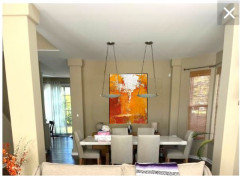
    @SF INTERIORS I had to share our pick! We are incredibly happy with it. Your help was very appreciated.


    Everone’s help was!


  • PRO
    yesterday

    Wow!

    Well done. It looks absolutely amazing here and while it is colorful, the deep red/purple tones are beautiful against the wood everywhere! You do not even need the purple throw( unless you want it); it looks fine as is. I am glad you stuck with your intuition and went with what you wanted. I love the painting :)

  • 11 hours ago

    @SF INTERIORS yayy thank you for your response!!!