

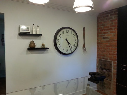
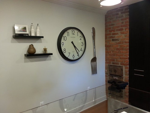
Which fork!?
12 years ago
Featured Answer
Sort by:Oldest
Comments (50)
 12 years ago
 12 years ago
Related Professionals
New Braunfels Interior Designers & Decorators · Gloucester Interior Designers & Decorators · Garden City Interior Designers & Decorators · Great Falls Interior Designers & Decorators · Cornwall Interior Designers & Decorators · Bronx Interior Designers & Decorators · Hot Springs Architects & Building Designers · Jacksonville Architects & Building Designers · Columbus Architects & Building Designers · Marietta Kitchen & Bathroom Designers · Myrtle Beach Kitchen & Bathroom Designers · Lafayette Kitchen & Bathroom Designers · Grand Rapids Kitchen & Bathroom Designers · Mission Viejo Kitchen & Bathroom Designers · Palm Desert Kitchen & Bathroom Designers 12 years ago
 12 years ago
 12 years ago
 12 years ago
 12 years ago
 PRO12 years ago
 12 years ago
- 12 years ago
 PRO12 years agolast modified: 12 years ago
- PRO12 years ago
- PRO12 years ago
- 12 years ago
- 12 years ago
- 12 years ago
 12 years ago
 12 years ago
- 12 years ago
- 12 years ago
 PRO12 years ago
- 12 years ago
- 12 years ago
- 12 years ago
- 12 years ago
- 12 years ago
 12 years ago
 12 years ago
 12 years ago
- 12 years ago
- 12 years ago
- 12 years ago
- 12 years ago
 PRO12 years ago
 12 years ago
- PRO12 years ago
- 12 years ago
- PRO12 years ago
- 12 years ago
 PRO12 years ago
- 12 years ago
- 12 years ago
 12 years ago
 12 years ago
- 12 years agolast modified: 12 years ago
 PRO12 years ago
 12 years ago
 12 years ago
 PRO12 years ago


Related Stories
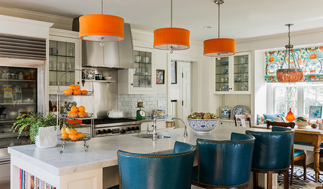
LIGHTINGAmp Up Your Room With Colorful Lampshades
Make a big impact minus the big cash fork-over by swapping white shades for ones in headier colors
Full Story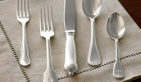
DINING ROOMSGuest Picks: Fresh Flatware
Time for a new set? 20 new favorite styles for your forks, spoons and knives
Full Story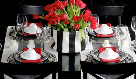
ENTERTAININGGot Hand-Me-Down Dinnerware? Make a Memorable Meal
They might be mismatched and not your style, but those inherited plates and forks can help bring meaning to your table
Full Story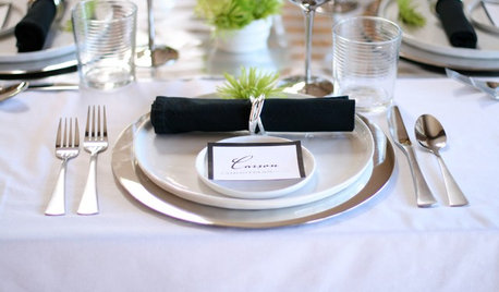
ENTERTAININGA Place for Everything: Beautiful Ways to Style Your Table
Polish your silver and pull out your china as we look at how tables were laid out traditionally and how they shine now
Full Story
EDIBLE GARDENSHow to Add an Apple Tree to Your Edible Garden
Readily available, beautiful and fragrant, apple trees offer four-season interest along with crisp, juicy fruit
Full Story
HOME TECHWhy Google Just Paid $3.2 Billion for a Company That Makes Thermostats
Smart home technology just got a new champion — and everyone is speculating about the reasons
Full Story
ENTERTAININGHouzz Guide: How to Set a Table
Here’s everything you need to know to prep your table for a get-together
Full Story
DECORATING GUIDESLiving Room Features That Never Go Out of Style
These key pieces will help your living room keep its good looks, no matter what's in fashion
Full Story
LIFEWhy We Want a House With a Great View
Research shows that just looking at nature has powerful mental benefits. Here's how to get a boost — with or without a million-dollar view
Full Story
DECORATING STYLESCity View: Dallas Design Corrals a Range of Styles
All antlers and cowhide? Hardly. See the real styles and trends, and the misconceptions, about design in this Lone Star State hub
Full Story





shannonscaliciOriginal Author