Software
Houzz Logo Print
mary_sheehanzsemlye

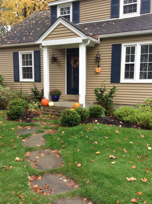
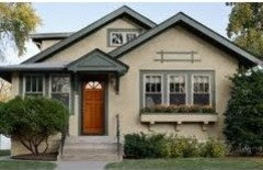
Please help me pick a color for my front door.

The roof is being done shades of dark brown. I've included a wrought iron piece-thought maybe it would look good above the door? Don't think so now-too curved? Any ideas to add interest to the garage end of house? Thanks!

Comments (156)

  • 12 years ago
    Thank you...as noted above my roof is being done in shades of brown in the spring. If you look more closely the house is gold with navy shutters. Amycali gave great suggestions..
  • 12 years ago
    Your house is still charming, and I like what lwaylette said!!
  • 12 years ago
    Lucyhomedecor...thank you..love that color!
  • 12 years ago
    last modified: 12 years ago
    Again, orange won't work because the shutters are navy, but look black and you get the Halloween look.

    Even though the roof will be shades in brown the shutters look black, and black and orange...well, you know....Halloween. Not good.

    Amy Cali got it right on the colors and choosing one of those colors would be fabulous.
    Mary Sheehan Zsemlye thanked ghesa1
  • 12 years ago
    Holy cow what a dialog! I have an art background and agree with Anne Carlson speaking of the color wheel, suggesting a front door choice of either dark brickish/brown /red (oxblood)or a periwinkle blue, in a med/dark shade. Your third color on your home is your dark contrast shade and your front door should be in a similar shade (value) range, in my opinion. And since your shutters are already navy, it would certainly be safe to paint the front door in the dk blue wheel, but maybe more interesting to choose from the brownish/ red wheel to set it apart. It should be of the darker value though, with the casing around your door painted white. I have a French Normandy style home and chose a similar combination last year from Sherwin Williams- "Universal Khaki" and "Dover White" trim. Our front door was Martha Stewart "Mariner", a dark French blue. This color combo WAS a professional choice trio from Sherwin Williams, the Khaki & white & dark blue. We just changed the colors slightly but kept the shade ranges (values) the same. We dont have shutters but Im hoping to add them in the dark blue & then will change my front door to a brickish bronze. All our outdoor lighting fixtures, house numbers, doorknobs etc, & any future garage door hardware are dark bronze. We got our house numbers from Pottery Barn, loved their detail, size & weight. Our roof is also done in shades of brown. I really love your navy color shutters and agree it is their scale that is incorrect. They should be the size of half your window width. Your garage would really be improved with windows that are larger with panes closer to the pane size of your house windows. . That may need to be a project for later. Until then, paint their current pane trims with white., to match your house. Your garage needs more white trim for balance. The dark shade should only be done in hints here and there not too overpowering. I think you should paint your light fixtures bronze not black, to pull from your roof color. That will be the hint of contrast you need on the garage. Or you could add bronze flower bed lighting which we did from Home Depot & it is subtle, but is a nice added detail repeating the bronze, but just a hint. Lastly I agree with Elizabeth Woodfield, we can share opinions without being snarky, they're just opinions & paint, not world peace! Enjoy the process.
  • 12 years ago
    I am also liking the periwinkle color suggestions for the front door and painting the light fixtures bronze and adding other bronze hardware. Some more excellent suggestions by Debbie Field and Anne Carlson.
  • 12 years ago
    Oh jeez Mary what happened? Now you know I'm a fan and I try to be supportive. However, for me, the orange is a clear swing and a miss. (sorry). How are you feeling about it? You know at the end of the day that is all that really matters.
  • 12 years ago
    Amy Cali - thought of you...while painting! I loved the pumpkin and was excited to try something I wouldn't normally do...it will get changed next weekend! :/
  • 12 years ago
    ehh que sera sera at least you can say you gave it a shot! I'd keep it for Halloween then get back to trusting that sophisticated eye you have ;)
  • 12 years ago
    Debbiefield-thank you...appreciate the comments about the color wheel. I painted over my white trim around the door. Ugh..May have to live with that. I will repaint it this weekend. My light fixtures are an antique bronze or weathered bronze...not bright enough? I am putting hardware on the garage door. I also like the scrip numbers someone suggested putting them above the door instead of the wrought iron piece. Thanks again for the input.
  • 12 years ago
    Lol Amy Cali..even my 13 y/o son hated it.....
  • 12 years ago
    An entry door is the most important feature in a home. It should make a statement about you and your home. It sets the standard and the feelings you get when you enter your home. If it is just plain and makes no statement, then your guest will assume they are just at an ordinary place and will react accordingly. If its elegant and powerful, then your guest will feel important, and have respect for you. I have been installing and designing entry systems for years. There are no rules. To be honest with you it doesn't have to match at all, of course we all want it to blend or pop, depending on the effect you are going for. I personally like mine to pop and make a huge bold statement. In the case of your house, I personally would add a powerful but somewhat traditional style glass first, Then depending on the style of glass, I would go with a red, or orange. Possibly a brass or copper color would look awesome as well. I have found there are so many new options with paint and color, it's mind boggling. I just did my walls on front of my house with a base coat of solid orange, spray a transparent stain over it in walnut, and my house looks like leather now, it's incredible. The blue door I saw on someones post, is completely wrong if your going for matching and subtle elegance. Blue never offers elegance. I wish you luck with your quest for color. I think you should get yourself a fandeck from the paint store, and have fun with looking at the hundreds of colors and pick one that makes you want to enter. You will know it when you see it. I think you have unlimited possibilities. You obviously have style and are great with color choices, the house looks amazing. You should be proud. Have a great day, and thanks for allowing me to share my opinion. Tomac
  • 12 years ago
    @tomac12,

    How about providing some pictures of the entry systems you have been designing for years?

    Your advice is all over the place and just plain wrong on the orange for this door. Blue would be better than orange and so would many other colors, but just not orange.
  • 12 years ago
    red door!!!!!
  • 12 years ago
    I just uploaded a couple jobs in progress, and my website is artistryinglassbytomac.com I am not here to sell or be a know it all, I am in a very upscale design district and I see some things that sound horrible, but are incredible when applied correctly. I have seen almost everything imaginable, and sometimes it sounds terrible, but once implemented it is remarkable. As fa as being all over the place, this is the first time I ever involved myself in something like this, I am not sure what to say or do. I have been in business for thirty years, but computers and the blogging system are all new to me. So forgive me if I was out of line. Have a great day!
    Tomac
  • 12 years ago
    great color! My suggestion was either to match the pumpkins or to go with a natural wood with a lot of orange tone in it with a window with a curvy swiry inset ( the type you sees on bungalow homes)...at this point you may want to research a curvy full inset for your storm door :)
  • 12 years ago
    or add some tall spiral shrubs on either side of the stoop against the house....!
  • 12 years ago
    i meant swirly...HAHAHAHA your front door is drawing attention as it should.. now put some jewelery on it!! When and if you can afford it go for the natural wood door with the warm orange and gold tones mainly orange and a window with a swirly grill (of course then leave the storm door plain and not orange painted) ..you will love it!
  • 12 years ago
    I wouldnt consider your wrought iron piece pic above for outdoor, it is just not heavy enough to make a statement
  • 12 years ago
    the rhubarb was my choice on the above 4 colors
  • 12 years ago
    Burnt orange
  • 12 years ago
    Please no orange.
  • 12 years ago
    Orange is all gone- back to navy blue will change in the spring! Lol...
  • 12 years ago
    Wow! I have to read the whole post. Sometimes asking the paint store people help. You could do swatches of color rather than painting the whole door.
  • 12 years ago
    To tomac, this site is dealing with a condescending person, namely ghesa1. One must ignore him or her. He or she needs social skills advice. You are absolutely right. First, the color depends on the gold or whatever color the siding is. Then one works with the color wheel to find the right contrast or complement. I am not sure navy blue is the right color for the shutters. I agree a professional needs to add input. If you have a color for instance of red, the obvious contrast is green like the Christmas colors. The orange may have worked but it appears it was the wrong orange. If the Siding is a real gold then you determine what goes with a gold color. A brown roof sounds good. And I agree the garage door should probably blend with the rest of the house and not stand out. Try samples of colors on swatches.
  • 12 years ago
    Your siding looks like a green gold. There is a house on houzz that has a similar color and I think a green similar to a muted army green suits the siding color. I would also ask someone at the paint store.
  • 12 years ago
    Something like this.
  • 12 years ago
    Hi there. I am completely new to the discussion, but I love the house, and the current color combinations. I think you have a lot of options you could use for the door-and I did not think that the orange was a bad color for the door. I do think that maybe painting the storm door might have been too much, but it was a dark orange, and orange does not clash with either the rather brownish gold of the house, and certainly not blue. However, I realize that the decision has been made to paint the door another color, and I like the Spanish Red color, myself.
  • PRO
    12 years ago
    I, too, am late to the party, but someone asked me to take a look at this dilemma, so here I am. You have a beautiful house, and even tho your shutters are not sized properly, I DO like them and would keep them.

    I'd happily suggest a couple of door colors if I knew what shade of blue and gold your shutters and siding were. If that has been stated previously, I apologize. Maybe someone who has followed the entire post would tell me what they are.

    The iron scroll would not go well with your home, so I hope you have eliminated that idea.
    Carolyn Albert-Kincl, ASID
  • 12 years ago
    I have a white house with battleship gray trim (no shutters) and I boldly painted my front door red - and I've gotten a ton of compliments on it.
  • PRO
    12 years ago
    Yes, that sounds like a nice combination for a white house with battleship gray trim, but on a blue and gold house, with white trim, I'm afraid a red door might look overly patriotic.
  • 12 years ago
    How about the one we all missed? A white door. I think it would still pop.
  • 12 years ago
    Thank you Carolyn!! The house has navy blue shutters. The front door was changed from navy to orange back to navy. I don't think the color of the siding was stated. I will look.
  • 12 years ago
    Owner calls siding color gold Carolyn. She has copper fixtures and someone said to paint them black with navy shutters.
  • PRO
    12 years ago
    last modified: 12 years ago
    I adore the idea of an orange door for this house! One shade lighter than the BM pumpkin pie, which would be BM harvest moon, should look great with matching trim.
    Carolyn Albert-Kincl, ASID
  • 12 years ago
    Red or burgundy door.
  • 12 years ago
    Dont want to be critical, but i strongly suggest you listen to the professionals, the designer. Carolyn does a beautiful job with all of her advice on Houzz...and she is very nice and professional. Red or burgundy does not go with the color combo of the home. It is very important to put colors the way colors complement each other and not just because someone may like it.
  • PRO
    12 years ago
    Thank you, bevballew, for the very kind words. This dilemma seems to have had a lot of negative influence from the anti-orange camp which has led Mary away from that color. The photos of the house with the door painted orange were wonderful, even if the orange was perhaps not quite the right orange. If you like orange, then I'd definitely paint the door orange again.
  • 12 years ago
    I like the idea of an orange shade with the shutter color, but am struggling a bit with an orange shade with the current siding color.
  • 12 years ago
    Mary, sometimes experiences like this (which many of us have:) make us realize how nice something looked originally. My first thought when I first saw this post is what a nice looking house you have. The door looks great in navy IMO.
  • 12 years ago
    Thank you Carolyn for your input. Yes, the negative, critical responses and reactions upset me and I knew you would have the correct response and it was needed especially since Mary got upset and went back to blue.
  • PRO
    12 years ago
    last modified: 12 years ago
    If I had only seen the colors on my computer, I would agree that the orange does not go with the siding color. But I have also seen the colors on my iPad which has much better color rendition than my Dell computer, and on the iPad, the orange looks great with the siding.

    Mary, if your siding color is gold, then the orange should work beautifully. But if your siding has any pinkish tones to it, then I would not select orange, and instead would look at something like Sherwin-Williams Foxy, which is a dark pinkish coral. It's long been a favorite color of mine. Yes, I'm a professional interior designer, but I'm not a professional interior designer standing in your front yard. That's why my first posting on this dilemma asked what colors the siding and the blue shutters were. What I needed to know were the brand and color names or numbers of the paints.
  • 12 years ago
    I had said that I thought that the Spanish Red would work, but on my monitor it looks like a red that I would classify as a dark, "brick" red.
    Carolyn, you are a professional, so you are familiar with these color schemes and know which ones do match. The overall color scheme of the house is nice, so I'm sure Mary will find one that coordinates nicely.
  • PRO
    12 years ago
    last modified: 12 years ago
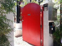
    I would recommend a red door, similar to what we did for one of our clients in the picture below. At the end of the day, color is a very personal choice and it should express the feelings of the owner.
  • 12 years ago
    Beautiful red door but you have to take into account the other colors on a house. This house does not have a coordinating siding for a red door.
  • 12 years ago
    I didn't realize my house was still being discussed! LOL I painted my door back to navy blue...the orange looked soo bad and I took so much flack from family and friends I may never change it!! love this site and the kind words most share!
  • 12 years ago
    Well, perhaps you can tell your family and friends that you want to change it from the navy blue, and ask them to make suggestions. Maybe then, with the suggestions here, you can come to a consensus about a new color. So, good luck on finding the elusive "just right" color for your door.