Software
Houzz Logo Print
rogerb

Door color

12 years ago
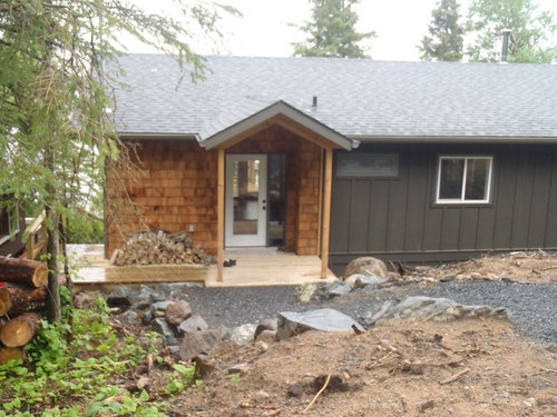
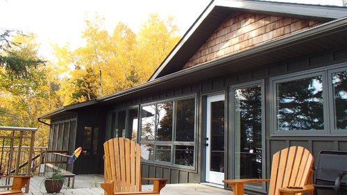
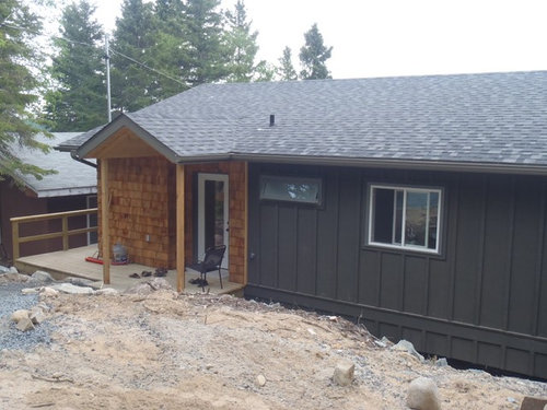
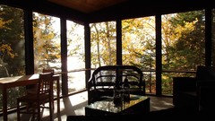
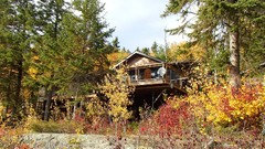
Finishing up our cottage and have 2 doors to paint. South gets full exposure and opens onto a deck. The north or formal entry door is surrounded by cedar shake. Otherwise whole cottage is monochromatic slate grey. Was thinking high gloss black for both but concerned about scuffs and blistering. Open to any suggestion. Was considering a brass or brushed aluminum kick plate also.

Comments (28)

  • 12 years ago
    I suggest to choose the lightest grey of the roof for the doors.
    I also like the idea of black.
    Roger Burns thanked Maryam Alborzi
  • 12 years ago
    How about burgundy or red?
    Roger Burns thanked candies1
  • 12 years ago
    I suggest Benjamin Moore's "Dinner Party"
  • 12 years ago
    I think a nice shade of sage green would look good.
  • 12 years ago
    This would be my pick - Anjou Pear by S-W.
  • 12 years ago
    Thanks so much. These are the imaginations I need to play with. It's tough to work with the wood, and the grey. I have a red on my White House that looks good so color is welcome. Is there a paint company software that lets you play with color changes to door?
  • 12 years ago
    Will you let the cedar shake go gray / weather / stain it like driftwood or is it your intention that it remain natural? The dijon tone is a fun one -test also sw bees wax if you like that idea also turquoise blue would be amazing - try sw gulfstream

    one small note - are those posts that hold up the gable over the front door termporary? if not, proportions need beefing up - can square up and trim columns out.
  • 12 years ago
    Roger, I have both Behr and Sherwin-Williams apps on my iPad - I'm sure there's a desk top version. Word of warning - I still haven't really figured either of them out, so IMO not very user friendly. Even my 15 year old daughter wasn't able to help me, and you know it's just in their DNA by now lol. Hopefully, you will have better luck!
  • 12 years ago
    Do front and back doors need to match color?
    I do think the posts will beef up - do I finish in cedar shake or 2x6 wrap?
    Also thinking I will treat cedar to keep the clean look..
  • 12 years ago
    Karen . Love your comment about your kids being stumped by the software! Will give it a whirl and see how I do. Thanks for the tip
  • 12 years ago
    I like the idea of a dark green. Compliments the colors of the house, but goes with the woodsy feel of the lot.
  • 12 years ago
    Dark green to door or cedar. Hadn't thought of green but seems very logical
  • 12 years ago
    Roger, I would wrap the posts in 2X6 and paint same color as siding. I like the idea of preserving the gold color of the shakes. Personally, I don't care for the weathered cedar look,but especially in your case where that gold tone is working so well with the green siding.

    No, your front and back door colors don't need to match. If it was me, I would do the back door one shade lighter than the siding, and leave the punch color for the front door.
  • 12 years ago
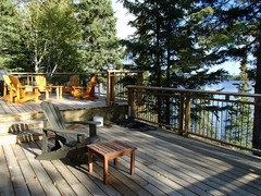
    Roger, I hadn't looked at your pics in awhile and, looking at them once again, I cant decide which you are calling the front door! We always had this argument (friendly) when we owned a cottage, and was the lakeside the front, or the side where you drive up the back? I'm now a little undecided here because you have the "approach" side which should be attractive, and the lake side where you will spend most of your time. I still think you can use two different colors, but maybe I wouldn't default to the two-shades-lighter idea. It seems a little blah for an area where you will spend a lot of time. If you have patio furniture or a patio umbrella with a specific color you can pull from that, this could be your door color for the lake side. It's perfectly OK to use the door color as part of the design!
  • PRO
    12 years ago
    Roger,
    Your cottage looks like a real gem.
    One of the great things about front doors is that they can either be finished to match a color/finish found on the interior or exterior of the home, or they can be a perfect location to add an accent of color. You could go with any shade of green to tie into the beautiful surrounding vegetation, or go with a bold color choice like red to make a design statement.
    The only real limitation is your imagination for the space. Please keep us posted on your final decision...I know you have many comments here to help you make your own! Good luck!
  • 12 years ago
    Thank you everyone. This is soon helpful. And your professional input is very appreciated and very respected. Thanks!

    Front door has gravel approach, back is large deck. And now that I think of it that makes no sense! Oh well - the privilege of ownership!!

    I prefer to sustain the clear new finish to shakes and look to find a product to help that.

    This fall I will chub up the posts.
    Q. Vertical or narrowing tower shape???
  • 12 years ago
    Needs a pop of color and beef up those posts!
  • 12 years ago
    Ransoms of the almost finished cottage
  • PRO
    12 years ago
    Brushed aluminum kick plate
  • PRO
    12 years ago
    Use high gloss black paint for the door. It will balance and ground the left side of the home. A "color" May detract from the design element you have going on. You can never go wrong with black! Make sure the door is professionally painted and done by hand door high gloss!
  • 12 years ago
    Roger, Beautiful cottage and property. We used to have a cottage on Sylvan Lake in Alberta and had a very similar lot (medium bank). I still see a Dijon color on front and back as I think it will blend very well with the natural surroundings, and look especially awesome in the autumn! I also like the idea of a pop of color since cottages,don't usually have flower beds or other hits of contrast - just lots of shades of green - and black when they're in the shadows.
  • PRO
    12 years ago
    What a great place!
  • 12 years ago
    Vertical posts, no taper 2 x 8 wrap + 1 x 14 trim / bottom 1 x 12 top chamfer traditional/ straight better w lines.

    Doors are easy to paint - try anything and switch later. K is right about her gold, though I would say more of a chartreuse green - a green that will still give you the contemporary pop against both elements but also resonate with the gold in the wood tone. Or paint a red w some orange in it to pick up the warm orange undertone of wood - sw fireweed is a great option there. I will come back w some specifics.
  • 12 years ago
    Libra thanks for the design ideas for post. Have no real saw skill but looking forward to tackling. Looks simple enough. Go with cedar to all materials? Or a harder wood and stain?
  • 12 years ago
    Cedar - and here, I went looking at colors and had an ephiphany. What about purple? Just like the orange of the wood is halfway between the primaries red and yellow, purple is halfway between red and blue. It will echo the gray in depth but provide contrast and the modern pop - you could pick a very blue-violet like iris but the one I pulled is sw izmir purple. http://www.sherwin-williams.com/homeowners/color/find-and-explore-colors/paint-colors-by-family/SW6825-izmir-purple/
  • 12 years ago
    Love Karemore's idea of Anjou Pear!
  • 12 years ago
    I would go for a glorious Orange color. Not a pumpkin color, but perhaps a deeper orange/red. I saw a similar color combo at a resort on the Jersey Shore.The doors where a great orange and there was stone and natural materials. Really great look. Try: Raucous Orange, Daredevil or Energetic Orange by Sherwin Wiliams.