Software
Houzz Logo Print
teambell

Need help pulling my guest bedroom together.

12 years ago
last modified: 12 years ago
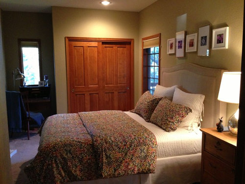
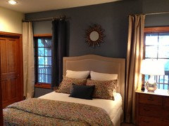
I've purchased the bedding and the headboard. I need to paint the walls and add new window treatments. Any other suggestions I'd happily take as well. It's not a huge room (I'm maxed out at the end of the bed) and gets very little natural light. The current color was painted before we moved in and is way too dark and green. I'd love to accent with purple or blue. Please help! Oh, there is a bathroom off this room as well. The main area of the house and the hallway going into the room is Benjamin Moore Manchester Tan HC-81.

Comments (143)

  • PRO
    12 years ago
    last modified: 12 years ago
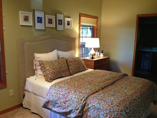
    Wow.....you've been busy! I'll start with the window treatments.......I find the valance and sheer you just posted are very traditional for the bedding. Just plain roman shades look unfinished. I like the curtains but you're right some with a sheen like silk would be better. You could also add sheers to have a more polished and elegant look. As for the height, I disagree that it should always be at the ceiling. It depends on the overall space. To me the empty wall space between the window and the ceiling just looks odd sometimes. But at this point it's more a matter of personal preference. I still suggest hanging a single panel for the small window. The curtains would make the nook a cozy focal point without being overwhelming.
  • PRO
    12 years ago
    last modified: 12 years ago
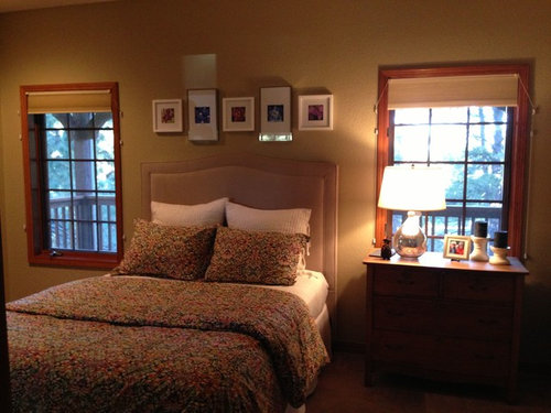
    I don't find the starburst is too small. Don't forget that once the curtains (or shades) are properly hung and the hardware is installed that wall will be more filled. I like the subtle interest the smaller starburst adds.
  • PRO
    12 years ago
    last modified: 12 years ago
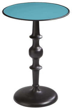
    As for the chair, I really like the colour of the blue one but prefer the shape of the chair you're thinking of reupholstering. The blue one would look nice with the desk but your chair would be better to create a reading nook. The arms and overall shape make it much more inviting to sit down and relax. An accent table is a good idea. Choose one that has texture with a different finish than the existing furniture. A darker one would be better to contrast with the wall. These are from Pier I Imports. I thought the one with the blue top could be interesting to go with the wall.
  • PRO
    12 years ago
    last modified: 12 years ago
    Art........either a large print like you mentioned (the zebra is whimsical like the bedding!) or you could use the small frames you had over the bed to create a collage on the wall closer to the chair (like litehearted suggested also).
  • 12 years ago
    I love the mirror,and the bedding.What shade blue did you paint?
  • 12 years ago
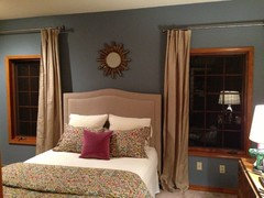
    I opted for Bachelor Blue, as Lydia had suggested. I finally have some things figured out and will post when I am complete. I opted for the solid silk drapery - which looks awesome - hung a little higher (they were 96" and it just worked out better to hang them higher).

    I didn't know if the chair I originally had was too big or not. Perhaps since it was the only thing on that side it was okay. I do like the tables. I did bring back some light purple in the pillow on bed and as a throw on chair. Also found a print that might work today (see attached). I like the zebra better, but thought it might be too much?
  • 12 years ago
    The color goes well with the bedding,very nice .
  • 12 years ago
    Oh I just seen the zebra pic..may be too busy,but love it.
  • 12 years ago
    Thanks decoratinglady5! The piece above actually is pretty subtle in the room, believe it or not!
  • PRO
    12 years ago
    You've done a great job. Depending on your style preference I would recommend either long drapes hung higher than the window to the left of the left window and the right of the right window or if you want to show the window frames, I'd use Natural Shades with an inside mount.
  • 12 years ago
    last modified: 12 years ago
    I need some help. I'm confused. I have about 26" from the top of the window molding to the ceiling. When I do research on this it states to go 4-6" above the molding if you have ceilings that are higher than 8'. My eye is having a hard time adjusting to seeing that much wall between molding and drapery rod (approx. 16"). Having the drapes higher gives a more formal look and having them lower is more casual... in my room.
  • PRO
    12 years ago
    What is most important is what looks good to you- if you think it looks too high then lower it closer to the top of your windows.
  • PRO
    12 years ago
    last modified: 12 years ago
    That's what I meant about it looking odd. I agree with Bali though. There are no rules.......your room looks great so whatever you find pleasing is the best choice for you. :)
  • PRO
    12 years ago
    last modified: 12 years ago
    Haphazardly came across this pillow and thought of your room. I think the zebra print would be fun in the room but if you think it's too much you can add an accent pillow instead that looks alot like the print! It's from Pier I Imports.
  • 12 years ago
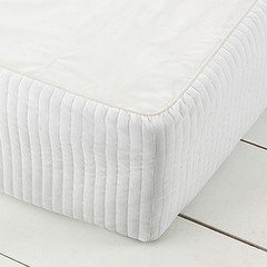
    What a gorgeous room! I think a bed wrap would look more modern than a vallance, you can get them at target for cheap and in all different colours.
  • 12 years ago
    i do not think you need anyone's help!! i love the one blue wall and the cream colour drapes or romans.
  • 12 years ago
    last modified: 12 years ago
    Thank you everyone. I'm just struggling with window panel placement since I don't have a good 'ole measurement! From the floor to the top of my window molding is 82". The panels are sold in 84" or 96". I actually like the look of about 10" above the molding - means I would have 4" to pool on the bottom. Hey - this is just what Lydia said earlier! Geez....

    Love the zebra pillow! Do you think the zebra print would be too much? Or, zebra pillow with painting above of forest?
  • PRO
    12 years ago
    Funny about the curtain height! The zebra print and the zebra pillow would probably be too much. Both together would take away from the originality of the other one. But the zebra pillow would be whimsical with the forest print. I noticed the forest print is vertical. You could use a vertical print if you hang it "above" the chair but if you want a print on the wall (centered with the bed) then I suggest a horizontal print. You could also hang two or three vertical paintings. As long as the artwork is nearly the same width as the bed.
  • 12 years ago
    You should do what you like, of course, but if I were staying in someone's guest room, not sure I'd want to look up and see that zebra dude staring back at me! LOL. Something about having eyes looking at you, can't really explain it! Anyway, I did like the other two prints, actually that first one you put up with the flowers, best of all, but that is me and this is YOUR guestroom after all! So if you love zebras, go for it! Question: In talk about need for a table near the chair and under whatever artwork you decide upon, what ever happened to that cute little desk you had in your room at the start? Could that make it's way to the wall under your artwork? Would you still have room for your upholstered chair? I like to have a table or desk in the room to set down my tablet, phone etc for charging.
  • 12 years ago
    So - here it is - two different heights. Which one? I just can't decide and my brain is freezing up! :)
  • 12 years ago
    close the curtains and see which you prefer!
  • 12 years ago
    oh and ditch the pink velvet cushion.. replace with blue faux silk.
  • 12 years ago
    LOL laurie - Kind of wondered about the zebra and if it might scare people! Maybe better suited to a common area. Since I got the most recent vertical print it's been interesting to see the colors - it looks good. However, as Lydia said, it's not right for the space size wise. I like the first one with flowers too, but would have to order it online - so you never know what you'll actually get. I'll have to sleep on it all.
  • PRO
    12 years ago
    last modified: 12 years ago
    You know which height I like! ;)
    The pink pillow looks great! Not so predictable.
  • 12 years ago
    I like the puddle on the floor and but hard to know from a picture. Also i would use a small table/desk in the nook area. Guests can sit and use the space for writing , computer etc.... Good job so far,,,,,,,,
  • 12 years ago
    last modified: 12 years ago
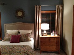
    So, just got my 18 yr. old daughters opinion (and she's pretty good at this stuff) and she didn't like either. Felt it shortened the room a lot - I have to agree - closed it in. Maybe it just felt that way because it's dark outside. It's not a big room to begin with. Maybe going back to roman shades that I make out of the fabric I purchased to match headboard would work best. I like the drapery, but it also makes the room more formal and although it is a guest room, my 19 year old son stays in it when he is home from college also. Time to sleep on it and see how I feel in the morning!
  • 12 years ago
    last modified: 12 years ago
    Last photo then I'm done - promise. Who said my daughter could have an opinion anyway?

    I'ts not crooked - I am.
  • PRO
    12 years ago
    last modified: 12 years ago
    lol......I think you really need to sleep on this! I like it though. Curtains make the room cozier and warmer (roman shades look bare and cold). They also add volume to the upholstered headboard. I'm thinking adding sheers would soften the look. But If you choose roman shades I suggest hanging them inside the window. They look odd just hanging on the wall. They also hide the details of the windows which are pretty. Hope I didn't confuse you even more! P.S. you shouldn't design a guest room depending on who sleeps there (aka your son). This is your house and guests should be happy to have a place to stay. My guest room is antique pink! ;)
  • 12 years ago
    romans will be lovely. beautiful room. can i be your guest? LOL you could open a nice b and b in this room!
  • 12 years ago
    LOL - that's awesome. Wonder what my husband would say to pink! I figure this is the only room I can have some fun in and do what I want. I think it will look better in the light of day also. Everywhere else I have to take into consideration the rest of the family and I want a nice, restful, neutral palette everywhere else - so, here's my color!
  • 12 years ago
    Shannon - thanks for your support. It is pretty nice for a guest room :)
  • 12 years ago
    Team bell, with the chest of drawers and lamp back, the panels do look nice, my vote would be for the height you have on right side but I am no expert. Love what you have done with the room! Do hope you're able to find a new spot for the little desk- I am a sucker for those little compartments for stationary most of us no longer use, still SO cute!
  • 12 years ago
    I love the room, the colors and think the silk drapes are a great choice. BTW, where did you get the headboard? I am looking for one the same shape and color.
  • PRO
    12 years ago
    teambell, I would love to see the curtains be the accent wall color, or closely in that range. I didn't see it that way initially, but it seems so clear now. This would maintain the softness that the fabric infuses, but create a very strong focal point in the bed. Consider it. They need to be 2/3 high in the space between the molding and ceiling. Too low in your pic.
  • 12 years ago
    Lydia, what happened to pic of your guest room? I was going to take a peek again. :/
  • 12 years ago
    I'd paint the walls a light beige, similar to ottoman under new bedding. I'd do sheets in a green that is in the bedding. A second night stand, that is same color as current night stand. Glass lamps with linen shades & light linen panels on the windows. I'd use light beige paint in the bathroom & green towels. Definately remove the small pictures over the bed.
  • 12 years ago
    Got up this morning and decided the drapes were too much. They over power the headboard and that wall. One more thing I will try before going to roman shades is what Daniel suggested of going a blue, maybe a little lighter than what's on the wall to see if that blends a little better. I love the look of what I've done in other pictures, but it may be the wood that's throwing everything off, but it just isn't right in this room. I can't explain unless you are standing in the room... one of the limitations of the internet. :)
  • 12 years ago
    I've mocked up what a blue drape would look like (it's a throw I had). It's slightly deeper than the wall color. I like it. I also don't mind that it's hung higher and there isn't as much going on with contrast. Keeps the wall receded instead of moving in on me. This may be the answer!
  • 12 years ago
    Are you thinking of doing roman shades?
  • 12 years ago
    I now see the blue drape..and hung higher looks nice!!!
  • 12 years ago
    Teambell, you've got it now! Love this. Usually that distance between a rod and the window frame bothers me, but now that all is blue I think it all ties together beautifully. Looks rich and cozy. You've got a winner!
  • 12 years ago
    Yes I love it now!!!
  • 12 years ago
    Me too! Thanks to Daniel who suggested it. I like the darker as well.
  • 12 years ago
    last modified: 12 years ago
    Hi Teambell!

    That dark blue color on the wall looks really great. It has richness and a beautiful contrast to the beige.

    Now, I know you want drapes, and I can see why. If the spaces for the drapes were wider, they would add the softness, and detail I think you're looking for.

    The dark blue conceals that a bit, with just one in that spot, but the corner next to the closet, and with a nightstand, I think they will also end up taking away from the beautiful headboard, and the lovely design of the room, in general. It was a good idea, and worth a try.

    One of the outstanding details of your home is the finish trim. Your closets, and paned windows are beautiful architectural details to work with.

    I think with a pretty valance, nightstands with framed photos, etc would look beautiful.

    Also, I think you need something much larger and more colorful over the bed, that won't kill someone if it (they fall).

    I just saw the photo with the Roman shade option. That did not look good. I can see more why you went with the drapes. I don't think beige is the answer either way.

    A valance, that is three dimensional, and maybe the same print as the bedspread would be pretty. I think you need something brighter. You could kind of mimic the curve of the headboard, or a scallop, with trim.

    It is SO easy. I had them in a home of mine, and it's just a bit of screwing in corner pieces for the valance. Then you can sew, or fold edges, and use glue gun for that and any trim. I think that would be very pretty. All you do is really make a rectangle and do corner folds to create the dimension. I know you've done a lot of work already, and it's paid off.

    You could also try wall lighting on either side of the headboard?

    Maybe matching the red pillow (maroon) on the bed? And more on the bed.

    You'll do it. You work so hard, and have done a great job so far!
  • 12 years ago
    I love dark curtain. Great idea. I wish you would bring your original pictures above the bed. Why did everybody hate it? How many of these star mirrors can we all see? Dark color of the wall is very refreshing too. Bring it everywhere in the room.
  • 12 years ago
    last modified: 12 years ago
    Teambell,

    Okay, you are such a sweet person, and I care enough to want you to have the beautiful room you envisioned, and are working so hard on.

    I thought you were on your way for a bit, but I wonder if reading about color principles, the color wheel, and complementary colors, contrasting colors, etc. would help, give you some ideas. I refer to mine, often.

    I have participated in the discussion, and I feel a responsibility to tell the truth, because I'm just looking at photos, but you are spending your hard earned money, time and energy, to achieve something great. Decorating is VERY difficult, You're working with color, function, style, and other challenges with light, space, architecture that you cannot change, etc. It is NOT easy and you have worked hard!

    However, I think you are getting off track between what you want to make work, and what actually works, and looks good.

    The brightness in the bedding does not show up in the photos, so all we see is beige drapes, a beige headboard, and a very deep, chilly blue wall, half of the bedding folded down to expose plain white sheets, and pillows, dust ruffle, with a tiny dark blue accent pillow.

    If you look at the room, what looks the best is the blue wall against the beautiful warm cherry woodwork, because of the contrast. The cherry brings out the blue, and adds brightness and needed warmth.which showcases the beauty of the wood.

    The beige headboard is really very dull against the blue wall. It would be fine, and a good neutral to add some more color and pattern, with accessories, but alone, it's just kind of there. It is understandable, as the project has progressed, you seem to be becoming more timid in your choices, and a bit afraid of color, and bolder looks, because you have invested a lot in money and emotion, and really want to make what you already have work.

    (I painted a bathroom wall 8 times once, before I got the right one.)
    Cool colors need a warm color to contrast, so it will excite the eye, and actually be noticed.

    If you use all warm colors, or all cool colors, your eye just kinds of lazily glides along, and it doesn't look BAD, but it can also become almost invisible. and it's not the fantastic look i know you want. But a wall full of solids, and blue and beige, will definitely put you to sleep.

    You need pattern, and color.........orange, warm bright green, fuscia, (forget so much about making it palatable to male and female sensibilities. What you will do, and are doing is compromising so much, the room is just looking bland.

    Get some orange, green, and dark red striped valances with some trim. Get some brighter colored sheets, and different sizes and colored pillows, IN WARMER and Cooler colors and in prints, plaids, etc. The secret of mixing prints, and patterns, is to have them share just one color, and have one pattern be large, and one be half the size.

    My rule is since I like warm colors, I'll paint the walls a cool color, other wise if you put a painting with warmer colors, in a gold frame, on a warm beige wall, it looks okay, until you try it against a cool color. The first look is rather soothing.............works better than Ambien!

    Goethe said, "Boldness has genius." Another woman I respect, said," If you follow status quo, you will do okay, but you will never produce anything remarkable!

    You've got it in you.!! Erma Bombeck, a famous writer and syndicated journalist, who died of breast cancer, said, "If I had it to do over, I'd go for the white sofa, instead of the grey that wouldn't show the dirt"

    I have a quote of my own. "When in doubt, keep my mouth shut". However, I rarely follow my wisdom! :)
  • PRO
    12 years ago
    I like the lighter panels and the way they contrast against the wall. I would install the rod on the higher side with the panels just kissing the floor. You have done a great job transforming your room! Time to quit! You are done!
  • 12 years ago
    smdrovetto - thanks for the honest feedback. I honestly left the room for awhile since I was just too undecided about where to go from here. During this time I actually threw a bright orange pillow I had on the bed and it all came alive. I think you are right about throwing in more colors (warmer) and looking at options for my windows. I was actually planning a trip to the fabric store to pull together some other patterns, etc. I'll repost when I have gotten further along. I'm reminded there is no hurry and I want to make good choices.
  • PRO
    11 years ago
    White trim would warm up & make the room fall into place, with the white night stands suggested previously.
  • PRO
    9 years ago

    The guest bedroom looks old schooled, but it is very nice. I would do a few changes on the curtains such as adding a cream color window curtain to add lighting. Also, maybe changing the color walls into a warmer shade of grey to modernize it a bit more.