Software
Houzz Logo Print
divecaribbean

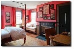
I love this wall color!

12 years ago
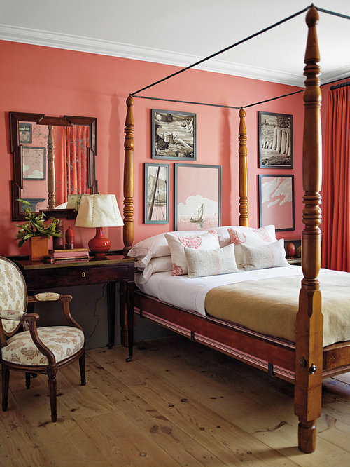
What a stunning room. Please do share the brand and paint color for the wall. I'm in love!
Steven Gambrel Time and Place · More Info

Comments (18)

  • 11 years ago
    Cool Lava seems far less salmony and a pink more suited for a child's room. I had this one pegged on either Persimmon 2088-40 or Coral Bronze 1298.
  • 11 years ago

    tool1974 Did you actually use the color? I agree I am amazed that it is cool lava. Going to get a sample. I lvoe the color too.


  • 11 years ago
    Hi Gina! Yes, I redid this room in my guest room. The designer is Steven Gambrel in his Sag Harbor home. I contacted his asst by email at his NY studio and got the whole paint schedule. I PROMISE you it is Cool Lava by Benjamin Moore.
  • 11 years ago
    I have the complete paint schedule if anyone needs it which includes ceiling color, sash color, color under chair rail, door color, and trim color. I did them all. If you look closely, you will see there is a cool muddy green color under the wall chair rail. Please put in steven gambrel sag harbor in a search engine and you will see more pics of this room.
  • 11 years ago
    Lighting will play a role in this too. In the light, the punk really comes out. At night, it's more coral. It's stunning. Look closely at the pic where you can see the wall color by the windows with the light hitting it. See how it looks more pink there? You will love it. When I get my bed accessories, I will post pics. It's my favorite room!
  • 11 years ago
    And use FLAT not eggshell or satin etc :)
  • 11 years ago
    Here's another view that really shows the pink in the cool lava :)
  • 11 years ago

    Thank you! I am convinced.

  • 11 years ago

    Do you know what color the trim is?


  • 11 years ago
    Hi Gina, yes I sure do. Let me copy that email that lists all the colors his asst gave me and I'll post it here.
  • 11 years ago
    WAINSCOTTING, TRIM AND TRANSOM
    COLOR: BM HC-103
    NAME: CROMWELL GRAY
    FINISH: SATIN IMPERVO

    CLOSET DOOR, SASHES, MANTLE
    COLOR: BM 1547
    NAME: DRAGONS BREATH
    FINISH: SATIN IMPERVO OIL

    WALLS (BASE)
    COLOR: BM 2088-50
    NAME: COOL LAVA
    FINISH: FLAT LATEX

    CEILING
    COLOR: BM
    NAME: SUPERWHITE
    FINISH: FLAT LATEX
  • 11 years ago

    you rock! Thanks


  • 11 years ago
    I don't know about that! Lol. But thanks. And I'm pretty darn sure that the color of the drapes is cadmium red. I didn't get that from the designers info or anything but someone had mentioned it under another post of this pic somewhere. I then looked online of fabric in that color and its spot on. The drapes are one thing I was having trouble with.
  • 11 years ago

    I have drapes in the room already. They were the start of the inspiration. Coral with a tad of butter yellow and sage green stripes coral is the core color though.

    Off to Benjamin this week curious if they will be able to mix the grey in oil. My mantel and trim are in white oil currently. I love oil paint! My recent experience at Sherwin is they only carry pure white


  • 11 years ago
    Oh I bet those are gorgeous :) are you talking about the Cromwell Gray color? They should be able to do it, it's satin impervo oil. That was the first time I think I've ever used oil and it's stunning. The fumes are just super strong! :)
  • 11 years ago

    Thank you for the wall colors. It's funny because depending on the designer you hear different opinions in terms of the finish. I know three designers all of whom are very talented in their own right, each with a different style of course, but one swears by flat finish, another recommends satin finish and the other one likes glossier finish. Each of their homes are stunningly beautiful. I know that flat is the hardest to clean though, scuffing easily. I'm torn, having seen all three.


    The Lava seems too pink for me in the other pic you posted so I think I'll stick with BM Coral Bronze but this is a good start for me. This room is gorgeous.

  • 11 years ago
    I agree! I'll read different columns where designers are quoted and it seems like they all have so many different opinions on finishes! I get so confused sometimes! Yes, if the cool lava is too pink, def dont do it. I really love just about any coral color I've seen :) I think coral is such a nice substitute for the traditional red :)