Software
Houzz Logo Print
teambell

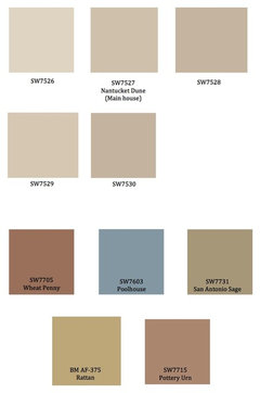
Think I've found my color palette! Do they work together?

12 years ago
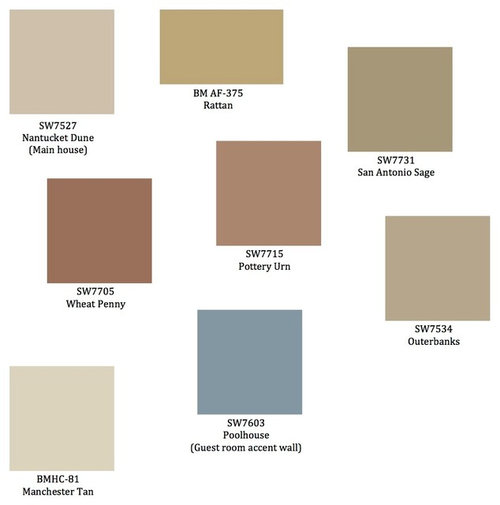
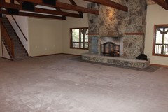
I've pulled all the colors (besides blue) from our large moss rock fireplace in the living room. The outside of our house is the rock as well. I know the colors work with the house, but do they work together? I'd either use Nantucket Dune or Manchester Tan as the main color throughout with the others being used more as accents, laundry room, powder room, etc. My goal is to have a very restful house that flows from one area to the other without a lot of upset - which is why some of the colors are very close. Would you eliminate some colors? How many are typically used in a house? Our house is pretty open and you can see a little of most rooms from the main area.

Comments (35)

  • 12 years ago
    I would pick three colors. Pick your dominate color and then 2 accent colors. I think you can do whatever you want in a bedroom.
  • 12 years ago
    You may want to vary the values of your colors a little more.
  • 12 years ago
    I like your choices,

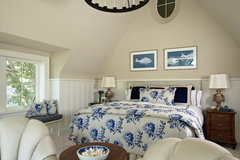
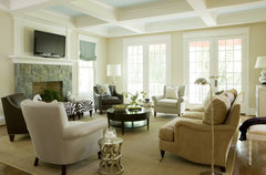
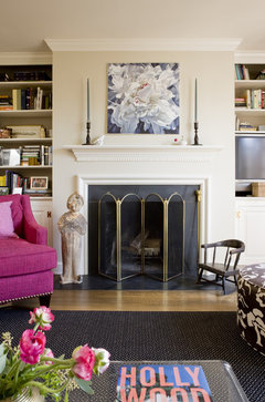
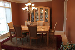
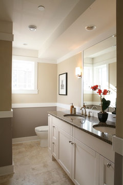
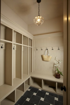
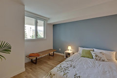
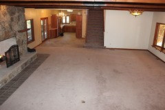
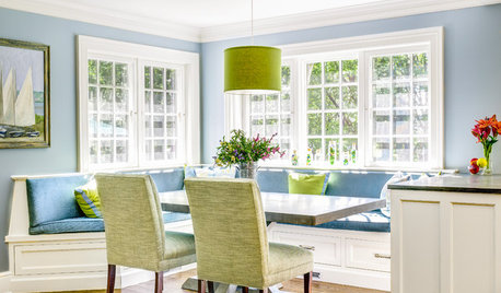
    Here are some rooms with your colors:
    Master Bedroom · More Info
    Bethesda · More Info
    Georgetown Residence · More Info
    Riss Lake Project · More Info
    Libertyville Not So Big Showhouse · More Info
    and Nantucket Dune on the wood work:
    Stonebreaker Builders & Remodelers · More Info
    teambell thanked houssaon
  • 12 years ago
    I'm thinking Wheat Penny would be your wood furniture color. Use Nantucket Dune and any of the other shades found on its color strip card to work throughout the home. Darker tones from the card in naturally well lighted spaces, mid-tones where there is average light, and the lighter ones in hallways, baths, closets. You can even take the lightest shade on the card, cut it with as much as 50% white and put it on the ceiling. Do you have a tray ceiling in any of the rooms? That is where I'd put the Poolhouse. It would be especially pretty for a dining room or master bedroom. I'm not into accent walls unless you have a very large space or a very small one, and neither should have windows or doors piercing them. I could see it behind the bed in the master, and I do like an accent on a FP wall sometimes but usually it would just be the darkest shade on the Dune color strip card. The four colors on the upper right side would be great for your upholstered items, rugs, drapes and accessories, and the Manchester Tea would work for all woodwork, cabinetry, trim, doors, etc. It is a warm and comforting palette, and I think, applied not only as paint, but as the other items I listed, it will be a very nice home.
    Halifax St · More Info
    teambell thanked decoenthusiaste
  • 12 years ago
    They do work together, but lack much variability in so many choices...need to also consider furniture, cabinetry and floors.
  • 12 years ago
    last modified: 12 years ago
    Yes - I should have mentioned that all the trim and cabinets in the house are a natural cherry finish. The carpet will be replaced with hardwoods eventually and I'm still debating whether to paint the trim a creamy white. I've seen samples where the white trim is mixed with wood tones on doors/windows, etc. I think it would really help brighten the house, since it doesn't get much light in the main room. The main room and kitchen would be the Nantucket Dune or Manchester Tan with an accent wall to the left of the fireplace where the tv sits (we will have built ins around it, so the accent color would only peak out in places). There is also a powder room off the kitchen that gets no natural light and not sure what to paint in there.
  • 12 years ago
    last modified: 12 years ago
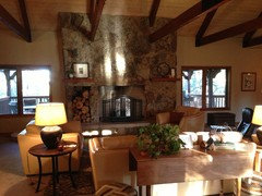
    Here is a picture with our furnishings. We took out the chairs and loveseat and replaced them with dark brown leather loveseat and chairs that have lighter wood trim.
  • 12 years ago
    Oops. Here is the picture. I guess this is the best thing to do on Christmas day right now :)
  • 12 years ago
    Here is a mock up with using what decoenthusiaste suggested on the various hues of Nantucket Dune - obviously, not using them all, but posted them anyway.
  • PRO
    12 years ago
    last modified: 12 years ago
    I think if you choose Manchester Tan for the entire house, the same trim paint, maybe White Dove, you can use all the colors in fabrics and accents.

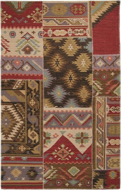
    One suggestion: buy a rug you love with colors you want to incorporate and work off it. Paints are easy to pick, rugs not so easy.
    Patch Work Southwest Lodge Hand Crafted Wool Rug · More Info

    Manchester Tan HC-81 by Benjamin Moore · More Info
  • 12 years ago
    Not all the trim needs to be white. I would use a white like BM Dove White for more of a contrast rather than a creamy white.
  • 12 years ago
    Yes, start with rugs and art, take colours from them.
  • 12 years ago
    I have my rugs and artwork. All these colors have been pulled from those things. The Nantucket Dune and Manchester Tan can be found in all those things as a base color. The other accent colors would work as stated. I guess what I'm asking is how many colors do you use throughout a house (bedrooms included)? I want to keep a nice color scheme going throughout, but I also like color and mixing it up. We have a great room w/kitchen off of that (as shown); an office, master bed and bath; guest bed and bath; laundry room; and powder room on main level. These are the ones I'm trying to coordinate. I've already painted the guest room the Nantucket Dune with the blue accent wall and the bathroom off that room is the Nantucket Dune as well.
  • 12 years ago
    Keep one colour running through, starting at the front door. You're on the right track with your palette. Change accessory colours throughout, but toning with main colour.
    teambell thanked User
  • PRO
    12 years ago
    I like your pallet. But, in application I would choose either Wheat Penny or Pottery Urn because they will look so similar in reality. I would choose between San Antonio Sage and Quarterbanks as these will look so similar in reality. Now you are good to go.

    I think ceilings can be painted wall colors as well and do not need to be cut with white at all if your lighting in general is good. If lighting is not great then keep ceilings light to maximize light reflection.
    teambell thanked Siegler Design Services + INTERIORS
  • PRO
    12 years ago
    Number of colors just depends on your various decorating scenarios. I do not think 5 or 6 colors is too, many at all as long as you don't mind keeping up with the paint for touch-up and refreshing. Make a master list of what was painted where for future reference in case you do have paint colors very close to each other.
    teambell thanked Siegler Design Services + INTERIORS
  • 12 years ago
    Keep all rooms same color. I like the more taupe color. 2nd darkest color. Then use other colors for accent color in accessories, pillows, rug. Even art. Don't put the dark rust color on any walls. Too 1980s. Walls should just be the canvas. Art, furn is the main event.
  • 12 years ago
    No accent walls paint all walls same or a shade lighter or darker than main color. Nantucket is nice for all walls. The blue in guest room is dark, and I'm guessing room is small. Painting a accent wall will make it appear smaller. It's a nice color. Just go ahead and finish painting with blue. Or a shade lighter. But same tone.
  • PRO
    12 years ago
    last modified: 12 years ago
    I'm in agreement with iamjudy and lgstacey in picking only 3 colors, to bring through the house ( neutral) You can then introduce the other colors in your accessories( art, rugs, pillows, etc.) You want to create a space that will carry you through many years of joy. When we design with too many colors, I find we tire of them quickly!
    teambell thanked Blondiesloft
  • 12 years ago
    I like all the comments you all have given me. I opted to go with Nantucket Dune for base color and use lighter/darker shades of that color throughout house. What's amazing is that the Manchester Tan looks so green when on the walls - so it was out. Our trim, cabinets and some accessories are the rust color anyway and I think I'll stick with keeping the color in art/accessories, etc., as suggested. That way I can go bold with those things and have some fun. Thanks all! I love color and the first place I think of putting it is on the walls, but I don't want to outshine all the other elements going on in the house. I already have plenty of focal points :)
  • 12 years ago
    Well said, sieglerdesign! Thank you - I will!
  • PRO
    12 years ago
    If you post pictures later on or write to me I will try to respond back and give you input. I think that fireplace wall and view out is terrific. Enjoy that home! You are a lucky gal.
    teambell thanked Siegler Design Services + INTERIORS
  • 12 years ago
    Yes, you have too many colors in your palette, but also you have "pinky" tans mixed with "yellowy" tans. It depends on your personal taste. I tend to be drawn to the yellow hues more. Manchester Tan and Rattan look terrific with Poolhouse, in my opinion. I would stick to those three. Best of luck!

    BarnandBungalow.com
    teambell thanked barnandbungalow
  • 12 years ago
    last modified: 12 years ago
    sieglerdesign - I will take you up on your offer! Thank you! I'm just struggling with the overall design theme, etc. I need to do. For instance, window treatments (should I even use them); furniture arrangements; what to put on certain walls; and, of course, color. I'll get some pictures.
  • 12 years ago
    barnadnbungalow - I agree. I won't be using two different tan colors - one or the other.
  • PRO
    12 years ago
    last modified: 12 years ago
    Well teambell the truth is that the "struggle" and sometime frustration can be part of the overall process! It is the grain of sand in the oyster that produces the PEARL. Every creative process has a very long and hard WORK PHASE and that is what the shows and books do not teach. Remember even Einstein said 1% inspiration and 99% perspiration! If a genius says this then how how do you think creativity is for us average folks? It can be very hard and a lot of work so, its a good thing I love and care for his business and this process because, I can never be compensated enough for all the time and learning that goes into what I do.

    I can tell you this though. Assemble a lot of possibilities and options. Know you will not use them all. Know that you will whittle down all your options to maybe 20% of the options and ideas you have assembled. Know when you are done shopping. Design is NOT shopping and shopping is NOT design. How do you eat an elephant....answer: one bite at a time.

    So, assemble your ideas, possibilities, options, choices. But, work on one room or design problem at a time.

    Does that help? Where I can really help you is in the "editing process". To often we fall in love with some item or idea that is in conflict with some other item or idea. Fresh eyes on the outside that are "trained" can quickly tell you want to discard or "edit out". You must do the footwork and research though of assembling what you love and care about. Then for the sake of a GREAT final look be willing to submit your self to a disciplined and organized process for a final 3 dimensional composition in the room. This is where most amateurs fall down. They want a big mish-mash of everything they like rather than the discipline of following design principals of 3 dimensional design to get to a room design solution that READS well to your eye from many vantage points and as you move through the space of the room. You must be aware of "negative" space and use it as vigorously as every other quality and element of design but, amateurs fall down here too. Make the space as functional as it is attractive and you will enjoy it for a long, long time!
  • PRO
    12 years ago
    SW sells samples and you can't buy enough of them. Paint large samples on the wall with trim and wall adjoining. Then look through a paper toewl tube, blocking out the surroundiing colors. Paint is very tricky. I've seen some of the best pros taking a do-over after paint turned out less than expected. Good Luck!
    teambell thanked Matt Patterson Custom Homes
  • PRO
    12 years ago
    last modified: 12 years ago
    -
    Paint Color 7527 Nantucket Dune - Sherwin-Williams · More Info
    http://www.sherwin-williams.com/homeowners/color/find-and-explore-colors/paint-colors-by-family/SW6369/
    Paint Color 6369 Tassel - Sherwin-Williams · More Info
    Paint Color 7566 Westhighland White - Sherwin-Williams · More Info
    Paint Color 6980 Gutsy Grape - Sherwin-Williams · More Info
    Paint Color 6704 Hep Green - Sherwin-Williams · More Info


    If you decide to use the Nantucket Dune, you have quite a few options for upholstery/pillows, etc.
    teambell thanked karen paul interiors
  • 12 years ago
    last modified: 12 years ago
    The challenge my house presents is that there are warm wood tones throughout (red/orange tones) and gray tile floors in bathrooms, kitchen and fireplace area. Either neutral (Manchester Tan or Nantucket Dune) look good with the fireplace, but the Manchester Tan has a very strong green undertone on our walls. For me, it's too much. It's one of those things where you just have to see it in the house and how it changes. The Nantucket Dune, though it looks to have very pink undertones on the screen, is actually very neutral and soft in the house. I do like the colors you posted, Karen. Any with Nantucket Dune? :)
  • PRO
    12 years ago
    last modified: 12 years ago
    I believe what you are saying is true because, I've have seen for years how different color can be in specific rooms with varied daylight and man-made light and at different hours of the day. Paint makers know this and why they encourage "brushing out 4' x 4' samples" on the wall and other techniques for seeing color properly in your specific home and in specific rooms with specific light.

    Also, I do not believe you have to keep only warm with warm colors and cool with cool colors. That is okay but, kind of simplistic. It just really depends on so much more that could be going on. I think a balance of cool and warm is possible too, but, again just depends on exactly what we're talking about (paint, fabric, art etc....) and the specific light conditions going on in that environment. I think the number one thing that comes up again and again for me is quality of overall lighting. If overall lighting is not good then you can spend time on finishes and color all day long and things could still not look good because, the lighting is so bad. On all my residential remodel projects, I usually involve a trusted lighting design source to work with me on what I'm trying to accomplish aesthetically.

    Before you get much farther in your planning you might go through the whole house and evaluate your lighting. Lamps and general down lights (usually wrong size and bulbs or "lamping") are just not enough to bring an environment to life the way most people would prefer now days. Most people see incredible interiors and environments like on this site and other places and do not realize how much thought, time and effort goes into the lighting. They tend to focus on what they know and not on what they do not and ignore lighting issues without even realizing that they are missing information they need. . Lighting is a complex and high tech category of planning and design most people cannot do on their own.
    teambell thanked Siegler Design Services + INTERIORS
  • PRO
    12 years ago
    Great discussion! The comment about buying and trying a lot of samples is good advice. Lighting is crucial to having your colors come off looking as fantastic as you hope.
  • PRO
    12 years ago
    Just a quick word of advice about paint samples...instead of painting the walls with several choices, try painting a large piece of poster board. Then you have the option to move it around the space, and hang it in different areas and lighting. I love the trick of looking through a paper towel tube. thank you for that idea!!
  • 12 years ago
    We are actually in the process of having a lighting designer come out and work with us on our main room in an effort to highlight certain areas and add more up-light, etc. Good idea to hold off until then.
  • PRO
    12 years ago
    EXCELLENT and EXCITING step. I hope you are pleased! Will be interested to hear about your experience. :)