Software
Houzz Logo Print
jennifer_sellers

Our New Kitchen!

12 years ago
last modified: 12 years ago
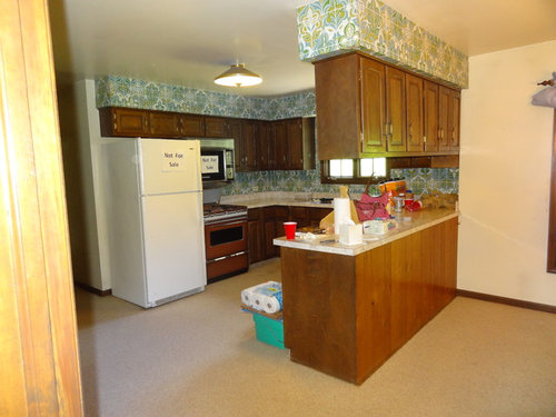
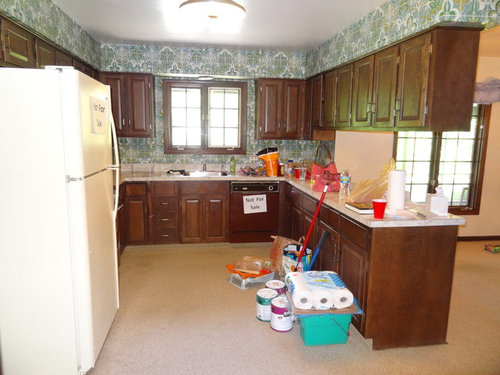
My best gift this year was remodeling the kitchen in our new (to us!) 1968 Tudor-style home. Originally, the plan was to save up to do a project this big but after just a few short months cooking in the kitchen with one light above and a refrigerator practically on top of the stove, I knew that was not going to happen if I was going to live here and entertain friends and family the way I wanted to when we moved here.

My goal was a family-friendly space with lots of light, as the large window in the breakfast area looks out onto the screened-in porch so it's pretty dim here on the north side of the house. I wanted classic as a bow to the Tudor-style and for a style that will last but with modern appeal. We were also on a reasonable budget so we were not going to spend the earth on this remodel.

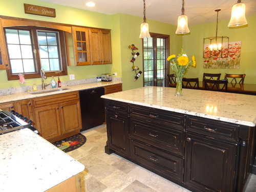
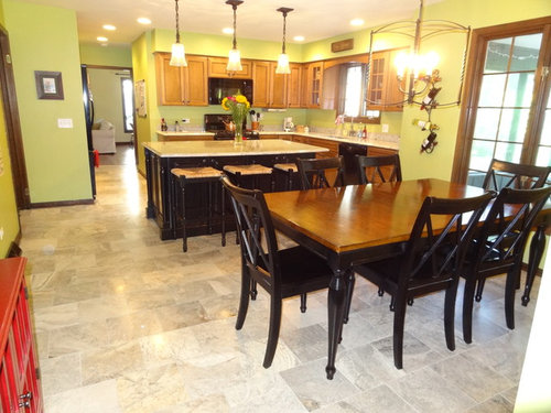
You can see that the biggest difference came when we removed the soffit and upper cabinets, and eliminating the peninsula to create an open feel with more light and a better traffic pattern. We relocated the fridge and a pantry into one of two large closets in the hallway adjacent to the cooking area to create cabinet and counter space on either side of the range with a double-oven and microwave above. The perimeter cabinetry is a coffee-glazed maple and the island (distressed black-painted cherry) has three stools my three kids use daily in addition to tons of storage and work space and built-in garbage drawer. The pulls are all oil-rubbed bronze with copper accents so they can be seen better on the black of the island.

The floor was the greatest dilemma as it was carpeted in the kitchen (yes, carpet) when we moved in. We wanted it to flow into the adjacent foyer and hallways and powder room but didn't want more hardwood like in the adjacent living, dining and family rooms. My husband spent three days with an air hammer removing the mustard hexagonal tiles and underlayment from the foyer and powder room to make way for a new subfloor and then beautiful travertine tile laid in a brick pattern for a bit of interest. My contractor about killed me over the floor (as I was originally going to go with ceramic) but even he admitted it looked great when he was done with the over 500 sq. ft. 10 days later.

After about 15 samples of random shades of green paint testers for the walls, I turned to Houzz to look at green rooms and discovered Benjamin Moore's Dill Pickle for the walls. This worked perfectly with the red accents I wanted in the room and the fresh, bright feel I was looking for to bring life into a darker room. So happy with the final result! Thought I'd share for anyone needing ideas for their space in case anything inspired like the pictures I used on Houzz when I was designing.

Comments (18)

  • 12 years ago
    last modified: 12 years ago
    Love your style! Your kitchen is beautiful! So glad to see the pop of green in your very well thought out 'new to you' kitchen.
    Jennifer S thanked Denita
  • 12 years ago
    @jn3344 - the floor is travertine from The Tile Shop but I got a deal on it since I was buying so much of it, making it not far over the original ceramic budget and totally worth the extra.
  • 12 years ago
    So nice to see a kitchen that has a lovely, unique personality. Your green walls add such life!
    Jennifer S thanked leannebrum
  • 12 years ago
    beautiful transformation!
    Jennifer S thanked Nicole Lee
  • PRO
    12 years ago
    Super looking kitchen. Bet it's a joy to cook in now.
    Jennifer S thanked Creative Visual Concepts, Kevin Strader
  • 12 years ago
    Beautiful transformation.
    Jennifer S thanked Voyageurs47 Voyageurs 47
  • 12 years ago
    Beautiful!
    Jennifer S thanked grobby
  • 12 years ago
    Oh my gosh, I love it! You have great vision! Enjoy it!
    Jennifer S thanked handymam
  • PRO
    12 years ago
    Very nice transformation! Really opens the kitchen to dining room up.
    Jennifer S thanked User
  • 12 years ago
    Love the new transformation
    Jennifer S thanked nmclarke
  • PRO
    12 years ago
    Wow! Very nice change! So open and beautiful!
    Jennifer S thanked purehome
  • 12 years ago
    Just lovely- I especially love the distressed black cabinets in the island.
    Jennifer S thanked sbrustein
  • 12 years ago
    Wow, your old kitchen looks like ours, which we are planning on redoing. The after picture is the kind of space we would like to have. Where did you place the stuff in the cabinets above the peninsula. how long did it take to redo the space?
    Jennifer S thanked boons13
  • 12 years ago
    @boons13 - Actually, once we had cabinets which did not have a dividing center bar in them, it was easy to fit more stuff into them than the cabinets over the peninsula. A lot of things fit into the drawers on the island and the corner cabinets too. Actually, there are 12 inch deep cabinets in front of the stools where I store things I don't use very often like cookie cutters, vases, and wine glasses for entertaining. From gut to paint it took about 7 weeks. We did it Jan-March to get a deal on labor when our contractor was slow and had only our job to focus on.
  • 12 years ago
    Thanks for the information. We are hoping to get the renovation this winter.
  • 12 years ago
    very nice, so much more open space that's usable.
  • 12 years ago
    lovely
Sponsored
The Creative Kitchen Company
Average rating: 5 out of 5 stars52 Reviews
Columbus Area Kitchen Remodeling and Refacing Professional