Software
Houzz Logo Print
maria_scazzero

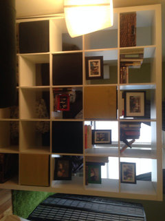
Pictures on bookshelf

12 years ago
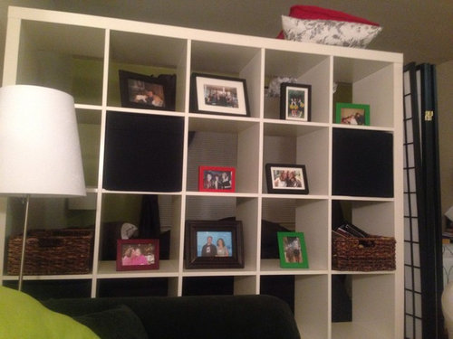
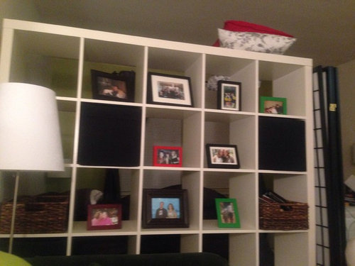
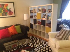
I got the idea to put pictures in from just magazines and using my own creativity. Please give me some ideas on how i should arrange the frames and cubes so it looks more aesthetically pleasing. I like the red and green and black color frames i have should I get more of them
Or make all the frames one color? How do i position the different size photos next to one another etc..

Comments (20)

  • PRO
    12 years ago
    Black and red fit very good whit your bookshelf, creating both luxurious and modern vibe. But you might wanna reconsider the green ones. Using red and black ones together with the other details you have will look just fabulous! You can arrange them in some form of pattern as most of people find symmetry more pleasing to the eye and are very keen on searching for the pattern themselves.
  • 12 years ago
    How do i arrange the different size
    Photos in what kind of pattern?
    I tried it different ways and it doesn't seem to be looking right? I love the black and red photos i will definitely get more red
  • 12 years ago
    I did a new arrangement for my bookcases recently but I have a lot of books, so on some of the shelves I arranged books and picture frames in between or even on a pile of books in a couple of places. I also added a basket on bottom shelf with some diaries I have and a vase of flowers and candle arrangements on others. Looks far better than before anyway.
  • 12 years ago
    last modified: 12 years ago
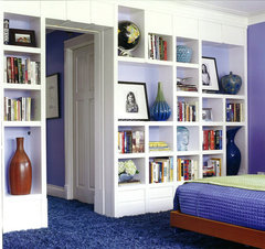
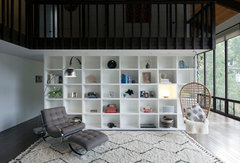
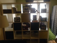
    One idea you might try is to first place a backing to the unit, so the view from the other side isn't of frame backs. I think all the frames should be kept neutral -both black w white mats, or white without mats - and in thin frames, so that the pictures receive the focus. Place multiples of smaller shots together, trade out a few for more vertical shots, and enlarge one or two for greater variety. You can then add in the accent shades of the room sparingly, via vases, a few books, a plant, etc.[houzz=
    Colorful Elegance · More Info
    ][houzz=
    Contemporary Living Room · More Info
    ]
  • 12 years ago
    The green is a very hot colour this year, use it.
  • 12 years ago
    I think you need to stack books under someand to the right or left of some. They look very lonely. I would use Naomi's room above as an inspiration and place the frames where she has objects.
  • 12 years ago
    Or how about glass inserts as frames w photos on both sides?
  • 12 years ago
    Right. Great idea but you are trying to be too literal. You don't want each picture centered in its own cube. You want the whole arrangement to appear to be random.

    So as northernhic suggested stack books in some, they can be both vertical in some cubes or horizontal in others. Then one frame can go on a stack of 3 books, for example, and another frame could go beside a grouping of other books.

    Collect some other items you want to display like vases or figures or whatever. Then play with the arrangement until you get something that looks random and balanced. As if someone just threw each item onto a shelf as it came into the house.

    For frames, I like to mix all kinds of different frames. My sister only buys one kind of frame. So each option has plus and minus.
  • 12 years ago
    I think you've gotten great advise from all who responded. I like to decorate my bookshelf by treating each space as an individual shadowbox. Let the space tell something about the
    picture by including memorabilia, i.e., a souvenir from a vacation picture, etc. You have to be careful to keep the space uncluttered and done in the colors that are cohesive to the entire room.
  • 12 years ago
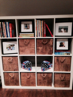
    We have the same shelving unit in our basement. I obviously need to store toys and books and I'm sure this is not the look you are going for but I thought it might be helpful to show how to incorporate books/photos etc. GL
  • 12 years ago
    I could never waste shelf storage space with frames whether empty or with a picture within. Surely you have wall space for hanging pictures. Studio 100001's Colorful Elegance appeals to my style the most: objects and mementos included with the things you really need to store in the shelves, but those object and mementos must have value. When I look at homes I sometimes wonder, "Where is the value in this displayed object? " If it is an empty picture frame I would want it to be an antique and unusual. Otherwise I would think the owner just didn't know what to do, or started a project and didn't follow it to completion.
  • 12 years ago
    Thank you guys Iam going to work on this today i loved your feedback
  • 12 years ago
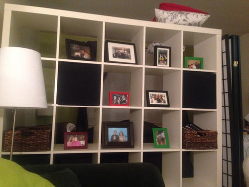
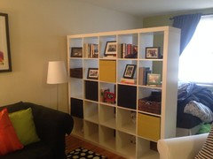
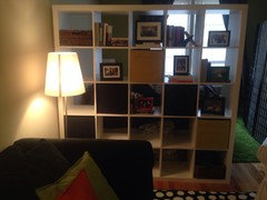
    Updated pic of bookshelf

    I am going to buy some more red frames large vertical ones to put two more
    Pics in it

    I also am going to buy some vases and more nic backs to put in between. I would love your feedback
  • 12 years ago
    What was the invisible fishnet someone was talking about in one of the post i like that idea actually also i love the red and black frames the two different colors a lot!! Any feedback
    Let me know.
    Mu was goig to do a orange lampshade with the lamp by the bookshelf
  • 12 years ago
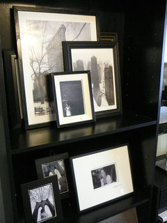
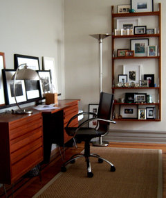
    Layering is a much more dramatic and interesting way to display photos. If it requires one to approach the shelves to investigate the details, all the better. Grouping like items works well, as does creating levels with books or other objects to raise some items and fill the upper part of your cubes.
    FL HOME OFFICE 2007 · More Info

    Contemporary Home Office · More Info
  • 12 years ago
    So I can layer some of cubes in one box with different size frames

    The bottom cubes should have more items and nick knacks and books while the upper has more of the pictures
  • 12 years ago
    You want to "anchor" the bottom with your visually "heavier' items like books and large decor pieces. Lighter items on top keeps the shelf system from looking like it is top heavy and might tip over with the load, or like the upper shelves might break with the weight, falling and crushing the lighter stuff underneath. Just a bit of "visual" common sense.
  • 12 years ago
    Also, you don't want photos on the top shelves if it is too high to see them clearly.
Sponsored
Mary Shipley Interiors
Average rating: 4.8 out of 5 stars34 Reviews
Columbus OH Premier Interior Designer 10x Best of Houzz