Software
Houzz Logo Print
a_rainbow

Feedback please on Master Suite finishes

12 years ago
last modified: 12 years ago
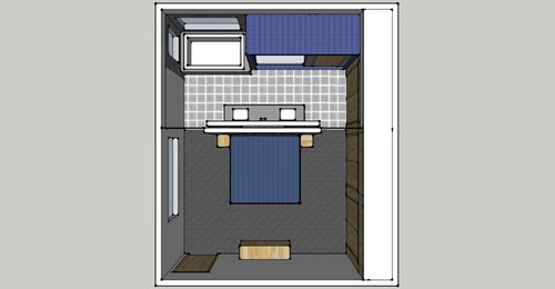
This is the last room to complete. We are moved in but everything else is complete. Master is just a closed door :-( we use my 2 year old daughters room upstairs and she moved in with her 6 year old brother about 6 months ago because I was getting zero sleep! But its temporary. We have one more currently baking and don't know gender. But same genders will share rooms. I want my own space with infant and for my daughter to get her room back.

Must stay:
-the light grey floor tile in bathroom is purchased.
-the charcoal carpet in bedroom is purchased.
-trim and doors (locally grown and milled birch trim and Lynden birch doors)
-all plumbing and electrical is roughed in whole room is framed and sheetrocked for this layout.
-kohler purist is the fixtures for shower and tub and sink faucets etc.

What we don't have:
-vanities - open for suggestions on my design. I have reversed frame by manu with drawers on bottom and recessed toe kick on all sides. Have not ordered but am needing to do that next so we can tile floor.
-do not own any wall, shower, tub backsplash tile. All open for suggestion. However, the idea is to still read the way I have it. I just don't know what I should do for sizes and "colors" and where. This is my first go. I don't want it to feel dark.
-no idea what bedding will be but I HOPE to find a light grey comforter with that bold pop of blue running though it. If you knew me, you would know that I don't settle and I always find what I am looking for without sacrificing quality! :-)

Whole house is contemporary with same birch trim and doors running through and diff shades of greys. Each room has pop of color. Laundry and powder are white, grey, pops of lime. Kids bath is white, greys, pops of orange. Kitchen and open living room to kitchen are pops of red. Kids rooms are a color I picked from their bedding.

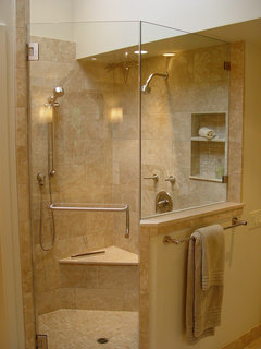
Also, a BIG question... I have the tile in shower running on shower ceiling on the inside and outside walls that won't be touched by water because I want it to read the same. Hubby wants me to match the paint color to the tile and paint where we don't "need" tile. Same with the toilet inner block.. tile the one wall inside shower and paint the wall with the toilet door. I disagree :-(

anyway... ive said enough. let know know thoughts... suggestions.... questions... whatever! We are starting to clean it out of tools and junk we accumulated this month and work!

Thanks for looking!

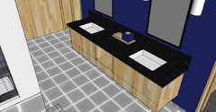
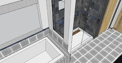
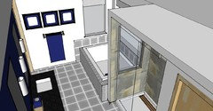
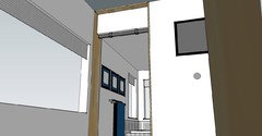
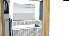
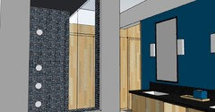
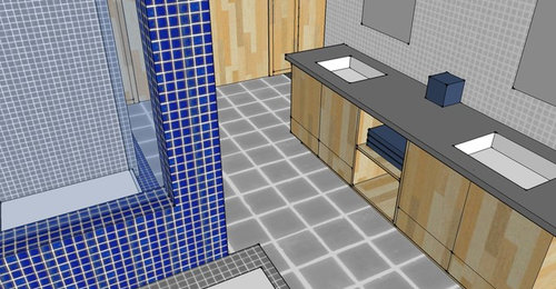
photo 1 - top perspective of entire room minus the dropped ceiling in bath side.
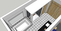
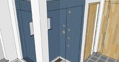
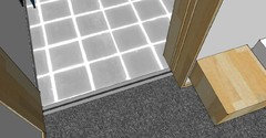
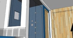
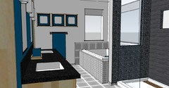
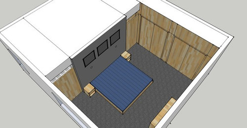
photo 2 - better view of birch ply wall and the doors sliding out.
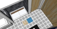
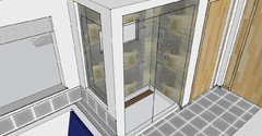
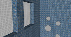
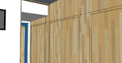
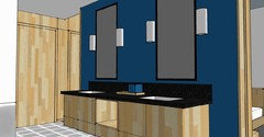
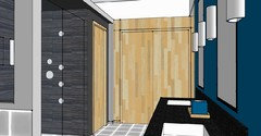
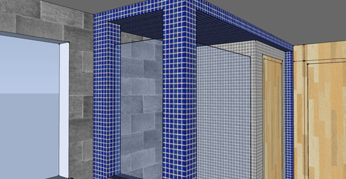
photo 3 - shower box wrapping toilet room.
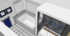
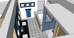
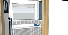
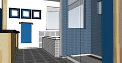
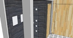
photo 4 - just trying to get as much in view as I can.

Comments (198)

  • 12 years ago
    ok, ill update my drawings to reflect what youve mentioned above :-)
  • PRO
    12 years ago
    The pop of blue is in our previous designs. Blue not in the niche only is not pop of blue to really be obvious.. Don't like dark blue vanity wall with black counter - too dark next to each other. You can add blue in paint on the vanity wall, not in the cabinets. Cabinets are more expensive to change out than paint changes.
  • PRO
    12 years ago
    Cabinets, are you changing the birch cabinets? or the construction of them?
  • PRO
    12 years ago
    Like the drawing of the cabinets if it works for you.
  • 12 years ago
    just construction. i just put boxes there before to represent. this would be more accurately how they would look. still birch :-) I just wanted to see what my options even were. looking promising. I just wanted to make sure that was enough clearance underneath.

    ok, back to room shower wall! So far I have painted walls all back white, added a niche, and shower still has grey tile. i don't mind how it looks right now?

    I was never going to change the cabinets so no worries there :-) it was just the style of it and the crisp lines and pop of color of entire space, similar to the lime green vanity one in your batches above :-) But the rending i just attached is where i am with vanity wall. :-)
  • 12 years ago
    ok... labeling walls here

    tub small window towel wall is WALL 1
    tub big window is WALL 2
    niche wall is WALL 3
    spray wall is WALL 4
    door wall (toilet door) is WALL 5

    the interior shower wall opposite sprayers, just call it opposite sprayer :-)
    and there is the entire white shower box.

    its nice and bright right now!! :-) but where is the blue in shower?

    (i left this rendering blank on purpose with the "knows" unless you want to change something up on tub or something)

    no blue stripe in paint. not sure how he felt about wide stripe in shower? they worked together tho so who knows.
  • 12 years ago
    last modified: 12 years ago
    i still like that french blue subway! I need a sample :-) It's made to order and $$$ so we might have to use it wisely if we get that. then i would probably match paint to that?
  • 12 years ago
    last modified: 12 years ago
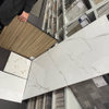
    brought these in. not sure how coloring was affected. blue looks brighter now then from site so real life sample would be better.
  • 12 years ago
    darn. that stone is going to be hard to get here. Shipping is a pain. Sears (overstock) and overstock.com won't ship since both are from same place.

    I think hubby and I are going to visit a few showrooms here in town and ill take these with me and see if we can't find similar. That stone is amazing because it as so many "colors" to go in space! Ill write down our findings.
  • PRO
    12 years ago
    I love the texture, irregular shapes and the array of colors in that stone. The blue subway is a great color contrast as well as opposite design with linear lines.
  • PRO
    12 years ago
    last modified: 12 years ago
    Look at how the stone ties in the birch, gray floor and is warm, lots of interest and contrasting to the blue. Still think you can do a wide blue stripe in the shower only with the blue tile. Pop of color. Add the blue pop of color in a window treatment and paint on the vanity wall.
  • PRO
    12 years ago
    That subway French Blue will be fine as paint for the entire vanity wall. It is contrasting enough because it is brighter. It is not too dark with black countertop.
  • PRO
    12 years ago
    The blue subway tile for the stripe in the shower and the stone for the remainder of the tile in the shower. Gorgeous.
    a_rainbow thanked LB Interiors
  • 12 years ago
    hubby back inside. ARGH! not what we thought. He likes gray in the shower. I changed all walls white, except vanity wall. I finally told him, let's go look in town and see what we can find. There might be one like that beige stone above he likes when he can see and touch!
    You know what I hope to find, is maybe one that is very similar to that but appears more grey, but still has beiges? a happy medium. He does want the pop of blue in shower though so that's good news! But not a wide strip i guess. He liked the smaller horizontals I showed him in the picture above.

    He likes blue vanity wall and I think as of now, our vanity wall is set! It's just the inside of shower now and I feel so good to be this far. So much harder when it's for two people and not just one! Window walls white. Shower outside enclosure white? For now, I have shower in that deeper more contrasting grey in bigger tiles on inside 3 walls. But it is majorly lacking blue pop! (again, I am going to be on a hunt for something resembling one above because I can see how it pulls EVERYTHING together! it's an amazing beige stone tile!!!)

    those subways are made to order. I hope I can get a sample!!!
  • 12 years ago
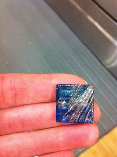
    agree on your last comment. I am going to try and find. something in town and send pic your way. He said gray but sometimes I can convince once he sees. We will see :-)
  • 12 years ago
    i can't help but post... this is a first go. It's just a concept and not a final of any kind...

    but would something like this be...interesting? I would start again up higher... but I mean it would take more time to get it to look right. But it's just an idea... I am sure I could take it further and maybe get it to make more sense. I kind of tried to keep the blue strip idea from tub area to shower.

    it would be neat to find a tile tho that had the beige in it also for the large tile (charcoal/grey/beige.) but anyway... tomorrow starts homeschool again and a normal week.
  • PRO
    12 years ago
    last modified: 12 years ago
    Thanks for hubby's update. Good progress. I too, love the colors in the stone. I think you need enough beige and gray to make it work visually. You have a lot of wood beige found in the birch. I feel beige should show up in the shower too. You are right in looking for a tile that has beige and gray.

    The rendering above, tiles have no contrast. Can't see the blue stripe. It gets lost with dark tile surrounding it. Blue tile does not pop! Need a lighter tile to make the blue tile pop. Charcoal is too dark. Why would you want to add another new color to this? (nothing in the bath is charcoal).
  • PRO
    12 years ago
    You can place the band of color for the blue tile wherever you want, because you are not following a design plan that continues on the window walls.
  • 12 years ago
    :-) Well we have to pretend the blue is subway tile from modwalls, that id do more then just there (thats as far as i got on it but it wasnt done. ill continue tomorrow with more stripes) and pretend the charcoal tile is one with beige :-) I can't seem to create a material to look like what we are looking for.
  • 12 years ago
    Everytime I try its either all grey with no beige or all beige brown with no grey. I need to learn more about material in sketchup. I've taught myself the program. I just need to learn materials better.

    Woa... We just had a small earthquake!
  • PRO
    12 years ago
    last modified: 12 years ago
    That's okay, I got the idea. If you choose a solid color for the beige. (light tan) and don't worrry about the texture, it will help you for a visual. Knowing that there will be some gray in it too.

    Wow, earthquake, we know what that feels like.
  • PRO
    12 years ago
    Is there a beige stone in your program?
  • 12 years ago
    Yes. I can add that in morning if you want to see?
  • PRO
    12 years ago
    last modified: 12 years ago
    okay, let's take a look. Blue tile will pop and beige will pick up the birch wall and cabinets.
  • PRO
    12 years ago
    This is interesting of how they added the stripe tile to the tub facade.
    https://www.houzz.com/photos/2011-showcase-of-homes-traditional-bathroom-boston-phvw-vp~2549720
  • PRO
    12 years ago
    This is the style of niche I have, love it!
    Orinda residence · More Info
  • PRO
    12 years ago
    Regarding your vanity, it seems to me that you are wasting a lot of space with the 36" sink cabs on each end. I would reduce those to 30, or 28". Sinks don't really take that much space. Then I'd leave 12" space between the bottom of vanity and the floor and would put drawers in the middle section, not a towel niche. Towels can easily go under the sinks and allow drawers to go at a higher level where they are more useful.

    The extra 12" of space you gain with smaller sink cabs, plus adding more drawers in the center will make up for losing drawers at the bottom of the sink cabinets.
  • PRO
    12 years ago
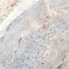
    Maybe you can keep an eye open for something like this when you're shopping.
    Something that has beige and gray.
    Tile Travertine · More Info

    http://www.homedepot.com/p/qv/202508334#
  • 12 years ago
    @carolyn- I started writing why and if got long and possibly confusing. I'm limited slightly in options unless I go 100% custom. They do not make any floating cabinets. I'm pushing vanity budget as it is with keeping them semi-custom (decreasing/ increasing the heights/depths of cabinets they do make to create this). I have a few drawer sizes they make but no combo ended up in the same height as main sink base. We are limited to what's left with tax return to finish this project. It will be enough if we pick and choose where the money goes. Good thing a lot if stuff is purchased already. However, when I go sit with my guy there, we will compare the costs and see what the difference is. The difference in the entire scheme if things is what matters. These aren't ordered. They are an option. But I'll post my options after I see him :-)

    @LB Yes. That travertine was the one listed way up in convo and i hadnt forgotten it. i grabbed it last night and have that link saved already since its Home Depot. I also figured out how to make my own material from a real one! I saved image in computer and there is a spot to "make new texture" and then it allows you to find a file.

    The travertine would be more promising as hubby seemed nervous to work with stone since we are the installers. We are able to so a lot of work and we do really well and finish always looks great, but we've always worked with materials in comfort zone. The solid surface was a first for them but they practiced first and it ended up being really easy! He doesn't feel super great about stone.

    I may need an opposite... One where the percentage of grey and beige is reversed per hubby's request. Even though I see how the shower becomes the place where all colors mix, he still leans towards more grey.

    I told him what u said about the darker grey, not being anywhere... And he said, there isn't black anywhere either but it's on counter? I had nothing to say on that. Ooops.

    We both discussed how its all "shades if grey" so why is bringing charcoal not a good idea when there is white, light grey, and black? I'm just wondering for sake of learning. He's at work now but I would like to have info for him about this when he gets home.

    he and I see how the beige grey do bring everything together, but we see another grey working too. This is why we aren't pros. Ours eyes don't see things exactly as yours do. I admit I'm better at it then hubby for sure, but with things like this I get confused!

    I woke a little late and kids with me so I didnt get to work but for a minute. Then right down to breakfast and school. Ill send you new renderings in a bit.

    :-) thanks!
  • PRO
    12 years ago
    last modified: 12 years ago
    I follow you and really do understand. My suggestion wasn't all clear for the proportions of beige/gray. That is up to your tastes. I would only want enough of each to be noticeable to not get lost. It could be 3/4 and 1/4, 2/3 and 1/3, 1/2 and 1/2. anything that suits both of you. For me, I would want to be able to walk in the room and know that there are two colors, rather than trying to find one of the colors in the mix.

    For questions about another gray. I absolutely agree that black, charcoal, medium gray, light gray, and gray/white fall under the base color of black with white added creating the different tones.

    My concern is the depth of another gray chosen. It makes a big difference on what surface, large or small surfaces the darker gray (charcoal) (medium gray) will be applied to. Plus ... what other color are they next to. Will the two colors that meet each other be complementary and have enough contrast, next to each other? In design, color choices, especially need to be repeated. You can have too many colors on too many different surfaces, on too many different planes which becomes too much visually and causes confusion and too much going on.

    Good choices: The gray floor is used again on the tub facade. The blue accent tile in the shower is repeated with a blue painted vanity wall. The birch color is on the entry wall, toilet door and the vanity cabinets and possibly again in the shower. That is continuity and smooth flow with added interest, with different colors and materials. A lot of color already.

    Hubby is right, the only black item ... The counter in black: black is a classic and sophisticated color to add to most any color combination. As I mentioned way back somewhere, you would need to add black somewhere else. There are many ways to add black. Mirror frames, faucets, light fixtures, towels, soap pump, vase or decorator box, window treatment. You don't need a lot if it. Just repeated somewhere. Black is a great contrast to all your other choices.

    The color of charcoal or medium gray or dark gray, would have to be 'repeated' somewhere for a smoothness in all the color choices for the room.

    You DO NOT have to use black counters. The main reason, I don't care for a gray counter, is that I'm not fond of it on top of the birch cabinets. The colors together. MO If you don't like black, I would then suggest - white (no pattern). There is enough pattern in the birch. I think the black is more dramatic, and what I would prefer. You can use white, Either will work for the room. It's what the two of you like. Hope that helps.
  • PRO
    12 years ago
    last modified: 12 years ago
    Just adding ... too many different tones or colors in a room can become disjointed, separate and break up a smoothness and softer flow for the eye to transition from one element with many colors, to another portion or plane with many colors. That's what I saw in your first renderings. The room was broken up in chunks by color. It's great to have other colors but there is a need to consider the proportion of the color, on what surface and what colors it is next to. Too many opposing or different tones in color, stop the eye. Break it apart. Becomes confusing. Too much to see, similarly, clutter is confusing and creates anxiety without one even knowing it.
  • 12 years ago
    Ok. A lot of that I know and understand. Funny tho that even tho I know materials and colors need to be repeated, I still don't do correctly. :-( I totally get it!!! Why aren't I doing it.

    We Really like black counters! There is white speckle too so looks good with whites in room. That is not changing. I planned on using the colors in space for accessories. On black counter I didnt want black accessories, but I can certainly do black towels etc...blue soap pump or something. There are also all kinds of light wood accessories a person could use to spread out in space.

    Ok check this out...from Home Depot...
  • 12 years ago
    last modified: 12 years ago
    http://www.homedepot.com/p/U-S-Ceramic-Tile-Classic-Gray-16-in-x-16-in-Porcelain-Floor-Tile-UFBI200-16/202192193#.Ut2B955vyt8

    Of course this is just one tile, and I am sure the pattern won't be repeated like that! More variation I am sure. The price is crazy! Is it safe for inside shower?

    needs blue still.... in terms of main tile what do you think

    my mother in law has a tub pillow. Meant for tub. I know I plan to get and could perhaps try and in one of our colors... black or blue or something
  • 12 years ago
    last modified: 12 years ago
    here is the brio summerville. Can i say... I actually really like it with the blueville! the brown in it really changes how it looks as a whole. That sample will be here soon :-)

    I matched the blue vanity wall and other accessories to the tile so blue changed slightly :-)

    having fun with making my own materials now!
  • 12 years ago
    here are views from all over.

    I need to insert a bedding. Making a material there doesn't work. I found this while googling by west elm but I don't see on their site!!! I love it though.

    http://www.chictip.com/textile/modern-colorful-bedding-by-west-elm
  • 12 years ago
    Ya know... I think I like this most? the blue mosaics in there. I painted birch door toilet wall the blue like vanity?

    but this bathroom right now really gets me excited..... I hope I am not wrong here and get my bubble burst! HAHA!

    I LOVE that west elm bedding but the blue changes from screen to screen. I am wondering if the blue isn't as "bold" as my laptop shows. My laptop is usually off in calibration. can't find it anyway but i love the print!

    I know we have been back and forth on the mosaics. But we haven't even seen them and I would like to give them a chance. I think my feelings changed because the entire shower exterior enclosure isn't blue? I like it better with just the inside shower and door wall blue I guess? Hubby doesn't like mosaics bc they are harder to work with and cut. But I always try and get him the least amount of cuts. our other mosaics have come out great. So it's still something we will have to discuss. But man... I put the actual material in there from the site and it looks cool!!!
  • PRO
    12 years ago
    last modified: 12 years ago
    I keep getting behind here, with the rate you two send postings back and forth, so I'm still thinking about your tile, which may have been overcome by events, but I wanted to add this:
    Here in Austin, where stone tiles were popular for many years, we're now seeing them used only in traditional settings while porcelains seem to have taken over the contemporary market. I was out with a client this morning on a tile search and we liked Interceramic's Concrete Ivory 12 x 24"s, around $4 something retail. It was a rather greige color, falling between light gray and beige.
    http://www.fastfloors.com/catalog/productline.asp?wid=GS-FDDXL&productlineid=36933&productid=277644&origin=pla&unique_id=277644&gdftrk=gdfV22128_a_7c1_a_7c80_a_7c277644&gclid=CLvk7prrjbwCFZRr7AodizwAkw
  • 12 years ago
    last modified: 12 years ago
    we were up late last night yes. :-) I write like 5 diff ones then realize and go back and try and combine into one! Ive never been so involved in a houzz discussion!!! You two are probably topping the charts for "comments" :-)

    What do you think of the overall scheme I posted above? the mosaics in general are up in the air. But hubby likes them, it's just working with them. he likes bigger tiles, but it's not a deal breaker.
  • PRO
    12 years ago
    It feels like you've overdone the blue, mostly in the shower.
  • 12 years ago
    last modified: 12 years ago
    thanks for your input.

    in the end, we are down to that part of bathroom...the inside shower and blue pop inside. I think we are looking at tiles tomorrow night. Hopefully we see something that is perfect.

    there isn't enough of the modwalls blueville in stock to cover that amount.

    it's super helpful to have everything narrowed down too! now we aren't looking at every single tile there wondering where it will go! So it's been helpful to have figured this much out. There is so much tile available out there. Something will work! :-)
  • PRO
    12 years ago
    For me, the all blue shower is too heavy, too much.
  • 12 years ago
    I like where bath is going. It's just the shower. Ill post photos if what we find in town :-)
  • 12 years ago
    I'm not completely limited to in town, but its a start
  • 12 years ago
    last modified: 12 years ago
    Home depot can get in MS international tiles. This is one we saw and liked. It has all the colors in it and really looks a lot like the vanity wall, with the black (counters), and swirls of blue and brown running though it. Well, you'll see for yourself from link :-) But I used it to make material and we like it a lot. A person could choose to bring in a solid blue subway tile as a horizontal stripe in shower or not... the blue seems to pop out. But a stripe could really help bring it out maybe?

    http://www.msistone.com/iridescent-glass-4mm/midnight-blue/

    hubby found this one online. It's 12x24 and also comes in 6x24 but it's $2 more. But it too has those same colors almost like those "grassy" fabric daltile tiles, which we like too. I see black (or really dark charcoal? like counter) and then brown and blue. A person would definitely want to bring a pop of blue stripe or something in this one to really bring out those blues? Only thing is, this tile is REALLY hard to get! I have one site for it and I have to order a miminum of 13 boxes. ugh. I need like half that. Not sure how to deal with that.

    http://www.builddirect.com/Porcelain-Tile/Nero/ProductDisplay_6933_p1_10055476.aspx

    I know hubby would prefer the large tile and I do think it's pretty! And maybe the vanity wall across the way would be enough to bring out the blue in it.

    the rendering of the mosaics doesn't show brown as much as I think it would according to the link. I would think it would show like the blue. That's why i need to see sample.

    I think the big tile is really pretty tho
  • PRO
    12 years ago
    last modified: 12 years ago
    The black and blue tile is pretty. If you go to the site and click on 'Concept Designs" ... here's the link http://www.msistone.com/bsinfo.aspx?bsid=75. This gives you an idea of how it will look. There is not a lot of blue. More black and gray.. it's dramatic and beautiful with the black counter. It is surrounded by the bamboo small tile. Nice contrast. I think it needs a light surround tile.
  • PRO
    12 years ago
    last modified: 12 years ago
    The stripe type tile in gray, seems quite dark. Guess it's a matter of preference. The shower will be dark as in your renderings.
  • PRO
    12 years ago
    The black, blue, brown mozaic will not show much of blue or brown. It will almost look like all black tile. MO
  • 12 years ago
    Yes samples are critical. I have them coming to really see how we feel about them. My modwalls samples should be here soon.

    Thanks.
  • 12 years ago
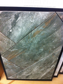
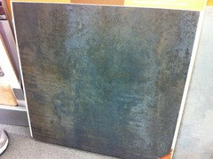
    I said I'd share in town findings. We have yet to visit our two flooring showrooms and tomorrow hubby gets off early so it might be an option before they close!

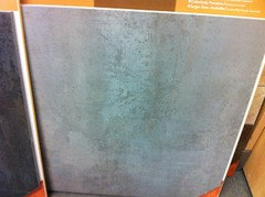
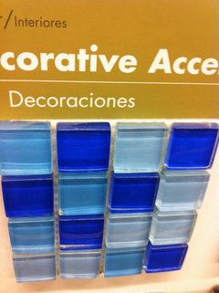
    But these are the only ones with any of the coloring in it. All the rest were all beiges with no other coloring.

    The last pic is just to show the blue hubby likes. The darker royal. I showed him a blue I'd prefer and he didnt like. This will get interesting as he also showed me one almost indigo he liked. That's not what I had in mind at all!!!

    I go to anchorage soon for hubby conference and have an entire Saturday. Much more competition and places to shop there.

    I've been quoted $1000 for shipping in tile from states before (no way), so it gets tricky! My dads place if work has a freight forwarder we've used before so there is a way if nothing in town works.

    I do love the horizontal grassy look of the Torino I posted earlier.

    Anyway... Just sharing my findings. Not necessarily options.

    :-)

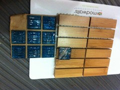
    My modwalls samples came! Even though the bamboo can't be used in wet areas and doesn't really have a place in our bathroom, it's really cool!!!!!! I had 3 samples to include so i figured why not :-) The blueville is definitely pretty! It's edging is that royal blue actually then it lightens up.
  • 12 years ago
    Blueville