Software
Houzz Logo Print
mmakf

Need help- display items, color scheme,etc.

12 years ago
last modified: 12 years ago
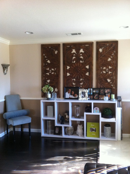
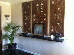
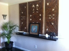
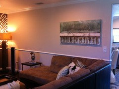
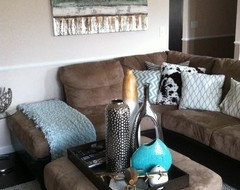
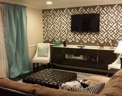
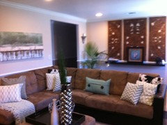
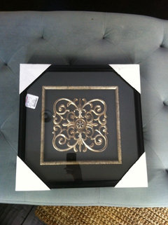
Wanted to have an unconventional entryway so Instead of a huge mirror I opted for this wood art, love the art but felt it was too much brown going on- I like the display items but want a cohesive look. Any ideas or suggestions with few tweaks will help.

Comments (376)

  • PRO
    12 years ago
    -- Bless groveraxle! However, I need someone to send me a reply, or something, so I can find the other thread. Don't want to comment until I see his rendering.
  • 12 years ago
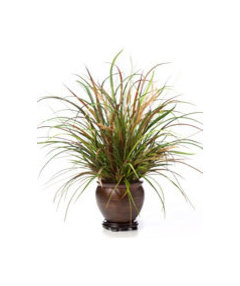
    Plant moved to the Foyer! Thoughts? Rug is in too!
  • 12 years ago
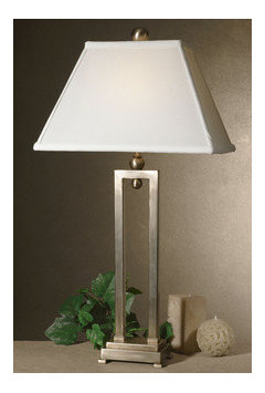
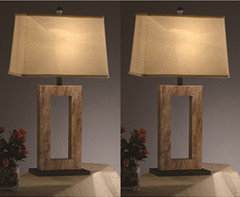
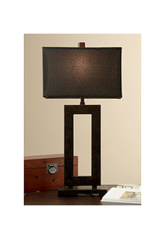
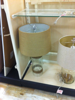
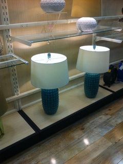
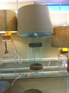
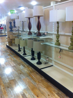
    Shopping for the lamps, height over 30". any of these work?
  • 12 years ago
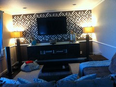
    mmakf, I like the palm in the entry corner. Wondering what you and SandyG would think about a matching pair of floor lamps (Like the one you have now) on either side of your entertainment unit? (To help address the corner issues.)
  • 12 years ago
    I always thought about that! and what should we have over the media console? leave it the way it is?

    I can also put a slender palm in the corner, less fuller? I will then take the end table away, put a chair on the left?

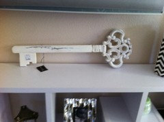
    I also bought this key art that I was thinking to put on the wall, will need help placing it correctly.
  • 12 years ago
    You are really good at the accessories. IF you select matching floor lamps, my first thought for the console: three of your vases in varying heights on one side, a large round platter on an easel type stand on the other. Just pieces of scale and the appearance of height / weight that pleases your eye. You will know. Cannot see the key art. You are a woman on a mission! Good for you!
  • 12 years ago
    Any of these work? If not, I will proceed to buying the floor lamp, same as on the other side?
  • 12 years ago
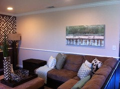
    Art hung okay? Also I introduced much slender and taller palm, thoughts? I like that touch of green there! I can replace the pot in white?
  • 12 years ago
    last modified: 12 years ago
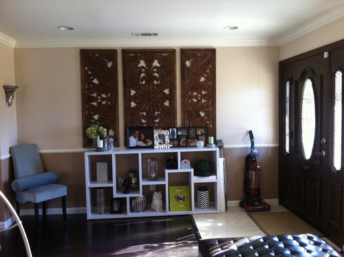
    mmakf, I love the pic, now that is hung. Maybe a tad lower?
    Where is SandyG?
    If you go with the tabletop lamps as a pair, I like top right, most.
    Also like the two pairs, middle area in the bottom right pic. Top and lower shelf.

    Still, do like the concept of a pair of floor lamps the most. Maybe try a pic with your current floor lamp moved to the left side? Repost the pic of its' current spot and add the new left side position pic, for concept? Might help you visualize before buying.
    Like the tray you added.
  • 12 years ago
    mmakf, checking in. Did you decide on the lamps?
  • 12 years ago
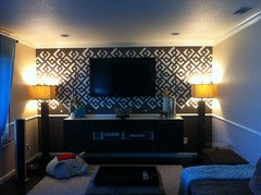
    Thanks Moggie7 for following up! Here is the pic.
  • 12 years ago
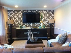
    mmakf, love the balance of the lamps. I have been remiss to check in on your family room project. Will stop by this week. You have accomplished so much. Best to you.
  • PRO
    12 years ago
    last modified: 12 years ago
    -- Hi mmakf -
    The lamps are good!

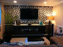
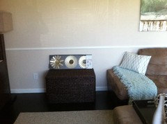
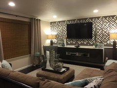
    What could be improved is the arrangement on top of the cabinet. It could be more cohesive and you could use a stronger color statement on that wall.

    You might have some pieces around your home that could be combined or shop for them on the internet or thrift shops, etc.

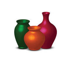
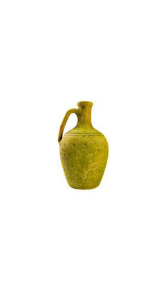
    Choose a color family from your painting and stick to it. Find pottery, stoneware, etc., that is in your chosen colors and that have simple glazes with no, or very little decoration, since there is a strong pattern on the wall and you want to enhance that aspect of the wall/room, not compete with it. Do not go crazy trying to match pieces one to another, it's just a loose palette that would "read" as coordinating with your painting. This is just a tip for choosing accessories that coordinate with the other pieces in the space. Not sticking to a design direction will produce a cluttered/undecided look and we do not want that for sure!

    Find pieces that have different shapes & heights - graduating from a platter [under the tv, filled with oranges], to a tall vase. Keep the items from the edges of the cabinet top. They need to have elbow room and not feel like they are going to fall off - group them closer to the tv.
  • 12 years ago
    last modified: 12 years ago
    mmakf and Sandy G. Curious to know what you would think about extending the existing curtain rod a full panel's width on both sides to accommodate window treatment that would cover the electrical outlets? Or, a plant potted in a strong ceramic color, as above, in that area?
  • 12 years ago
    Oh, it's turning out great, but curtain panels, hung high and wide, are in desperate need. They really would help soften the look and give a finishing touch to the room. I'm anxious to follow your progress. :)
  • PRO
    12 years ago
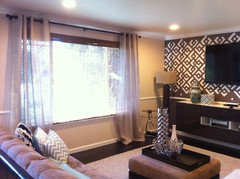
    --Totally agree with moggie73 [as usual!] and tlparks re: drapery panels. Do you see in the pic below how there is a wash of blue over your room? That is coming from light filtering through the blue sheers. The room would look crisper with natural colored, linen-like panels at the windows. These should hang from a few inches inside the window frame and over towards the corner/front door. Your room has a sophistication that is not reflected in the window coverings - and I apologize for telling you this. Ikea has some very sensibly priced panels - on line and in their stores. You could remove the blue sheers and see the difference.

    I was going to address your window earlier, but felt I was sending enough info for that installment! Do not want to overwhelm you!
  • PRO
    12 years ago
    last modified: 12 years ago
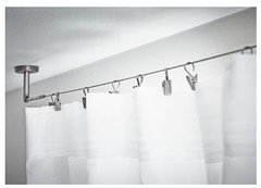
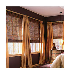
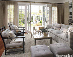
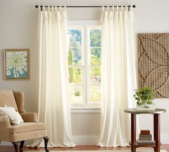
    Some panel and rod ideas.

    The wire "rod" is so cool - I have used it 2x in rooms in homes where clients are very much like you in taste. They wanted logical solutions but a little bit "out there". It is $12.99 or so at Ikea [clips are sold separately] and I think it is a lot of bang for that buck. This hanging solution gives simple panels pizzazz and quirkiness that you like.

    If you prefer sheers at the window, switch to a neutral color as in pic# 3. The woven bamboo blinds would tie in with the stenciled wall and leather furniture. And there is absolutely nothing wrong with the tie-top cream panels either.
  • 12 years ago
    Even if I left the drapes down like that? Do you really want me to change them?

    I will be sending pics of things that I may go look for today, plz let me know if they can be used, I mean your prompt reply may help me buy stuff readily without worrying abt returning it.
  • 12 years ago
    I still have my old ones, if you think they will go well?
  • 12 years ago
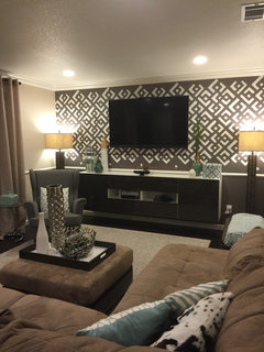
    I have attached the pic for accessories over the cabinet, painting for reference, what stays and what should go?
  • 12 years ago
    mmakf, you have a wonderful eye for the accessories. I am coveting the turquoise pottery.
    Wonder what the two tall silver vases and the branch bowl as a grouping look like on the left.

    Are your current window treatments also an aqua hue? It is hard for me to see. You still have bamboo shades on those windows, without lace sheers, right?
  • 12 years ago
    Ditch the shelves and the chair and add a big tall plant in a pot with some shine to it.
  • PRO
    12 years ago
    -- Would like to ask the same important question moggie73 asked re: drapery panels and accessories.

    It looks like you nailed the blue/green color of the panels with the b/g in the painting. It could work if you pulled them off the window so they are on the wall and no light casts that blue hue over everything. The safest panels are going to be linen colored with the hits of color in accessories. Bamboo blinds seem more appropriate than the delicate lace panels.

    Try grouping the silver vases & twig basket together on the ottoman tray and then gather the seafoam, green/blue pots on the TV cabinet. The turquoise color seems too hot for this room . . now that we have a close up of the painting. The robin's egg blue in the throw is better than turq. I could not find the turq in the painting - but that could be the internet playing around with color!

    I feel so bad - having you run from pillar to post trying to find these things! Please let us know when you have had enough and have been able to use the guidelines above?
  • PRO
    12 years ago
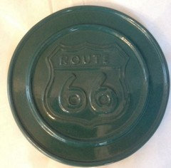
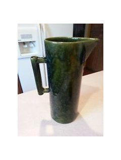
    So, I went to ebay to see what was there as far as your blue/green color pottery. A combination of these would work on the TV cabinet. The cups show how to mix the b/g colors - they do not match but coordinate. You should decide if you want matte or shiny glaze finishes - I would not mix those. These are reasonably priced - I entered "blue green pottery" and had several hundred items to look
  • PRO
    12 years ago
    last modified: 12 years ago
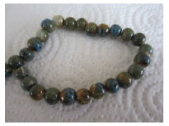
    Goofed up submitting, so here are more for you to look at. Beads would be a fun addition to the grouping - flowing out of a vase, or laying loose on a small plate/shallow bowl, for example. These colors are "dusty", not clean, clear, vibrant.

    Does this help at all? It would be a big help to see a close up of your painting - these are a guess color-wise, and I am wondering if there are any other colors in the art that you could pull out and use.

    In order to keep these groupings from becoming boring, the colors should be in the same blue/green family but different degrees of lightness and darkness.
  • 12 years ago
    Thanks SandyG! And m0ggie73! Yes I have them in aqua tied up. I will look for linen drapes. I will post the pics with the suggested setup.
  • PRO
    12 years ago
    Super!
  • 12 years ago
    SandyG- that end table works? I always wanted little glitz in all my rooms, will it be okay to keep them all shiny? How many of these pottery vases we need if I go colored shiny? Silver vases and basket are to keep or leave?
    I am just asking to know what I need to buy. I also want to attach pics of things that I had in mind when I chose the wood art. I think everything will fall dull if I chose Matt. Thoughts?
  • PRO
    12 years ago
    last modified: 12 years ago
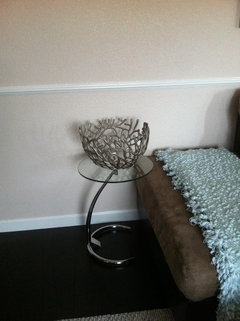
    OK then. Group the silver vases and bowl on the tray on the ottoman. Should be a nice statement there.

    The collection on the TV cabinet could be shiny and you need to remember that you want to compliment the stenciled wall - not compete with it. These objects should not be the stars - the wall is. I get that you like glitz and if that makes you happy, for heaven's sake, that is what matters! Seriously! I am here using my experience + gut and would recommend the matte finish. Understatement = a higher road. Be careful with glitz - less is more - let that element be just on your ottoman and you can go so sparkly your teeth hurt! But limit yourself to that spot and you will be good. I feel like I just dashed some of your hopes and you need to promise that you will do whatever makes you love this room! Deal?

    As far as the number of pots/vases needed, it is really a case where it depends on what you find out there. The size and shape of them will determine what makes a good grouping. Begin with 3 good-sized pieces, all different heights, and see how that looks. 2 on the wall side and one on the window side for starters. You can always add other pieces and at least, you have a start. Keep this collection pure - do not veer off the guidelines or you will defeat the purpose which is to pull color to that side of the room while coordinating with your artwork while not competing with the stenciled wall. Tall order you say?
    Easy!

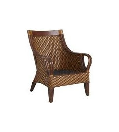
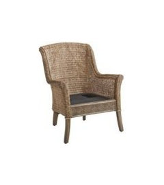
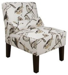
    A table at the end of the sectional should be heftier than the glass-topped round table because your sectional is on the chunky side. The wicker trunk might work [you have had it there before]. Maybe a cube-shaped one would fit a little better. Wicker works in this space - it is nice with your stenciled wall. Think about adding a side chair between the window and entertainment center. That area feels a little hungry and another seat in the space would be nice. A wicker chair, an upholstered chair in a non-linear print, a smallish size but comfortable . . . You might have such a chair already? Then, try the glass top table beside that chair placing it on the window side of the chair. The first 2 chairs below are on line at Pier 1 and the upholstered one is from Joss & Main.
  • 12 years ago
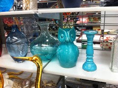
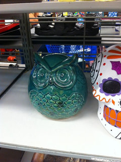
    This is the color I found on the shelves, bought the owl on the second pic. Let me know if any of this works? I am still on hunt for more.
  • PRO
    12 years ago
    The owl on the right looks like a great color compared to the one on the left. You are working to coordinate your curtain panels, artwork and accessories. This guy looks like a good fit! But, what do you think? Looks like you are shopping at a thrift shop and that is even better
  • 12 years ago
    Agree with you SandyG, right pic owl is the one I bought. I have to get something lighter now, it's a hard find. I think the colors are justified in person over online shopping, hence the stores:) I will look for linen drapes today. Didn't come across any yet. This window is wide and regular drapes don't cover the width all the way.
  • PRO
    12 years ago
    -- I get that not all panels are not wide enough to pull closed and cover the entire window. You could use these panels as stationary panels at the sides of the window, and then install the matchstick/bamboo style blinds for light control and privacy. If you can find linen panels, that is fine.

    However, if you like these seafoam panels, keep them - being careful to coordinate accessories with this color. Linen panels would give you more flexibility with color but you are still guided by your artwork re: accessory colors.

    You could certainly use a darker color that is in the glaze on the owl. Keep an open mind while shopping and take the owl with you for inspiration. You might find a piece that looks great with the owl and is not something you would ever have considered.

    I know I am so picky about this stuff and am shelling out so many "rules", but it pays off in the end.
  • 12 years ago
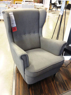
    SandyG- Hubs and I try went shopping, testing the comfort of these chairs and he likes this one a lot. Once you approve, I can go buy. He prefers upholstery over wicker for indoors.
  • PRO
    12 years ago
    Progress! I think the taller back will be nice at the end of the room. And the fact that they are comfortable is great! Post pix please? Nicely done!
  • 12 years ago
    I am so excited to post pics and show you everything I bought, I think it will look good! Once I buy this chair, I will post pics with everything:)
  • PRO
    12 years ago
    It IS exciting to finish up a space! You have worked so hard on this - cannot wait for the reveal!
  • 12 years ago
    LOVE this whole thread and cannot wait to see these pics!!! GREAT team work!!!
  • 12 years ago
    mmakf, really love that chair. Hubbys are very selective about chairs. So happy he likes that one. Your home gets more beautiful every step you take.
  • 12 years ago
    Tried getting the chair, didn't fit in the car, bummer! Have to wait for hubs to free up a van or a truck. But let me know your thoughts on the accesories, drapes and also that gold bowl? I couldn't centralize it over the console, have a better home for it in the room? I love the new accesories:)
  • 12 years ago
    This place of the wall needs attention too. Random placement of this in a bunch?
  • PRO
    12 years ago
    I also think the display case and the artwork are fighting with one another. I would move the triptych to another wall. On top of the display case a tall lamp and graduate the accessories in the middle and perhaps something sculptural on the other side for balance - mid level high.
  • 12 years ago
    Maybe pick a great color(lime?) and paint the display piece that color and paint the wall behind the wood carving the same brt color to show thru and make it a cohesive unit...only paint behind the carving ...not the whole wall...
  • 12 years ago
    Maybe skip the chair an put a rug in front of the unit to give it the featured attention it deserves...if seating is needed maybe some form of a simple,even primitive wood bench in front
  • PRO
    12 years ago
    last modified: 12 years ago
    A good way to finish off this space is to move the new chair in and then work on smaller things. Rooms can fill up quickly and you can spend money on things that are not really needed.

    I agree that the blank wall space above the wicker trunk feels a little empty now, and this can be addressed next. Live with it a short while and see what you think.

    It will be a challenge to figure out what to put there, if you need something there. A different art piece, a mirror, a lamp on the wicker trunk, - too much, borderline clutter. If you do too much on this wall, you should really remove some pillows, vases, etc. You are almost at the accessory saturation point now.

    The suggestions I would have would be another silk plant, tall enough to go 1' - 2' above the chair rail and one that would be sort of shaped like the one in the corner, or hang a simple white/cream mobile above the wicker that would hang down half way to the chair rail.

    Check out "hangingmobilegallery.com." or 'allmobiles.com"
  • PRO
    12 years ago
    I lost track of you somehow! Just happened upon your thread while cleaning up my bookmarks list! How are things going now that it is 2 months later? You worked so hard on your foyer and living room, it would be fun to see how it all turned out, , , ,
  • 11 years ago
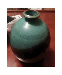
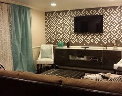
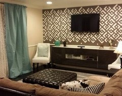
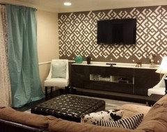
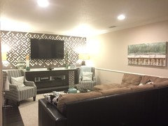
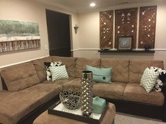
    Sorry it took this long! We finally had this:)
  • 11 years ago
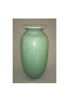
    You and Sandy have made a hardwworking team, and its nice to see the afters - thank for sharing them!

  • 11 years ago
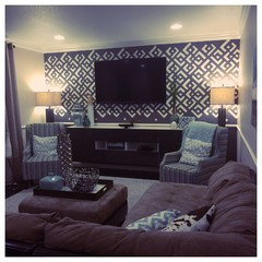
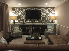
    Added chairs for balance on both sides.