Software
Houzz Logo Print
gayleben

Can I share photos of my home on Houzz?

12 years ago
last modified: 12 years ago
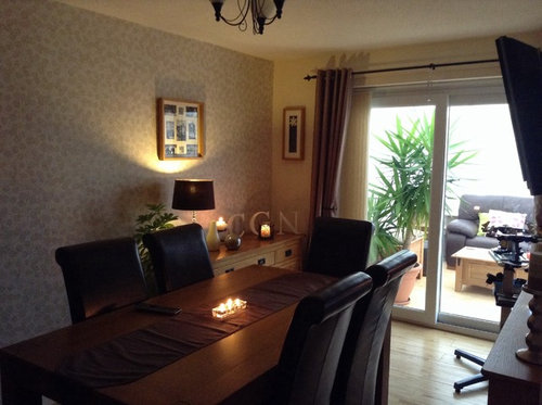
I would love to get opinions from the American users on our English homes. Our rooms are so much smaller, like my typically working class home. I love Houzz and the American style, but it is so hard to emulate in small spaces.

Comments (39)

  • 12 years ago
    Nice! Do you have a dilemma?
  • 12 years ago
    gayleben, not all Americans have large homes with large rooms...I don't. In fact, as an Anglophile, I enjoy viewing the British homes and their dilemmas. This Discussion area of Houzz has many modest rooms posted.
  • 12 years ago
    Hi, thanks for your comments. I'm sorry for generalising so much, I must watch too many movies and Houzz pics! It just seems that American homes across the board have more spacious layouts, and better use of space. My only dilemma is 'Have I done it right with what I have!? Working with such a limited budget is hard. I hope I haven't offended anyone and would love to know what you like about British homes.
  • PRO
    12 years ago
    Create an ideabook and post the photos you want to 'share' with the world.
  • 12 years ago
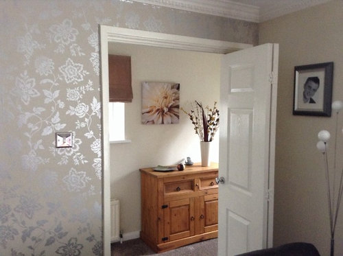
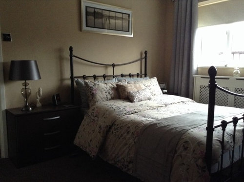
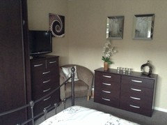
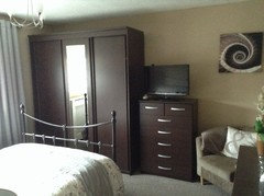
    You have done well. The bedroom looks very nice ! Browse around photos on Houzz that show how to hang art and pictures etc. because your pictures are hung too high. It's a very common mistake. You will see how much of a difference it will make when your pictures are hung the right height and scale to your furniture. Good luck and thanks for sharing !
  • 12 years ago
    i like your bedroom. it looks soothing and peaceful. the lighting helps that feeling i'm sure. the main comment i'd have, something you could adjust without spending any money at all, is lowering your pictures.
  • PRO
    12 years ago
    I agree lower all the pictures you will see the difference. These pics are of a very small living, dining room in a more modern style if you want some ideas.I find in smaller spaces if you keep the furniture a little smaller scaled and eliminate any pieces that don't serve a purpose it works better. This room was 10' wide and 25' long quite small by american standards.This was our house in Calgary it was built in 1905 we now live in a large 1950's rancher quite a different house with a huge living room, in some ways I had more fun doing the Calgary house.
  • 12 years ago
    Thanks everyone. Are the pictures in the living room too high, as well as the bedroom? Are they too high in the new pic? Patricia, I envy you!,,
  • 12 years ago
    yes, pictures too high in your bedroom. can you find some way to group the wall art all together…..all three of them. and to squash together your things on the dresser tighter. so much furniture….suppose it's necessary if there is no closet though…but the wardrobe…..it's there because that is your closet? this needs to be positioned so that you don't have to look at it full face from your bed or from the doorway.
  • 12 years ago
    Thanks. I know there is a lot of furniture! Apart from rooms being small in our average homes, we rarely have built in closets. This is a four bedroom house and has no built in cupboards in any of them, believe it or not!
  • PRO
    12 years ago
    Yes, I agree with all comments. It's a problem we don't often face in the US where built-in closets are the norm. I see the wardrobe being the elephant in the room. From a bespoke cabinetry design point of view, I don't see why the 'robe always needs to be so tall. Men's clothing and women's separates usually only need 3-4 feet in height and could be interspersed with dresser units. I realize I'm not going to revolutionize European furnishings but it is something to think about.
  • 12 years ago
    Not everyone here in the US has tons of space - take a look at San Francisco or Manhattan ideabooks! Here in SF our houses are much more like yours, and Manhattanites are famous for good use of space.
  • 12 years ago
    the height is so there is space for shoes too. not just hanging clothing goes into a chifferobe / wardrobe.
  • 12 years ago
    I would love you to post some pics of your 'normal' homes. It might get rid of this ideal that I have!! I think I'll always be an Americanaphile!
  • 12 years ago
    Ok, gayleben- I will take a couple of photos when I get home after work. My living room is small and I have no entranceway to speak of. I also have no closet space as my house was built in 1919.

    I already
  • 12 years ago
    Ok, great! But you are lucky to live in SF though!!
  • 12 years ago
    Just to add, the wardrobes here are so high as the have a shelf across the top with the hanging rail underneath it. We need all the space we can get!
  • PRO
    12 years ago
    last modified: 12 years ago
    It seems like the main theme in newly American homes is "Less is More". Yes, our spaces here are larger and we have open floor architecture replacing boxy rooms today. But you can achieve some of that by getting rid of excessive items (i.e. decorative pillows, extra furniture), busy wallpaper etc. Simplify by starting to remove items from your space one by one. If the room can function and still looks complete without that item, keep it out. Repeat until the room looks complete, but light with less ornamentation. p.s. Yes, pictures need to hang lower.
  • 12 years ago
    Thanks, that all makes sense. I would love to have less furniture, it would make the space look bigger. Unfortunately, the furniture all has a purpose!! I need to move to America I think, or win the Lottery, or both! One thing I can do though is lower my pictures!,,
  • PRO
    12 years ago
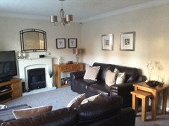
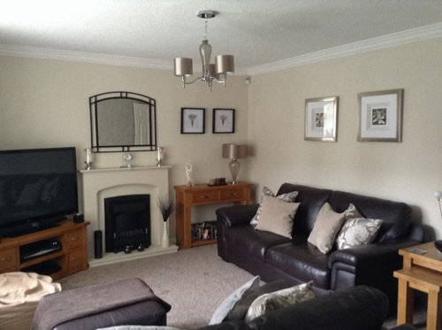
    Come on over gayleben! We'd love to have ya!! Here is an example. I only see one part of your family room, but if I were helping you to redesign this area, I'd propose moving the TV on top of the fireplace (mantel would have to move a bit lower), get rid of the console and TV stand left and right of the fireplace and install floating shelves on the walls instead.
  • 12 years ago
    Danniels-French Design- everything you've said makes perfect sense. I will try to at least make some of the changes. Sorry about the tennis racquet stringing machine in the dining room, not a good design feature I know! The 'table' on the right side is an oak radiator cover. It's better than looking at the radiator, right? The tv tilts and is on an arm so everyone can see it. I can't move it cos the screws go through to the kitchen!!!
  • 12 years ago
    Oh, to be able to afford a designer!!!
  • PRO
    12 years ago
    No problem gayleben! This is when Houzz is at it's best - we get to help you for free. And we designers don't want to keep our ideas to ourselves anyway! But you're right, things can never be perfect, whatever that might be, so we prioritize and do the best we can. Life is all about compromise.

    Here we get to throw ideas at you and you take and use what you want and how you want to. It's a process and it's ongoing.

    And here's a thought - rads can sometimes be fun to have exposed! I did a job years ago where in a guest bedroom we used a very bold Designers Guild fabric for bed covers and curtains. We then picked colours from the fabric - a dominant limey green for the walls and a darkish blue for the rad! Sounds odd but it really worked. I'd send a picture but it was before the advent of digital cameras!

    Anyway, bit by bit and have fun doing it. And please, I hate to disagree with APK Designs, but I personally really dislike placing a TV over any fireplace. The fireplace should be a lovely focal point in the room and somehow having a black rectangle over it just doesn't do it for me. Also, regardless of all the clever ways of hiding it over the fireplace, it is still at the wrong height. As I said earlier, the correct height for a TV is so it is at eye level when watching it and that would be based on a sitting position. So keep your fireplace pretty.
    gayleben thanked Danniels-French Design
  • PRO
    12 years ago
    PS And post us update pictures as you go! We'd love to follow your progress.
  • 12 years ago
    I will, thanks for the insight into a designers mind! My big dream is to knock through the dining room into the kitchen, so watch this space! I'm determined to get that open plan feel.
  • 12 years ago
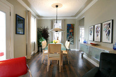
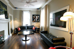
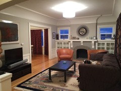
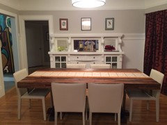
    Ok, here's my living room and dining room, both small by American standards. I'm standing at the front door when I'm taking the picture of the living room.
    gayleben thanked bittymonkey
  • 12 years ago
    We in America know that England is known for its English Gardens. I have noticed that many English homes bring that English Garden theme into their homes through artwork, bedding, accessories etc. so if your goal is to "Americanize" your home a little try to sprinkle in some great ikat pillows, mercury glass, etc and play down the floral a bit. Your home is really quaint and inviting just as it is. :-)
    gayleben thanked Keitha
  • 12 years ago
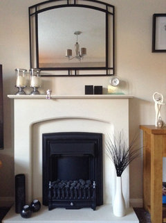
    I think once you've lowered your art and DR light fixture you'll see a big difference. Pictures on their own should have their centers at 5' above the floor. If they're with furniture they need to anchor with the furniture at 5" above it. Don't allow pieces to hang above door or window frames or above lamp shades. I'd remove all the items strung out along the hearth and follow Danniels-French's thoughts on the mantel decor, first lowering the mirror to 5" above the mantel. Do you have a favorite color you can start throwing into the mix?
    gayleben thanked decoenthusiaste
  • 12 years ago
    Thanks bittymonkey, your place is lovely, and very American. The rug reminds me of England though! Is that the kitchen off the DR with the huge artwork? Thanks everyone for the comments, I'll def be making some changes. And the garden thing; we do love our gardens and gardening, shame we don't get the weather to enjoy them as much as we'd like!! I'll wait for the better weather to post some outdoor pics I think.
  • 12 years ago
    Yes, the kitchen has our 6' painting, because that was the only wall big enough without trim!

    The rug is a Chinese export from the 80s that my parents gave to us when they downsized.
  • 12 years ago
    I think your space is beautiful. However, I would opt for much larger artwork.
    gayleben thanked janeinfo
  • PRO
    12 years ago
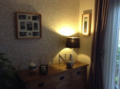
    Gayleben, I just love that wallpaper!
    gayleben thanked Lori Dennis, ASID, LEED AP
  • 12 years ago
    Choosing artwork is a nightmare for me, I never know what to choose for the best.
  • 12 years ago
    I understand about the artwork. I think your artwork choices are fine. Just remember to go LARGER. :)
    gayleben thanked janeinfo
  • 12 years ago
    Ok, spot the differences! Until I can go 'larger!, is this a small improvement?
  • 12 years ago
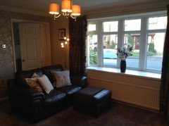
    This pic is taken from the console corner. I hope this huge window and radiator explains why the furniture is placed where it is!
  • PRO
    12 years ago
    Really nice
    gayleben thanked Lion Windows and Doors
  • 12 years ago
    I like what you did with your mantle. Someone may have already suggested this and you might not like it, but have you thought of putting your side nesting tables on the other side of your sofa and using your console table where those were? It might make your walkway between the sofa and love seat seem larger and maybe your fireplace wall less crowded. You'd have to try it if you like the idea because I am not very good at picturing layout with pictures.
    gayleben thanked janeinfo