

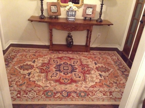
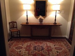
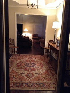
Entry rug
12 years ago
Featured Answer
Sort by:Oldest
Comments (19)
 12 years ago
Related Professionals
Brunswick Interior Designers & Decorators · Georgetown Interior Designers & Decorators · Parkersburg Interior Designers & Decorators · Portsmouth Interior Designers & Decorators · Dodge City Interior Designers & Decorators · Madison Architects & Building Designers · Asheville Architects & Building Designers · McAllen Architects & Building Designers · Allentown Architects & Building Designers · York Architects & Building Designers · Starkville Kitchen & Bathroom Designers · Knoxville Kitchen & Bathroom Designers · Oxnard Kitchen & Bathroom Designers · Santa Barbara Kitchen & Bathroom Designers · Ottawa Kitchen & Bathroom Designers 12 years ago
- 12 years ago
 12 years ago
- 12 years ago
- 12 years ago
- 12 years ago
 12 years agolast modified: 12 years ago
- 12 years ago
- 12 years ago
- 12 years ago
- 12 years agolast modified: 12 years ago
- 12 years ago
- 12 years ago
 12 years ago
 12 years ago
 12 years ago
- 12 years ago



Related Stories
REMODELING GUIDESTile Rugs: Decorative Features for Your Floor
Clever Floor Accents Bring Color and Style to Entry, Courtyard and Bath
Full Story
ENTRYWAYSHow to Choose the Right Rug for Your Entryway
Show your style and go big for the first rug you and your guests will see
Full Story
DECORATING GUIDESGet Clever With Area Rugs for Warmth and Beauty
Give feet a soft landing, protect your floor, hide a stain ... with area rugs in your arsenal, you can win any flooring battle
Full Story
PATIO OF THE WEEKRugged Comfort in Northern California
A garage relocation opens up a family's comfortable outdoor living space
Full Story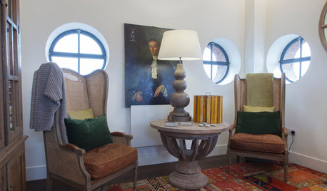
DECORATING GUIDESHow to Choose an Awesome Area Rug No Matter What Your Space
High use, a low door, kids and pets running amok — whatever your area endures, this insight will help you find the right rug for it
Full Story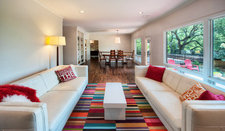
PATTERN17 Gorgeous Ways to Work In a Patterned Area Rug
Add spark underfoot and pull a room together all around with a patterned rug as bold or subtle as you please
Full Story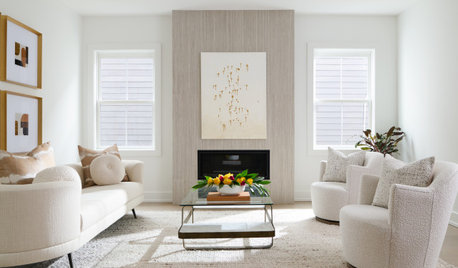
DECORATING GUIDES11 Area Rug Rules and How to Break Them
How big should an area rug be? These guidelines will help you find the right size and placement
Full Story
RUGSEnjoy the Tactile Beauty of Braided and Hooked Rugs
Rugs born of Colonial days offer the most color choices — and the most homey feel — of any floor covering around
Full Story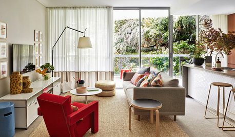
DECORATING GUIDESSize Up the Right Area Rug for Your Room
The size of a rug can make an important difference to the feel of a room. Here are some tips to help you make the right choice
Full Story
DECORATING GUIDESThe Beauty of Contrast: Modern Rugs in Traditional Spaces
Give a time-honored look an energy infusion with an unexpectedly modern rug. Here’s how to contrast without clashing
Full Story





3lindakj