Software
Houzz Logo Print
snowjulie

Stairway photo collage

12 years ago
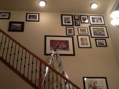
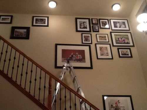
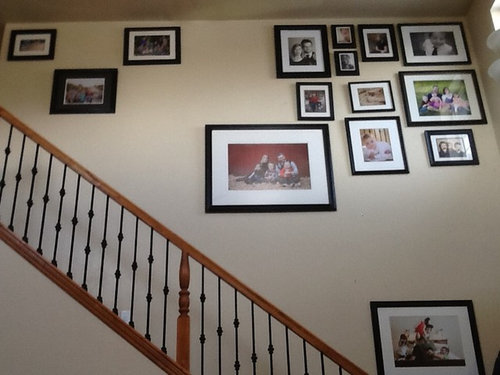
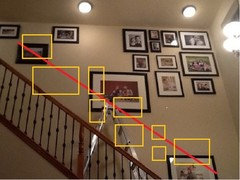
My husband and I are photographers so we thought a huge photo collage in our stairway would be perfect. I got inspiration from photos on Houzz of floor to ceiling, eclectic, photo collages but when I look at our project it doesn't seem to be clicking. I'm wondering if it is just too much. I don't want to continue until I'm sure.

Should we keep going? Should we nix the layout and start over again? Is the 22 ft wall just too large for this sort of eclectic look?

Thanks!

Comments (26)

  • 12 years ago
    put more obviously and try to make the spacing between them as even as you can
  • 12 years ago
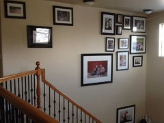
    Another angle
  • 12 years ago
    Keep going. But stop first. ;) What makes a collage interesting is mixing art in as well. Since you are photographers, maybe the occasional macro of a colorful flower? Or butterfly, or thumb prints of the family framed? It really needs planned though. I put the art on the floor and arrange and rearrange until I like the look, then, take a photo of the collage, then duplicate on the wall. If you don't have floor space, graph paper will work, with little squares depicting your photos. Or, take chalk to your patio and map the wall and lay the photos/art on the ground until you like it.
  • 12 years ago
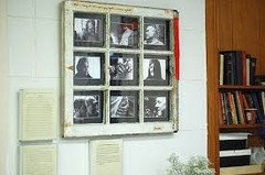
    I can never make these work. Either the frames are too different, or the layout is not right. I love window art for family stuff:
  • 12 years ago
    last modified: 12 years ago
    Oh..I think it also looks best when the photo's composition is similar next to each other. If the shots are head and shoulders only, I'd group them together. Group shots together, etc. Unless you need to use a certain size to make the spacing look right.
  • 12 years ago
    Great article anne dee! I like the idea of taped paper on the wall too to test it out!
  • 12 years ago
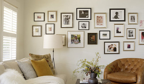
    Yes you have the right idea. As Darzy says, keep going! I think some of your framed photos are too small for such a large area, esp up in the right corner. Darzy's photo is often brought out to demonstrate how to do this right.

    Smaller photos at eye level if you want them on the wall, otherwise nobody will see them.

    if you have enough framed photos may as well go all the way up to the upper right corner. But if you don't you can draw a line parallel to the rise of the stairs and use that as a guide for placement as well.

    Good luck!
  • 12 years ago
    We did photoshop the wall with our prints without the frames but now that they are all in different frames it is throwing everything off. Thanks for the grouping advice!
  • 12 years ago
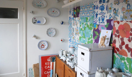
    Keep in mind that your gallery wall can include more than just framed pictures, for example below they have decided to put in masks that they collected in with their pictures. Keep all the rules of thumb in mind but have some fun and make your wall interesting and a reflection of who you are and things that you love.
  • 12 years ago
    Darz, I saved that photo collage to my ideabook. It's just the look I'm going for. Thanks!! :)
  • 12 years ago
    Oh good happyasaclam! I bookmarked anne's link as well. :)
  • PRO
    12 years ago
    The dark frame is not helping your cause as it is emphasizing the spacing and size of the photos. perhaps mixing media or using white or mixed color frames might help create that eclectic concept you're going for.
  • PRO
    12 years ago
    Take it all down....start over...on the living room floor! Set it up to be symmetric on the floor...then you can see just how it would look on your wall....Then return to the wall :)
  • 12 years ago
    I feel like it will be too heavy and like it is falling in on me. Am I wrong? The living room it looks over is about 15x20 with two more equally high walls and an overlooking loft.
  • 12 years ago
    You might try laying the pix out on the floor before you put them on the wall to see what it will look like (as Functional Conceptz suggests) or tape cardstock shapes of the size of your pix on your wall to see how it will work, before you drive a nail into the wall. Think negative space. I agree that all white mats and all black (or all another color - even the wall color) frames would unify such a large number of varied pix and do vary what you hang.
  • 12 years ago
    I can see where it might feel heavy. Maybe an arrangement more like this.
  • 12 years ago
    Would you consider painting the wall a dark gray so that the heavy black frames disappear a little? The frames stand out more than the photos on a light wall.
  • PRO
    12 years ago
    jn3344 has arranged it in a beautiful way.

    Here is a photo of an eclectic style of framing. I like the use of colors.
    http://st.houzz.com/simgs/5c01c8e00d7cd3ac_4-1982/eclectic-entry.jpg
  • PRO
    12 years ago
    Don't square off the arrangement with the wall/ceiling. It should be more free flowing and organic. Take away the ones from the corners and edges and it should start to look better.
  • 12 years ago
    MJ, yes, I think that's what was bothering me about the design...the corners and too straight at the top. Thanks.
  • 12 years ago
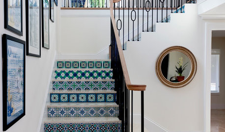
    The pictures are too high. They should be at eye level as you go up the stairs. Note Darzy's example picture, and how the pictures ascend as you go up the stairs so they remain at eye level.
  • 12 years ago
    Start lower and work up, not the opposite. Looks like you started at the ceiling and are working down. That's probably why it doesn't look right.
  • 12 years ago
    Really, no picture should be hung at the ceiling level--you can't even see the faces.
  • 12 years ago
    Yikes, pictures should never be hung up to the ceiling. Take it all down and start again, never above eye level, less is best