Software
Houzz Logo Print
lisa_point

Need help re doing living room

12 years ago
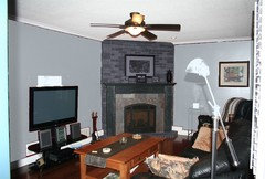
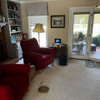
We are in the process of redoing this room. We are planning on painting the brick and mantel around the fireplace. Unfortunately we are stuck with the black furniture so thinking a
Light gray. Will also be wall mounting the tv with built in shelving to one side to hold components and some accessories. Ideas for colours and fireplace options welcome! Having problems attaching photos from my iPad!

Comments (59)

  • 12 years ago
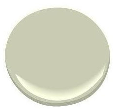
    Hi Lisa -- sorry, yes, I realised that you must mean grey for the walls, and not just the fireplace. I'm not sure grey might not end up looking a bit drab or over-formal? Do you like the colour I posted above, or the Soft Fern Patricia suggested?
  • 12 years ago
    Hi Rina, we just redid our kitchen which had a similar colour to what you are suggesting (it was called pea soup or somthing like that) so I'm afraid it's too familiar to me. any other suggestions?
  • 12 years ago
    The green was Patricia's suggestion; I just thought it worth posting because it's a lovely colour. Okay, to go back to the picture I posted above -- although alas the source didn't give the paint colour name. But it's not a green, although I see on my monitor it's looking a bit green. Monitors drive me crazy.

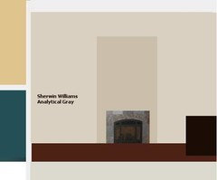
    I see you have what looks like a dark teal wall in one of your pictures above. Would you consider a light, subtle teal for this room. (Pauses to hunt US paint colours -- you are in the US, right?) Oh dear, I can't find a suitable teal right now. But here's a "gray" I really like -- if my monitor is telling the truth. Sherwin Williams Analytical Gray, courtesy of http://www.redesignedinteriors.net/category/yellow-and-grey-colour-schemes/

    Probably signing off for the night now. Happy hunting.
  • 12 years ago
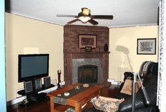
    Thanks Rina - your such a big help! You are correct, we just did our kitchen in the dark teal, which I like and wanted to go with a lighter colour in the family room (cause the kitchen is so dark). I like the gray you linked to above! Our hallway throughout the main floor and second floor (which you can see a smidgen of beside the teal kitchen (to the right above the door of the dining room) is like a butterschotch colour. We also have a yellow living room and a taupe laudry room around the corner from the kitchen...so we are kinda sick of the gold/yellow/taupe colours....thus thinking gray....but I do like the gray you provided in the link. What do you think we should do with the fireplace....we were thinking of painting the brick and mantel perhaps one shade darker then whatever we pick for the walls - so the only thing on the fireplace we wouldn't paint would be the dark gray slate.The other thought I had was painting the brick and mantel white to match trim and shutters....but not sure - thoughts? BTW, are you a professional designer and where do you live? I'm a proud Canadian :)
  • 12 years ago
    Hi Lisa. No, not a professional designer, just a busybody with more opinions than I should have. I'm a proud South African, hence our non-co-ordinating day/night schedules.

    Be back in a bit, D.V. I want to play with colours for a while. I've noticed that the slate in your fireplace has both blue and taupe tones, or so it seems. That is a good thing; it shouldn't limit your colour choice.
  • 12 years ago
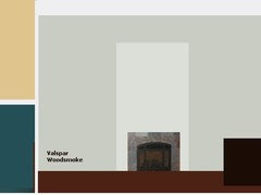
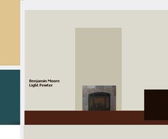
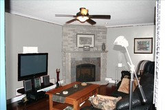
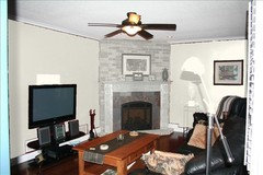
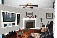
    Back. Playing here with three options, with an approximation of the colours in the neighbouring rooms, which must be taken into account. In fact I think that whatever colour you paint the room, toned-down versions of those colours should appear as accents in the rest of the room, too.* The first one is the colour I posted above, which seems very taupe in this image -- but please be aware how inaccurate colour rendering is on screen. What it can do is give you an idea of what colours you might like to look at when doing your actual paint hunt. I really like the last of the three, though it may be too light for you?

    * To which I'd love to turn my attention later :-).
  • 12 years ago
    Wot happened to the others? Hey?
  • 12 years ago
    Wow Rina, some great ideas - I can't believe how well you matched the colours of the other rooms, your awesome :) My preference seems to be the valspar woodsmoke right now but like you said, it may change when I look at the actual paint chip vs. monitor. So how did you pick the paint for the mantel and brick, just a shade up? And do you agree that we should paint the wooden mantel? THanks again for all your help, I love this collaboration!
  • 12 years ago
    Glad that was useful. The Valspar Woodsmoke is almost a teal grey, isn't it? Or looks like it. I just darkened or lightened the colour I had onscreen for the fireplace, just to give impressions of those options. I'm not sure about the mantel itself -- it could glow beautifully against that bluish grey. I don't have much time, but let me try a quick illustration (very quick, don't expect art!).
    Lisa Point thanked Rina
  • 12 years ago
    Rina, 1 quick question, what does the red at the bottom represent? If it's the flooring, then it's not red but more brown. Or is it to represent the current colour of the room?
  • 12 years ago
    Not very inspiring, I'm afraid. I can't pick up your images at any decent size for some reason so it's teensy and then when I converted it to jpeg it went all pink ... sigh. Fixed it, somewhat. It's not good enough to be really useful, but I'm thinking a white mantle would work, as the wood looks a bit overwhelming. Most importantly, though, I think that it's probably a decision that should be left until you have painted the walls. If you like the wood, leave it. If not, paint it.
  • 12 years ago
    Yes, I picked up what looked like a representative bit of floor for that stripe -- it does look like a red wood on my screen. If it's bugging you let me know and I'll repost the Valspar with a browner colour, later on. Must do some work now.
  • 12 years ago
    PS Not sure a white mantle wouldn't look overwhelming, too. Food for thought. Same colour as chimney breast, or same as the wall, or darker than the wall?
  • 12 years ago
    Hi Rina, ew, I definitely don't like the white brick and wooden mantel. I was thinking painting the brick and mantel a darker shade then the wall. What do you mean by chimney breast, do you mean the brick?
  • 12 years ago
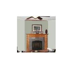
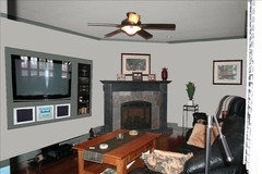
    Yes, sorry, the brick. Transcontinental vocabulary difficulties. I agree, I think, although as I say that picture is not much use ... and it wasn't actually white, but a lighter version of the wall colour. Haven't had time to try it the other way around, with a darker colour on the chimney. The issue of the mantle remains -- wood, lighter, darker, the same. And I still think that decision should be made later. However, small as it is, here's a version with a darker chimney (again, no time to do the brick texture but it might help).

    Looking at this, I think using a darker, more definite version of the colour on the brick makes it much more important that you take the colour of the slate into account. This looks like an uncomfortable mix, the paint looks too green -- not to say the actual paint would be, of you got a more intense version of the wall colour from Velspar. Just that it becomes more of an issue to be sure.

    Back to work, then to bed. Good night from me.
  • 12 years ago
    Hi Rina, yes you make a very good point, whatever we do needs to incorporate that slate - especially if we paint the mantel too, because then the paint and the slate will be side by side......thanks for pointing that out. Yikes! Decisions, decisions! Thanks again and good night :)
  • 12 years ago
    Had an interesting suggestion from a friend to paint the wood a dark glossy colour, like a colour from the slate, then do the brick the same colour as walls so it kinda disappears. Thoughts?
  • 12 years ago
    Very interesting ... will fiddle with Paint later. Good morning, when you reach your morning.
  • 12 years ago
    I think the wall colour in a light grey along the fire place the same colour keeping the brick work natural. You can always paint the black furniture and will come out looking like a new piece. Add some art work even of it printed canvas. Hope this helps.
    Lisa Point thanked Astella Hrela
  • 12 years ago
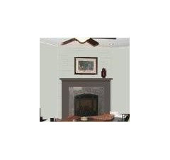
    Hi, Lisa. Clever, clever friend, I think. I've simplified the mantle decoration for a better look.
  • 12 years ago
    The dark mantle seems to bridge the colour gap between the slate and the wall beautifully. Problem gone.
    Lisa Point thanked Rina
  • 12 years ago
    Hi Rina. Yes! That looks great! I've been thinking more about the finish of the paint on the mantel, my friend suggested glossy but I'm afraid that may be too formal for this room. Thoughts?
  • 12 years ago
    I prefer a gloss paint, or at least a low-gloss, on wood. I don't think it will make the room seem formal at all. But it's hard to be sure without seeing the effect in the room. You could choose matt and gloss paints in sample tins and paint boards (using appropriate undercoats to get the right effect); place them in that corner to see how much or little they shine at various times of day. It's worth going to the trouble to get what you want.

    Get technical advice on the correct way to prepare the wood for painting.

    Don't forget to paint boards too for the wall colour to test in the same way, and to test against the colour for the mantle.

    Getting there ... exciting. Buy your friend a box of chox.
    Lisa Point thanked Rina
  • 12 years ago
    Good morning Rina. Thx for the advice. Next I'm going to show you a sketch of the tv wall to get your thoughts. Have a super day !
  • 12 years ago
    Hi Lisa. It's been fun so far. Looking forward to the TV wall. I'll be back later.
  • 12 years ago
    I have decided I just hate this room! I've been playing around with colours and cannot find anything that works! See attached for the only thing that even resembles a half decent room...
  • 12 years ago
    All of a sudden the slate on the fireplace looks so red!
  • 12 years ago
    Here are a couple of more ideas...help!
  • 12 years ago
    what about this
  • 12 years ago
    with this kinda idea for the TV wall
    Adelson · More Info
  • 12 years ago
    I think the only problem is the gray slate on the fireplace, not sure it goes with the brown
  • 12 years ago
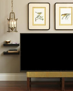
    Hi Lisa -- what happened to your approval of your friend's idea of painting wall and fireplace the same colour and leaving the wood? The slate does have a lot of red, but the pale grey works with it -- it seems to pick up the grey in the light tile on the top row. Or are you just going off the boil on grey? A cream would be a good choice, though, and also fine with the colours on the 'neighbouring' walls. I'll try to do some more mock-ups later, also experimenting with the brown TV wall -- which could also be a light wall; the dark wall's good but there's more to that design than just the wall colour. I think it's great, that pic is also also in my ideas book.

    Don't hate the room; you're just suffering decorating-think overload. :-)
  • 12 years ago
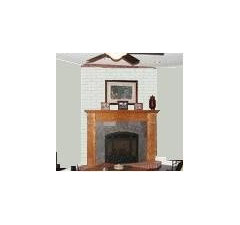
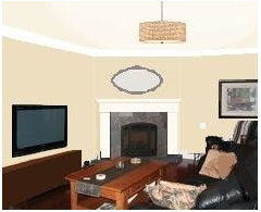
    It struck me you might just be sick and tired of brick. So here's one with the brick plastered (rendered, I think I mean, not drunk) and everything rather simplified. I haven't done much on the TV wall which is hard to draw on anyway with my software because of the slants. Repainted the ceiling. Added crown moulding, or a suggestion thereof. Replaced fan with pendant light. Gave you an oval mirror. Made the picture on the right wall bigger and lower (been itching to do that).

    It's possible the brown TV wall with this would be too much -- though I did play with it, and created various browns, and there are brown-slate colours that seem to work fine. But I think you need to make a decision on the basic look of that fireplace before you can build the rest of the room. I rather like the cream and brick you did, though. This is just another alternative.
    Lisa Point thanked Rina
  • 12 years ago
    Hi Rina! I think the whole fireplace is hard to work with! We have been talking about painting the ceiling. Difficulty there is it runsinto thr hallway (there's no stop to it) . The other thing Im having a hard time with is the white. All of our moulding,mincluding the crown is white, along with the California shutters. I don't know if I want the white anymore. I don't really fancy the white mantel. You are right, I have decorators over think! I love the cream but we have so much throughout the house!, I think we need to stick with grays. And just use variations between the walls, fireplace and tv wall. Argggggg!
  • 12 years ago
    Hubby is open to getting rid of brick. That may solve part of the prob!
  • 12 years ago
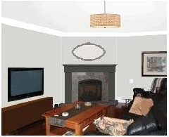
    Here's a grey version. Not unlike some previously posted versions. Not difficult, I think, to find a ceiling grey or cream that would work with both the pumpkin wall and the teal. That's it for me for today. TV, supper, Sleep.
  • 12 years ago
    Sorry ...
  • 12 years ago
    Thx! Getting there! Then maybe we use the dark gray mantel colour for the tv unit!, which my hubby is sketching out now. I'll show u that when he's done. Have a nice night and thx again for your help and being my sounding board!
  • 12 years ago
    Would love to trim in dark gray too but then the shutters r a prob.
  • 12 years ago
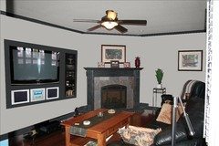
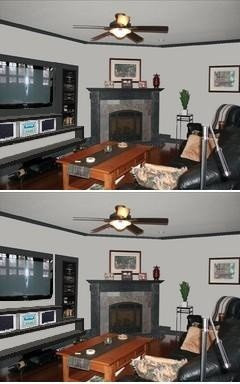
    What do you think about these? Included the TV unit on wall, trim and ceiling painted too.
  • 12 years ago
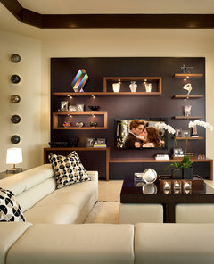
    Hi Lisa. Sorry for the delay in replying. The "panel" design is good but it looks like a TV control room. What gives the design you liked up top its grace is the shelving, so that the TV becomes just part of a whole design, rather than the design being an attachment to the TV.
  • 12 years ago
    I've added two long shelves below to domesticate the design a bit. On the bottom one you could place decorative items such as low bowls, or books -- just to make it a bit less Spaceship Lisa and more homey. It's also tricky as the fireplace, however it's painted, is essentially traditional so too techie a display clashes in style.
    Lisa Point thanked Rina
  • 12 years ago
    Hi Rina, good points and i totally agree. Did you attach a pic with shelves, I don't see it? One of the reasons we are mounting everything on the wall is to save on floor space so shelves on the bottom would defeat that (that's why the shelves to the right of the TV are built into the wall). Any suggestions on how we can work around the space issue?
  • 12 years ago
    Disregard my picture comment, I see the pic above where you put the shelf.
  • 12 years ago
    also, what colour scheme do you like best out of the 3?
  • 12 years ago
    Hi Lisa. Heavily on deadline (ugh), but briefly -- I'm glad you see the picture with the shelf, because I don't. Reposting to set my little heart at ease that we're looking at the same thing. The most logical of the schemes is the first one, but that square of dark grey does look so overwhelming. I don't like the white for the wall square; no solidity. The medium grey isn't working with the dark grey of the fireplace. Looks indecisive. As you see below I tried to ameliorate the overwhelmingness of the dark grey -- eliminating the colour block entirely on the bottom one. Trouble is that a high-tech wall and a traditional fireplace make uncomfortable room mates ...

    (Would you consider a deep, dark oxblood red for the fireplace and the wall square? No idea right now if it would work but it just popped into my mind so I'm sharing the thought -- I think it would work with grey. Not entirely sure.)
  • 12 years ago
    Oh boy, do you ever have to hover your cursor on that to make sense of it!
  • 12 years ago
    Is that coffee table staying? Because if not, I think a glass/plexiglass one would really help declutter the room.
  • 12 years ago
    Hi Rina, I guess I didn't see your pic with the shelf, I was looking at the pic above with the mirror over the fireplace - thought that was the shelf under the TV you meant. Thanks for the new pics. I had thought of red too! and experiemented with it, to no evail. The slate in the middle is screaming red....so it's a good idea to try and work with it! If you can find a colour that works, I'd like to see. I agree on the coffee table, but I know my hubby will want to keep it because it's the same furniture we have in our kitchen. Its just so bulky and heavy. I see what you mean by getting rid of the dark block that the TV is on, I was trying to emulate the professional shelved design (brown and cream) in the pic above. I think I have convinced my husband (with your comments) that we need to do more like the professional one and add the shelves in, we'll still save about a foot of floor room even if we add in a foot of shelves. Also note, that coloured wall will be painted out closer to the edges (like the professional one). My husband is going back to the drawing board to add shelves. We are in paralysis analysis and meanwhile nothing is getting done! BUT this is really helping to ensure we get the desired resluts. Good night!
  • 12 years ago
    Good night. Take time off, at least a few days. Do anything but think decor (husband can carry on working in the meanwhile). A spa day? Baking 500 chocolate chip cookies? A day at the movies with friends? (If you have children, lock them in a cupboard while you have fun.)