Software
Houzz Logo Print
dasha81

Curtains or valance/cornice

12 years ago
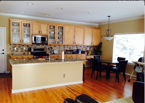
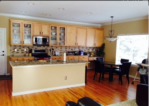
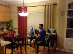
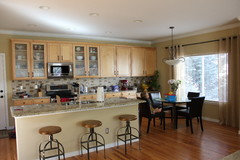
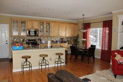
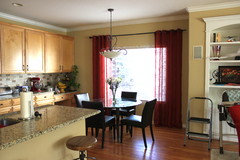
This room is well overdue for a window treatment and some artwork on that window wall.....any suggestions? My accent color in the adjacent family room is red.

Comments (54)

  • 12 years ago
    Yes, the sofa and chairs are brown, not black. Would a cornice not warm it up enough? Also, how far off the edge of the window for curtains?
  • PRO
    12 years ago
    I think I would do a print as well. Here are a few choices for wall art and curtains:

    http://deciture.com/shop/decor/9/campione-floral-curtain/

    http://deciture.com/shop/decor/9/suzani-print-curtain/

    http://deciture.com/shop/decor/7/walter-wooden-wall-keys-set-3/ (I think these would look great to the left of the window)

    http://deciture.com/shop/decor/9/big-tulips-i-and-ii-gia-whitlock-set-2/


    Hope that helps!
  • 12 years ago
    Love the tulips!!
  • PRO
    12 years ago
    me too. I think thet would really soften your look :)
  • 12 years ago
    I would put in a soft fabric roman shade;)
    Project 1 · More Info
  • 12 years ago
    last modified: 12 years ago
    I like the red panels and would continue them on the kitchen window. I think patterned curtains will end up being too busy and ruin the serene look you've got going now. Be bold (and big) with the art.
  • 12 years ago
    I'd go with panels like you have in the living room but in a neutral beige (like the living room rug color). I think that would tie in nicely with the backsplash. For consistency, I'd hang them at the exact height you've hung the living room panels. I'd bring in color with art. I love the tulips (hung in a vertical pair) if the size is right! Does your island have an overhang (it's hard to tell in the pic)? If so, I'd get three counter stools so that area doesn't look so bare.
  • 12 years ago
    I like the idea of matching or coordinating the panels in both rooms, and I like the idea of a print rather than the solid red in at least one of the rooms. Also, and I know you didn't ask for it, but would you consider painting the base of the kitchen island a darker color, like a dark red (if you are going in that direction) or a dark brown (not too dark)?
  • 12 years ago
    I like the island base the same color as the wall. If stools can be placed there, I don't think you'll even notice it.
  • 12 years ago
    Very nice rooms and decorating.
    Dasha thanked rosiegabby
  • 12 years ago
    Sorry. I did not finish comment.

    Maybe these curtains from pottery barn would look nice. Can't always tell from photos what will work though.

    http://www.potterybarn.com/products/alessandra-blackout-pole-top-drape/?pkey=cpattern-drapes-curtains&cm_src=pattern-drapes-curtains||NoFacet-_-NoFacet-_--_-

    I also agree about painting the island. Not sure what color.

    I think your back splash needs updating.
  • 12 years ago
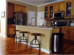
    we do have barstools, here's the pic. they are a bit different style but we love them. :)

    i like the idea of the same red panels, mostly because it's easy to get them and just get it done!

    i would also like the change the light fixture over the breakfast table...thinking of a drum pendant. and maybe a couple of pendants over the island.
  • 12 years ago
    I like your barstools. I do think you should keep consistent in the same room with window treatments so re panels would make sense. I think you may need two or three pendants.
  • PRO
    12 years ago
    I would say put a wall deco that is scrolly. It looks like you have a little one close by this highly functional area. The wall decor would soften the area as fabrics would but be serviceable. If fabric is chosen I would go with a valance with scalloped hem that touches the top of the window to lift the space to the cabinet height.
  • 12 years ago
    Thank you, Ann! I will check if those panels come in a beige...maybe even a light brown?
  • 12 years ago
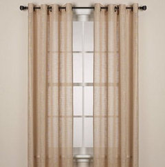
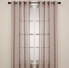
    here are 2 lighter colors in that same panel as the red ones in our living room. which color would go best? or should i stick with the red? i'm afraid the lighter colors will blend into the wall too much.
  • 12 years ago
    also, i wouldn't just hang them down like in the pic....i would scoop them to the sides a bit for a softer look and to not block light from the window.
  • 12 years ago
    Is there by any chance an ivory option, lighter than these. I personally don't like the scooped look and would instead hang them a bit wide of the window so they don't block light but instead just cover about 1" of each window side and the rest is over the wall. Maybe the red will work - I'm just worried it won't work as well with the cabinets, counter and backsplash as it does in the living room.
  • 12 years ago
    these are the only light options...the other is a dark brown, sage green and the red and a grey.
  • 12 years ago
    Hmmm, just not sure. Maybe it would be worth having someone hold up one of your living room panels so you can stand back and see how the red feels. Kind of a pain, but I'd probably go to the trouble just to feel comfortable with my decision.
  • 12 years ago
    I think I will do that with the red ones and the lighter ones...just to see. I can always return the ones that didn't work out.
  • 12 years ago
    Sorry pic is pretty terrible. Lol. Which one works better...red or the ivory?
  • 12 years ago
    Nice! I think I actually prefer the ivory but would you please take a picture tomorrow in daylight from a distance like the original pic in this post? Probably, they both work fine and it's just a matter of which you prefer.
  • 12 years ago
    I aboslutely will! It's hard to tell from the pic.
  • 12 years ago
    I would definitely not tie them back - it looks like you hung them nice and wide (which is perfect) and so they just hit the floor (which is also perfect). Which are you liking?
  • PRO
    12 years ago
    I like the ivory you can accent with table mats or runner with center piece
  • 12 years ago
    I like the red!
  • PRO
    12 years ago
    I know everyone has gone down the curtains path; but I'm seeing a cornice (so easy to DIY) with a fabric that will pull in your red and backsplash colors. I feel like curtains are adding one more thing to the middle-bottom part of that space. They just never work out well with a high chair nearby.. I may have visited the dry cleaners a time or two for this reason!?!
    I would hang the cornice at the same height of the cabinets -- so you would build it to cover the top few inches of your window up to the top height of your cabinets. It will open up the space instead of framing the window.
    Pick a fun fabric with a light background, I'm envisioning a floral paisley with white/cream background, navy blue, green, red pulled in.
  • 12 years ago
    I thought about cornice, it wouldn't warm up the space as much as I'd like. The fabric panels really add warmth, I feel.

    DH and I are both leaning towards the ivory/tan color. And adding some prints to the left.
  • 12 years ago
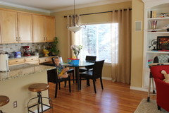
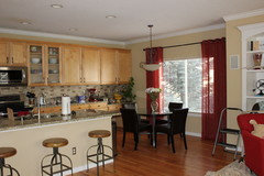
    okay, here are the ivory. i like them a lot but they seem a bit dull and blend into the wall. thoughts? maybe a couple of bright prints on that left wall will help? i will try doing 2 red ones, for comparison
  • 12 years ago
    here's another angle...don't mind the mess in our built-in. that's a whole other project ahead. :)
  • 12 years ago
    I'll be leaving for a few hours but I love the ivory! I like the idea of bringing color in with art.
    Dasha thanked Ann
  • 12 years ago
    I love the ivory. Love the entire space! Very nice!
    Dasha thanked lizpb85
  • 12 years ago
    I think the Red curtain looks more appealing for me because it contrast on your wall. The ivory looks plain & dull.... :)
  • 12 years ago
    here's the red. i'm really torn, because i don't want the space to look dark, but the red is giving a nice contrast. argh!!!
  • 12 years ago
    Well, they are both nice! They have their own character. I can feel you. So hard to tell which is which! :)
  • 12 years ago
    i'm still at a loss. i like the contrast of the red but the ivory gives it a nice complete look, too. i'll keep the red up overnight to see how i feel in the morning. :)
  • 12 years ago
    last modified: 12 years ago
    Does the red match the chair in the living room? IF all the reds in both areas match, I like the red. If they are off even a bit, it will not look right, and the lighter drape will be best. The good thing? THEY BOTH LOOK AWESOME!
  • 12 years ago
    Use the red somewhere other than the curtains. Flowers or a nice pottery piece on the counter, place mats, etc. The red curtains are too much, beige is better. Or go back to your valence idea
  • 12 years ago
    The red does match the same red panels that are in the living room and the red chair.
  • 12 years ago
    last modified: 12 years ago
    I had a feeling they were the same......and since they all share the same space with no walls to separate it at all, I like them matching. I know....the color change makes the dining area separate....and that works, too. My opinion.
  • 12 years ago
    Are the ivory panels too bland?
  • 12 years ago
    I think the red adds a richness to this part of your home.
  • 12 years ago
    last modified: 12 years ago
    FOR FUN......I just showed your two pics to my husband....something I do not usually do, but he is sitting right here, watching tv. He chose the red.
  • 12 years ago
    Haha!! Cool! My hubby chose the ivory. Lol. :/
  • 12 years ago
    Another vote for red.
  • 12 years ago
    FUNNY! Hubby vs hubby now!!!
  • 12 years ago
    Both look great but my vote remains the same - ivory with some red in art.
  • 12 years ago
    definitely prefer the red! The ivory gets lost on against the paint color.
Sponsored
The Creative Kitchen Company
Average rating: 5 out of 5 stars52 Reviews
Columbus Area Kitchen Remodeling and Refacing Professional