Software
Houzz Logo Print
dkdyche

bathroom dilemna

12 years ago
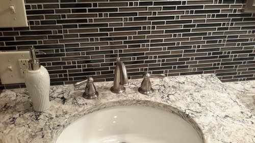
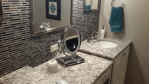
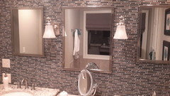
Is my tile too busy for the counter

Comments (24)

  • 12 years ago
    Thanks, I have been worrying even thinking of changing if designers think it's too much or too busy. I do like the cold though
  • 12 years ago
    Think of it as a patterned skirt and jacket that don't match, but go together. If you ever watched What Not to Wear, you will remember how Stacy and Clinton paired prints together saying 'it doesn't have to match, just go.' Same with your bathroom. Enjoy!!
    dkdyche thanked hayleydaniels
  • 12 years ago
    I don't think it's too busy. I think they compliment each other well. I also vote for leaving it.
    dkdyche thanked Christine Smith
  • 12 years ago
    I think it looks lovely. Yes, it is a slightly busy pattern, but it isn't a high contrast mosaic. I love that the two shades are dark. This makes it much more subtle, and it picks up the dark veins in your granite.
    dkdyche thanked feeny
  • 12 years ago
    It looks nice. I know both surfaces have their own pattern, but the counter is pretty subdued and it doesn't complete with the tile.
    dkdyche thanked printesa
  • 12 years ago
    It's gorgeous and rich. Really unexpected and elegant!
    dkdyche thanked twinkleberry
  • 12 years ago
    Thank you all.
  • PRO
    12 years ago
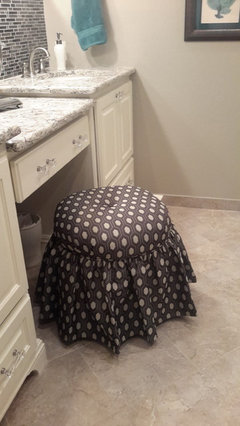
    I agree with others, color-wise both counter & glass tile work well together. It would be helpful to see vertical picture of the room showing what the floor tile looks like. I would recommend dark hardware for your cabinetry, and/or larger mirrors if you feel the tile wall is too much.
    dkdyche thanked Jolana Knupp Interior Design
  • 12 years ago
    Interesting idea, bigger mirrors
  • 12 years ago
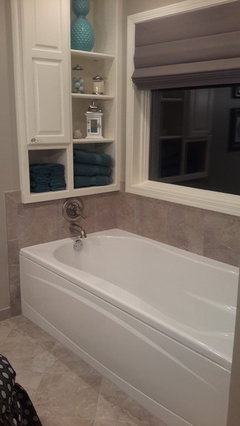
    I have attached more pics. Perhaps I should change out the glass knows I put on, I can reuse them in another room. Do you think dark hardware would be better? Also floor cannot be changed, and bathroom is narrow
  • 12 years ago
    Pics
  • 12 years ago
    Beautiful space! Job well done :)
    dkdyche thanked Denita
  • PRO
    12 years ago
    Thanks for adding more pics - this is a beautiful bathroom! I would definitevly change the knobs to dark bronze to blend better with the dark tile though. Still, not seeing the whole tile wall, bigger mirrors would soften the look - you can get large thick light-colored paper (dark would mislead you) and attach them over the mirrors to see how would you feel about seeing less tile.
    dkdyche thanked Jolana Knupp Interior Design
  • PRO
    12 years ago
    Besides - larger mirrors would make the space look bigger and reflext more light from your window
    dkdyche thanked Jolana Knupp Interior Design
  • 12 years ago
    I like it. The colors and design work well together.
    dkdyche thanked grobby
  • PRO
    12 years ago
    I totally agree with the previous comments and Jolana. Large mirrors to cover more of the tile will calm things down a bit. And, you probably feel like I did the first time I saw the busy marble tile in my master bath - wow, that's too much. But, after you get used to it, it will be fine.
    dkdyche thanked Ku Interior Design
  • PRO
    12 years ago
    My suggestion is to increase the size of the frame around the mirror, and it would eat up a little of the busy-ness. I agree to change out the hardware -- although it's a cute style it's not for the style that you have gone with the countertop and tile. Lastly, that cabinet above your tub, consider wallpapering the backs of the shelves and changing out the hardware -- it would bring a nice unexpected touch to the space.
    dkdyche thanked Cindy Sherman, CKBD
  • 12 years ago
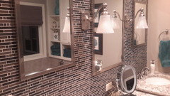
    Ok, last pic, jolana, entire back splash tile with my size mirrors
  • 12 years ago
    The room is done wel, it is one of my favorite topsl. I do agree the hardware in a darker color would work better with the cabinet. Also, I specialize in Tile design and I do have one suggestions that would help the backsplash to just fade away a little more. The light grout color is what is making the pattern pop so much, which I think is what you are worrying is fighting the Cambrian countertop. If you were to use a grout stain, (can be ordered from aquamix) and darken the grout to a more charcoal tone that blends with the pattern a bit more I think it may help soften the look.. Also I like the suggestion of getting a larger mirror or creating a wider frame around the mirror. (reusing tile is not an easy task, I would never recommend it, when removing it you will have thinset stuck to the back of the glass and it may remove some of the backpaint from the glass in the process)
    dkdyche thanked Rebecca
  • 12 years ago
    last modified: 12 years ago
    https://www.groutcolorants.com/ This is just a suggestion. Again, I think the room is beautiful but the grout being such a contrast is what is making the tile pattern pop so much. The color Coco may be a nice color for this (always test in a more inconspicuous place when using a grout colorant. Or taking one sheet gluing it onto a board, grouting it the way you did on your wall, then after it drys, trying out the grout colorant to get a very real idea of how that changes the look, BEFORE testing it on your permanent wall. It is much less expensive route than changing out the tile, which I think is unnecessary. I would love to have a beautiful bathroom like yours!
    dkdyche thanked Rebecca
  • PRO
    12 years ago
    Look like you only have the option to increase the size of the outer mirrors/frame because the center mirror is constrained by your sconces.
    dkdyche thanked Ku Interior Design
  • PRO
    12 years ago
    Ok- I see the switches on the left enabling you goong much wider, but I feel the side mirrors should be the same length as the middle one, and overall all of them could be longer and installed lower. It would make a big difference.
    dkdyche thanked Jolana Knupp Interior Design
  • PRO
    12 years ago
    I meant not enabling - sorry
    dkdyche thanked Jolana Knupp Interior Design