Software
Houzz Logo Print
abigailca

Color/art for guest bedroom - contemporary style

12 years ago
last modified: 12 years ago
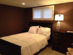
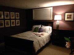
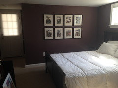
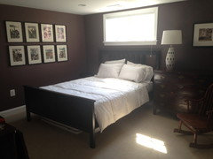
Our guest bedroom is a bland kilim beige color with the same beige color for the wall-to-wall carpet. We need to repair one of the walls, which is an opportunity for us to change the paint color (!) and some of the decor. We had success going dark with the paint color in our master bedroom (a dark charcoal blue), and so I was thinking about doing the same in this room, even though the lighting in the two rooms is very different (i.e., our master has a lot of light and our guest bedroom only has two windows and is more somber.) I think it might work for different reasons in each room. Because the rug is light, I think we could stand to go darker on the paint color.

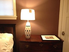
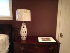
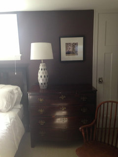
I would like to use a lamp that I inherited as the inspiration (see picture in post that follows this one). I want a contemporary style, even though the chest of drawers is not contemporary.

Here are some things I've considered:
1) Paint the room in Amazon Soil (sort of a brown with a purple tint to it.)
2) Put a light colored blue/turquoise type of comforter cover on the bed.
3) Put some existing art up on the wall next to the bed. There are two choices -
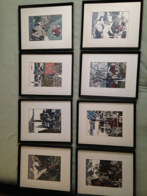
a. a group of prints from Switzerland that I would touch up and re-mat. I'm wondering if this is too bland though given that I would like a little more pizazz to the room.
b. an abstract watercolor that my great aunt painted that looks a little like fishing lines or something. It is too small to hang alone on that wall so I would have to pair it with something.

A few things I cannot/don't want to change:
1) The bed.
2) The placement of the bed is best where it is.
3) I'm not planning on putting drapes in.
4) The carpet.
5) I have mixed feelings about painting the chest.

Attached are some images. Please look at the next post for a picture of the bedroom.

Thanks in advance for your help on how I can make the most of these changes!

Comments (101)

  • 12 years ago
    Looks GREAT!!!!
  • 12 years ago
    Nice! And, I love the contrast of the white bedding with the dark walls. Also love the white bedding with the lamp base and white trim.
  • 12 years ago
    last modified: 12 years ago

    If you do go with white bedding, I'm thinking kind of puffy, fluffy and textured would be a really nice look. If you go with flat white bedding, it could look a bit too formal. Another option would be to go with flatter white bedding but have fun with playful, colorful, patterned decorative pillows. Oh, but with the art in mind, I think puffy and fluffy is best.
  • 12 years ago
    last modified: 12 years ago
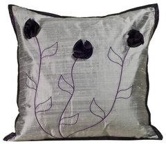
    Silver and purple
    Flower Silk Decorative Pillow in Silver and Plum · More Info


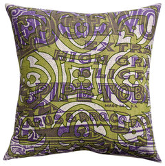
    green and purple
    Press Pillow, Edgeworth Pipe and Tile Print, Purple/Lime, 18" x 18" · More Info
  • 12 years ago
    Ann - it's true that the flat bedding isn't as appealing as the renditions groveraxel did. (The old duvet is not the one I will use.) Wish you could all see the color in person. It's really lovely and not as brown as this appearsappears.
  • 12 years ago
    Yeah, I have flat bedding in my master bedroom and when I had a bedroom design dilemma, everyone said to get a fluffy duvet. I didn't because my Restoration Hardward bedding was expensive and I didn't want to replace it. I had painted an accent wall dark brown (which I LOVE) and it kind of reminds me of your dark color. I think those dark colors are very nice but can present a buttoned up formal look, so if you are buying bedding rather than using existing bedding, I think "fluffy" is a good choice to soften a room with dark paint. I can see how nice the color looks and I bet it's even better in person!
  • 12 years ago
    I'm wondering if a subtle pattern or texture for the duvet would also help to make it look less formal? The trick would be to find sthg that goes with the art and lamp. My color consultant suggested a light peach or green. Westelm has sort of a soft blue linen cover but I'm afraid it would look kind of messy.
  • 12 years ago
    Well, you could sure try a color or pattern if you could return it if it didn't work. I'd go white with texture and very fluffy, but I'm not very creative:)
  • 12 years ago
    I really liked that pinch pleat-ish that groveraxel had in their rendition. I have a white shower curtain like that and love it. abigalica it is looking great, I am anxious to see the art framed
  • 12 years ago
    last modified: 12 years ago
    hmm..well that did not work well. Anyhooo...it is a nice white pinchpleat comforter very similar to the west elm one i believe
  • 12 years ago
    I'm beginning to wonder about the Swiss prints. I called the frame shop to tell then to hold off because I think the water colors might be better suited. I held up the fish print and it looks terrific against the purple. I don't want the room to be too sedate.
  • 12 years ago
    Interesting! I always loved the idea of the dark paint, water colors, white bedding and mustard accents. I was surprised when grover did that rendering and said it wasn't as vibrant as expected. I LOVED it! It'll be fun to see what decisions you make:)
  • 12 years ago
    last modified: 12 years ago
    Does this barrel shade look like the right size for the lamp? Or does it need to be taller to cover the neck? (Plastic cover is still on the shade).

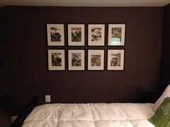
    I decided to stick with the Swiss prints. They are at the framers so we will get them back soon!
  • 12 years ago
    I think that shade looks nice. About the same amount of the neck is showing as was before and it looks fine in both cases. It will be fun to see the art on the wall!
  • 12 years ago
    Love it. The lighter color shade and updated shape really show off the personality of the lamp. A rule of thumb for lamp shades is the diameter of the shade should not exceed the height of the lamp from base to bottom of socket. I think if you covered the neck of the lamp it might make it look squatty. It is looking great.
  • 12 years ago
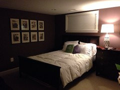
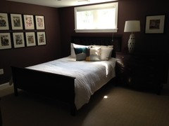
    Yay! Getting there! I still need to deal with the bedding. I think white works. (The duvet is not covered here.) What do you think about bedding color? I might get some European pillows with shams (clean cut) to put behind.

    Note - the colored "pillows" on the bed are just folded up duvets. I think the green looks nice. I had originally thought a coral pillow but now I'm wondering if it would look a little jarring? Opinions?
  • 12 years ago
    Note that the pictures were taken at night. There is recessed lighting but I didn't have it turned in. I plan on putting another lamp, possibly floor, across from the bed (the wall you don't see.) sorry these are a but dark but I wanted to share.
  • 12 years ago
    The whole room is stunning. Wall color, lamp, prints: everything works. Crisp white bedding with aubergine and green pillows and maybe a green throw at the foot of the bed would be perfect.
  • 12 years ago
    Thanks, groveraxle!
    PS The purple "pillow" isn't quite the right color … I think the green works. And I like the idea of the green throw at the foot of the bed. I'll take pictures in daylight. The Swiss pictures look a little high in these photos but they are just right in person. Wish the paint color came out right in the pictures … it really is much prettier in person.
  • 12 years ago
    so funny, I was thinking " a floor lamp would be nice"....and then read your post. you know what they say about great minds. Love the white bedding. Love the colors for pillows, but would maybe think about pillows with a simple print or texture instead of solids. It really is looking lovely.
  • 12 years ago
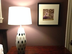
    It does look great! I think I'd lower the pic above the nightstand a bunch so the top of it hits about the center of the lampshade. I think green is a good plan for accents, but I still prefer the mustard color from one of grover's renderings. I think the mustard brightens the room a bit better than the green.
  • 12 years ago
    Hi Ann - I agree mustard would work.

    The picture that you would lower is above a chest. Right now if you are looking at it, the picture is at eye level. Lowered, the top of the frame would be at eye level. Is that what you meant?
  • 12 years ago
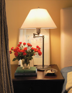
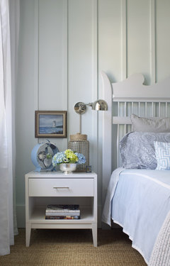
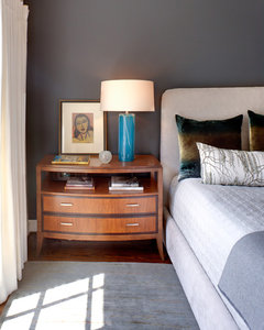
    Yeah, since the art is fairly small in scale, I'd tuck it down above the nightstand and beside the lamp, making a nice grouping. I've attached some examples. In your case, I would hang it rather than lean it on the chest, but pretty low. If you decide to go with this thought, it will be well below eye level. I really like the art in that spot, but due to its smaller size, I think it looks a bit lost up at eye level.
    houzz=
    Traditional Bedroom · More Info
    ]
    [houzz=
    Guest Bedroom 1 · More Info
    ]
    [houzz=
    Master Bedroom · More Info
    ]
  • 12 years ago
    How is the project going?
  • 12 years ago
    last modified: 12 years ago
    Thanks for checking in, sellable home. I'm still in search of the perfect colored pillows. I'm using a white duvet cover from our master bedroom (I've switched to our summer matelesse in our bedroom so am lending the white cover to the guest bedroom.) The room feels so good to me. I'm very glad to have gone with the Swiss prints … they are unique and fun to look at.

    So appreciative for this small group of Houzz advisors for the room. You all are great! I'll post more pictures when I finalize the room.

    Hope all of your projects are going swimmingly! I'm likely to post other projects in the future!
  • 12 years ago
    last modified: 12 years ago
    Here are a few pictures taken in daylight. (Still a naked duvet here!) You can see a little more of the purple in the paint in these pictures.

    PS We are having 12 girls over for a slumber party tonight - my daughter's 14th birthday party. I'm hoping the guest room stays intact! (We're moving the mattress into the family room for the sleepover part.)
  • 12 years ago
    last modified: 12 years ago
    ooohhh....everybody loves a slumber party! Enjoy/survive the night!
  • 12 years ago
    a tray for keys/wallets/glasses would be nice on the dresser top and you could add some color and pattern into the room with it. Everything is looking lovely.
  • 12 years ago
    last modified: 12 years ago
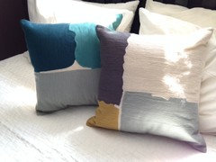
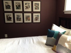
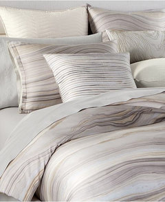
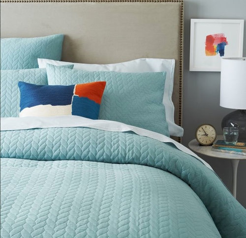
    Me again! How is everyone? I had a bummer of a setback with the guest bedroom … there was a big storm a couple of months ago and water seeped in and partially soaked the first 10 feet of carpet … I had to tear the carpet up to dry it. It was a mess. We decided to replace the carpet (ouch) because we didn't want any weird smells in our guest bedroom. Anyway - the new carpet is in (same as the one that was there before since it matches the adjacent family room) and I went out and bought a duvet cover and some decorative pillows from West Elm. I'm very happy with how it is coming together (see pictures) but I had a couple bedding questions:

    1) In the attached pictures, the regular pillows do not have pillow cases on them yet. Should I go with white pillowcases to keep it simple or do I choose some sheets with color?
    2) Do I buy an additional throw in teal or turquoise to put at the end of the bed? I've always been sort of a minimalist bedmaker, but I admire pretty beds and would like to add a little bit more color (not over the top.)

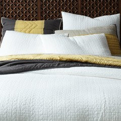
    Note - the first three pictures were taken in my guest room. The final picture is from the West Elm website of the duvet cover that I ended up buying. Trying to figure out how to add a bit more color without it being overwhelming. I keep thinking that teal is the right color because it appears in most of the artwork.

    Thanks in advance for your help! Hopefully there are a few of you still following this post. :)
  • 12 years ago
    PS I just realized that I ended up buying the duvet cover that I had looked at many months ago and posted above in this very thread. I considered the pintuck duvet at West Elm (and so many many many others), but I like a slightly more streamlined look.
  • 12 years ago
    I'd skip the blanket unless you need it and add color through the pillows. Ex. One set of pillows white and the other set teal.
  • 12 years ago
    I'd stick with white sheets and add a throw in the mustard color. I love, love, love your accent pillows but really think the mustard color is stunning with the wall color - much better than the turquoise with the wall color. Looks fantastic!
  • 12 years ago
    I think I'd place the throw in a somewhat casual way, kind of angled off the side like this example is angled off the bottom.
    [houzz=
    East Lake Shore Drive Residence · More Info
    ]
  • 12 years ago
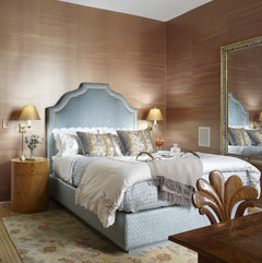
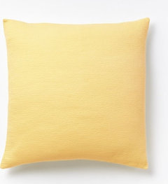
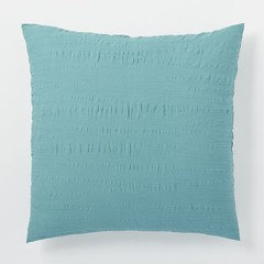
    Thanks for your help! Another quick question - would buying two Euro shams to put behind the pillows make sense? I'm attaching a few options. (two of the pictures are small - sorry.) I could also do shams in regular pillow size.
  • 12 years ago
    If it were me, I'd start with a throw and see how it looks. The current number of pillows is pretty good.
  • 12 years ago
    It's funny you ask about the shams. I have a white comforter on my bed with white sheets and thought "maybe some colored shams with the white would be nice" I have bought and returned 3 sets and now have white shams with accent pillows. I love love your pillows btw. Also, the mustard color is in your lamp, always nice to repeat a color.
  • 12 years ago
    How is it coming along?
  • 12 years ago
    Thanks for asking, sellable. I haven't bought anything new recently for that bedroom since it looks good now and I've spent enough for the time being on that room! Your point about buying and returning colorful shams sounds exactly like something I would do so I backed off.

    Other projects call ...

    I've posted a new design dilemma on the forum about lighting for our foyer and upstairs hallway. Not sure if this appeals to anyone here but if you have an idea, would love to hear it!
  • 12 years ago
    It DOES look great...I am so sorry if I implied it did not look finished , I certainly did not mean to do that. I thought there was something about shams or pillows.....sometimes I read to fast and miss important things :-)
  • 12 years ago
    Absolutely no offense taken, sellable. I'm super grateful for your advice and continued support. You were right about my asking about the shams - after I bought the decorative pillows, I suddenly stopped bc of expense and feeling that it looked good enough without. I was thinking about the many other projects in the house I want to do and how that sham money could go to better use.
    But ... maybe someday! :)

    Thank you!
  • 12 years ago
    I like it w/o the shams. I checked out your hall lighting question....not feeling very creative this morning...I will look at it again when my mojo gets going
  • 12 years ago
    No worries about the other post.
  • PRO
    12 years ago
    last modified: 12 years ago
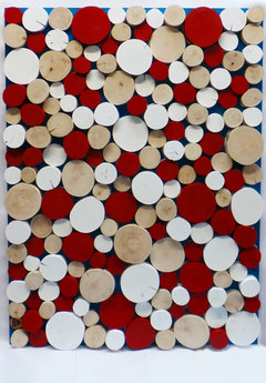
    Why not try some of our LogWall artistry. We can produce in any mix from over 100 colours!

    http://www.logwall.co.uk/store/products/90x120cm-london-landscape/#
  • PRO
    10 years ago

    When you bought the new lampshade, did you take the lamp with you or did you "guess" at the size? Take the lamp to a good lamp/shade shop and try on different sizes and textures. Possibly the "harp" needs to be changed to a better size so that the socket will not show and the bulb will no be in your eyes when you are in bed.

    The dark walls and dark furniture do not work well together. A mid-blue would look nice with white and blue bedding and curtains. Please do not neglect that window. Add sheers between the panels and have them both go to the floor. That will be a nice back-drop for the bed.

    Please do not hand art work on the wall to the side of the bed...it looks like it is floating around trying to find a place to land. I'm sure that you have other places what would be better for showing it off.

  • 8 years ago

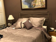
    I just painted the wall behind my bed Amazon Soil, the other walls are muslin. Struggling with a comforter color....don’t want white. Carpet is neutral and furniture is medium to dark brown. I bought a dark mauve comforter which I like but I think it is too dark against the walls - see picture. The inside of the comforter and the bed skirt are dark, not far off the wall color. Should I add different accent pillows perhaps? Help! Thanks

  • 8 years ago
    Hi Denise / I think white or off white is best against the dark walls. It gives the eyes something refreshing to look at. I’ve been happy with our off white duvet from West elm and a light grey throw blanket from Crate and Barrel (I think). Good luck!
  • 8 years ago
    I just reread your comment that you don’t want white. Maybe muslin to match the other walls?
  • 8 years ago
    I thought about this comforter, otherwise I will go with a cream color.
  • 8 years ago
    I think that could work. The dark walls need something light for contrast in my opinion. Post pictures!