Software
Houzz Logo Print
tracyfields

Living Room Re-do

12 years ago
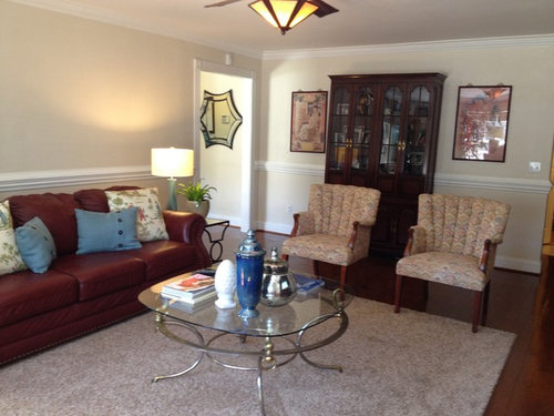
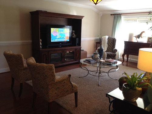
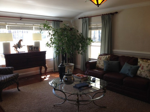
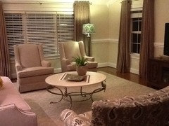
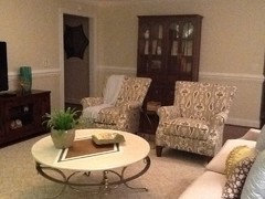
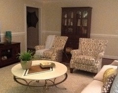
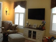
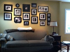
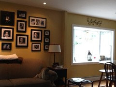
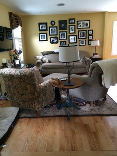
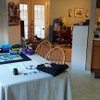
I'm going to buy some new furniture for my living room. New couch, chairs, coffee table, rug and drapery. I want the space to be practical, comfy and pretty, I want to want to sit in this room. I would love suggestions for placement of furniture and ideas of furniture. Please help me design this room! I want to keep the wall color as is, it's Sherwin Williams, moderate white. I'm posting pics of existing. Also I will post a couple pics of couches and chairs that I like that are at some local furniture stores. One of my first purchases, I would like to be is a couch, the one in that room simple is just not my style anymore, the color and it's so fluffy puffy (it is comfortable though).
This project unfortunately will not be completed overnight but I am ready to get suggestions and move forward. Room dimensions 24' x 14'.

Comments (383)

  • 12 years ago
    You are to be commended, I agree. Your work is paying off, looking much better. May I ask where you purchased the sofa?
  • PRO
    12 years ago
    last modified: 12 years ago
    Chairs much better!!

    Like the blue art by the CH.....a little large, but better than by the window.

    Mirror in other room is too close, though. Sorry to rearrange another room!

    I like the horse there, but fear a huge reflection. You could use museum glass, but it is very expensive. It will probably be around $100, just for the glass, if that is okay with you. Is the horse a print?
  • 12 years ago
    Thanks fly4fun...I purchased at a local furniture store close to me in Society Hill, SC, they didn't have exactly what I wanted so they ordered the fabric I liked. They really have some pretty fabric selections. Couch manufacture is Craftmaster, they have a website cmfurniture.com you can look to see if they have a distributor near you, not sure if you can buy from their online website.
  • 12 years ago
    Glad to see the E-center cut down to size! Much improved!
  • 12 years ago
    The horse is poster. I'm considering a light creamy colored frame with specks of tan, it's darker than the wall color or should I use a brown wood frame? I'll check on the non-glare glass if it is a big difference in price I probably won't get it. I was also concerned about that mirror....urrr! Thanks!
  • PRO
    12 years ago
    last modified: 12 years ago
    For the poster, I would do a brown frame. Same color as the drapes? Tables and lamps and pillows are great.
  • 12 years ago
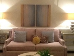
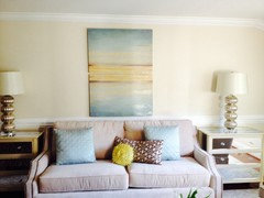
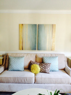
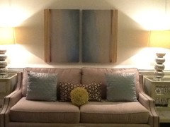
    Would put the two canvas works above sofa. They have the blue and gold of the pillows. Not liking the horse in the room at all....Put two of something small and round on each side of the CH to repeat the round of pillow and coffee table. Small gold framed mirrors......starburst style would be nice. They will repeat the shape of that cool urchin sculpture. Can find on eBay very easy and inexpensive.
  • 12 years ago
    Thoughts?
  • 12 years ago
    last modified: 12 years ago
    Oh, I was soooo excited to see this room again and wow! It looks sooooo nice! You have such great ideas!!!! SMART to take the top off the ent center....instant update and totally works! Pillows on the couch are sooooo pretty!

    I like the art with the couch. It works in this room and fits there better than anywhere else. I just do not think you need anything by the windows or the hutch. And while I love the horse, I am not sure it works in this space. These pics have the right colors. SMALL question and maybe just me, but can the pics be turned at all? Wondering what it would look like with the blue in the middle and the brown edge on the top and bottom????
  • 12 years ago
    YES! Those 2 pieces of art add great dimension and an additional accent of color to the room. This is the 1st time I see this thread and as I was scrolling looking at all the transformations (great job, btw).... I came across the horse above the couch and was kind of hoping for something better.

    These pieces are definitely it.
    :)
  • PRO
    12 years ago
    Love the art above the sofa. Abby is right, I think I'd like the art turned also.

    Is that the same coffee table base with a new top?
  • PRO
    12 years ago
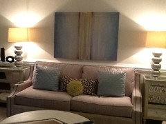
    Thanks for moving the art above the sofa! The art by the CH was too large and the CH was too large, looking like the focal point and intruding on the next room.

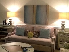
    It works above the sofa. The 2 pieces vertical, as you have them now, I think is best.

    Love the new top for the coffee table. I don't think you need anything on the coffee table.

    By the CH, put something there that fits the space and accents the CH. For example,


    [houzz=
    Ophelia Five Teardrops Wall Mirror (Set of 3) - Rakuten.com Shopping · More Info
    [houzz=
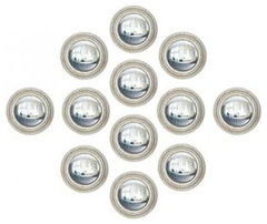
    Portia Wall Mirror - Set of 12 - Wall Mirrors - Home Decor | HomeDecorators.com · More Info
    [houzz=
    Iron and Glass Wall Sconces, Set of 2 · More Info
    ]
  • 12 years ago
    Thanks everyone! I do finally feel like this room is coming together, really nice not to feel the need to drag this furniture around any more. I really appreciate all the advice and suggestions.

    I do like the canvases over the couch, initially I tried them over the couch and didn't feel that they made a statement and it may have been because I had 2 other end tables and the canvas just didn't look as nice as they do with the chests but now I'm pleased.

    The coffee table has the same base I just replaced the top and painted it.

    I will look for something for side of CH.....probably small round mirrors or sconces.

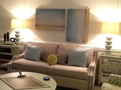
    Also I will post pics: I turned art horizontal but it doesn't work as well as vertical.
  • 12 years ago
    Horizontal and vertical:
  • PRO
    12 years ago
    Yes, vertical is best.

    You certainly can play around with.....

    - yellow stripes both on left side
    -yellow stripes both on right side
    -yellow stripes in center

    The room looks great!!! No more large dark pieces towering looming large!
  • 12 years ago
    My style is more eclectic than traditional, but I love these and wanted to share an idea for each side if CH.....

    http://www.ebay.com/itm/Set-of-2-Small-Decorative-Mirrors-11-8-Decorative-Gold-wall-mirror-Cuzco-style-/121380224899?pt=Mirrors&hash=item1c42d33f83
  • 12 years ago
    last modified: 12 years ago
    I never even thought about the size of the art over the couch changing if you switched direction of the canvas. Thanks for that visual again! Nope, it needs to stay the direction it is, but would love to see some of the options CDR posted as far as how the brown stripes would look the best. And it might happen that they are best on the ends, too.
  • 12 years ago
    I love the sconces CDR posted last. Nice style and size and shape for beside the hutch.
  • PRO
    12 years ago
    Okay, I am going to take the plunge and "move" to your next room. It just seems the mirror is so close to the living room and sort of encroaching on the living room space.

    Can you explain?
  • 12 years ago
    Sure...I will change the canvases when I get home and see what we think.

    Chrom: thanks for the visual of mirrors, those are pretty.

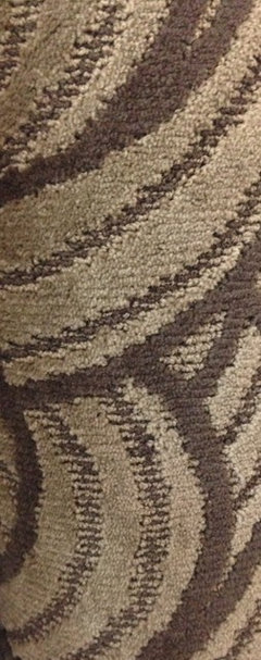
    Question: first let me say that I am happy and satisfied with my rug that I have BUT a friend saw this rug and sent me a pic.....what would u think of this rug, it would also be a 15' x 12'....just curious of your thoughts. (Plus it wouldn't break the bank if I purchased that's the only reason I would consider changing it)
  • PRO
    12 years ago
    It looks fantastic! I love the artwork behind the couch! - Mandi @ Dura
  • 12 years ago
    CDR: Mirror wall

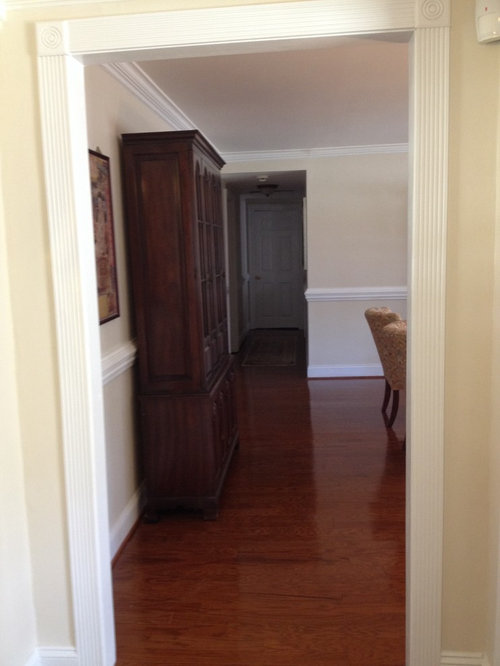
    When you enter the front door you come into a small foyer, when you leave the foyer you walk directly into the wall with the mirror, turn right into living room and turn left into kitchen/ den dining area. I would not be apposed to putting something else there or maybe I don't need anything?
  • PRO
    12 years ago
    placing chairs to view next to rug..

    I think the rug would work. It is really a personal choice on how much you want going on in the room.

    It will leave less flexibility for future changes. On the other hand, it could add to your room.

    I would say that if the rug is returnable and in your budget (seems to be) it is worth a try.

    My personal opinion is that, looking at your idea books, you seem to like a calm room with one "busy" item. You already have that: your chairs.

    By the way, you may want to try your busy chairs against the window, where they will show up as more of a showpiece (so switch out the 2 sets of chairs).
  • PRO
    12 years ago
    Thanks. The mirror doesn't seem to fit the space. I would say, a high, narrow mirror (if the mirror is reflecting something interesting) or nothing at all.

    Hard to say without seeing the space, but I am not sure you are ready for us to pick apart another space!
  • PRO
    12 years ago
    I agree vertical is best for the art above the sofa.
  • PRO
    12 years ago
    I like the new rug. It would dramatize the room a bit more. It depends if you want a bit more drama or more subtle. The pattern is a large scale and will work fine with the chair pattern.
  • PRO
    12 years ago
    I think it would be better to have only one mirror in adjacent areas.
  • 12 years ago
    LB Interiors....Thank you for liking my word "peace". I live just off a river but near the Atlantic Ocean. It is therapeutic, calming and God's creation. Sadly, I am exposed to tourists from Memorial Day to Labor Day who are rude, have no manners and obnoxious. Once they are gone the "locals" such as myself bid good-bye to the "Bennies" and head back to our solace and pride.
  • PRO
    12 years ago
    Hi Nellie. ?? I think you posted the above comment on the wrong thread? Thanks though.
  • 12 years ago
    last modified: 12 years ago
    You mentioned kids….For their safety, I would be cautious on the tall flat furniture against the wall as is the armoire/bookcase and the entertainment center because of the safety factor. These can be tippy and fall forward, especially the TV. Even an open oven door can present a tipping hazard. You may wish to Google "furniture tipping accidents". Safety first.
  • 12 years ago
    OMG! It's just a room to relax in! And knock it off with 2 matching chairs balanced by 2 matching lamps, etc. Buy things you LOVE, in colors you LOVE but just one, NOT 2!
  • 12 years ago
    I do find swivel rockers very comfortable (second photo), but I like the Ikat like upholstery in the first chair photo. Both of these choices look much more comfortable than what you currently have. I like the first couch in the first photo's.... don't like two cushions on full size couch, third person has to sit on crack. The tufted back couches look hard to clean and uncomfortable.
  • PRO
    12 years ago
    An interesting day, Tracy. Your hard work and search for the space that will work best for you is paying off! You are almost there!
  • 12 years ago
    Thanks CDR I really appreciate that, I guess that is a way to describe it or NOT necessary maybe but it's okay!
  • 12 years ago
    Art:
  • 12 years ago
    I like the second arrangement the best.
  • 12 years ago
    lol....@katie can you repeat that post I PERSONALLY like things duplicated! Why have only one fabulous thing when you can have two! Thanks for comment!
  • 12 years ago
    @tammy thanks for your comment and I must say your good, I typically have to sit in something before I know if it's comfy, not by just looking at a picture, I always say looks can be deceiving. ALL of my furniture pieces are extremely comfortable and "I" like them!
  • 12 years ago
    I rather like the brown stripes in the center and the blues on the outside edge.
  • PRO
    12 years ago
    I agree with Abby, blue on the outside.
  • PRO
    12 years ago
    favorite: upper right

    UL: looks a little like barn doors, so not my favorite

    UR: looks good, but almost looks like one piece of art (not a bad thing). Do you think they should be separated a touch (I could go either way) or do you like them almost touching?

    LL: no, because it looks like what it is: 2 of the same next to each other

    LR: I rather like it, but would want to see a third piece in the mix
  • 12 years ago
    I like that the second pic ALMOST looks like one piece, but is really two.
  • PRO
    12 years ago
    I agree, Abbyjean.....just wondering if it should either be separated more OR, the 2 butted up to each other.

    We still have you moving, Tracy. At least the pieces are not as heavy!!
  • PRO
    12 years ago
    Notice you placed Ikat chairs in "showpiece" position. Can we see a view of the room? Thanks!

    Also, I think the pillows on the couch would look better with just the yellow and brown one, plus an added third, right oriented on couch.

    What are your thoughts on the blue pillows? Do you like them?
  • 12 years ago
    Tracy....you are not alone. My eye loves symmetry too. I am trying really hard not to do it right now. I've been tweaking my living room and I have two of every pillow in there. You could have drawn a line right down the middle and had mirror images of the room. I have learned here that it's more interesting to the eye to have things off balance. We now have tons of "decorative" bed pillows because I didn't know what else to do with them.....lol
  • 12 years ago
    Tracy, you may soon become eligible for the "two of everything" award. LOL.
    You will have to find room for all the award plaques too (two?).

    Now that everyone is happy with the paintings above the sofa, I will throw a monkey wrench into the situation. The prints seem way too beachy coastal for the room you have been developing. For me (and I may be alone in this) they clash with the gray ikats, not so much for the colors, but for overall compatibility of style. You seemed to start out with more blue in the mix but transitioned into more brown/orange but also with a more neutral scheme. I think your horse poster was more in line with the rest of the decor as it stands now. The pale blue pillows on the sofa don't seem to reference anything but the prints. So ... just my impressions. You still get some of my mythical awards :-)
  • PRO
    12 years ago
    Hi Tracy,

    There is nothing wrong with symmetry. But, the eye does like some balance between rigid symmetry and asymmetry thrown into the mix.

    Also, form follows function. What, afterall, is the purpose of a pillow and are you giving you are your guests a chore each time one sits on the couch? What do I mean my that? As soon as I see those pillows arranged very neatly across the couch.....here is what I think (and maybe I am the odd person out) :

    "Oh, in order to sit there, I will have to move those pillows or I will feel an odd lumpiness in my back. Then, when I get up, I will be rearranging them, because Tracy has gone to great measures to arrange them so neatly. I hope I can arrange them as neatly and symmetrically as they were before."

    So, please do what feels the most comfortable for you. But, just stating that, if you are interested in what might be going through guests minds, the above is food for thought.

    Blue pillows: they just seem too pale to me. How about trying to add some of the bolder blue in the art in pillows for the chairs?
  • 12 years ago
    Would like to purchase new furniture ...room is a cozy 15/11ft off of our kitchen. Was thinking four chairs ... No sofa ... Suggestions please... Only the two of us @ home now
  • 12 years ago
    Dee, you need to start a new thread. Go to the section called "Advice" and put your pics and comments there. Believe it or not, all of this page is about this lady's one room!
  • 12 years ago
    Thanks I just realized that