Software
Houzz Logo Print
dubinett

Before & After

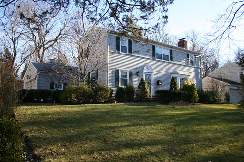
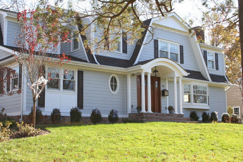
Talk about great curb appeal!

Comments (64)

  • 12 years ago
    Wow, it's great to have constructive criticism, but get brains/some sense! The home addition was driven by a home owner's vision, and is pleasantly eclectic, if not totally, ya know perfect. There is obviously a kitchen expansion happening here to the left, they included panels below to compensate for the front kitchen arrangement without getting over complicated. There is a hallway, half bath or some aux space, between the new entry and kitchen, and again the interior and exterior drove the election of a unique window to create interest. The shutters were an original design element that was replicated to create continuity without added complication or exorbitant price (create bigger, real-scaled craftsman-made shutters, really necessary?). Well executed and beautiful, how about the inside?
  • 12 years ago
    What a great transformation from ordinary to interesting and inviting! I love how the addition fits right in and doesn't flaunt the extra space. This project is perfect, but I wish this page had dislike buttons for comments. Some people, literally, can't think outside the box!
  • 12 years ago
    why be so show-offy? the new one is simply false facade...
  • 12 years ago
    Overall stunning...the only thing I feel is that the round window looks too small and out of place.
  • PRO
    12 years ago
    I enjoy all the comments good and bad, at first glance great after photo. If you take some time to really look at things there are a few elements that some houzzers have picked on which do have merit. Long shutters flanking double window, small oval in front possibly a powder room, bay window possibly not in harmony with this style of architecture and columns in the front could have been sized a bit larger in diameter. Overall nice dimension with mid level roofing. Aren't Opinions a Great Thing !
  • 12 years ago
    Kudos to you for changing out of the symmetric boring salt box, however I have to agree with bungalowmn on that front window option. It looks like two screen doors put together with shutters along side. Perhaps a Friday afternoon decision.
  • 12 years ago
    This house looks like on horror movies. Just joke. l like it :)
  • 12 years ago
    A big improvement in curb appeal. I think turning it into a Dutch Colonial was very smart. The house prior to the remodel was decidedly unwelcoming with an oddly undersized front door.
  • 12 years ago
    Although I'm not a fan of the Dutch Colonial style, I think it's a beautiful transformation. However, the little green balls - that will grow into big green balls - have got to go. And all lined up in a row. How boring! Why do people spend tens of thousands on exterior renovations then blow it with lousy landscaping? With hundreds of very interesting foundation plants to choose from, why even think about planting what appears to be boxwood? Even cherry laurels would be an improvement if all the owner wants is green. Please hire a very good landscape designer and you will truly have a house with great curb appeal.
  • 12 years ago
    last modified: 12 years ago
    I like this. People get grumpy sometimes I don't understand it. I am glad to see the Dutch Colonial making a come back and it works very nicely here.
  • 12 years ago
    Am I the only one who prefers the original - the 'after' is just too much and too twee.
  • 12 years ago
    :))) I guess i'm to much of a twee
  • 12 years ago
    Love the transformation.
  • 12 years ago
    Wonderful transformation from boring to interesting. I understand keeping the bay window but the others could have been better thought out.
  • 12 years ago
    It is absolutely beautiful. When doing a renovation of this caliber it is with hope that you can achieve a tasteful and charming transformation within a given budget. It is beautiful enjoy your new home. disregard the smug commentary for anyone making comments as such couldn't even afford to put in a new toilet in their homes.
    Dubinett Architects, llc. thanked cdeb
  • 12 years ago
    Love the new curves your house has!
  • 12 years ago
    Love the changes!! The addition and Update really did gives this house some true "Curb Appeal!" I love it! Great Job! WM
  • PRO
    12 years ago
    cdeb, Please don't put people down who can't afford to put a new toilet in their home, Why did you say that? This is why we as professionals put our work on display to get feedback! Relax I am sure that Dubinett Architects reads all reviews good & bad. I personally think this job was well done
  • 12 years ago
    The integration with the addition is absolutely fabulous! SEAMLESS upgrades! Very impressive!
  • 12 years ago
    The only thing I am disappointed in is.........I want to see more pictures. This transformation needs to strut it's stuff.
  • 12 years ago
    I don't understand how some people can think that a classic New England style colonial is boring, or like the person who stated that they hate flat front houses. To each his own I guess, but for me, nothing beats a grey shingled colonial, classic and timeless.
  • PRO
    12 years ago
    Stunning job! Congratulations on such a beautiful job!
  • 12 years ago
    Some may agree with my comments & some may not. Upon first glance, yes, it looks like a nice update.

    There is nothing that I pointed out that wasn't true. When the OP posts "talk about great curb appeal", I can disagree. I don't expect everyone to agree with projects I have done either, but I also do mine pretty much as a home owner & doing a lot of the work myself, not as an architectural business.
  • 12 years ago
    Well, telling somebody they should go back to being an apprentice because their design sucks is pretty much asking for it imo.
  • 12 years ago
    Oh, dear.....Dubinett didn't "thank" EVERYONE for taking the time to comment, just SOME of the commenters.....hmmmmmmm
  • 12 years ago
    And I can take it like a big girl. It's fine.
  • PRO
    12 years ago
    The exterior renovation has certainly enhanced this home.! I agree with the more prominent larger and more welcoming entrance. The window area to the left of the entrance appears to be out of scale. Great overall job with this renovation to achieve curb appeal! Maybe adding some curve to the Boxwoods that are slow growers with a taller tree between the left window and entrance would add more interest and scale with the new home exterior. I am glad the client put the money in renovating the home exterior and they can still capitalize on additional landscaping as the budget will allow. Congradulations on a beautiful exterior renovation!
  • PRO
    12 years ago
    I think it's great and very unique!
  • PRO
    12 years ago
    Very nice transition - great lines, and doesn't look like an addition (as a good design accomplishes).
  • PRO
    12 years ago
    wonderful transformation - great job!
  • PRO
    12 years ago
    This is stunning! Great job!!!
  • PRO
    12 years ago
    So gorgeous!
  • 12 years ago
    Bungalowmn...I will say it,you are an ass.This is someone's home.I bet they are glad you are not part of the neighborhood.
  • 12 years ago
    Ditto....Brandi. "Know-it-all's" abound on the internet.
  • 12 years ago
    Brandi, I hope you might change your wording, just because you don't like someone's blunt opinion, doesn't mean you need to resort to name calling. Brings the whole site down.
  • 12 years ago
    @elsahfixerupper It's not "simply false facade." Look again and you'll see a 2-story addition that begins where the Dutch Colonial roof ends. Also, I don't think "show-offy" describes a remodel with a large addition that fits so well it can easily be missed!
  • 12 years ago
    The best thing to do is totally ignore "certain people." The internet gives them a "stage" to feel superior. If their remarks are ignored, they have no power. Negativity breeds upon itself. Don't react.
  • 12 years ago
    There are pros and cons to every idea...Period! For any/every good idea there will always be positives vs negatives. Period! One truthism ? Comments good or bad will be takened into consideration ! Thx
  • 12 years ago
    Beautiful!!!
  • 12 years ago
    I am the homeowner and I have thoroughly enjoyed reading all of your comments. It is refreshing to get some truly objective opinions and I must say that I have found merit in all of your feedback - both positive and otherwise. Thank you - and if I have time I will post some pictures of the interior, though it is very much a work in progress!!
  • PRO
    12 years ago
    The form suggests east coast shingle style, the color suggests suburban subdivision. It is a wonderful improvement and a great example of what possibilities are out there. I'll bet it was a fun project to design; good job Dubinett.
  • 12 years ago
    Doesn't even look like the same house!! it is amazing!!
  • 12 years ago
    Wow! Amazing job. After pic makes the look so much nicer. Well done.
  • 12 years ago
    Stunning make over! Looks great.
  • 12 years ago
    Very, very, nice!!!!!
  • PRO
    12 years ago
    wow,good job.
  • 12 years ago
    Really Nice. How long was construction?
  • PRO
    12 years ago
    It appears there was an addition and some remodeling done in addition to changing the character of the house. Did it cost that much more than if you hand maintained the existing character?
  • 5 years ago

    All I can saw is “wow!!!’

  • PRO
    5 years ago

    WOW!!!!! Doesn't even look like the same property! What great curb appeal.