Software
Houzz Logo Print
nancylin1116

Which layout is better?

12 years ago
I talked to my contractor and ended up with two options in kitchen remodel. I'm not sure which one is better...

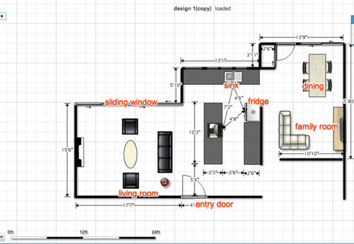
Attached are my drawings. In both layouts, I'd like to leave the kitchen sink where it is now, because we don't want to touch plumbing.

Layout 1
The kitchen opens to the living room and fire place, but couldn't see dining area. I have no plan to push the entry door further out in the next 5 years, so the whole kitchen is visible from the front door.

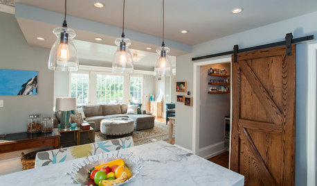
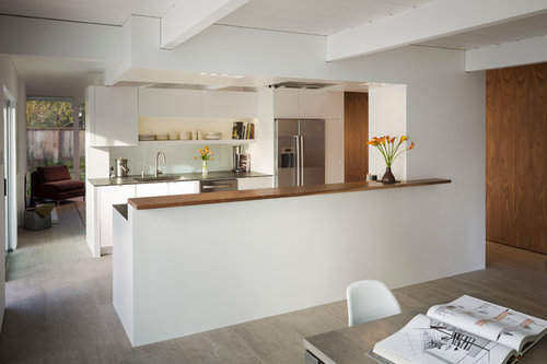
This link is similar to layout 1:
eichler in marinwood · More Info


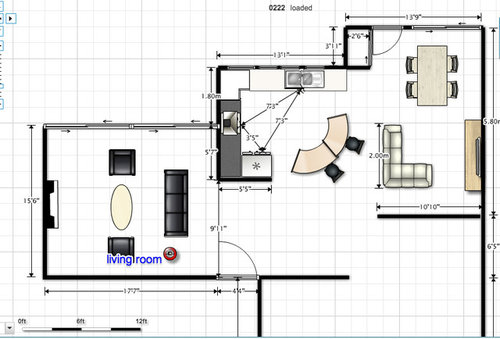
Layout 2
We have a curved countertop here. The kitchen opens to the dining table and family room, but we have some funny spaces (about 120 inch x 120 inch) after we enter the front door (we don't know what to put there).

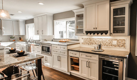
This link is similar to layout 2:
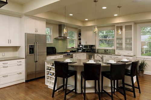
Kitchen View · More Info


Thanks!!!

Comments (25)

  • 12 years ago
    last modified: 12 years ago
    I'm not a fan of either plan. I would have a "great room" concept. I think two living spaces are a waste of space. One space usually rarely gets used. I would make the kitchen larger and reverse the island space to face the LR. Then, make the family room the larger dining area.
  • 12 years ago
    last modified: 12 years ago
    To clarify.,.make the kitchen an L shape with the peninsula facing the dining space and extend the sliding window kitchen wall long enough to accommodate the refrigerator. The stove/ vent will be on the peninsula. The curved island will be facing the LR.
    Yenan Lin thanked Darzy
  • 12 years ago
    @Darzy: i also like great room, but we don't want to move the sink, so we need to decide what we want to see from the kitchen.
  • 12 years ago
    What's in the space in the lower right of the plan? Do the walls just end like that or are their doors/ hallway to the bedrooms? What is the little rectangle up back the back door in the dining area?

    If you do Option 1, I would flip the kitchen wall so that the kitchen opens into the more informal family room and dining area and let the living room be a more private/ formal/ adult space. I would also flip the way the front door opens so that you see the living room instead of the kitchen when you enter. I would also scoot the (new) left kitchen wall closer to the living room so that it lines up with where the kitchen bumps out at the back and then make a flat wall that the front door opens into so you could put some nice art, a console table, etc. to make more of an entry space.

    If you do Option 2, you could add a nice coat closet, entry way organization zone to the right of the door. Again, I would switch the front door so that you walk into the living room instead of oriented the other way when you enter.
  • 12 years ago
    last modified: 12 years ago
    Neither layout allows adequate circulation space. This is an error I see in many Houzz layouts these days. In both your plans, traffic needs to pass along the back of the sectional but may have only 2 feet or less to do so. In plan 2, if people are seated at the island, there will be literally NO SPACE to pass between island chairs and sectional.

    You have plenty of square footage to fit in the features you need, you just have to observe proper clearances and make use of all the space you have.

    Basic flow and usability of the layout is by far your biggest challenge. Farther down come issues like:

    1) What do you see when you walk in the front door?

    2) Where do you put coats, shows and packages as you come in the front door?
  • PRO
    12 years ago
    Do you have a designer or an architect ?
    I know that you can do a better design.........

    There is some very good advice in this post.

    Maybe you can give this information to your designer and see what they can come up with that will be perfect for you.

    Don't accept a mediocre design for you precious house...
  • 12 years ago
    I much prefer layout 2. For the area at the entry, I would have a hall table.
  • 12 years ago
    I much prefer layout 2
  • 12 years ago
    Neither. If the primary purpose of the remodel is to give you a a better kitchen, then both designs fail badly on that account. (The fridge location is egregiously bad in 2) If the primary purpose is to open the walls at àll costs, then you are placing the kitchen as the sacrifice to that desire.

    To get both a good kitchen and an open concept may require that you place moving plunbing on the table. And a high budget project may need to become even higher budget.
  • PRO
    12 years ago
    You should not design a complete kitchen remodel around the current sink location. Moving a sink is under $1000 and in the larger scheme of your kitchen remodel, that's not a lot of money. If you have a gas stove or oven or an ice maker, you'll have a plumber on site anyway to move those items. Free yourself from the sink!
  • 12 years ago
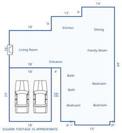
    this is the current layout:
  • 12 years ago
    The 6'x13' area is the current kitchen (long and narrow). It is separated by a wall. I think i've abandoned option 1.

    The purpose of the remodel is to make the kitchen more open (or semi-open):

    - I don't want people to see the whole kitchen (esp. fridge) from entrance.

    - Coat/hat hangers/closets will be on the right side as I go into the house. Actually I'm not sure here, any people put coat hanger on the wall in front of the entrance?

    I need some suggest on where to put the fridge...
  • 12 years ago
    @lmckuin, "If you do Option 2, you could add a nice coat closet, entry way organization zone to the right of the door. Again, I would switch the front door so that you walk into the living room instead of oriented the other way when you enter."

    Thanks for the advice. If I flip the front door, I'll need to go to the back of the door to put my coat/hat. so I'm not sure if flipping the door is a good idea here..
  • PRO
    12 years ago
    last modified: 12 years ago
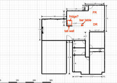
    Can you put a half wall opposite the kitchen wall for bar seating? The cabinets to be shallower than standard. On the left side of the bar a tall wall to conceal the fridge, only the depth needed to house the fridge. Bring the fridge forward using a small section of the living room. Not sure if I've got your perspective correct : )
    Yenan Lin thanked LB Interiors
  • PRO
    12 years ago
    Are you missing walls in your drawing?
  • 12 years ago
    Circular islands are...weird. They look like casino tables or newscasters desks (but with the seating on the wrong side). And angled/circular stuff like this tends to be like a black hole in space, sucking all the energy and attention away from everything else, drawing attention to themselves due to their weirdness.

    Number 1 is better but two living spaces so close, in an otherwise lively but not huge house, is odd. One space will go unused for sure.
    Yenan Lin thanked jpp221
  • PRO
    12 years ago
    In your current floor plan, I would switch the dining room and family room.
    Yenan Lin thanked LB Interiors
  • 12 years ago
    @LB Interiors, did you mean this (see attached photo)?
  • PRO
    12 years ago
    last modified: 12 years ago
    Nancylin, thanks for the drawing. If your sizes for the rooms are correct, the family room and dining spaces are way too small.

    I think I would eliminate a family room. Use the area near the kitchen for dining for at least 6 people.

    Good job, congrats! Yes, that was the way I was thinking for the fridge and the bar. The bar gives you breakfast space and semi blocks the visual from the entry from being all open. You will have a small breakfast spot and a dining area.

    Use the living room for a family room with a TV. It is the largest room. You will live in the living/family room. I don't think you can use the space on the right of the kitchen for two separate spaces.
  • PRO
    12 years ago
    last modified: 12 years ago
    On the tall fridge wall, it would look nice if you had an entry table console and a mirror as you entered the home facing the entry door, if there's enough pathway.
  • PRO
    12 years ago
    last modified: 12 years ago
    I went back to study your first floor plans. Just wondering if you have the furniture in all the rooms at the proper scale on the floorplan? Sofas average 84"-92" long. Loveseats are about 5' long. Easy chairs are about 32" - 36" wide and 30"-36" deep. Dining chairs start at about 24" wide. Your sectional in your drawing looks like it will not fit that far away from the TV?
  • PRO
    12 years ago
    last modified: 12 years ago
    If you do not draw within the grid to scale, you will not truly know how much space you have for furniture or the actual sizes of the rooms : ) Each grid square should equal 1' or 2' and continue with everything you place on the drawing by choosing which scale you want to use.
  • 11 years ago

    Option 2 looks great and inviting.

  • PRO
    11 years ago

    This is an OLD Post.

Sponsored
Wannemacher Interiors
Average rating: 5 out of 5 stars26 Reviews
Customized Award-Winning Interior Design Solutions in Franklin Cnty OH