Software
Houzz Logo Print
jacissa

Quick help me pick a tile backsplash

12 years ago
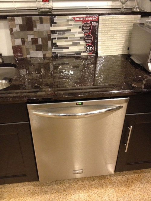
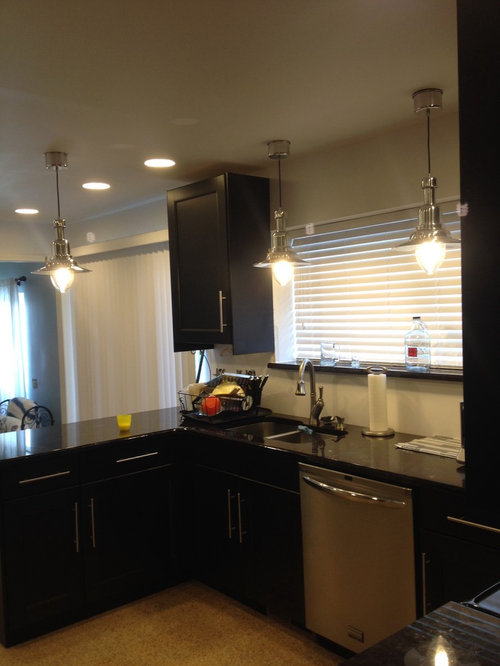
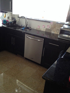
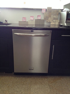
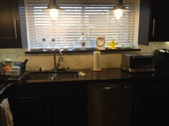
Please let me know if you like any of these back splash options and what color paint you'd suggest to go along with it. For reference the family room that our kitchen opens up to is a light blue. All of our cabinets are dark and we have stainless looking pendants.

Comments (70)

  • PRO
    12 years ago
    I like the first option. This will give you plenty of color and contrast from your cabinet and counter tops. You will also be able to pick a wall or accent color for your family room.
  • PRO
    12 years ago
    The one we used (got it from Lowe's) would look really good. It's got a bit more color than the instant mosaic one. You could then paint with a cream or taupe, which is what we did.
  • 12 years ago
    It turned out rather nicely. Great job!
  • 12 years ago
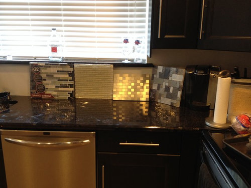
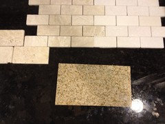
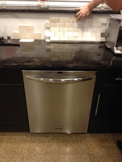
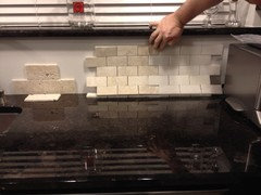
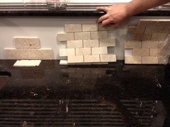
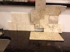
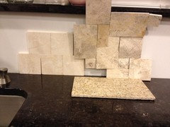
    Went to a tile shop and picked up more options. Please share your feedback. These pics were taken with artificial light.
  • 12 years ago
    The one your hand is touching :) Mosaics from the original pics are too busy, maybe too trendy, could look dated in 5yrs.
  • 12 years ago
    Ooh it's 2 different shades, sorry poor eyesight. The creamy darker beige.
  • PRO
    12 years ago
    agree with dfromthebdot on both accounts. Those packaged tiles from the big box stores epitomize trendy. The pure white looks artificial. My call is the smooth beige.
  • 12 years ago
    I like the slightly darker mosaic in the new tiles you've put up. It ties with the floor nicely, keeps the space from looking overly dark but the tones are in keeping with what you've got going on. I like the white as well but I think the cream one works a bit better.

    I agree the random strip glass mosaics are starting to look dated and I find them really busy to look at when they're installed in large areas (not jut as accent tile)
  • 12 years ago
    I'm glad you went to the tile shop - make that four for the middle choice.
  • PRO
    12 years ago
    I like the one with with the roughness, a beautiful grout filling those areas will give it some extra personality.
  • 12 years ago
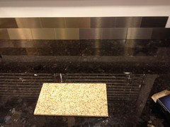
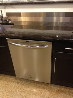
    Anyone care to share feedback on these tiles compared to the others in this thread I've asked about? Champagne & stainless pictured here. Goal is to downplay the yellow/orange in the granite floor and make the counter stand out more.
  • 12 years ago
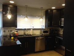
    The champagne and stainless pic above was also taken in artificial light. And here is a pic to show the pendants we have. Feel free to weigh on what you think ties them in best too.
  • 12 years ago
    I think, while nice with the counters, the metal choices leave your floor tiles odd man out, so still prefer the previous selection.
  • 12 years ago
    I actually like the colorful mosaic in the first photo. I think it's unique and ties everything together.
  • 12 years ago
    The metal tiles are awful, and no backsplash is going to help your floor, so don't worry about that. I completely agree that those glass mosaics from the big box stores are already dated, not to mention busy. I like the lighter ones you found for the tile store- the ones you are holding to the right. I think that color will open up the room, play up the pretty countertops and cabinets, and draw the eye away from the floor.
  • 12 years ago
    Another trip to the tile shop and one more option at this point worth posting. Thoughts? This pic is taken in artificial light.
  • 12 years ago
    We are just finishing our basement in our five year old house. our wet bar backsplash is the horizontal glass tile that you show.
    the colors are a lIttle darker. We are painting the basement Lulled Beige. It's a Kwal paint. See if you like it. We love the tile. jane
  • 12 years ago
    WAY too busy! they are worse than those big box store glass mosaics. Go back to your post from last Thursday. The picture where you are holding up two samples of the same tiles - use the ones on the right - the lighter ones. Very nice. Now, go!
  • 12 years ago
    The white one! Other ones are too busy.
  • PRO
    12 years ago
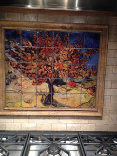
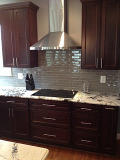
    I disagree, I think this is THE backsplash for this kitchen. The larger tiles eliminate the too busy look. I would use a light gray grout to make the stainless theme pop. And over the range for a dramatic color I would add a portrait
  • PRO
    12 years ago
    My photo refuse to cooperate. Please turn your head sideways . . . really?
  • PRO
    12 years ago
    Love the pendants!
  • PRO
    12 years ago
    You will cooperate
  • 12 years ago
    Second in three , new one is even worst
  • 12 years ago
    Of the first few, I like the third. My favourite of all that you posted was actually the stainless steel. Please keep in mind that will be a pain to clean around the stove, but it is beautiful!
  • 12 years ago
    I like the last one you posted best, then the creamy middle one from the set two sets before the last. While I think the stainless steel would look fantastic if you didn't have a creamy orangey floor, you do. So I would not suggest that. You need earthy tones not stark tiny glass mosaic.
  • PRO
    12 years ago
    2nd or 3rd choice would work great
  • 12 years ago
    We don't have room behind our stove for anything fun. Actually we have relatively little wall space to tile. In person looking at the stainless pictured here and the other tile having the floor sample right by it, it looks like the stainless makes the grey in the tile stand out more. Unfortunately pics don't show the same as in person. Also the black counter isn't really busy looking at all in person, the variation in color is very minimal.
  • 12 years ago
    If the pics are inaccurate, it is time to stop polling.
  • 12 years ago
    Studio... the feedback is still helpful to me, the pics aren't that inaccurate, I was just giving info to help.
  • 12 years ago
    you are looking at details too much. Stand back and look at the room as a whole. It's already pretty hard looking with a tile floor, granite counter top and stainless appliances. OK, so it depends on your style, but I'd want to warm it up and simplify it a bit. Which is why I'd choose a larger, warmer, white-ish tile. Stand back, take it in as a whole.
  • 12 years ago
    Just curious - did you make your tile selection? Please post photos when complete!
  • 12 years ago
    Nope haven't figured it out yet. Will post pics when done but it'll probably be a while as I'm having a heck of a time committing to a backsplash.
  • 12 years ago
    the first one in the first photo.
  • 12 years ago
    more photos and info about the rest of the home would help your cause.
  • 12 years ago
    I like the larger creamy tumbled marble prior to the stainless selections. I think you will tire of the mosaics quicker because they are busier and the metals retook dark with the cabinets and granite. Think about adding a random metal accent.

    The mint green would be pretty on the walls but you may also consider a light sage green.
  • 12 years ago
    I like the lighter one. Leaves you with the option of throwing in punches of color with other things. You won't have to commit to the backsplash colors. It would also be an accent to your counter which is dark.
  • 12 years ago
    I meant to say that the metal backsplash looks too dark...
  • 12 years ago
    Trip to a different tile shop. And some glass subway options. If we went with a subway it wouldn't necessarily be in size shown, they have various sizes but only this for sample. Maybe worth noting, our counter top doesn't really look that busy from a distance. I'll attach pics from hall to kitchen and dining to kitchen view. Our eyes are drawn to 4 cuz it gives some interest to the eye. That may be just because we only have one tile of each subway so it's harder for me to imagine it. Our fridge and stove are also stainless. Fridge is on opposite wall and stove is on wall to right.
  • PRO
    12 years ago
    4 with a gray grout.
  • 12 years ago
    #4!!!
  • 12 years ago
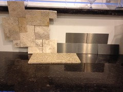
    Why is this such a hard decision for me. Another trip to the tile shop resulted in another option. The one on the right we've been considering for a while, ones on left are new and we'd likely do in a diamond pattern. Thoughts?
  • 12 years ago
    Third from the left. It is safe, clean and neutral. I feel as if it is the best in the long run.
  • PRO
    12 years ago
    Of the options shown in the main photo, I would recommend the mosaic on the far right. The cool tones and patterning will help to provide a beautiful contrast and some additional depth to your kitchen
  • 12 years ago
    Opinions on the newest options I posted above? Will post again. If we do one on left we'd do in diamond pattern.
  • 12 years ago
    in newest photo, the ones on the left. Clean, bright, neutral. You may tire quickly of a backsplash with many small tiles as in a mosaic or the one on the right with all those different sizes. And maybe even with diamond pattern? Plus what a main to install!
  • 12 years ago
    Of your latest options, the one on the left. I still recommend glass subway tiles though. I just did a remodel and first used a travertine which I hated (long story there), so we redid it using glass tile. Love the look now!
  • 12 years ago
    I like the way the glass subway looks but we already have granite tile floors (shiny), granite counter tops (shiny), and stainless appliances (shiny) so I'm concerned with adding yet even more shiny with glass subway.
  • 11 years ago
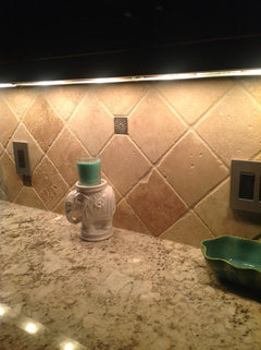
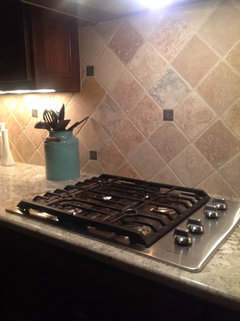
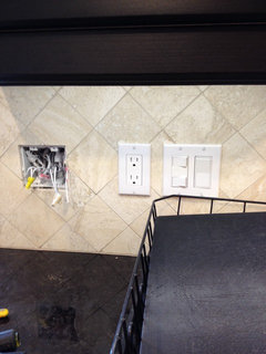
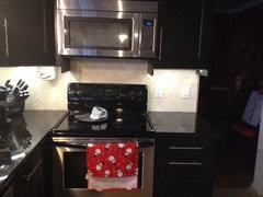
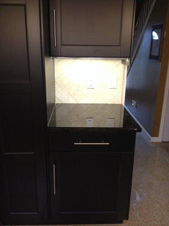
    We went with ivory honed filled travertine. Had a 3+ month wait for the tiles to come in but we love how they look! Still need to finish the cabinet trims so excuse the unfinishedness of that. Now to pick out paint for the exposed walls...