

Paint Color for a 1920's Cottage Exterior
12 years ago
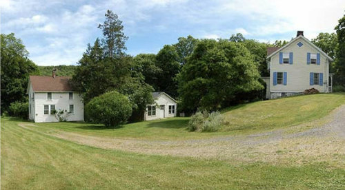
Featured Answer
Sort by:Oldest
Comments (19)
- 12 years ago
 PRO12 years ago
Related Professionals
Paducah Interior Designers & Decorators · Murfreesboro Interior Designers & Decorators · Waterloo Interior Designers & Decorators · Niles Interior Designers & Decorators · Manhattan Interior Designers & Decorators · Hudson Interior Designers & Decorators · Kenosha Interior Designers & Decorators · Wilmington Architects & Building Designers · Carbondale Architects & Building Designers · Aberdeen Architects & Building Designers · Frisco Architects & Building Designers · Aurora Architects & Building Designers · Bemidji Architects & Building Designers · Milwaukee Kitchen & Bathroom Designers · Cowansville Kitchen & Bathroom Designers- 12 years ago
- 12 years ago
 12 years agolast modified: 12 years ago
- 12 years ago
- 12 years ago
- 12 years agolast modified: 12 years ago
- 12 years ago
- 12 years ago
- 12 years ago
- 12 years agolast modified: 12 years ago
- 12 years ago
- 12 years ago
- 12 years agolast modified: 12 years ago
- 12 years ago
- 12 years ago



Related Stories
HOUZZ TOURSMy Houzz: Saturated Colors Help a 1920s Fixer-Upper Flourish
Bright paint and cheerful patterns give this Spanish-style Los Angeles home a thriving new personality
Full Story
SMALL HOMESMy Houzz: Heirlooms and Family Art Fill a 1920s Bungalow
Personal touches trump a huge design budget for a Florida couple with a taste for Americana
Full Story
HOUZZ TOURSMy Houzz: Antiques Mingle With Modern Style in a 1920s Tudor
See how careful curating and a strong vision turned an empty New England home into an eclectic sight to behold
Full Story
HOUZZ TOURSMy Houzz: Boho Flair for a 1920s California Tudor
Frumpy furniture gets the boot in favor of eclectic pieces that appeal to the travel-loving homeowner
Full Story
MY HOUZZMy Houzz: Charming Update for a 1920s Bungalow in Salt Lake City
Travel-inspired style and new finishes help the original character shine through in this designer’s home
Full Story
HOUZZ TOURSMy Houzz: Vibrant Coziness for a 1920s Georgia Farmhouse
See how first-time homeowners perked up their history-laden home and befriended a community
Full Story
MY HOUZZMy Houzz: Early-California Style for a 1920s Home and Garden
Native plantings and flea market treasures fill the cozy live-work space of a Southern California landscape designer
Full Story
TRANSITIONAL HOMESHouzz Tour: A 1920s House Reinvented as a Chic Modern Family Home
An extensive renovation transforms a warren of rooms into a light, bright home
Full Story
HOUZZ TOURSMy Houzz: Traditional Meets Casual in a 1920s Florida Home
Nothing is too precious in this upgraded St. Petersburg home, except maybe the imaginative projects of the kids
Full Story




penelopesdreamydesigns