Software
Houzz Logo Print
jenfog77

Front door color

12 years ago
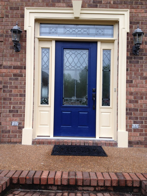
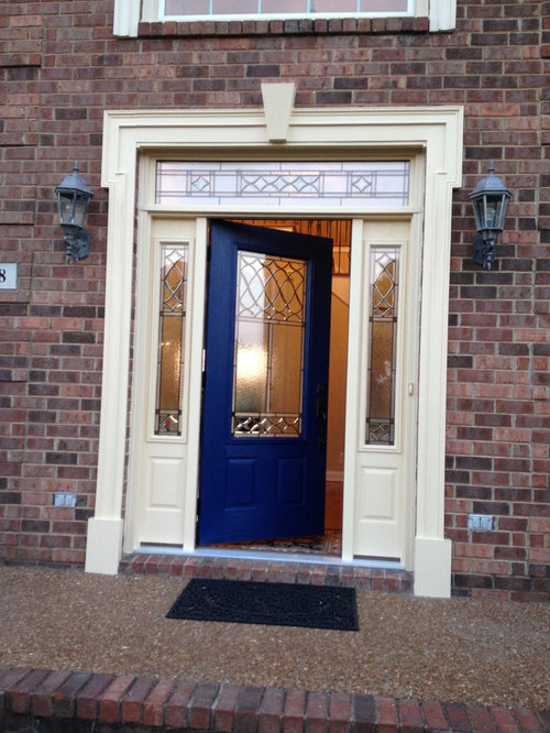
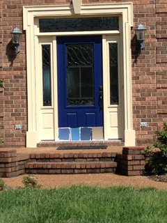
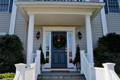
I had a new door installed and painted but now I don't think the navy blue works. It was supposed to be a dark navy but even if that came out right, I just don't think it would look good. The trim is a deep cream or colonial ivory. Should I go to a more muted and lighter blue? Last resort would be to use a khaki green color but I feel it would look good. Thanks!

Comments (97)

  • PRO
    12 years ago
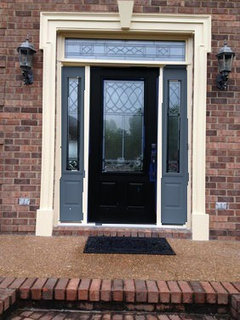
    I love the blue door! But, unfortunately it is bringing out the hint of pink in your trim color and making it less attractive. I'd consider black, and not a blue black. Charcoal with a hint of warmth.
  • 12 years ago
    I love a red door, too, and it was on the previous six panel door I had (rotted-that wonderful TN climate). Now that I have this glass insert, I just can't picture the red with it. I completely agree that the color of the door can set the mood for the home. A lot of the homes around here are big, formal, and blah! I always thought of this house as just a big box with windows; that is why I chose a decorative glass door-to add some oomph.
    By the way, I never noticed how small the mat looks compared to the entry! Do they make entry mats bigger than that?
  • 12 years ago
    last modified: 12 years ago
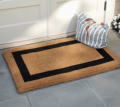
    Yes, you can get a double sized doormat (57 inches wide)
    Picture Frame Double-Wide Doormat, 22 x 57", Espresso · More Info

    Found one that is 60 inches wide :)
    http://www.seattleluxe.com
    Promomatting Charleston Border Monogram Cocoa Mat · More Info
  • 12 years ago
    Holy door mat! I found some extra wide mats on Frontgate also- 72" wide. Maybe a Christmas present to myself in the future...
  • 12 years ago
    I added color to the sidelights, but the SW app is acting a little wonky. There may be more than one color on the door unit.
  • PRO
    12 years ago
    The trim color looks very yellow at least in the photos. That's why the cobalt door doesn't work, it's too cool compared to the trim and brick. I agree that a warmer color like a chocolate brown, a rusty orange, or even a muted turquoise would sit better against those tones. An off-black such as SW 6991 Black Magic would also work. Do paint the sidelights the same color as the door.
  • 12 years ago
    I like it all ivory - lets the leading show up.
  • 12 years ago
    last modified: 12 years ago
    I like the idea of it all being the same color, or the door being only slightly darker. It's not a wide door for such a large house, and making it much darker plays that up. My eyes lit up with the door a slightly darker cream. Very classy.

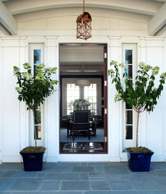
    Definitely need a wide, thin(ish) door mat and two tall plants - one on either side of the sidelights. If you want color, put the plants in colored pots - tall ones. Consider some newer light fixtures along with those tall. plants, too

    See these pots https://www.houzz.com/photos/planters-contemporary-landscape-austin-phvw-vp~243501

    In this color
    Coastal Living Entry 2 · More Info


    with these trees or something tall like them
    Bronze Door Hardware · More Info
  • 12 years ago
    last modified: 12 years ago
    No offense, but the entire front of your gorgeous house would benefit from some landscape spiffing up!
  • 12 years ago
    I agree the current blue is just not right...I would go lighter blue, maybe more of a "tiffany blue". try: Clemente Teal #730 by Benjamin Moore
  • 12 years ago
    kmkane, no offense taken! Last year I ripped out most of the landscaping and planted most of what you see there. By the time I got done with the big stuff, I was just done! It is always a work in progress. I usually have planters with lots of color on the porch and last year I had topiaries that didn't survive.
    Ok, so definitely paint the sidelights, and definitely go lighter.
    Paintcolorhelp, the door is fiberglass and faces southeast. I am afraid to paint it black because of the heat, and it will void my warranty if the door warps.
  • 12 years ago
    While you're at it, please paint the front edge of the gable the same cream as the rest of your trim. It will unify the front entry plane with the door and beautiful window.
  • 12 years ago
    A lot of colonial homes here seem to go for black doors. But, I also am in the south and with direct sun on a black door it can certainly cause some heat damage.

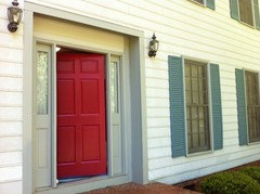
    I decided to go with red for mine (see picture below) since most of my neighbors have black/cream and only a few have very dark red.

    The door before was a blue similar to the shutter color but was in a matte finish and showed every piece of dust/pollen. Also, my wall color right inside the door is a vibrant teal and the dull blue just kept looking worse by comparison.

    The door is freshly painted as of an hour ago and will be getting yet another coat once ready.
  • 12 years ago
    If it were my door, given that it's getting some southern exposure, I'd go with a cream shade that is perhaps only slightly darker than the trim. I know it would be nice to have a different colour entirely but I think I'd rather put some massive planters on each side of the door and get something colorful that way. Part of the problem here is the unfortunately enormous window above it. I'm sure they thoughtfully balanced the width with the door, but it competes with the entrance, dwarfing what really is a lovely door and sidelight combination. So you need to make the entrance more prominent because that window up there just hovers over the door like a big crown and steals some of the entrance's thunder. You want the door to carry more visual weight. Bigger light fixtures could help also to give the entrance more prominence. However if you're wanting to do something really spectacular, have a carpenter put a trimmed panel between the door and the window to link them together into one big structure. The entrance then becomes the major feature of the house and then you may even be able to do the door in a different colour!
  • 12 years ago
    Since your brick has mostly brown terra cotta tones and you have a brown roof and cream trim, I would use green or something in the orange family, of course, not bright orange! Maybe a midtone burnt orange. Or you could downplay things with an oil rubbed bronze and have colorful planters on either side if the door.
  • 12 years ago
    Karen, nicely said! I have always felt that the house just didn't pull off the look it was intended to have. And your assessment about the window is spot on. We have discussed building a portico to give the house more architectural detail but I think that window may be too big for that. I have been leaning toward a cream color for the door now. I really appreciate all of the comments and the thought you guys have put to this. I am going to let it simmer for a few days (if I can tolerate it). Please share any other thoughts.
  • 12 years ago
    My neighbor has shared with me that the door looks purple at times -eek! She likes the cream but also suggested the burnt orange/rust red color. I have oil rubbed bronze hardware on the door and was considering a kickplate to match. I will bring out the planters soon, waiting for warmer temps at night.
  • 12 years ago
    My take on this is more simple - you just got the wrong shade - what a difference the right shade makes. This is a bright royal navy tone. A historic muted navy will look great with the trim and the house. You also don't want a dark navy because of the south facing / heat gain issue and because from the street it will just read black.

    My friends are 100% right too that here, the scale and the special window leading means the sidelight should be painted with the door.

    Consider testing ben moore's kensington blue - sw doesn't have the right shade that is navy but not quite a dark navy - http://www.benjaminmoore.com/en-us/paint-color/kensingtonblue
    this tone is made for cream (BM pairs it with one) and will solve the problem in a classic and beautiful way. . it will also only take one coat on the main door and create a lot less work than any other fix - worth the try on the main to see the color and then you can commit.
  • 12 years ago
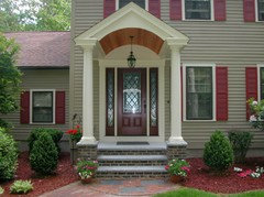
    It might be tough to squeeze a gabled portico in, but a flat one would likely work. Something like:
    Front garden · More Info
  • 12 years ago
    jen, rethink that kickplate. There are many elements at play here; you may not need to add another, especially since the door has two panels on the bottom, and it's not a particularly large door. So not only is the window above gigantic, the door and the sidelights are on the small side. Keep them the same-ish color and add the planters and nicer lights to play up the entry. Good luck
  • 12 years ago
    Closest SW match to benjamin Moore Kensington blue is SW indigo batik.
  • 12 years ago
    Obviously, with all these posts, you've been dithering over this for some time. The photos where the whole doorway including all the trim painted the same color have the most impact, and in contrast to the rest of the trim, give a powerful focus.

    Personally, I like the navy, and that shade, and the green tones don't have the same impact. Just paint the whole doorway whatever color you choose, maybe the door a darker (or lighter) color.

    Since you haven't really decided on any of the colors presented, maybe you should consider a totally different direction. Up to you.
  • 12 years ago
    If you like blue, try van courtland blue by BM ..it's a great blue for exterior.. Although brick red is great for your house...It's a lucky color too ..
  • 12 years ago
    With the added visual weight of the portico painted in the trim colour, the door can be a diffent colour...
    Bryn Mawr Stone Colonial · More Info
  • 12 years ago
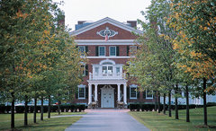
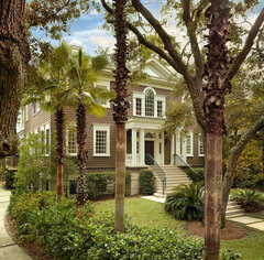
    A grand house needs a grand entrance. Jen you have a lot of potential with this house to make it a real standout. Some other examples...
    Fairholt · More Info
    Front view from entrance · More Info
  • 12 years ago
    the poor girl just wants to paint her door, and here we are having her built a portico! Sorry jenn, but you have to admit, some of these are lovely!
  • 12 years ago
    The portico is a nice idea that Jen mentioned and which would add a lot of character to the house as well as emphasize the entrance. It may be a future project, but you can't beat boosting curb appeal for adding perceived value to a home.
  • 12 years ago
    I am with you completely on the portico! I did mention it first but it is a project for the future. For now, paint is easiest and cheapest! Indigo batik is one of the blues I photoshopped earlier. And yes, I am a perfectionist. I have obsessed over this since Saturday. We actually paid someone to paint but I will be putting on the next color!
  • 12 years ago
    The current color looks like a royal blue, but navy blue would have been nice! Beautiful home!
  • PRO
    12 years ago
    I would suggest a charcoal color and definitely paint the sidelights to match including
  • 12 years ago
    Paint the door black with colorful planters on each side with topiaries etc
  • 12 years ago
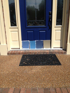
    Well, I picked up four new colors: 3 blues and one tan. If anyone is still following, let me know what you think. Solicited opinions among my family say that the third color (the darkest blue) is the winner. Thanks!
  • 12 years ago
    I like the blue on the left.
  • 12 years ago
    I'd probably also go with the darkest blue. The blue on the left would be my second choice. Love the look of gray/blue with the brick. The second blue is way too bright, and the tan is just kind of so-so to me.
  • PRO
    12 years ago
    I agree darker on wis better, I like the idea of the blue door, as long as it has a bit of gray tones, and is not too light. Here are a couple other options, that are a bit more muted. I think the one you show is pretty nice too.
  • 12 years ago
    Tan! See comments above about going for the overall look of the entire front, not just the door.
  • 12 years ago
    You might also check Ben Moore's Hale Navy.
  • 12 years ago
    Hale navy is a great color but I'm afraid it may read black. Love black doors just not this one! I'm torn between the darkest blue and the tan. Tan is boring but safe and I am really drawn to it for some reason, however the blue is what I was really going for. I am still having a hard time seeing the sidelights painted blue.
  • 12 years ago
    Tan is definitely safe...it just doesn't pop as much. I'm not sure the Hale Navy would read black, as seen in these pics. I know you haven't mentioned green, but BM's Tarrytown Green (in last pic) can look amazing with brick.
  • 12 years ago
    I like the third one. Tan is blah and the other blues, too light I think. I think the darker blue is very welcoming. I remember real estate business woman, Barbara Corcoran mentioning that, when selling your home (not that you are, of course), the first thing you should do is paint your front door a color that stands out.
  • 12 years ago
    last modified: 12 years ago
    Jen, i think your heart wants blue. Safe is boring and will leave you with this gnawing feeling that you never got what you really wanted. The feeling won't go away. I do like that third blue too. Is that the one you hear calling to you? My house is reclaimed Detroit red brick. I used a dark blue-green on my door and sidelights because I like green. I think it might be the tarrytown green. Never regretted it. Go for what you want!
  • 12 years ago
    Yes, the blue is calling me! I am sticking with my gut instinct to go with the third blue. I will think about the sidelights, while looking for more examples. Thanks everyone for your immense help! I will post pics of the finished product once I repaint (in between rain, soccer, piano practice,etc!).
  • 12 years ago
    I like the aqua blue #2. It will give your home that "wow" factor.
  • PRO
    12 years ago
    A dark maroon color would be perfect to compliment the rest of your house.
  • 12 years ago
    It's been several weeks but the door is still blue. I had to let it cure because the paint was tacky for some time. Now it is just too hot and humid to paint and then leave a door open all day to dry. During this time, I have thought a lot about what would be best. I am now leaning towards bm classic burgundy or sw marooned for the door and sidelights (transom too?). Here is what I would love the end result to be eventually...
  • 12 years ago
    I love the blue door, but agree that a blue with some gray in it or a navy would also look great.
  • 12 years ago
    As I mentioned before, my front door was painted with BM Classic Burgundy for years - still love it, even though I wanted a change.
  • PRO
    12 years ago
    Maybe a steely grey/ blue- a shade of blue with more of a grey tone might look more consistent with the look of the home. I also agree with a few of the other posts that a deep red would look amazing. Good luck.
  • 11 years ago
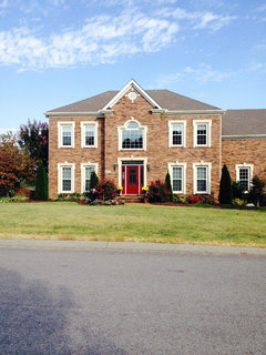
    It's finally done! I used BM Aura in classic burgundy and it went on fabulous. I am very happy with the color. Of course, I loved the blue but the shade was off and it would have taken me too long to find the right blue. The red just looks so much better with the brick color we have. By the way, the direct sunlight in this pic does make the door appear really bright. Still a great color! Thanks all for your advice.
  • 11 years ago
    I really like that. Beautiful!