Software
Houzz Logo Print
lincthelendesign

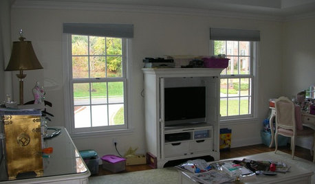
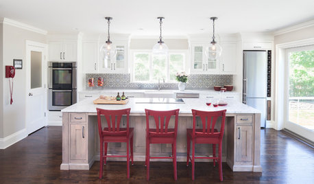
Kitchen before and after

12 years ago
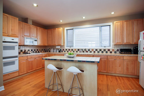
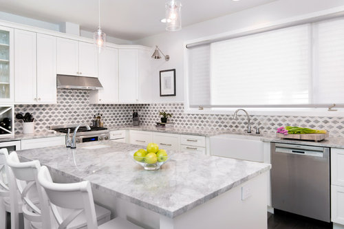
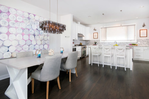
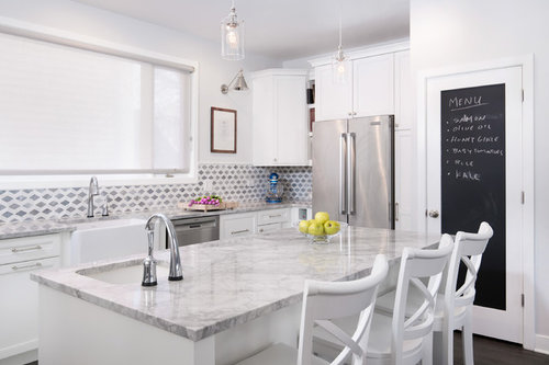
Another successful project with great clients. Here are a few before and after images

Comments (51)

  • PRO
    12 years ago
    last modified: 12 years ago
    Wow! What a dramatic transformation! Clever chalkboard pantry "menu".
    Linc Thelen Design thanked City Cabinet Center
  • PRO
    12 years ago
    Nice and clean and fresh.! the backsplash is just the right touch.
    Linc Thelen Design thanked LB Interiors
  • PRO
    12 years ago
    Great refreshed space.
    Linc Thelen Design thanked Dytecture
  • 12 years ago
    Just love the white. Nice touch with blackboard paint on door.
  • 12 years ago
    What is backsplash?
  • PRO
    12 years ago
    nice job!
  • 12 years ago
    Too much white for me
  • 12 years ago
    love the tiles. very pretty.
  • 12 years ago
    Sweet! Great job.
  • 12 years ago
    What's black and white and bland all over?
  • 12 years ago
    sorry, I liked the "before" better.
  • 12 years ago
    the before was nice. The after is fantastic, but for me I would need a bit of colour.
  • 12 years ago
    I'd much rather have this "before" kitchen than the blinding-white-surgery-room "after". The only improvements in the make-over are the new appliances, the dark floor, and the blackboard on the door.
  • 12 years ago
    Too white!!!!
  • 12 years ago
    I echo Pegster on the comments. The BEFORE is much BETTER
  • 12 years ago
    Before is so much nicer. The new splash back is awful
  • 12 years ago
    Looks like a mausoleum.
  • 12 years ago
    I prefer the wood, it needed a few improvements but the after isn't my taste at all
  • 12 years ago
    So much white. Is this the kitchen in the hospital?
  • 12 years ago
    last modified: 12 years ago
    Too white. Perhaps adding colourful blinds/curtains could make it feel warmer??
  • 12 years ago
    Thank you for this great idea i have the same kitchen and you just gave it me the idea again Thank you .
  • PRO
    12 years ago
    Great overhaul brought this kitchen into this millennium. Love that backsplash tile!
  • 12 years ago
    Clean & nice but I would want a little warmth, too white for me!
  • 12 years ago
    Not a fan of all these white kitchens.
  • 12 years ago
    My new kitchen is white as well but I have black granite counter tops and island. My back splash is a mix of black granite, white glass small stones. This kitchen has too much white and would be hard to work in.
  • PRO
    12 years ago
    I may not like this, but if your client is happy then it is a success.
  • 12 years ago
    What is it with this white these days??? At least they could have painted the walls a different color...I would feel like I am in an operating laboratory!! ...
  • 12 years ago
    great tile choice!!!!
  • 12 years ago
    I'm not sure the photographer's lighting of the new white kitchen is doing it any favors. I love all white kitchens, but even I find the glare of the bright white too surgical. But I suspect this isn't the effect when you are actually in the kitchen with the shades up seeing it in natural light. Instead, I suspect that it was overlit for the photoshoot, making the whites look too uniform and a bit blinding.
  • 12 years ago
    white, white, white ... do not understand an all white kitchens. pretty, but needs a little warmth
  • 12 years ago
    I absolutely love the floor. Would have loved to see the tone repeated in the countertops.
  • 12 years ago
    Both are beautiful, but the new is definitely more modern! It'd be easy to add more color in with personal items, and at a later date the owner could easily change things up with a pretty wall shade that is echoed by decorative pieces on the countertops. Very nice!
  • 12 years ago
    I find that people who have to make derogative/mean comments should keep those to themselves. How would you feel all if someone wrote stuff like you do about your own place?

    On the other side, I absolutely love the breakfast/ eating table area.
  • 12 years ago
    It didn't look so bad to me "before". I just wasn't crazy about the island. It could have been larger and had a better surface.
  • 12 years ago
    This is one time when I'll say, I liked the before so much better! I liked the checkerboard, the warmth, the colour. I think the after looks sterile, cookie-cutter and bland. White isn't always the answer in kitchen makeovers. White and grey is too cold.
  • 12 years ago
    Too bad they took all the charm out of the first one...now it is just blaaaah looking.
  • 12 years ago
    Too White
  • 12 years ago
    I bet it looks awesome when you are actually in the 'new' kitchen, and that it is just a lighting issue when photographing it that it appears overly bright white. I wonder how easy it is to keep a white kitchen looking spotless? With such a white 'canvas' to play with adding colorful accessories and changing the wall paint, this kitchen can be changed several times over -- when ever you feel like a change.
  • PRO
    12 years ago
    Well executed, nicely done, congratulations.

    J Design Group, Modern Interior Design Firm in Miami, Florida. http://www.JDesignGroup.com
  • 12 years ago
    I don't agree with some comments. The white is very nice. Very updated. White is coming back in a big way. Just wait you are ahead of the curve.
  • PRO
    12 years ago
    Great work!
  • 12 years ago
    I think that backsplash is neat...different.
  • 12 years ago
    I liked the before.
  • 12 years ago
    Debbie, just so you know, I have waiting 10 yrs to put in this kitchen in our home. After visiting a beautiful villa and some other hotels in Italy, I fell in love with white marble and classic white country ktichen, but I wanted to incorporate some contemporary details (such as the lighting and chairs). My entire house has the old bones with contemporary furnishings.. it's just what I love. I never did it to be "trendy". In fact, I don't even this it is a trendy kitchen.
  • 12 years ago
    To each their own...both are beautiful; I prefered the "before". The important thing is the homeowner loves it and is proud to show it.
  • 12 years ago
    It's gorgeous. I love cool colors.
  • 12 years ago
    Looks great....well done
  • 12 years ago
    The before looks better. After is too white and the gray and white patterned backsplash is dizzying.
  • 12 years ago
    Looks too monotonous for me. Seems like dark counter-tops similar to floor would have looked better. Sorry, I like "before" better.
  • 12 years ago
    Looks great. Enjoy your new kitchen