Software
Houzz Logo Print
karenrappa

Kitchen backsplash

14 years ago
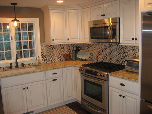
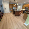
After looking at the many beautiful kitchens on Houzz, I am afraid that I made a mistake having this glass mosaic tile installed in our newly remodeled kitchen. It is so busy. I would appreciate thoughts on whether I should redo to an ivory subway tile or something else.
Cape Cod · More Info

Comments (18)

  • PRO
    14 years ago
    Personal opinion -- I think you've hit on the reason this trend will pass and eventually look dated. It's cool and modern for now, but I like your idea for long term. No rush though, as this is very nice for now. And to un-busy it in the meantime, I'd keep the counters as empty as possible, and use Command strips to hang a collection of large simple rectangular silver trays on your backsplash.
  • 14 years ago
    I think that maybe if you put out lighter accessories, it would lighten the overall look. Maybe instead of the decorations you have out, put in some milk glass? Maybe a brighter light - What kind of light fixture is in the middle? I'm picturing a white, chiffony pleated drum shade that would help brighten it up, if it's not all pot lights.

    Definitely change the rug to a solid - the tile and granite have enough pattern for sure!

    It just seems silly to take out brand new tile.
  • 14 years ago
    Thanks very much for your ideas.
  • 14 years ago
    Since this is not your kitchen, find it hard to make suggestions. I'm sure there must be an easy fix if you feel it is too busy. Here's a closeup of the decorative accessories that do not show too well in the photo you sent, I think the tasteful objects help a great deal. Is your tile the same color? stainless appliances? floors? cabinet finish? knobs? sink fixtures? under cabinet lights?
    Cape Cod Ranch Style Home · More Info
  • 14 years ago
    I would remove everything from the countertops. Put back 1white bottle with a bar spout on it to house your soap. Also, get some large white cannisters for the corner and place them atop an oil rubbed bronze tray. Keep everything simple and elegant. I would keep the light over the sink. As for the floor, I would get a dark brown woven leather mat to put at the sink.
  • 14 years ago
    I'm confused by j222b's comment above. Is he claiming that the photo above is not karenrappa's kitchen? Because Houzz shows the photo as being uploaded by karenrappa? In any case, I say keep the mosaic tile and enjoy it. You'll be hankering to change it down the road because it is a bit "of the moment" but so are so many design choices we make. Just keepin geverything else simple and plain will keep your eye focused on the backsplash and not going all over the place. Light, simple and edited. Then wait 5 - 10 years, get inspired and repeat!
  • 14 years ago
    Alisha544: You are correct, I am not correct. Thanks! I didn't look at the name.

    Everyone: Please disregard my comments.

    Karenrappa: I think your kitchen and rest of the house are very very nice. I don't think the tile is too busy, but In the photo above the colors of the tile do not seem to enhance the granite. In the more close up photo I posted, the colors look very nice together and your arrangement of dishes & their soft colors is perfect. Different lighting? Or maybe we need to stand farther away (like artists do) when we choose our tiles and granite combinations to get the effect from a distance. Close-up:
    Cape Cod Ranch Style Home · More Info
  • 14 years ago
    I think it looks "too busy," because you have a pattern in your granite countertop as well as the backsplash. I probably would have used the elongated tiles as opposed to the little squares. The colors are nice though. Having white cupboards helps, but I agree with keeping everything off the counters-lose toaster oven and all the accessories except the ivory bowl to create the look of more space. I also agree about the rug. Use a solid color to match the floor so your eyes don't follow it up.
  • 14 years ago
    What is the paint color on the walls above the window? I like the kitchen tile...it's very pretty:)
  • PRO
    14 years ago
    Late to the conversation but it looks like the cabinets have a light bar detail..are there under cabinet lights, if you do keep them on, whole different look. It even looks like you could add low voltage halogen under mount lights.
  • 14 years ago
    Ok I too am late in this conversation but here's a suggestion: Add a stainless steel backsplash that is the width of the stove, to visually connect the stove and microwave. They are very thin and could be easily added over the existing tile. This would break up the tile and add a custom look for a minimal price. There are many examples of these backsplashes on this site for ideas. Otherwise don't be too hard on yourself, you have a very nice kitchen.
  • 14 years ago
    Thank you all for the suggestions. I really appreciate them!
  • 14 years ago
    Call me crazy, but I'd be tempted to paint black, or another dark colour around the window. Have to agree with other posters and rethink accessories on countertop.
    Good luck!
  • 14 years ago
    I agree with kelleygirl don't be too hard on yourself, it looks fine. When you want to renovate it again perhaps try something with a more solid old world look and then add the odd decorative pattern tile so that it won't look too solid and plain.
    Enjoy it for now it looks like a beautiful kitchen!
  • 14 years ago
    Oh, I'd think I'd replace your electrical cover plates, maybe a stainless steel? For the colour above/around the window did you go with the countertop colour, or your tile colour? All in all, you really do have a beautiful kitchen!
  • PRO
    14 years ago
    Definately replace the outlet covers with either stainless steel or a white that matches the cabinet finish. I would change to stainless steel canisters so you bring the modern element of the tiles to the countertop along with the appliances. Keep it simple. For the rug, change to a more solid design that pulls in the deeper colors of the glass tiles as this will help anchor the space.
    This is a beautifully updated space so enjoy your hard work! A few of these minor changes should help to settle your mind and eye.
  • 11 years ago

    The mosaic tile is too busy and clashes with your granite. Would drive me crazy :)

  • PRO
    11 years ago
    last modified: 11 years ago

    2012