Software
Houzz Logo Print
sherbile

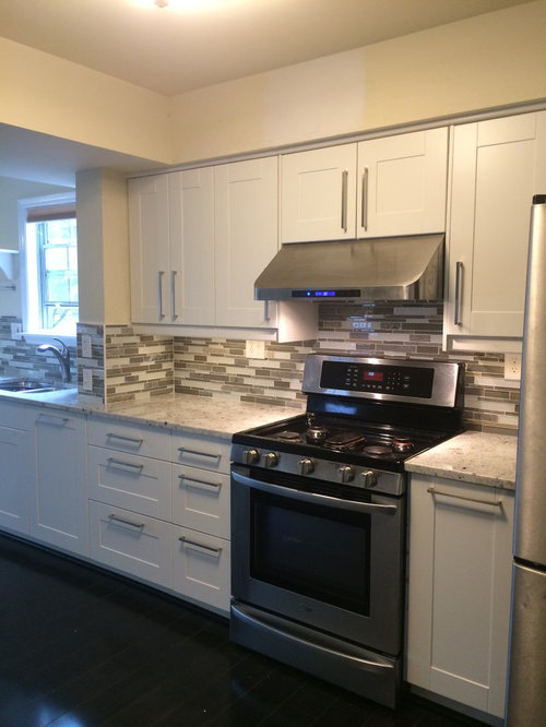
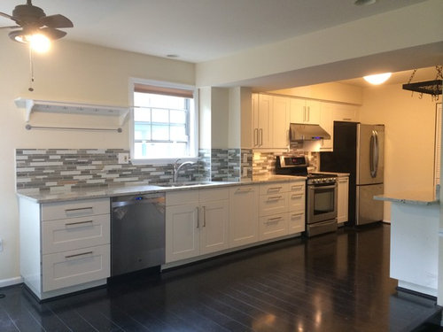
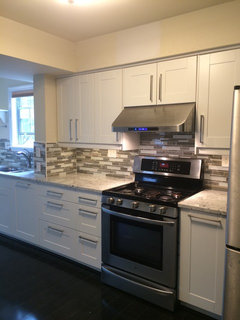
1983 kitchen before and after

12 years ago
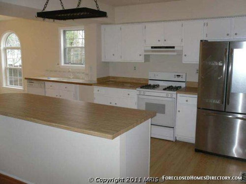
still need to paint the walls and ceilings. any suggestions for the colors of the paints?

Comments (41)

  • 12 years ago
    Impressive change. Try picking up one of the tile colors, two shades lighter. You might consider removing the pot rack as it is not adding to the overall impression.
  • 12 years ago
    Thanks! We designed the kitchen by ourselves, but didn't change it much due to the budget. Just tried to make the kitchen more contemporary. We did consider to take the pot rack away and hang two pendent lights there and maybe add some recess lights, but it was over our budget, so decided to keep it for now. We are pretty satisfied with the outcome.
  • 12 years ago
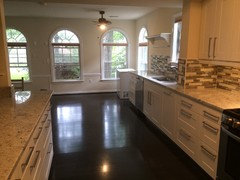
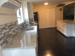
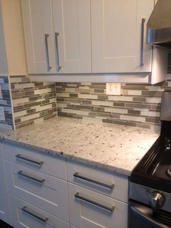
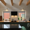
    Here are some other views of the kitchen.
  • 12 years ago
    Beautiful job! I agree with apple pie, a light grey will look great, or even an eggshell white to make the backsplash stand out.
  • 12 years ago
    The other views are beautiful, too. Nice to hear of someone who worked so well within their budget. What is the flooring?
  • 12 years ago
    Beautiful choice of counters and back splash.
  • 12 years ago
    When you get money put in recessed lights. And pendant over counter. I agree pot rack takes away I would remove.
  • 12 years ago
    Yes for sure paint a dove gray. That will make your backsplash pop. A cheap fix.
  • 12 years ago
    Very pretty, excellent selections. I like the above idea of eggshell.
  • 12 years ago
    last modified: 12 years ago
    Beautiful! I prefer grey. Edgecomb grey by Ben Moore is beautiful.
  • PRO
    12 years ago
    Yes, great job.

    J Design Group, Modern Interior Design Firm in Miami, Florida. http://www.JDesignGroup.com
  • 12 years ago
    Thank you all for the compliments! The flooring is the "Chimney Rock Charcoal" 12mm St. James laminate from Lumber Liquidators. We will definitely check those grays out and once the painting is done, I will post more photos. We still need to fix our unfinished basement and remodel the bathrooms once we have more budgets later on, but I do hope one day we can get rid of that pot rack. The pots hit my head more than 5 times today when I worked on the island...
  • 12 years ago
    I would go with Ashley gray HC- 87 or Chelsea gray HC-168 or maybe Woodlawn blue HC- 147 to brighten it up a bit.
  • 12 years ago
    I agree with going with a gray, and if you like the pot rack keep the pot rack. I have Sherwin Williams Intellectual Gray in most of my house and it's a nice brown gray.
  • 12 years ago
    Nice job. I would suggest adding another upper cabinet by the dishwasher to make it a little more convenient for you when putting away dishes. I agree a grey tone would look awesome in your kitchen with a deep purple or yellow accent piece.
  • PRO
    12 years ago
    I love the cabinets! Here are 4 different gray, which any of them might work well, it all depends on whether you want a cool palette or a warmer one :-)
  • 12 years ago
    i would go with a sage…will pick up the backsplash nicely….
  • 12 years ago
    I think your kitchen turned out very nice. Especially love the cabinets!
  • 12 years ago
    Great work! What kind of emotion do you want in this space? Bright and cheery to stimulate family conversation? Cool and calm for relaxing after a long day? I would pick colors based on the answers you find yourself drawn to. With so much time spent in the kitchen, and so much neutrality in the gorgeous work you've done, a pop of color would connect the two.
  • PRO
    12 years ago
    I would go with a sage or a gray.
  • 12 years ago
    Love the floor! Nice job.
  • 12 years ago
    I would add a bit oft color to it perhaps red towels or pictures framed red....
  • 12 years ago
    I think this could have been more dramatic and with the space and light a dark wood could have been used which would have "jelled" with the windows more.....and totally agree with the remark of the pan rack, get rid......
  • 12 years ago
    If you can not get rid of the pan rack, what about painting it a mid-tone gray and letting it take a less prominent role in the area.
  • 12 years ago
    i like it so much
  • 12 years ago
    Lovely job
  • PRO
    12 years ago
    last modified: 12 years ago
    Beautiful kitchen! For paint I would try some grays. I would start with Gallery Buff CSP- 225 from Benjamin Moore. It is a beautiful gray that doesn't go purple in daylight. It is also rich enough to go with your dark floors and light enough to keep the space feeling airy.
  • 12 years ago
    @ Stamps Design Services - What brand paint are the samples from
  • 12 years ago
    You have a lovely home. Have fun with your future renovations.
  • PRO
    12 years ago
    I'm going to go with Shannon Stancliff-Chandler, and say some color would be nice. Too much gray washes out the whole place and makes it a little on the dreary side, even on a sunny day. It doesn't have to be an obnoxiously bright color. A pale yellow would brighten the room and make it seem sunnier. My favorite trick is to use a satin finish to add just a hint of shine and reflect the light better.
  • 12 years ago
    You did great job! I would stay neutral on the walls and add pops of color in your decor. Cement by Martha Stewart is my go to grey... A little darker, but beautiful!
  • 12 years ago
    Ashley Grey by BM is fabulous. It changes color throughout the day and gives tremendous warmth. I loved it so much inside my house that I painted the outside the same color and we get compliments constantly
  • 12 years ago
    Can you afford a new. statement light fixture instead of the ceiling fan?
  • 12 years ago
    I agree with the suggestions for going neutral on the walls. With the open floor plan, it needs to be a color that flows with the rest of the house, but if grey works within that flow, I think a great grey would look very nice. There are some very good color suggestions in earlier comments. One of those, Benjamin Moore's Revere Pewter, is a very popular paint color, maybe Benjamin Moore's most popular color right now. I haven't used it in my own house because it really doesn't work all that well with my palette, but it may work very well in your space. Then you can introduce color in your accessories, window treatments, rugs, etc., to tie into colors in your adjoining rooms. Beautiful job so far!
  • 12 years ago
    A blue/grey would be so nice... :)
  • 12 years ago
    Wow, it seems the majority, myself included, sees grey for the walls. It looks like you added under cabinet lighting.....excellent. I love your drawer and cabinet pulls. Enjoy your successful updates.
  • 12 years ago
    Thank you all! I got samples of OC-23, HC-173, OC-27 from Benjamin Moore the other day, but all 3 of them didn't work out so well. I will check out other color suggestions from all of you later. Thanks again!
  • 12 years ago
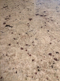
    I have to know what kind of counter tops you have.
  • 12 years ago
    The countertop is Colonial White granite.
  • 12 years ago
    Add a few Bauer Pottery ( http://bauerpottery.com/lastore/ ) pieces as the budget allows on the shelf for a pop of color & wow!, one piece at a time.