Software
Houzz Logo Print
cami_applegate

I get one color for the whole house.

12 years ago
last modified: 12 years ago
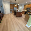
It's a new build. I get one color and one color only right now. I don't really want to do white. I have medium brown leather couches, the wood floors will be stained in Early American by Minwax (true medium brown), all the fixtures are chrome or satin nickle, and the cabinets are natural hickory. I don't plan on repainting anytime soon if ever. My last house was Dunn Edwards Gourmet Honey so we will skip that one this go around. Initial Thoughts: Revere Pewter; but I am worried about depressing the family, (and I heard that gray can be a mood killer in the bedroom.) Other thoughts were Chocolate Froth by Behr, Gentle Shadows by Valspar, and Sculpters Clay by Behr. Any suggestions?

Comments (39)

  • 12 years ago
    BM Jackson Tan or BM Yosemite Sand.
    Cami Applegate thanked Leslie Brooks
  • 12 years ago
    Do you know the Dunn Edwards crossover for Yosemite Sand?
  • PRO
    12 years ago
    Remember that you can always add color through accents! Here are a few that I thought may help you:

    http://deciture.com/adalie-vase/

    http://deciture.com/attractive-zig-zag-designed-metal-vase-3-assorted/

    http://deciture.com/attractive-styled-elegant-bamboo-laquer-vase/

    Hope this helps you!
    Cami Applegate thanked Warner Decor
  • 12 years ago
    Test bm wheeling neutral http://www.benjaminmoore.com/en-us/paint-color/wheelingneutral
    or one step lighter bm manchester tan http://www.benjaminmoore.com/en-us/paint-color/manchestertan - that is a great buff that works with all future colors

    both neutrals with gold undertones so the things that worked with honey will still work, but won't dominate . .
    if you want to try a cool color - do one of these neutrals with a khaki green brown undertone - very warm and work with all colors http://www.benjaminmoore.com/en-us/paint-color/brushedaluminum
    Cami Applegate thanked libradesigneye
  • 12 years ago
    I second BM Manchester Tan. I've used it in 3 homes and it seems to work as a perfect neutral.
    Cami Applegate thanked Gretchen
  • 12 years ago
    please don't do gray!
    Cami Applegate thanked bgfuqua
  • 12 years ago
    libradesigneye, The brushed aluminum looks very close to revere pewter. Revere Pewter was my first choice, but I am nervous about it being too dark or even depressing. Do you have any experience with the grays with warm undertones?
  • 12 years ago
    Revere Pewter is not too dark. I have it in a fairly dark bathroom and the undertone changes from grey to taupe depending on the time of day - but the color is not dark. My best advice is to get some samples - even if you have to paint it on poster board - and look at colors in your home.
    Cami Applegate thanked Gretchen
  • 12 years ago
    Other than my leather sofas, I don't have any furniture I kept/or that can't be painted or something. I want to go away from Gormet Honey entirely.
  • 12 years ago
    bgfunqua, why not gray? Other than personal preference is there a negative attribute you have experienced?
  • 12 years ago
    Take a look at BM Horizon Gray or Camouflage. Both have a subtle green undertone but still are neutral.
    Cami Applegate thanked Gretchen
  • 12 years ago
    I currently have 9 colors tested on the walls. Revere Pewter (BM), Sculpters Clay (Behr), Owlet (Vlaspar), Gentle Shadows (Valspar), Warm Outmeal (Valspar), Chocolate Froth (Behr), Linen (Valspar), and two others that I will not use. I like all of the others but can't figure out if they make good whole house colors.
  • 12 years ago
    No one color will ever be perfect for every room. Pick a neutral you like - especially in the larger/main areas. You can always paint rooms with different colors as you settle in and make more furniture choices.
    Cami Applegate thanked Gretchen
  • 12 years ago
    Just now back. I don't know the equivalent in another brand. I just thought u would suggest as I've used both and are true to color. They don't pull peach or green or yellow. They are just nice.
    Cami Applegate thanked Leslie Brooks
  • 12 years ago
    I dislike gray for several reasons: 1. It can look dirty. 2. It is jarring to see lots of gray, black and white with random bright color. It's like watching black and white tv where only the people are in color. 3. Gray can color change and pull green or blue which will greatly alter your look. 4. It can be depressing. 4. It can look industrial.
    Cami Applegate thanked Leslie Brooks
  • 12 years ago
    Of your tested options, I like the chocolate froth -it is very near sw canvas tan . . a neutral that isn't too warm or cool and can work with all color.

    I tend to agree that the grays can be "depressing" depending on your climate. You really need to have great natural light and not be in a place where it rains a lot or you have marine layer or cloudy weather frequently.

    I don't think revere pewter is a typical gray, and I don't think you would find it depressing, but it is a bit dark for a whole house. You can come back and use it well with the chocolate froth in a room that can take more drama.
    Cami Applegate thanked libradesigneye
  • 12 years ago
    Okay Leslie. Those were my same concerns with gray as well. Revere Pewter was being passed off as a warm neutral but it does not really look warm to me. It looks neat, and with the right contemporary arrangement, probably even stunning. My gut says I will like it, probably even a lot, but only temporarily. I am an eclectic decorator. Grabbing what I like and fitting it in. I would rather change things in a room over the paint.
  • 12 years ago
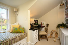
    What about going with a very neutral off white color like
    Traditional Kids · More Info

    Albescent OC-40 by Benjamin Moore · More Info
    Cami Applegate thanked Denita
  • 12 years ago
    Thank you libradesigneye. I am very much leaning toward the chocolate froth. In fact had I not ran into a friend at a local supply store and been discourage by her from using it, I would have already painted it. My husband has fear that the chocolate froth is too light to not do white trim (neither of us want white trim). I don't think it is too light. I think it will appear light and then change to match whatever I do for decorating.

    As far as the Revere Pewter; we have steady sunshine by comparison to a lot of places. That said, I loath overcast, rain, snow, sleet or any other sun blocking weather for more than a day or even part of a day.
  • 12 years ago
    Thank you Denita. I had thought on that as well. I need the house to have sell-ability when I am done as well. Is off white too boring? I strongly considered Dunn Edwards Antique White which looks very much like your selection.
  • 12 years ago
    My house actually has lots and lots of angles like the photo Denita, including reading lofts and kids nooks.
  • 12 years ago
    Think about the seasons. Winter is long, cold, and dark. Gray will only amplify that feeling.
    Cami Applegate thanked Leslie Brooks
  • 12 years ago
    Cami - what color are you planning for trim? That is a significant consideration.
  • 12 years ago
    I just went through that torture myself. Though I cringed over the thought of grey, living in the valley of western Oregon, I learned that I am so sick of tan/beige/off white that I could not stand the thought of using anything near that shade in my entire new build out in sunny Central Oregon.

    So after looking at about nine other colors, believe it not, I went with a blue-ish grey. And it looks great.

    Now I only had to do that on one floor (upstairs, open area), the other floor will be a green-ish grey. It works because the floor and trim is medium brown, like yours, and we have a lot of windows and angles, so the light changes every wall and the inside looks like the outside - beautiful, clear and sky-like (that's the upstairs). The green-ish grey reflects all the trees on the ground floor.

    Anyway, that's my story and I'm sticking to it, because like you, I had to choose and can't repaint! Good luck.
    Cami Applegate thanked km kane
  • 12 years ago
    The paint option is one color everything with an optional alternate ceiling color. I am actually okay with this plan. (I only have base and case not widow trim.) Trim is not under consideration yet. If I do trim latter, it can't be white. I like the look of white trim but don't like it in real life.
  • 12 years ago
    last modified: 12 years ago
    I do have a lot of natural light and angles, which is one reason I thought I could pull off the sculptors clay or revere pewter. My decorations are pretty eclectic though, even some rustic. Everything I read said you need contemporary or at least contemporary flare to pull off gray. How did it go with your furnishings kmkane? What color did you use? Did you do the whole house? My home is 3000 square feet.
  • 12 years ago
    Can antique white be paired with natural hickory cabinets?
  • 12 years ago
    1200 feet on both floors. Medium stained oak floors, medium stained clear alder on trim, painted kitchen cabinets in a dark-ish hue. (This place faces south all day long, so light is no problem) No furnishings yet, but they will be on the contemporary side (not terribly modern for me!). Art work is all over the board, from antique maps to modern to my husband's airplane propeller (I think you could consider that eclectic!), all original. I used a local company - Miller Paint, but it is close to the Revere Pewter. I don't have sample of the Revere though, so can't compare exactly.

    I actually agreed to go with all one color. After living in a 1917 Craftsman, where all the rooms were a different color, I think the idea of one color in this new home is refreshing, at least to me. Plus, as we know, each wall, corner, area, etc, looks different at any time of day because of the lighting.

    My neighbor (in our city townhouse) painted the entire (three story, 2350 square foot) place entirely grey (Sherwin Williams Knitting Needles), which is where I got the idea and why hubby kinda forced me to go with one color. Her place is gorgeous.
    Cami Applegate thanked km kane
  • PRO
    12 years ago
    What about something like Sherwin Williams Relaxed Khaki?! It's a great neutral!!
    Cami Applegate thanked User
  • 12 years ago
    I'm also following because I'm building and have a large space that will be one color. Liking some of these ideas. :)
  • 12 years ago
    I think I'll start a discussion on this, as I would like the pros to weigh in. I'm sure they'll have some advice we could all use.
  • 12 years ago
    Okay, so I think I am down to Warm Oatmeal (Valspar) or Chocolate Froth (Behr)-color matched to Dunn Edwards Versa-satin. (Picture of Chocolate Froth and Warm Oatmeal is a lighter version.)
  • PRO
    12 years ago
    Revere pewter is one of the most versatile colours I have come across. And it seems others feel the same. It is a contemporary colour, but it works with traditional and eclectic.Do paint larger patches on various angles to test it out. Technical grey is not a colour and thus serves to frame all other colours. That is why it has come to the fore in design recently. People were afraid to use a "grey" considering it dreary and somber. But it put other colours into context.. Hence it's emergence as a trend.Finally, your ceilings should ideally be painted two tints lighter on the colour you eventually choose to give the illusion of height.
    Cami Applegate thanked ASVInteriors
  • 12 years ago
    I live Revere Pewter. Has slight brown undertones. Does not look dark. I considering for our dining room and will pull gold elements in.
  • 12 years ago
    ASVInteriors, Would you use Rrevere Pewter as the whole house color? (I just get one color for now.) I like the color, but I am worried it won't make a good whole house color.
  • 12 years ago
    Testing is the key - I wasn't sure about revere next to the hickory cabinets myself . . since they often have a bit of red. Test and see how you like it.
  • PRO
    12 years ago
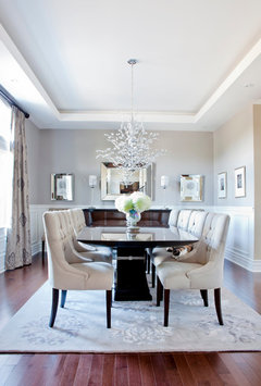
    I'm sorry to sound like a broken record on these posts about good neutral colours. Still, my go-to neutral is Natural Linen by Benjamin Moore - it's beige but not boring, it goes with all styles (traditional and contemporary) and is pleasing to the eye in day and evening light. Here are some photos of projects I've done with this colour to help you see if it's something that you like. I love Revere Pewter too but it's a little cold - if you have lots of white trim and dark furniture it could look very sharp though (I'm enclosing a dining room I did in RP for you to see). Good luck from Montreal!
  • 12 years ago
    BM Healing Aloe...all over my house...love it!
Sponsored
Bella Casa LLC
Average rating: 5 out of 5 stars17 Reviews
The Leading Interior Design Studio in Franklin County