Software
Houzz Logo Print
birdkkk

Are 4 stools too much for 30" bar table?

12 years ago
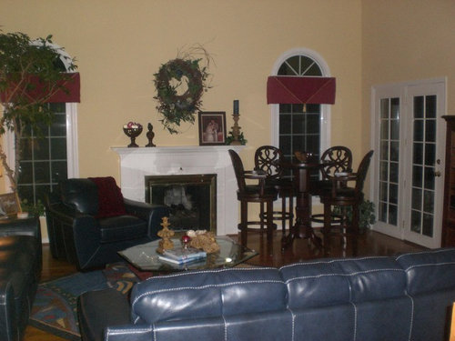
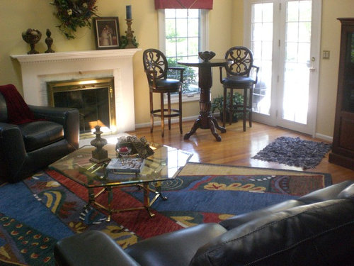
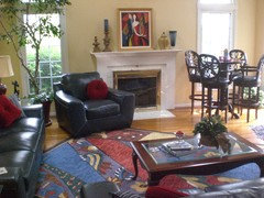
I have a 19x19 family room with vaulted ceiling and sky lights. Do the 4 stools overpower the table or would I be better off with just or 3? I like the idea of having additional seating for entertaining etc.

Comments (145)

  • 12 years ago
    I love the tree, but if you don't already prune it back, you might want to start. It's trying to outgrow its light source. Not a drastic pruning, just a little tip pruning. And ficus sap is an irritant, so wear gloves.
  • 12 years ago
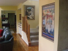
    I like your taste in art! The poster appeals to me because it tells a story, is a conversation starter, is unique and the reds are a different tone than some of the others you are using. Personally, I prefer the poster.
    birdkkk thanked SusanMac
  • 12 years ago
    last modified: 12 years ago
    I need to switch out the navy thingy to the right of the picture. I am surprised that you prefer the poster to this painting. Much "richer" than the poster but color is color!!! I also have to admit, I like the geometric repetition of the painting and the rug. IMHO!
  • 12 years ago
    Fissfiss, I have been trimming, that is why is looks a little sparse! Apparently I likes the sky lights! It is root bound though but seems to like abuse!
    !
  • 12 years ago
    last modified: 12 years ago
    birdkkk, love the art over the mantle ;0) , did you find anything else? Art goes very well with the style furniture.
  • 12 years ago
    Two chairs for the pub table. Keep the other pair handy for extra seating when you need it but it makes the room look crowded, especially with two leather sofas and an arm chair. (Love the blue) Your wall above the mantle can support a fairly good-sized piece of artwork. Find something even larger than what you're working with now. It'll open the space up and make it look larger. Love the bold colors in the art you have.
    birdkkk thanked celliohana
  • 12 years ago
    I say no to the new coffee table. The glass one is better. It allows the rug to show.
  • 12 years ago
    groveraxle, the one thing I like about the "new" coffee table is it is easier to reach from the sofa than the rectangular. I will consider your suggestion though. Anyone else?
  • 12 years ago
    bird, someone had suggested to keep the rug the way it is, do you remember why they suggested that? To me the way the rug is make no sense, it scrambles my brain. It would be ok if you were not seeing part of the hardwood under the couches. There are rules in design, you can break these rules, but only if you really really, really have to lol.
  • 12 years ago
    last modified: 12 years ago
    Thanks for the comment on the rug! When I placed it not at an angle, it encroached the pub table and chairs. At an angle, it fit the room better. It is a big rug! I could tweak the angle but I want to make sure the legs of the sofas sit flat on the floor equally. That was a trick in and of itself! Maybe i will do an arial from the upper story for a better view. Curious, what are the rules?
  • 12 years ago
    Oh, I'd love to see the room from above!
  • 12 years ago
    Rules are made to be broken.
  • 12 years ago
    groveraxle, only if they really really really have to be lol ;0))))).
  • 12 years ago
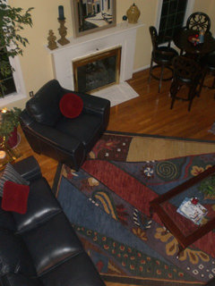
    Here you go...view from the top!
  • 12 years ago
    I like the painting over the poster;)
  • 12 years ago
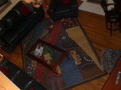
    and another...
  • 12 years ago
    birdkkk- does that other little blue shaggy rug have to stay in the room?
  • 12 years ago
    Margo, for clarification...there are pictures of three different pictures above the mantle...#1 muted colors to match the picture on the opposite wall. #2 The poster, #3 the vibrant painting of the couple. Thanks for weighing in!
  • 12 years ago
    The shaggy rug is just for convenience.
  • 12 years ago
    I was referring to #3 then;)
  • 12 years ago
    bird, what do you think?
  • 12 years ago
    I like that one too! However I will be curious to see what the others say. The poster will need to be framed. Probably $100. + to do so. Ugh! But I have other places I can use it.
  • 12 years ago
    tw123456.. I like the vibrancy of the couple, #3. I would hang it though rather than prop it. I like the way the original #1 goes with the other in the room. I love the image on the poster. so what do I think...not sure!
  • 12 years ago
    I too, love the nuns' poster. The pic that you got is also very nice.
    The more I look at your blue leather the more I like it. It looks like Italian styling, where did you buy it from?
  • 12 years ago
    I thought you were asking what we thought of the view of the fam. room. My response was what you thought of the view?
    To me it is very disconcerting, but if you think it is fine, because of necessity, then that is how it should stay.
  • 12 years ago
    Tw, please explain...disconcerting. I showed the view from upstairs to show better the angle of the rug which I thing you are suggesting should be straightened.
  • 12 years ago
    last modified: 12 years ago
    What I mean by disconcerting is, my mind gets more scrambled when I look at it the (area rug) from the top view, but as I said if this is how it has to be place in the room, then you have no other choice.
    Did you say that the rug would be very close to the fireplace, if you straightened it?
  • 12 years ago
    All the pictures are nice and if you like you can change them around for the Summer use the poster since it mainly focuses on that season,you can have a 4 season room and a fresh look with everyone of them .
  • 12 years ago
    An odd number of stools has better eye appeal. Stick with three stools.
  • 12 years ago
    An odd number of stools has better eye appeal. Stick with three stools.
  • 12 years ago
    birdkk love the colours in the couple picture. They all have their merits, perhaps you need to just keep the pictures moving around every three months from your home gallery.
    Thanks for the aerial shots - I would like to see the rug straightened up and the blue chair as well, with the coffee table turned 90 degrees to be parallel to the sofa at the end. There seems to be too much going on with the pattern of the rug and the angle.
  • 12 years ago
    Anniau, thanks for the comments. I will consider straightening the rug! The coffee table is there b/c the one needs a place to put their drink!!! The other sofa already has the end tables. So you like the rectangular coffee table or the original octagon, glass &n brass?
  • 12 years ago
    birdkkk, the 4 chairs are a bit much. The table is too small and the chairs are too heavy. I have a 36" table in my kitchen with 2 stools. Actually, your room is lovely without it, but if you insist, stick with only two stools. The corner looks extremely heavy with the 4 stools.
  • 12 years ago
    Btw, your artwork is beautiful!
    birdkkk thanked beverlynn
  • 12 years ago
    last modified: 12 years ago
    Cannot believe you have so many art choices right in your home! How nice! Guess I am still with hubby and like the matching ones here.

    And I know it is not fun to change tables back and forth when they are heavy and awkward, but I rather liked the glass one, too. Not only did it allow your rug to really show, which is a huge plus, but it leaves the perimeter of your room....tv and table and chairs......to carry the heaviness of the wood and the center of your room does not compete with it and stays light and airy, so to speak. The other table was a nice size and just felt a bit more updated???? Brass works with your fireplace, too.
  • 12 years ago
    Abby jean, you are great! Ok. I have learned to trust your judgement! So....I will change the table back. Now, I hope you will join me as I wander into my dining room. can't wait for your constructive criticism here in addition to all the other wonderful suggestions. I will post tomorrow. One last comment, I have decided on the couple painting for above the mantle. Husband concurs!
  • 12 years ago
    last modified: 12 years ago
    That is a great pic and the colors are soooo perfect! Rather romantic, too, huh?

    Be sure to post a link here so we can all travel together to your next room. Love your home and seeing all you have done......and all you have to shop from under one roof!
    birdkkk thanked abbyjean
  • 12 years ago
    To all who care...we ARE using the pub table and chairs. Coffee in the morning and cocktails in the evening. Marveling at the wonderful suggestions that have been given here. Houzz posters are amazing! Be back tomorrow with more challenges for you.
  • 12 years ago
    Good reminder.....it is cocktail time right now!!!!
  • 12 years ago
    it most certainly is!! Cheers all!!
  • 12 years ago
    Bird I prefer the original glass , I think it fits the scale of the space, lets the rug shine and has plenty of room for your drinks.
  • 12 years ago
    I moved the brass and glass coffee table to the formal living room. It suits the room I think. Also framed the poster and used it where I had the clock. Added a navy blue vase to the mantle. Lots of shuffling!
  • 12 years ago
    I agree with you bird on the coffee table switch;)
  • 12 years ago
    Meant to include this with the other pictures! I think we will call it mission complete!
  • 12 years ago
    Thank you for all your help and suggestions. I am now over here https://www.houzz.com/discussions/dated-dining-room-dsvw-vd~1002242 needing help with my dining room. Look forward to hearing from you!
  • 12 years ago
    last modified: 12 years ago
    You did make a good choice with all you did by moving things from room to room. FUN to be able to do that.
    birdkkk thanked abbyjean
  • 12 years ago
    Abbyjean, join me over on my other thread! see link above!
  • 12 years ago
    Nice work bird, the coffee table looks perfect in the formal room.
    birdkkk thanked anniau
  • 12 years ago
    Hi birdkkk, know that you are "finished" in this room but was wondering if you were still open to an observation?.. well here it is anyway.

    Wondering if you would consider ( depending if you now have 2, 3 or 4 chairs at the pub table)..moving the ficus tree to the corner in back of the pub table ( think that would cozy up that spot a lot). Love real plants , I also have always had a lot on my home.

    The pub table side seems very light but the sofa side seems to have lots going on. Moving the tree would not be so much work as moving furniture.

    By doing that the chair to the left of the fireplace could be pushed back a bit so as not to be hiding the fireplace so much.. Also the end tables with the lamps (look to be rectangular) could be turned so they come out to the end of the sofa arms (this will make that wall seem not so crowded).

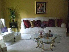
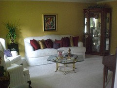
    Love you light filled family room. Also the formal living room has a nice color on the walls. What is that color (if you don't mind sharing)?

    Where do you live &how long have you been in your home? Seems like you are up to a complete "overhaul". You are tireless!! I have been in mine for 42 years & have been redoing for the last 10 yrs. Not an easy task.
  • 12 years ago
    Hi Leona, The tree is really large. The pot is 2" wide which would put the pub table out too far into the room However, I like the suggestion though. On the wall near the pub table is a large TV cabinet which does balance the room some. The end tables are rectangular and turned to take up less wall space. I am not really overhauling as much as trying to update and switch things up. The paint you refer to is a Sherwin Williams. I can't get to it to see the number right now.
Sponsored
Snider & Metcalf Interior Design, LTD
Average rating: 5 out of 5 stars25 Reviews
Leading Interior Designers in Columbus, Ohio & Ponte Vedra, Florida