Software
Houzz Logo Print
lisa_wuller

BM Edgecomb Gray = Lavender?

12 years ago
last modified: 12 years ago
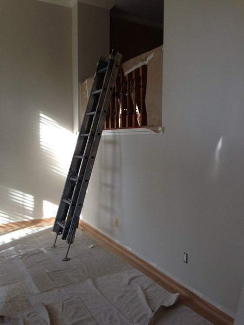
I've been living the last few weeks in my own "50 shades of gray" type of dilemma trying to choose the perfect wall color for my husband and I's new townhome. After no less than 9 samples we tried on poster boards and on the walls from both Sherwin Williams and Benjamin Moore, I chose BM's "Edgecomb Gray" because of it's more beige (or "greige") tones. I dislike anything with a lavender tint and have a purple-y taupe wall in my current apartment that I can't stand, so I thought the tan tones in the gray would warm it up and nix any chance of pink or purple.

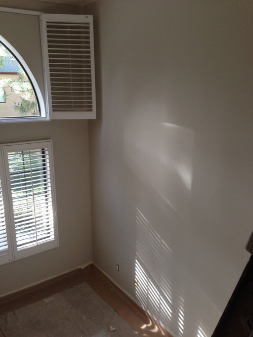
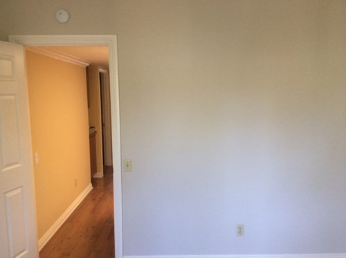
I'll bet you can guess what happened next. After $900 for painters and 10 gallons of paint, our walls are lavender. Not in all lights, but whenever a bit of sunlight hits the wall it turns into a neon, glowing version of my worst purple nightmare.

We have new, darker almost coffee-colored wood flooring going in next week, and I'm desperately hoping that this will help change the tone of the paint. Could it be that easy? A few friends and my husband have tried talking me down from the ledge saying that once our furniture is in, it'll change the color... it's just too much light in an empty room ... it really is a nice soothing lavender (wait, no!!)

Any suggestions, similar experiences, commiserating, advice?

Comments (27)

  • 12 years ago
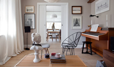
    How does the color go with the furniture and artwork?
    It looks like a nice color to me. I don't see too much lavender.
    The lighter, yellow wood tone of your floors highlights the bluish/lavender undertone. Darker brown floors should help somewhat.
    I'd assess after you get the room put together.
  • 12 years ago
    I'm not seeing any lavender, which is good since I'm definitely considering using that same color for my whole interior in the very near future. I think it looks great in your house.
  • 12 years ago
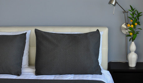
    Thank you both. We were hoping that the yellow in the floors was part of the issue. The lavender comes and goes when the light hits it (like the lower portion of the wall in photo 3). Ill post new photos once the floors go in.
  • 12 years ago
    We are also doing a darker gray accent wall in the dining room, adjacent to the living room. Any suggestion for undertones in the darker gray that might reduce the lavender?
  • 11 years ago
    Lisa...how did you make out with Edgecomb Gray? Did you stick with it? I'd like to use it throughout my downstairs which gets northern and southern light - and I'm so afraid of it looking purple or pink. Do you have pictures?
  • 11 years ago
    christy25, if you're thinking of going with Edgecomb Gray, get all the paint swatches in that color range, hold them together like a hand of cards, and look at them in the noon day sun. It's amazing how light to medium tone grays look very purple in bright light. I have a lot of paint swatches as I'm repainting part of my house, and am amazed at how the grays and blues look very purple in bright light. I'm not saying it's not pretty, just make sure you know what you're getting into before you commit to the color. Be sure and buy a sample to see how it looks in your house.
  • 11 years ago
    Thanks Hayley :) I have 4 foam core boards, and at least 100 sample cards from BM and SW organized in a binder - they are the big ones that are 9x11 and 8x8. A lot of my samples cards are duplicates - so I can fill up an entire foam board with one color. It's still so difficult because I'm doing such a vast area, and each has different lighting. My main living area (kitchen, Family Room and 2 story entry) all share walls and the windows are north and south facing. It just seems like everything I put on the north facing walls turns pink or purple.
  • 11 years ago
    christy25, I had my interior painted earlier this year and gave great consideration to edgecomb gray but after extensive googling, I read some felt it went pink. That made me nervous. The color sample I had that was closest to edgecomb gray was Sherwin Williams accessible beige and that's the one I ended up choosing. We're quite happy with it. Might be worth comparing the two samples to see if you see the differences and to see how you feel about the subtle differences.
  • 11 years ago
    Overlapped Christy. If you have all those samples, I'm sure you've already compared accessible beige and edgecomb gray.
  • 11 years ago
    Christy, that's interesting about the pink and purple. My north facing walls turned all the paint colors blue. I thought I wanted SW agreeable gray, but it turned quite blue in a few of my various lights.
  • 11 years ago
    Breathe, Lisa.....just take a deep breath. I think you will really like the Edgecomb grey when your furniture goes in. We did our entire condo in that color, and it's just a nice neutral that keeps the focus on the furniture & art, not on the color of the walls. And I've never noticed a lavender undertone. Our condo gets late afternoon sun, but I've never seen a purple cast. I'm like you.....NOT a fan of lavender.
    Let us know what happens in the end.
  • 11 years ago
    The color changes depending on the light that comes into your room, light from the north and east will make your paint take on a cooler tone. Edge comb grey is a really nice color- not purple at all in light from the west and south. The lower the sheen (matte or flat is best) the less reflection of light.
  • 11 years ago
    Thanks Howellmsue...I didn't think about the sheen effecting it. Ann, I do have Accessible Beige as one of the colors I'm now considering. I actually did paint my kitchen Agreeable Gray today - it got dark out, so I'll look better at it tomorrow, but I think it is too bluish. It doesn't seem like it looks like the color samples on the foam core board, and I used SW's Superpaint to paint my kitchen. The walls seem cooler than the sample sheets I have on the boards. Now I'm thinking SW Worldly Gray or Accessible Beige or BM Revere Pewter or Edgecomb Gray - I will post pictures tomorrow of the kitchen, and maybe someone can help me.
  • 11 years ago
    Christy, when I was choosing a color, I painted agreeable gray on a board and I loved it. Then, I tried a sample on my wall and it was very blue - very, very strange.
  • PRO
    11 years ago
    Good Lord! Time to get a grip and stop analyzing everything to death. The Edgecomb you have up is just fine. Even though you are not a fan of an underlying pink which you refer to as lavender, you are way ahead of the game rather than having a cool blue leaning or green (also considered warm). An even warmer gray that is absolutely deliciously warm is Sherwin Williams Iconic. Just did an entire building and it doesn't go dark, or blue, or green, or too dark or anything else. It goes with everything and seems to have no disputes with other hues. JMO
  • 11 years ago
    Karen Paul Interiors, for some (most?) of us...the amount of money we're going to spend on that paint & the painters makes it essential we don't goof it the first time. Better to hash it all out on Houzz before commiting the $$
  • 11 years ago
    Christy, I would definitely analyze it as much as you need. Painting is a big expense and a lot of work for do it yourselfers. karen paul, the original poster is gone which means there wasn't that much analyzing going on. Statements like good lord and get a grip are not very professional.
  • PRO
    11 years ago
    I suggest seeing if the paint store you are getting all this paint from has a color expert that can do a complimentary drive by to look at the color. I also feel that in the end, it will depend on the other things in the room - empty room vs full room, will end up changing the sight differences. And sorry, cannot weigh in since i love slight lavender/pink/purple - but no blue, undertones, so now a color I was not considering I might take a look at! And of course, in the end its you would does have to live with it, so the color person might be able to advise better on a replacement choice. They will need to know the hues of everything going into the room - they can even do this remote if you bring the samples of everything and know when the light is hitting the room and from what direction. The light direction is the single most important driver, both the daylight and how you will light the room at night.
    I also suggest taking a sample of the chip/poster board and the actual color of anything you buy - put on another sample poster board or on wall and check it first. If its not mixed right, it can be redone - before the painters paint the whole room. Assume this was done after the rooms were primed first, so its not color underneath impacting it. Good luck!
  • PRO
    11 years ago
    And these points were made in case it might help someone new considering the color
  • 11 years ago
    That's why I say. Always put paint samples on yr wall. Paint a big 2x2. Do it in different areas study it for a couple of days. But, I do not see a lavender in BM paint You chosen. So could be the flooring. Lighting in a room makes a huge difference to.
  • PRO
    11 years ago
    last modified: 11 years ago
    I'm back. I'm sure most of you are thrilled. The color I said was Iconic and there is no such color. I meant to say Pediment by Sherwin Williams. I really would love for you to try it when you begin your samples. Because it has a smidgen more of the red factor than the blue and green, it seems to color shift less than other gray paints I have seen. Depending on the time of day you will get all sorts of hues as has been mentioned, however this one tends to neutralize the green element and warms up the blue. I've used it N, S, E, W and in areas with skylights. Determine the time of day that is most important for it to be the most appealing color to your eye. Also, I would get maybe three samples max to begin doing mock-ups and the bigger the better. If you paint on larger samples that can be moved around throughout the day, you will have a more accurate reading. Paint is always affected by its surroundings. The best way to view a sample is to take forefinger and thumb to create a circle, and curling the remaining fingers so you can see the paint on its own without anything adjacent that can influence what you see. It seems a rather odd technique but it works extremely well. Good luck.
    Paint Color 7634 Pediment - Sherwin-Williams · More Info
  • 11 years ago
    Thanks Karen - I will check it out. I REALLY like it on the monitor :) I have a SW fan deck, but it's almost 10 years old and that color isn't in it - so I'll stop at the store tomorrow.
  • PRO
    11 years ago
    last modified: 11 years ago
    I'm glad you are going to try it. Another problem with paint color is sometimes there simply is not enough pigment shot into the can. So it needs to be a little darker. There are many tweeners that just don't have enough to hold sway with lighting (both natural and artificial). So sometimes we need to tweak it down into a little deeper color for it to not color shift. I don't know your lighting but I imagine with the Edgecomb that may be a major part of the problem you are experiencing. Good luck, again!
    https://www.houzz.com/photos/280-transitional-orange-county-phvw-vp~7629459

    I tried to find a fairly accurate photo of the Pediment on a wall. The photo is a little deeper than the sample, so it would be somewhere in between but the warm element exists as you can see without reading green or blue.
  • 8 years ago

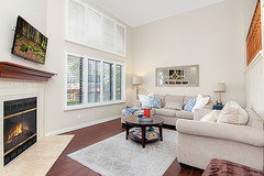
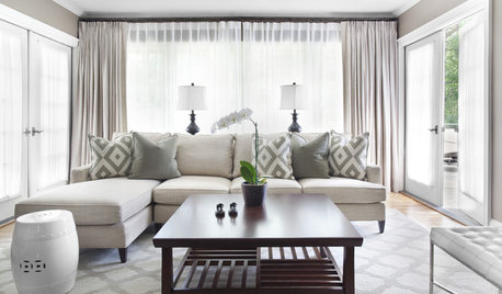
    It's nearly 3 years later, but I am back to analyze! And had a good laugh when I read some of the comments above. The edgecomb gray actually ended up working well for us. Our flooring contractor assured us that the paint tone would work with our dark floors, and it did. We used a lot of beige and white furnishings so it actually looked very pretty. Having said that, there are some pink/purple undertones which I may steer away from if you want a more "true gray." Lesson learned - all grays have undertones...actually quite incredible if you hold 5-10 samples together. Also any gray will look different with furnishings and floors. We sold that condo and are repainting our new home with another gray that will have more brown tones. Photo of what it looked like finished below.

    and Karen Paul... have a heart! I'm sure you've dealt with this many times in your career, but it was my first home and first time making renovation decisions. I was being a bit facetious with how upset I was, but it was still a big decision (or seemed it at the time) nonetheless.

  • PRO
    8 years ago
    last modified: 8 years ago

    Glad it worked out for you, Lisa!

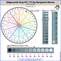
    Info about Edgecomb Gray if anyone else is considering. Every color of gray belongs to a hue family and Edgecomb belongs to the yellow hue family. It plots out over near the yellow-red hue family.

    In a balanced quality of light it's going to look like a near neutral warm gray, a southern exposure is a good example.

    In certain qualities of light you're going to see peach-pink overtones - we know that because of its hue family.

    Near neutrals from this hue family can also shift and look purple, or lavender. If it shifts purple, it's likely in a north facing room and/or an inherent quality of light that's heavy in blue wavelengths.

    Bottom line is if you feel like you have kinda weird light or would describe the space as more dim than bright, you need to test Edgecomb thoroughly before committing. Paint samples boards, move them around the room, and take your time don't rush.

  • 8 years ago
    I’d think a wall color that changes throughout the day would be preferable...add some life and depth to what is normally a pretty flat (literally) space.
Sponsored
Snider & Metcalf Interior Design, LTD
Average rating: 5 out of 5 stars25 Reviews
Leading Interior Designers in Columbus, Ohio & Ponte Vedra, Florida