Software
Houzz Logo Print
valerie_lepien_carrick

Ceilings

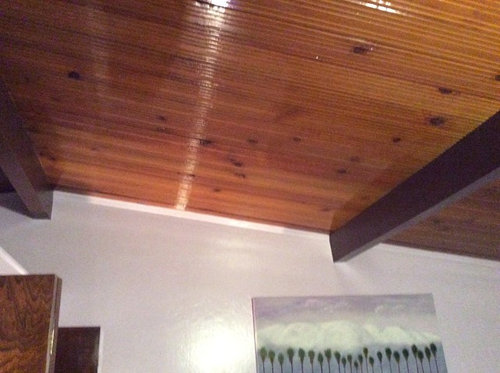
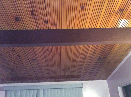
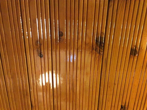
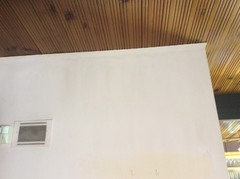
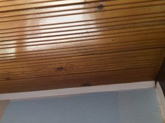
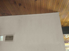
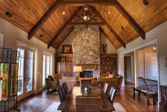
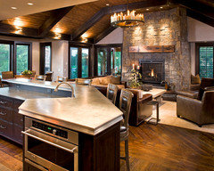
I just inherited a 1955 house in Southern California and need ideas as to what to do with my house and especially these ceilings. Part of me said keep them there beautiful and the other part of me says paint them. Ideas welcome... I'm at a loss

Comments (174)

  • 11 years ago

    Smile... thanks, a new nickname.

  • 11 years ago
    last modified: 11 years ago

    I decided to look through your ideabooks. Just more brainstorm-talk, but stop if you want. This has warm tones, but the kicker is the saturated color/ has windows.

    Mexico House · More Info

  • 11 years ago

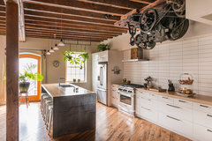
    No elevator motor for me!?

    pickle factory · More Info

  • 11 years ago
    I'm madly in love with the one with the elevator motor but leave that part out.
  • 11 years ago

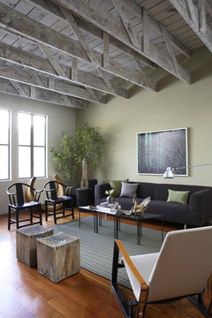
    Not really crazy, but turn this upside down and a bit similar -- saturated, and medium grey wood allowing sage green even.

    Lum · More Info

  • 11 years ago
    Your right turn it upside down and it is kind of what I'm going for. Don't especially like the room but the colors I do like.
    Oh and no I don't have any gray stone.
  • 11 years ago
    last modified: 11 years ago

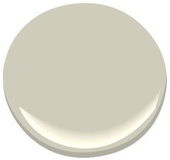
    Wow I saw them all! How about this paint color you saved?

    This subtle, delicate gray-green envelops a space with quiet, misty color.

    Hazy Skies OC-48 Paint · More Info

  • 11 years ago
    @everdebz I was thinking of almost white carpet tight flecked because it is only my husband and I close to retiring. Love love love the cinnamon tile. I really want to make that work. Do you think with the Tahitian sky on the walls and Swiss coffee trim? Or sculptor clay/ repose gray/ trying to find a warm pewter if there is such a thing. Lol
  • 11 years ago
    @everdebz I forgot about this color it's my favorite! Hazy skies throughout home with a Swiss coffee trim, maybe sculptor clay in man cave with Swiss coffee trim through the the whole house on trim doors etc...using cinnamon wood tile??? Throw in either the flecked light shag or a Berber in main rooms for softness.
    Please tell me exactly what you think of that. Maybe bamboo shades for the Windows facing pool to let all natural light in.
  • 11 years ago

    I can't be positive from little photos, sorry. I think I can tell that Hazy is subdued and warm /but not so warm it'd "heat up" the amber on the ceiling... it is tough!

    Q: why Swissc which seems a soft white? Why have the trim stick out??

  • 11 years ago

    Another look, and I'd say 'yes' to Cinnamon. Its 'grain' even reminds me of ceiling and its 'texture/pattern'. In person I bet it looks like bark on an evergreen tree, prettyyy.

    I hope at least 1 furniture piece or art includes 2 or more of the wood tones -that'd be cool. :)

  • 11 years ago
    last modified: 11 years ago

    Tahitian beautiful with the light carpeting though.... in bedroom!? anything but the bright teals and oranges!!!!!

  • 11 years ago
    last modified: 11 years ago

    BM's "Pebble Beach is a great pale blue with some green to warm it. It would look lovely with white wood trim." I put it next to "hazy" and both soft, but you need those boards to know for sure.

    Pebble Beach 1597 Paint · More Info
    This subtle, delicate gray-green envelops a space with quiet, misty color. Hazy Skies is evocative of early mornings in mid-summer.
    Hazy Skies OC-48 Paint · More Info
    Oh - this is Behr's Hazy Skies....
    BEHR® Paint Color Hazy Skies PPU14-12 · More Info

  • 11 years ago

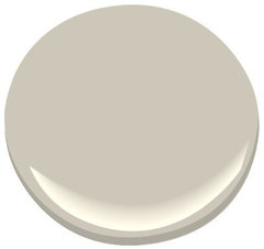
    Benjamin Moore's Revere Pewter is the perfect light gray with slightly warm undertones. It will make any room feel instantly classic. Many like it.

    Revere Pewter HC-172 Paint · More Info

  • 11 years ago

    It's late. Here's Behr that's like Natalie's floor and paint photos:

    BEHR® Paint Color Pensive Sky 710E-2 · More Info

  • 11 years ago

    One time you said you're buying Behr, and so now I'm not sure what Hazy looks like.... zzzz night.

  • 11 years ago

    Val I think you are in the crazy making portion of a remodel that you haven't wrapped your head around. I commend you for your choice to leave the ceiling as is and change out the flooring.

    When looking through the images a few things strike me. First off the images are very dark to see and offer a peephole into the room which makes it difficult to get a good feeling of the space. Secondly I gather you are integrating furniture to this home and from the home in Texas along with furnishings already in the home. The home seems very lovely, the project seems daunting at best.

    My best suggestion is to prime any walls in white. Choose which of the paneled walls to cover over with sheetrock. Create a floorplan and layout, oft-times colors evolve out of the items and personality of the room as it takes shape.

    The one thing that screams at me in this home is the trim work. It feels diminutive. The ceiling has a huge presence and the trim is trying to hide under it's skirt. Particularly for the open living areas I would address enhancing the trim or removing it entirely. The styling of the current trim is a throw back to the euro kitchen where everything had the tiny strips of wood as an embellishment. At the very least paint it to match the walls so it disappears.

    One thing that may work in the den particularly is leaving the wall paneling intact and adding a colored wash to it.


    Color washing can be done in any or even multiple colors.


  • 11 years ago
    @everdebz thanks for paint ideas. Revere pewter is beautiful. I can't keep changing my mind so I think I'm going with that throughout the house for now I just need a white for the trim and beams. White dove is pretty
  • 11 years ago
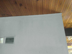
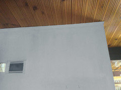
    @lucidos I appreciate your ideas. Are you saying to for now paint the thin trim up by ceilings in a white like the rest of home or to paint them in the color I do the walls? The first picture is how it is now no trim... And the second picture is where I was trying out paints and painted the thin trim.
  • 11 years ago

    Paint the same as the walls. You want to minimize the attention to it.

  • 11 years ago

    I've read the whole thread. Here are some colors juxtaposed against the ceiling (which I would definitely keep, though I might sand off the gloss and refinish in a matte). They are white, pure gray, warm gray, green gray, and blue gray. Hope this helps.


  • 11 years ago
    @lucidos would you paint the beams the white or leave them alone
  • 11 years ago
    @groxeraxle I only see four images but I really like the green one
  • 11 years ago

    I gave thanks to see the help that came!!

  • 11 years ago
    last modified: 11 years ago

    Valerie I hope you feel better - to me the green-grey is the most serene. Get combo with warm grey, which shouldn't be hard to find - possibly RPewter is that.

  • 11 years ago
    last modified: 11 years ago

    Remember the white kitchen you loved loved - sure you don't like your current white walls? It had medium toned flooring like cinnamon would be.

    Could see the white if below there was a 'by the pool' look with cheerful teals and you like turquoise.... ?

  • 11 years ago

    Personally I like the darker beams. They have a wonderful drama to them.


    Mixing white with a hint of color is perfect. You would want to correspond with textiles and furnishings you integrate while allowing the ceiling to keep center stage.

  • 11 years ago

    just to comment that the lighting in 1 and 3 is wow!

    So Cloud White on kit/living walls not tinted enough? - SW's Dover White has a bit of yellow-amber I think.

  • 11 years ago

    Another thing about Coastline as wood-look tile - seems it didn't have much grain, but more of the SAnd's scratchy, worn look. Mannington is local to our OP.

  • 11 years ago
    last modified: 11 years ago

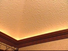
    Yes adding a modified tray lighting would be wonderful it would mean beefing up the trim so it could nest.

  • 11 years ago
    I love the tile that gives a wood floor look, and would opt for that over cork floor any day. Be sure you check out any tile to see how slippery it can be when wet. I like the ceiling, it adds character to the room. I know people who would fall all over themselves to have that driftwood glass top table. I would keep it and hand it down to the next generation.
    They make shades that are remote controlled that roll all the way up where you can't see them at all, you can adjust them at any level, and when down gives filtered light. I believe there are various types and color. If you go that route any window treatment you might use (not drapes) should have a simple clean line. Have fun, try not to over think each thing. Focus on the main area of both rooms ( the sliding glass doors; kitchen tile etc) once you have that it will make the other things fall into place. Choose lighting carefully, it makes such a difference in paint color whether it natural light or not. I always look at a color in natural light and do it at different times of the day because it will look different. At night do the same. You are lucky to have such a unique home, make it your own. Good luck.
  • 11 years ago
    last modified: 11 years ago

    Hi Valerie---

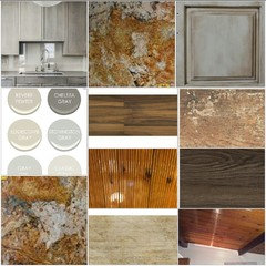
    Put a board together---pulled colors right from nature (granite). Wishing you all the best with your project. Keep us updated. Have Fun!

  • 11 years ago
    last modified: 10 years ago

    Quick comment that Natalie's post is reassuring in that if you never re-do your kitchen cabinets to that nice chalky tone, just 1 furniture piece would sure look good.

    I'd love to see a photo of your place of the entire room!? and/or layout diagram.

    I bet you're busy right now.....!

  • PRO
    10 years ago

    look at the house of Ray and Charles Eames-I always find them a great inspiration, and hope you do too! http://www.ncmodernist.org/eames.htm

  • 10 years ago
    @colorsmith oh my I so enjoyed looking at their homes. Exactly what I needed. An inspiration! Thank you
  • 10 years ago
    Definitely keeping knotty pine headboard ceilings and also definitely decided to paint the walls sculptor clay with Swiss coffee trim. Now my issue is the beams were all painted out in black and brown every other beam.
  • PRO
    10 years ago

    alternate beam colors have been used before-posted a new idea/project book w/some mid-century colors-from Sherwin Williams. Paint the small trims the same color as walls, when using a color on the walls. I would stick to a white, and not succumb to any colors that are trendy-because then you would have a brown and brown house. For the beams, match the darker color (charcoal) if you want them all the same-add to the architectural drama! And look at the natural carpets from Stanton-sisal look but extremely durable will add a nice contemporary touch and still be liveable for you-

  • PRO
    10 years ago

    PS-Swiss Coffee is the contractors-can't-go-wrong choice, that us design professionals just get sad about

  • 10 years ago
    Good to know... I ordered everything this morning and I was thinking hard about the Swiss coffee but it looked good on the swatches, iPad and a painter/designer that came over and suggested it. Choosing a white is so difficult. I may go back in tomorrow and choose a different white. My first choice was pure white but that intimidated me.
  • 10 years ago

    @Colorsmith or somebody, what's the sad about with Swiss Coffee?

  • 10 years ago

    I like Swiss Coffee or a lighter version. White with a touch of brown looks good with wood tones.

    Perhaps you can check out Maria Killiam White is Complicated on her blog to help you decide. I also suggest you take a long look at RetroRenovation.com to help you understand and appreciate the aesthetic of the original house and how to highlight its good and unique features.

    I love the ceilings. If you have a lot of light in a room, then white or light colors or almost any color can look good, especially with some nice clean-lined mid-century furniture. In darker rooms, pure white doesn't look good, but creams and yellows can work, or go dramatic with jewel tones.

    One thing I love about older homes is that they were not afraid of color, and you shouldn't be either. White, beige, brown, grey are OK as background colors, but are dull and lifeless without color or at least a lot of textural interest.

    It is tough to do on your own, so consider hiring someone before making expensive and difficult to remove choices. Get someone who understands and appreciates the 60s and 70s, not some caricature of it. It wasn't all gold shag carpeting, nor does that mean you have to live in a time capsule. But it is possible to keep original quality fixtures and have it look fresh.

    If you do want to get rid of stuff, like the swag lights and colored bath fixtures, there are eager buyers at the sellers forum on Retro Renovation.

  • PRO
    10 years ago

    Pure white rarely looks good in, or on, older homes. There are so many whites to choose from, the nuances are endless...and different paint companies have different formulas. It is always worth the pennies per square foot to buy the top of the line when it comes to paint. Here in So Cal; Swiss Coffee has been a fall back white, and is usually a bit drab. As Ms. Victorianbungalowranch (is that your real name : ) mentioned your white should be a rich one. The woods are warm tones, so one that works well should be a warm one, but not too much yellow. Best to spend 8bucks or so-to get the sample on the actual wall before commiting a whole house to a color. I'm glad you have a pro helping you-if they are used to mid-century, they should be chock full of great ideas, and better suited to answering your questions on site!

  • 10 years ago
    I'm now so in love with retro renovations.com I can't stay off. I have quite a few of those different accessories my mother in law left to us. Fun stuff
  • 10 years ago
    last modified: 10 years ago

    Hi Val gal. :) Target ad / seems houzz group is on my mind various times. Teal, red a bit bright could be good especially if off-white type paint:

    http://www.target.com/p/threshold-windham-tall-cabinet-with-drawer/-/A-16508093#prodSlot=medium_1_16&term=accent+cabinets

  • 10 years ago
    @everdebz I love it! Painting and floors start in the AM! Excited and nervous of my decisions but excited to choose the accessories. We decided to uncover the wood on the beams and see what we find! Hope it's good.
  • 10 years ago

    Oh! It's going to be a while before it starts to look 'somewhere' 'something' but I hope it's good tomorrow! :)

  • 10 years ago

    Hey.. :)

  • 10 years ago
    @everdebz hey... The house is making me feel like I'm on property brothers. I've been in hotel going on my third night and every day something has come up. Lots of different varnishes were put on cabinets throughout house and the doors. So were slowing down to sand them all. Layers and layers of gunk is coming off in strips with the stripper like a very bad sunburn. After being there today and the beams are all being primed for painting it's making me think again about painting the ceiling. So much more work than I ever expected besides just painting and flooring. New decisions have to be made every day.
  • 10 years ago

    wow... it sounds exciting and stressful both. What kind of wood being dealt with?

    You might as well enjoy the hotel stay though / whatever part would be good for you.

  • 2 years ago

    Valerie how do you like the sculptor Clay? I think I’m going to paint my exterior in it

Sponsored
Hope Restoration & General Contracting
Average rating: 4.7 out of 5 stars35 Reviews
Columbus Design-Build, Kitchen & Bath Remodeling, Historic Renovations