
Search results for "Between the studs storage" in Home Design Ideas
 Alicia Torosian Design
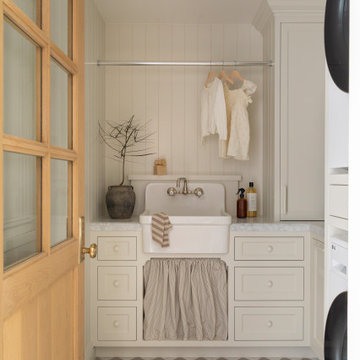
Located in Newport Beach’s coveted Port Streets, this family home was taken down to the studs and completely reimagined to create a layered, detail-rich forever home. We expanded key living spaces — including the kitchen and primary bathroom — to enhance both functionality and everyday luxury.
Throughout the home, thoughtfully curated moments bring personality and warmth. From the beautifully wallpapered dining room to the checkerboard marble laundry room, each space was designed to feel timeless yet distinctive. Living spaces and bathrooms were individually styled using a cohesive palette of blues, greens, and warm browns — creating a sense of flow while allowing each room its own identity.
The result is a thoughtfully tailored home that blends classic design with family-centered living in one of Newport Beach’s most beloved neighborhoods. This home was featured in the 2026 Corona del Mar Home Tour.
 Ulrich Inc
Ulrich Desginer: Don DiNovi, CKD
Photography by Peter Rymwid
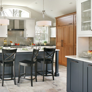
This lovely new kitchen incorporates defined work areas to accommodate the multi-tasking activities of a busy family. Four work stations fit and function easily and beautifully in a tidy 300 SF space: (1) cooking, including separate gas and electric cooking surfaces; (2) prep/cleaning, on the island; and (3) food storage, in the cherry wood armoire concealing both refrigerator and pantry. (4) is the area between the food storage and double ovens (around the corner from the formal serving hutch) and is devoted to baking.
 Pineapple House Interior Design
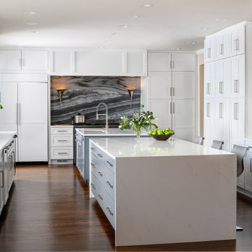
-In this kitchen renovation, new double islands & ceiling-high cabinetry quadruples the previous counter & storage space
-9’ island with seating includes three workstations
-Seating island offers under counter electronics charging ports & three shelves of storage per workstation in cabinets directly in front of stools
-Behind stools, lower cabinetry provides one drawer & two pull-out shelves per workstation
-7’ prep island services 48” paneled refrigerator & 48” gas range & includes 2nd sink, 2nd dishwasher & 2nd trash/recycling station
-Wine/beverage chiller located opposite island sink
-Both sink spigots are touch-less & are fed by whole-house water filtration system
-Independent non-leaching water faucet delivers purified, double-pass reverse osmosis drinking water
-Exhaust fan for gas range is hidden inside bridge of upper cabinets
-New built-in window seat in bay window increases seating for informal dining while reducing floor space needed for table and chairs
-New configuration allows unobstructed windows & French doors to flood space with natural light & enhances views into the back yard
-Gray-blue coloration of cabinet bases helps anchor the middle of the room and provides welcome contrast in scheme
Find the right local pro for your project
 Nar Design Group
This home remodel is a celebration of curves and light. Starting from humble beginnings as a basic builder ranch style house, the design challenge was maximizing natural light throughout and providing the unique contemporary style the client’s craved.
The Entry offers a spectacular first impression and sets the tone with a large skylight and an illuminated curved wall covered in a wavy pattern Porcelanosa tile.
The chic entertaining kitchen was designed to celebrate a public lifestyle and plenty of entertaining. Celebrating height with a robust amount of interior architectural details, this dynamic kitchen still gives one that cozy feeling of home sweet home. The large “L” shaped island accommodates 7 for seating. Large pendants over the kitchen table and sink provide additional task lighting and whimsy. The Dekton “puzzle” countertop connection was designed to aid the transition between the two color countertops and is one of the homeowner’s favorite details. The built-in bistro table provides additional seating and flows easily into the Living Room.
A curved wall in the Living Room showcases a contemporary linear fireplace and tv which is tucked away in a niche. Placing the fireplace and furniture arrangement at an angle allowed for more natural walkway areas that communicated with the exterior doors and the kitchen working areas.
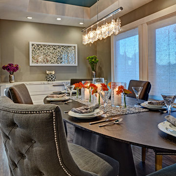
The dining room’s open plan is perfect for small groups and expands easily for larger events. Raising the ceiling created visual interest and bringing the pop of teal from the Kitchen cabinets ties the space together. A built-in buffet provides ample storage and display.
The Sitting Room (also called the Piano room for its previous life as such) is adjacent to the Kitchen and allows for easy conversation between chef and guests. It captures the homeowner’s chic sense of style and joie de vivre.
 Wendy Glaister Interiors
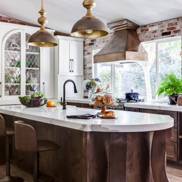
The kitchen boasts expansive views of the garden beyond. The windows are operational for light spring breezes and for ventilation. Between the stud storage is shown on the right for client mementos.

 Twelve Stones Designs, LLC
The owners of this kitchen had spent the money to upgrade the finishes in their kitchen upon building the home 12 years ago, but after living in the space for several years they realized how nonfunctional the layout really was. The (then) two preschool aged children had grown into busy, hungry teenagers with many friends who also liked to hang out at the house. So the family needed a more functional kitchen with better traffic flow, space for daily activities revolving around the kitchen at different times of day, and a kitchen that could accommodate cooking for and serving large groups. Furthermore, the dark, traditional finishes no longer reflected the homeowners’ style. They requested a brighter, more relaxed, coastal style that reflected their love of the seaside cities they like to visit.
Originally, the kitchen was U-shaped with a narrow island in the middle. The island created narrow aisles that bottle-necked at the dishwasher, refrigerator, and cooktop areas. There was a pass-through from the foyer into the kitchen, but the owners never liked that the pass-through was also located so close to the powder room. The awkward proximity was unappealing and made guests feel uncomfortable.
The kitchen’s storage was made up of lots of narrow cabinets, apothecary drawers, clipped corner units, and very few drawers. It lacked useful storage for the larger items the family used on a daily basis. And the kitchen’s only pantry was small closet that had only builder-grade, narrow shelving with no illumination to be able to see the contents inside.
Overall, the kitchen’s lighting plan was poorly executed. Only six recessed cans illuminated the entire kitchen and nook areas. The under cabinet lighting was not evenly distributed either. In fact, the builder had mis-placed the under cabinet lighting around the decorative pilasters which made for choppy, dark cubbies. Further, the builder didn’t include any lighting over the sink or the bar area, which meant whoever was doing the dishes was always in their own shadow. That, coupled with the steep overhang of the game room above made the bar area feel like a dim, cavernous space that wasn’t inviting or task oriented. The kitchen looked out into the main living space, but the raised bar and a narrow wall (which held the only large cabinet in the kitchen) created more of a barrier than a relationship to the living room or breakfast nook. In fact, one couldn’t even see the breakfast nook from the cooktop or sink areas due to its orientation. The raised bar top was too narrow to comfortably sit to either dine at or chat from due to the lack of knee space. The the homeowners confided that the kitchen felt more like a dark, dirty prison than place where the family, or their guests, wanted to gather and commune.
The clients' needs and desires were:
➢ to create a kitchen that would be a space the family loved to be in; to relate to the adjacent spaces all around, and to have better flow for entertaining large groups
➢ to remove the walls between the breakfast nook and living area and to be able to utilize the natural light from the windows in both those areas
➢ to incorporate a functional chopping block for prepping fresh food for home cooked meals, an island with a large sink and drain board, 2 pull out trash cans, and seating for at least the 2 teens to eat or do homework
➢ to design a kitchen and breakfast nook with an airy, coastal, relaxed vibe that blended with the rest of the house's coastal theme
➢ to integrate a layered lighting plan which would include ample general illumination, specific task lighting, decorative lighting, and lots of illuminated storage
➢ to design a kitchen with not only more storage for all the husband’s kitchen gadgets and collection of oils and spices, but smart storage, including a coffee/breakfast bar and a place to store and conceal the toaster oven and microwave
➢ to find a way to utilize the large open space between the kitchen, pantry area, and breakfast nook
Twelve Stones Designs achieved the owner's goals by:
➢ removing the walls between the kitchen and living room to allow the natural light to filter in from the adjacent rooms and to create a connection between the kitchen, nook, and living spaces for a sense of unity and communion
➢ removing the existing pantry and designing 3 large pantry style cabinets with LED tape lights and rollout drawers to house lots of kitchen appliances, gadgets, and tons of groceries. We also took the cabinets all the way up to the 9’ ceiling for additional storage for seasonal items and bulk storage.
➢ designing 2 islands - 1 with a gorgeous black walnut chopping block that houses a drawer for chopping and carving knives and a custom double pull out trash unit for point of use utilization - and 1 that houses the dishwasher, a large Blanco Gourmet sink with integrated drain board, woven baskets for fresh root vegetables and kitchen towels, plenty of drawer storage for kitchen items, and bar seating for up to 4 diners.
➢ closing off the space between the kitchen and the powder room to create a beautiful new private alcove for the powder room as well as adding some decorative storage. This also gave us space to include more tall storage near the new range for precision placement of the husband’s extensive oil and spice collection as well as a location for a combo-steam oven the wife wanted for baking and cooking healthy meals.
The project is enhanced functionally by:
➢ incorporated USB and standard receptacles for the kids’ laptops and phone charging in the large island
➢ designing the small island to include additional open shelving for items used on a daily basis such as a variety of bowls, plates, and colanders. This set up also works well for the husband who prefers to “plate” his dinners in restaurant-style fashion before presenting them to the table.
➢ the integration of specific storage units, such as double stacked cutlery drawers, a custom spice pull-out, a Kuerig coffee and tea pod drawer, and custom double stacked utensil drawers
➢ moving the refrigerator to the old oven location - this eliminated the bottle neck as well as created a better relationship to the eating table. It also utilizes the floor space between the pantry, nook, and kitchen
➢ creating a banquet style breakfast nook - this banquette seating not only doubles the amount of seating for large gatherings but it better utilizes the odd space between the kitchen and the previous nook area. It also helps to create a distinct pathway from the mudroom room through the pantry area, kitchen, nook, and living room.
➢ the coffee/breakfast bar area which includes the perfect location for the concealed microwave and toaster oven, convenient storage for the coffee pods and tea accoutrements. Roll-out drawers below also house the smoothie maker, hot water kettle, and a plethora of smoothie-making ingredients such as protein powders, smoothie additives, etc. Furthermore, the drawers below the Keurig house measuring utensil, cutlery, baking supplies and tupperware storage.
➢ incorporating lots of wide drawers and pullouts to accommodate large cookware.
➢ utilizing as much vertical space as possible by building storage to the ceiling which accommodates the family’s abundant amount of serving platters, baking sheets, bakeware, casserole dishes, and additional cutting boards.
The project is enhanced aesthetically by:
➢ new 5-piece Versailles pattern porcelain tile that now seamlessly joins the entire down stairs area together creating a bright, cohesiveness feeling instead of choppy separated spaces - it also adds a coastal feeling
➢ designing a cabinet to conceal the microwave and toaster oven
➢ the coastal influenced light fixtures over the nook table and island
➢ the sandy colors of the Langdon Cambria countertops. The swirling pattern and sparkling quartz pieces remind the homeowner of black-and-tan sandy beaches
➢ the striped banquet seating whose creamy white background and blue-green stripes were the inspiration for the cabinet and wall colors.
➢ All the interior doors were painted black to coordinate with the blacks and grays in the backsplash tile and countertop. This also adds a hint of tailored formality to an otherwise casual space.
➢ the use of WAC's Oculux small aperture LED units for the overhead lighting complimented with Diode LED strips for task lighting under the cabinets and inside the pantry and glass wall cabinets. All of the lighting applications are on separate dimmer switches.
Innovative uses of materials or construction methods by Realty Restoration LLC:
➢ Each 1-1/2” x 3” block of reclaimed end-grain black walnut that makes up the center island chopping block was hand milled and built in the shop. It was designed to look substantial and proportional to the surrounding elements, executed by creating the 4 inch tall top with a solid wood chamfered edge band.
➢ The metal doors on either side of the vent hood were also custom designed for this project and built in the Realty Restoration LLC shop. They are made 1x2, 11-gauge mild steel with ribbed glass. Weighing 60 lbs a piece, heavy duty cabinet hinges were added to support the weight of the door and keep them from sagging.
➢ Under-cabinet receptacles were added along the range wall in order to have a clean, uninterrupted backsplash.
Design obstacles to overcome:
➢ Because we were removing the demising walls between the kitchen and living room, we had to find a way to plumb and vent the new island. We did this by tunneling through the slab (the slab had post tension cables which prevented us from just trenching) to run a new wet vent through a nearby structural wall. We pulled the existing hot and cold lines between upper floor joists and ran them down the structural wall as well and up through a conduit in the tunnel.
➢ Since we were converting from wall overs to a gas range it allowed us to utilize the 220 feed for the wall ovens to provide a new sub panel for all the new kitchen circuits
➢ Due to framing deficiencies inherited from the original build there was a 1-1/2” differential in the floor-to-ceiling height over a 20 foot span; by utilizing the process of cutting and furring coupled with the crown moulding details on the cabinet elevations we were able to mask the problem and provide seamless transitions between the cabinet components.
Evidence of superior craftsmanship:
➢ uniquely designed, one-of-a-kind metal “X” end panels on the large island. The end panels were custom made in the Realty Restoration LLC shop and fitted to the exact dimensions of the island. The welding seams are completely indistinguishable - the posts look like they are cut from a single sheet of metal
➢ square metal posts on the small island were also custom made and designed to compliment and carry through the metal element s throughout the kitchen
➢ the beautiful, oversized end panels on the pantry cabinets which give the breakfast nook a tailored look
➢ integrating a large format 5 piece Versailles tile pattern to seamlessly flow from the existing spaces into the new kitchen space
➢ By constructing a custom cabinet that jogged around a corner we could not remodel (housing the entry way coat closet) we were able to camouflage the adjacent wall offset within the upper and lower cabinets. By designing around the existing jog in the structural walls we accomplished a few things: we were able to find the space to house, and hide, the microwave and toaster oven yet still have a clean cohesive appearance from the kitchen side. Additionally, the owners were able to keep their much needed coat closet and we didn’t have to increase the budget with unnecessary structural work.
 Sundberg Kennedy Ly-Au Young Architects
Photo Credit: Benjamin Benschneider
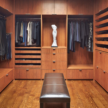
Large trendy men's medium tone wood floor dressing room photo in Seattle with flat-panel cabinets and medium tone wood cabinets
Large trendy men's medium tone wood floor dressing room photo in Seattle with flat-panel cabinets and medium tone wood cabinets

 Gardner Architects LLC
Photography by Ken Wyner
2101 Connecticut Avenue (c.1928), an 8-story brick and limestone Beaux Arts style building with spacious apartments, is said to have been “the finest apartment house to appear in Washington between the two World Wars.” (James M. Goode, Best Addresses, 1988.) As advertised for rent in 1928, the apartments were designed “to incorporate many details that would aid the residents in establishing a home atmosphere, one possessing charm and dignity usually found only in a private house… the character and tenancy (being) assured through careful selection of guests.” Home to Senators, Ambassadors, a Vice President and a Supreme Court Justice as well as numerous Washington socialites, the building still stands as one of the undisputed “best addresses” in Washington, DC.)
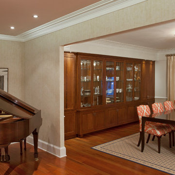
So well laid-out was this gracious 3,000 sf apartment that the basic floor plan remains unchanged from the original architect’s 1927 design. The organizing feature was, and continues to be, the grand “gallery” space in the center of the unit. Every room in the apartment can be accessed via the gallery, thus preserving it as the centerpiece of the “charm and dignity” which the original design intended. Programmatic modifications consisted of the addition of a small powder room off of the foyer, and the conversion of a corner “sun room” into a room for meditation and study. The apartment received a thorough updating of all systems, services and finishes, including a new kitchen and new bathrooms, several new built-in cabinetry units, and the consolidation of numerous small closets and passageways into more accessible and efficient storage spaces.
 Thayer Design Studio
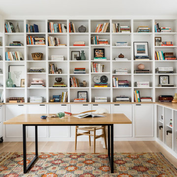
Designed by Thayer Design Studio. We are a full-service interior design firm located in South Boston, MA specializing in new construction, renovations, additions and room by room furnishing for residential and small commercial projects throughout New England.
From conception to completion, we engage in a collaborative process with our clients, working closely with contractors, architects, crafts-people and artisans to provide cohesion to our client’s vision.
We build spaces that tell a story and create comfort; always striving to find the balance between materials, architectural details, color and space. We believe a well-balanced and thoughtfully curated home is the foundation for happier living.
 Dura Supreme Cabinetry
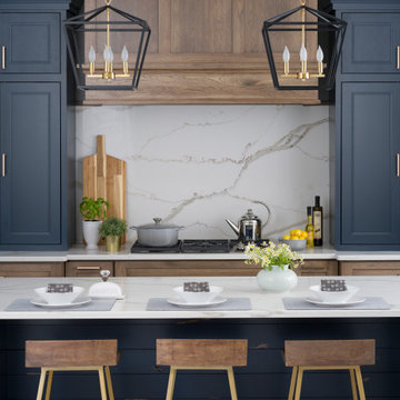
This modern farmhouse kitchen features a beautiful combination of Navy Blue painted and gray stained Hickory cabinets that’s sure to be an eye-catcher. The elegant “Morel” stain blends and harmonizes the natural Hickory wood grain while emphasizing the grain with a subtle gray tone that beautifully coordinated with the cool, deep blue paint.
The “Gale Force” SW 7605 blue paint from Sherwin-Williams is a stunning deep blue paint color that is sophisticated, fun, and creative. It’s a stunning statement-making color that’s sure to be a classic for years to come and represents the latest in color trends. It’s no surprise this beautiful navy blue has been a part of Dura Supreme’s Curated Color Collection for several years, making the top 6 colors for 2017 through 2020.
Beyond the beautiful exterior, there is so much well-thought-out storage and function behind each and every cabinet door. The two beautiful blue countertop towers that frame the modern wood hood and cooktop are two intricately designed larder cabinets built to meet the homeowner’s exact needs.
The larder cabinet on the left is designed as a beverage center with apothecary drawers designed for housing beverage stir sticks, sugar packets, creamers, and other misc. coffee and home bar supplies. A wine glass rack and shelves provides optimal storage for a full collection of glassware while a power supply in the back helps power coffee & espresso (machines, blenders, grinders and other small appliances that could be used for daily beverage creations. The roll-out shelf makes it easier to fill clean and operate each appliance while also making it easy to put away. Pocket doors tuck out of the way and into the cabinet so you can easily leave open for your household or guests to access, but easily shut the cabinet doors and conceal when you’re ready to tidy up.
Beneath the beverage center larder is a drawer designed with 2 layers of multi-tasking storage for utensils and additional beverage supplies storage with space for tea packets, and a full drawer of K-Cup storage. The cabinet below uses powered roll-out shelves to create the perfect breakfast center with power for a toaster and divided storage to organize all the daily fixings and pantry items the household needs for their morning routine.
On the right, the second larder is the ultimate hub and center for the homeowner’s baking tasks. A wide roll-out shelf helps store heavy small appliances like a KitchenAid Mixer while making them easy to use, clean, and put away. Shelves and a set of apothecary drawers help house an assortment of baking tools, ingredients, mixing bowls and cookbooks. Beneath the counter a drawer and a set of roll-out shelves in various heights provides more easy access storage for pantry items, misc. baking accessories, rolling pins, mixing bowls, and more.
The kitchen island provides a large worktop, seating for 3-4 guests, and even more storage! The back of the island includes an appliance lift cabinet used for a sewing machine for the homeowner’s beloved hobby, a deep drawer built for organizing a full collection of dishware, a waste recycling bin, and more!
All and all this kitchen is as functional as it is beautiful!
Request a FREE Dura Supreme Brochure Packet:
http://www.durasupreme.com/request-brochure
 Haile Kitchen & Bath LLC
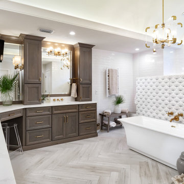
This stunning Gainesville bathroom design is a spa style retreat with a large vanity, freestanding tub, and spacious open shower. The Shiloh Cabinetry vanity with a Windsor door style in a Stonehenge finish on Alder gives the space a warm, luxurious feel, accessorized with Top Knobs honey bronze finish hardware. The large L-shaped vanity space has ample storage including tower cabinets with a make up vanity in the center. Large beveled framed mirrors to match the vanity fit neatly between each tower cabinet and Savoy House light fixtures are a practical addition that also enhances the style of the space. An engineered quartz countertop, plus Kohler Archer sinks and Kohler Purist faucets complete the vanity area. A gorgeous Strom freestanding tub add an architectural appeal to the room, paired with a Kohler bath faucet, and set against the backdrop of a Stone Impressions Lotus Shadow Thassos Marble tiled accent wall with a chandelier overhead. Adjacent to the tub is the spacious open shower style featuring Soci 3x12 textured white tile, gold finish Kohler showerheads, and recessed storage niches. A large, arched window offers natural light to the space, and towel hooks plus a radiator towel warmer sit just outside the shower. Happy Floors Northwind white 6 x 36 wood look porcelain floor tile in a herringbone pattern complete the look of this space.
 Thyme & Place Design LLC
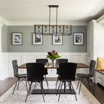
The existing kitchen was in a word, "stuck" between the family room, mudroom and the rest of the house. The client has renovated most of the home but did not know what to do with the kitchen. The space was visually cut off from the family room, had underwhelming storage capabilities, and could not accommodate family gatherings at the table. Access to the recently redesigned backyard was down a step and through the mud room.
We began by relocating the access to the yard into the kitchen with a French door. The remaining space was converted into a walk-in pantry accessible from the kitchen. Next, we opened a window to the family room, so the children were visible from the kitchen side. The old peninsula plan was replaced with a beautiful blue painted island with seating for 4. The outdated appliances received a major upgrade with Sub Zero Wolf cooking and food preservation products.
The visual beauty of the vaulted ceiling is enhanced by long pendants and oversized crown molding. A hard-working wood tile floor grounds the blue and white colorway. The colors are repeated in a lovely blue and white screened marble tile. White porcelain subway tiles frame the feature. The biggest and possibly the most appreciated change to the space was when we opened the wall from the kitchen into the dining room to connect the disjointed spaces. Now the family has experienced a new appreciation for their home. Rooms which were previously storage areas and now integrated into the family lifestyle. The open space is so conducive to entertaining visitors frequently just "drop in”.
In the dining area, we designed custom cabinets complete with a window seat, the perfect spot for additional diners or a perch for the family cat. The tall cabinets store all the china and crystal once stored in a back closet. Now it is always ready to be used. The last repurposed space is now home to a refreshment center. Cocktails and coffee are easily stored and served convenient to the kitchen but out of the main cooking area.
How do they feel about their new space? It has changed the way they live and use their home. The remodel has created a new environment to live, work and play at home. They could not be happier.
 McGuire + Co. Kitchen & Bath
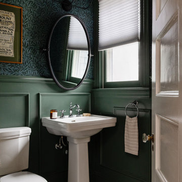
Design-build kitchen, powder room, and butler’s pantry remodel in an 1890 Victorian home in Wakefield, MA. Full renovation included reconfiguring the powder room layout and opening a load-bearing wall between the kitchen and dining room to improve flow and functionality.
Kitchen remodel features frameless full overlay cabinetry in Steel Blue, quartz countertops (Alleanza Dolomiti Extra), beveled crackle tile backsplash, and hardwood flooring. Island addition replaces freestanding table and adds prep space with microwave drawer. Full-height wall cabinets maximize kitchen storage. Historic-inspired details include ogee-edge countertops, bridge-style faucet in English Bronze, decorative corbels, polished nickel hardware, and industrial-style sconces.
Powder room renovation includes reduced footprint layout, basketweave floor tile, applied molding, wallpaper, and vintage-inspired plumbing fixtures in chrome.
Butler’s pantry remodel features inset cherry cabinetry in a coffee stain finish, quartz countertops, glass-front cabinets, beverage fridge, bar sink, and wallpapered cabinetry interiors. Designed as a functional wet bar and storage extension off dining room.
Style: Traditional / Victorian kitchen remodel, historic home renovation, design-build remodeling contractor Wakefield MA.


 TKS Design Group
Download our free ebook, Creating the Ideal Kitchen. DOWNLOAD NOW
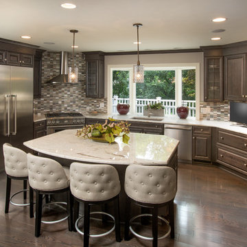
For many, extra time at home during COVID left them wanting more from their homes. Whether you realized the shortcomings of your space or simply wanted to combat boredom, a well-designed and functional home was no longer a want, it became a need. Tina found herself wanting more from her Old Irving Park home and reached out to The Kitchen Studio about adding function to her kitchen to make the most of the available real estate.
At the end of the day, there is nothing better than returning home to a bright and happy space you love. And this kitchen wasn’t that for Tina. Dark and dated, with a palette from the past and features that didn’t make the most of the available square footage, this remodel required vision and a fresh approach to the space. Lead designer, Stephanie Cole’s main design goal was better flow, while adding greater functionality with organized storage, accessible open shelving, and an overall sense of cohesion with the adjoining family room.
The original kitchen featured a large pizza oven, which was rarely used, yet its footprint limited storage space. The nearby pantry had become a catch-all, lacking the organization needed in the home. The initial plan was to keep the pizza oven, but eventually Tina realized she preferred the design possibilities that came from removing this cumbersome feature, with the goal of adding function throughout the upgraded and elevated space. Eliminating the pantry added square footage and length to the kitchen for greater function and more storage. This redesigned space reflects how she lives and uses her home, as well as her love for entertaining.
The kitchen features a classic, clean, and timeless palette. White cabinetry, with brass and bronze finishes, contrasts with rich wood flooring, and lets the large, deep blue island in Woodland’s custom color Harbor – a neutral, yet statement color – draw your eye.
The kitchen was the main priority. In addition to updating and elevating this space, Tina wanted to maximize what her home had to offer. From moving the location of the patio door and eliminating a window to removing an existing closet in the mudroom and the cluttered pantry, the kitchen footprint grew. Once the floorplan was set, it was time to bring cohesion to her home, creating connection between the kitchen and surrounding spaces.
The color palette carries into the mudroom, where we added beautiful new cabinetry, practical bench seating, and accessible hooks, perfect for guests and everyday living. The nearby bar continues the aesthetic, with stunning Carrara marble subway tile, hints of brass and bronze, and a design that further captures the vibe of the kitchen.
Every home has its unique design challenges. But with a fresh perspective and a bit of creativity, there is always a way to give the client exactly what they want [and need]. In this particular kitchen, the existing soffits and high slanted ceilings added a layer of complexity to the lighting layout and upper perimeter cabinets.
While a space needs to look good, it also needs to function well. This meant making the most of the height of the room and accounting for the varied ceiling features, while also giving Tina everything she wanted and more. Pendants and task lighting paired with an abundance of natural light amplify the bright aesthetic. The cabinetry layout and design compliments the soffits with subtle profile details that bring everything together. The tile selections add visual interest, drawing the eye to the focal area above the range. Glass-doored cabinets further customize the space and give the illusion of even more height within the room.
While her family may be grown and out of the house, Tina was focused on adding function without sacrificing a stunning aesthetic and dreamy finishes that make the kitchen the gathering place of any home. It was time to love her kitchen again, and if you’re wondering what she loves most, it’s the niche with glass door cabinetry and open shelving for display paired with the marble mosaic backsplash over the range and complimenting hood. Each of these features is a stunning point of interest within the kitchen – both brag-worthy additions to a perimeter layout that previously felt limited and lacking.
Whether your remodel is the result of special needs in your home or simply the excitement of focusing your energy on creating a fun new aesthetic, we are here for it. We love a good challenge because there is always a way to make a space better – adding function and beauty simultaneously.
 Alair Homes Plano
Our clients were living in a Northwood Hills home in Dallas that was built in 1968. Some updates had been done but none really to the main living areas in the front of the house. They love to entertain and do so frequently but the layout of their house wasn’t very functional. There was a galley kitchen, which was mostly shut off to the rest of the home. They were not using the formal living and dining room in front of your house, so they wanted to see how this space could be better utilized. They wanted to create a more open and updated kitchen space that fits their lifestyle. One idea was to turn part of this space into an office, utilizing the bay window with the view out of the front of the house. Storage was also a necessity, as they entertain often and need space for storing those items they use for entertaining. They would also like to incorporate a wet bar somewhere!
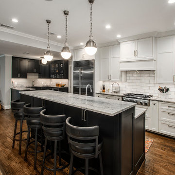
We demoed the brick and paneling from all of the existing walls and put up drywall. The openings on either side of the fireplace and through the entryway were widened and the kitchen was completely opened up. The fireplace surround is changed to a modern Emser Esplanade Trail tile, versus the chunky rock it was previously. The ceiling was raised and leveled out and the beams were removed throughout the entire area. Beautiful Olympus quartzite countertops were installed throughout the kitchen and butler’s pantry with white Chandler cabinets and Grace 4”x12” Bianco tile backsplash. A large two level island with bar seating for guests was built to create a little separation between the kitchen and dining room. Contrasting black Chandler cabinets were used for the island, as well as for the bar area, all with the same 6” Emtek Alexander pulls. A Blanco low divide metallic gray kitchen sink was placed in the center of the island with a Kohler Bellera kitchen faucet in vibrant stainless. To finish off the look three Iconic Classic Globe Small Pendants in Antiqued Nickel pendant lights were hung above the island. Black Supreme granite countertops with a cool leathered finish were installed in the wet bar, The backsplash is Choice Fawn gloss 4x12” tile, which created a little different look than in the kitchen. A hammered copper Hayden square sink was installed in the bar, giving it that cool bar feel with the black Chandler cabinets. Off the kitchen was a laundry room and powder bath that were also updated. They wanted to have a little fun with these spaces, so the clients chose a geometric black and white Bella Mori 9x9” porcelain tile. Coordinating black and white polka dot wallpaper was installed in the laundry room and a fun floral black and white wallpaper in the powder bath. A dark bronze Metal Mirror with a shelf was installed above the porcelain pedestal sink with simple floating black shelves for storage.
Their butlers pantry, the added storage space, and the overall functionality has made entertaining so much easier and keeps unwanted things out of sight, whether the guests are sitting at the island or at the wet bar! The clients absolutely love their new space and the way in which has transformed their lives and really love entertaining even more now!
 TKS Design Group
Free ebook, Creating the Ideal Kitchen. DOWNLOAD NOW
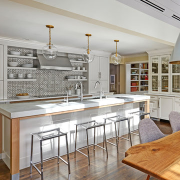
This large open concept kitchen and dining space was created by removing a load bearing wall between the old kitchen and a porch area. The new porch was insulated and incorporated into the overall space. The kitchen remodel was part of a whole house remodel so new quarter sawn oak flooring, a vaulted ceiling, windows and skylights were added.
A large calcutta marble topped island takes center stage. It houses a 5’ galley workstation - a sink that provides a convenient spot for prepping, serving, entertaining and clean up. A 36” induction cooktop is located directly across from the island for easy access. Two appliance garages on either side of the cooktop house small appliances that are used on a daily basis.
Honeycomb tile by Ann Sacks and open shelving along the cooktop wall add an interesting focal point to the room. Antique mirrored glass faces the storage unit housing dry goods and a beverage center. “I chose details for the space that had a bit of a mid-century vibe that would work well with what was originally a 1950s ranch. Along the way a previous owner added a 2nd floor making it more of a Cape Cod style home, a few eclectic details felt appropriate”, adds Klimala.
The wall opposite the cooktop houses a full size fridge, freezer, double oven, coffee machine and microwave. “There is a lot of functionality going on along that wall”, adds Klimala. A small pull out countertop below the coffee machine provides a spot for hot items coming out of the ovens.
The rooms creamy cabinetry is accented by quartersawn white oak at the island and wrapped ceiling beam. The golden tones are repeated in the antique brass light fixtures.
“This is the second kitchen I’ve had the opportunity to design for myself. My taste has gotten a little less traditional over the years, and although I’m still a traditionalist at heart, I had some fun with this kitchen and took some chances. The kitchen is super functional, easy to keep clean and has lots of storage to tuck things away when I’m done using them. The casual dining room is fabulous and is proving to be a great spot to linger after dinner. We love it!”
Designed by: Susan Klimala, CKD, CBD
For more information on kitchen and bath design ideas go to: www.kitchenstudio-ge.com
 Vision Interiors
As a conceptual urban infill project, the Wexley is designed for a narrow lot in the center of a city block. The 26’x48’ floor plan is divided into thirds from front to back and from left to right. In plan, the left third is reserved for circulation spaces and is reflected in elevation by a monolithic block wall in three shades of gray. Punching through this block wall, in three distinct parts, are the main levels windows for the stair tower, bathroom, and patio. The right two-thirds of the main level are reserved for the living room, kitchen, and dining room. At 16’ long, front to back, these three rooms align perfectly with the three-part block wall façade. It’s this interplay between plan and elevation that creates cohesion between each façade, no matter where it’s viewed. Given that this project would have neighbors on either side, great care was taken in crafting desirable vistas for the living, dining, and master bedroom. Upstairs, with a view to the street, the master bedroom has a pair of closets and a skillfully planned bathroom complete with soaker tub and separate tiled shower. Main level cabinetry and built-ins serve as dividing elements between rooms and framing elements for views outside.
Architect: Visbeen Architects
Builder: J. Peterson Homes
Photographer: Ashley Avila Photography

 Landis Architects | Builders
This 1890 rowhouse had been renovated over time, most recently in the 70s. Our clients wanted to renovate every floor. The floors and walls were out of level, and most of the systems were old. We gutted the structure to the studs, leveled and reframed the walls and floors, added insulation and updated the plumbing, electrical and HVAC. Once the structural and systems work was complete, our crew installed a new expanded kitchen, updated all the bathrooms, and updated the basement.
Reconfiguring the first floor plan involved taking down the wall between the kitchen and dining room to create one large entertaining space. To bring more natural light and provide sight lines from the front to the back of the rowhouse, we added new windows to the back wall and moved the opening to the other side as a full-light door.
Kitchen features include:
• Cabinetry that extends to the ceiling to maximize storage
• Large island with seating for four
• Painting that imitates the pattern of the ceiling we uncovered during the renovation
• Buffet cabinetry in the dining room with a built-in wine cooler
HDBros
 Nar Design Group
This home remodel is a celebration of curves and light. Starting from humble beginnings as a basic builder ranch style house, the design challenge was maximizing natural light throughout and providing the unique contemporary style the client’s craved.
The Entry offers a spectacular first impression and sets the tone with a large skylight and an illuminated curved wall covered in a wavy pattern Porcelanosa tile.
The chic entertaining kitchen was designed to celebrate a public lifestyle and plenty of entertaining. Celebrating height with a robust amount of interior architectural details, this dynamic kitchen still gives one that cozy feeling of home sweet home. The large “L” shaped island accommodates 7 for seating. Large pendants over the kitchen table and sink provide additional task lighting and whimsy. The Dekton “puzzle” countertop connection was designed to aid the transition between the two color countertops and is one of the homeowner’s favorite details. The built-in bistro table provides additional seating and flows easily into the Living Room.
A curved wall in the Living Room showcases a contemporary linear fireplace and tv which is tucked away in a niche. Placing the fireplace and furniture arrangement at an angle allowed for more natural walkway areas that communicated with the exterior doors and the kitchen working areas.
The dining room’s open plan is perfect for small groups and expands easily for larger events. Raising the ceiling created visual interest and bringing the pop of teal from the Kitchen cabinets ties the space together. A built-in buffet provides ample storage and display.
The Sitting Room (also called the Piano room for its previous life as such) is adjacent to the Kitchen and allows for easy conversation between chef and guests. It captures the homeowner’s chic sense of style and joie de vivre.
 Hillcrest Construction
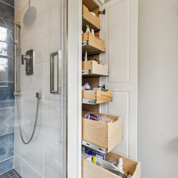
Hillcrest Construction designed and executed a complete facelift for these West Chester clients’ master bathroom. The sink/toilet/shower layout stayed relatively unchanged due to the limitations of the small space, but major changes were slated for the overall functionality and aesthetic appeal.
The bathroom was gutted completely, the wiring was updated, and minor plumbing alterations were completed for code compliance.
Bathroom waterproofing was installed utilizing the state-of-the-industry Schluter substrate products, and the feature wall of the shower is tiled with a striking blue 12x12 tile set in a stacked pattern, which is a departure of color and layout from the staggered gray-tome wall tile and floor tile.
The original bathroom lacked storage, and what little storage it had lacked practicality.
The original 1’ wide by 4’ deep “reach-in closet” was abandoned and replaced with a custom cabinetry unit that featured six 30” drawers to hold a world of personal bathroom items which could pulled out for easy access. The upper cubbie was shallower at 13” and was sized right to hold a few spare towels without the towels being lost to an unreachable area. The custom furniture-style vanity, also built and finished at the Hillcrest custom shop facilitated a clutter-free countertop with its two deep drawers, one with a u-shaped cut out for the sink plumbing. Considering the relatively small size of the bathroom, and the vanity’s proximity to the toilet, the drawer design allows for greater access to the storage area as compared to a vanity door design that would only be accessed from the front. The custom niche in the shower serves and a consolidated home for soap, shampoo bottles, and all other shower accessories.
Moen fixtures at the sink and in the shower and a Toto toilet complete the contemporary feel. The controls at the shower allow the user to easily switch between the fixed rain head, the hand shower, or both. And for a finishing touch, the client chose between a number for shower grate color and design options to complete their tailor-made sanctuary.
1